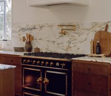
This Connecticut home elevates the limewash paint trend with sophisticated-yet-bold color choices
This elegant homes by Chango & Co takes on a new lease of life with color pops, natural light and muted tones

Located in Greenwich, Connecticut, this home was designed for a family by Susana Simonpietri, creative director of Brooklyn-based interior design studio Chango & Co.
Bright and filled with an abundance of natural light, Simonpietri looked to create special moments in each room, with each having its own distinctive characteristics, from exciting pops of color to bold wallpaper prints.
'The baseline of the house was actually layered neutrals,' explains Susana. 'You can see this in the dining area of the kitchen and the primary bedroom.'
'From there, we added bursts of bolder colors throughout the rest of the home, including in the children's rooms and the dining room.'
This project was a departure from Chango & Co's typical design work and helped the team discover that layering certain textures and patterns in a modern home can really pay off. 'It is proof that it’s good to go outside of your comfort zone. Some of the things you can be unsure about can wind up being the most successful parts of your work.'

Oonagh is an interiors writer and editor, and expert at keeping up with trends from the world of interior design. For this story, she's spoken to the the designers at Chango & Co to find out how they went about the design process of this bright and colorful Connecticut home.
The living room

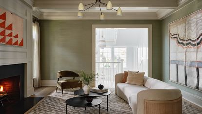
The living room is the relaxing center of the home. Calming, neutral, with a muted color palette.
'This room is a successful example of a calming, neutral space that’s accomplished by layering light colors that also had textures,' says Susana Simonpietri of Chango & Co. 'Nothing in the room lies flat and there’s interest created in those textures.
The glasscloth walls bring interest to the space, another texture that helps bring that coveted cozy feel. 'We selected a pale green grasscloth in this room, because we always love the subtle texture that grasscloth can give a room,' says Susana. 'When you add textures to walls, you become more enveloped in the space.'
Furniture is positioned just so, with the gentle curve of the cream colored sofa a beautiful addition, and well-thought-out decor tasteful arranged on the coffee table.
'In reference to the coffee table, sometimes when you have entirely neutral spaces, they can all blend together. Having occasional dark punches is really important to creating depth within the spaces.'
Pattern does creep into the room in the form of the rug underfoot and the beautiful textured wall art. It's all about layering texture and subtle colors to create the full effect. the living room, we kept it neutral but used a more patterned rug and other layers.
The dining room

The olive green theme carries through from the living room to the richly layered dining room where walls are painted in Portola Paints' Limewash Shelter. The living room is a slightly lighter shade of the dining's room's green and there progression of going from one room to the next creates a continuity.
'We knew we wanted to do a dark green dining room, which drove the character of the whole room and actually drove a lot of the first floor as well. In the case of the dining room, we wanted to use the limewash to add some texture and keep it tonal. The green generally allowed us to play with the wood tones.'
To really compliment the walls and allow the paintwork to stand out, Susana chose a wooden table from Homenature and cane armchairs with black trim from Pottery Barn.
Here, crown molding and paneling add to the charm and heritage of the home, and create an enveloping space. 'This house was built with a nod to traditional New England architecture, and the paneling was already installed when these clients purchased the home. The paneling on both the walls and the ceilings tie together various elements of that nod,' says Susana.

'Personally, my favorite room is the green dining room,' says Susana. 'Initially, it was a hue of green that we were all really on the fence about. When looking at the color in the office, it didn’t seem like the right direction. But when we brought the swatches to the site, it was a clear winner.
'I think sometimes the biggest surprise elements, or something you’re unsure about for a period of time, can turn out the best. The monochromatic coloring was really successful here and the layering of different furniture and lighting types really tied everything together.'
The children's rooms

The monochromatic theme continues into the kid's rooms where Susana was allowed to go more playful and slightly more saturated with her color picks. The son’s room is completely blue and painted in Benjamin Moore’s Nantucket Fog and Portola Paints’ Limewash in Waved. Susana chose mostly blue furnishings for this room with some pops of red.
The daughter’s room is completely pink with the walls covered in a floral wallpaper by Caitlin McGauley with a sprinkling of yellows, blues, greens, oranges and purples throughout it.

Nantucket Fog, Benjamin Moore
A calming and soothing shade with earthy undertones makes this particular blue a firm favorite. Perfect for bedrooms and living rooms where you might want to create a calming and cocooning effect.
The home office

Chango & Co. wanted a home office that was awash with light. The office had a large set of windows on three of the four walls so was at a natural advantage. This gave a great foundation to work with.
'When you walked into the space, you are flooded with light,' says Susana. 'A light-filled room can actually create an opportunity for going darker because you have so much natural light, but we didn’t want to fight against this and instead decided to work with that light.
'We used it as a color tonal direction and we continued the light greens throughout the first floor. This white had a slight green tint to it; which was further enhanced by relating to the exterior landscaping.'
The second office

Another space where layered color and pattern bring life and texture is the secondary office. 'The pink wallpaper was a riff on British wallpaper design. It's sophisticated, adult, and old-world at the same time.'
Smaller vignettes

Aside from the very functional rooms throughout the home, there are so many small vignettes, cozy corners for contemplation, nooks that serve for reading spaces, The console table decor in the entryway works as a decorative moment that welcomes guests, while the Fly lounge chair by Space Copenhagen and side table provides a quiet seating area.
Offering up these quieter moments was important to Susana, especially in a busy family home.
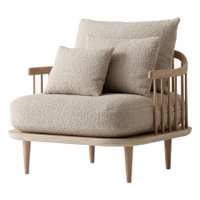
Fly SC1 loungechair by Space Copenhagen
A little pricey, I grant you, but this armchair is a statement piece by Space Copenhagen. With a lightweight, Scandi appearance, the chair is made from light oak, with cushions upholstered in high-quality wool blend fabric.
Be The First To Know
The Livingetc newsletter is your shortcut to the now and the next in home design. Subscribe today to receive a stunning free 200-page book of the best homes from around the world.

Oonagh is a content editor at Livingetc.com and an expert at spotting the interior trends that are making waves in the design world. Writing a mix of everything and everything from home tours to news, long-form features to design idea pieces on the website, as well as frequently featured in the monthly print magazine, she's the go-to for design advice in the home. Previously, she worked on a London property title, producing long-read interiors features, style pages and conducting interviews with a range of famous faces from the UK interiors scene, from Kit Kemp to Robert Kime. In doing so, she has developed a keen interest in London's historical architecture and the city's distinct tastemakers paving the way in the world of interiors.
-
 The 12 Best Wayfair Table Lamps Are All Under $200 — And Our Style Editor Wants The Lot
These 12 best Wayfair table lamps are the perfect excuse to get a head start on your President's Day sale shopping. With discounts up to 78% off
By Julia Demer Published
-
 Kitchen Utensils Worth Keeping vs the Ones Just Taking up Space — 'It's the Secret to Decluttering Drawers'
Declutter and organize your kitchen cabinets and drawers with these expert-approved tips
By Ottilie Blackhall Published

