An interior designer completely redesigned this Manhattan apartment in just 90 days from start to finish
Justin Charette proved that a challenging deadline doesn't have to get in the way of creating a beautiful home
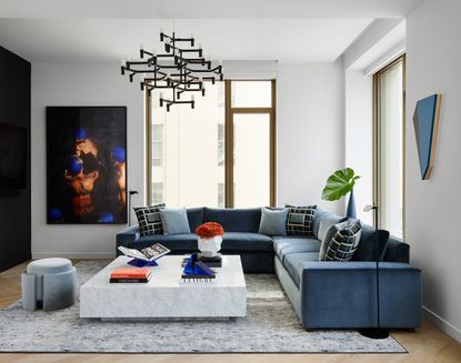

When you move into a new home, there's usually an expectation it's going to take time to get the space exactly how you want it. Yet faced with a client brief for a 2,500-square foot apartment in the West Chelsea neighborhood of Manhattan, interior designer Justin Charette had just 90 days to bring young entrepreneurs Bella and Elio Boyd's vision to life.
This included removing a wall, electric and AV, painting and wallpapering, window treatments and custom built-ins, and that's before even beginning to broach furnishing the three-bed, three-bath apartment, starting from zero. 'We started completely from scratch,' explains Justin. 'Bella and Elio essentially moved in with just clothes, suitcases, and their beautiful Frenchies.'
It wasn't your everyday interior designer-client situation, and with challenging supply chain issues, Justin had to work smart, as well as hard, to create this modern home. 'The clients gave me the freedom to execute, and through organization and very direct communication with all vendors I was able to meet their deadline,' he says. 'Simple tweaks like taking the in-stock dining table base to an auto body shop, or switching hardware on in-stock furniture are both great customization hacks.'
The resulting space has a modern, clean aesthetic, building on a neutral base with a palette of vibrant blues – a throughline that makes this apartment into a cohesive home.
Living room

There's a brilliance to imagining a whole home that feels like its rooms are related, but aren't repetitive or 'themey', and in this apartment, it's something that Justin captures with his use of color and pattern.
'The clients love the color blue, and wanted me to incorporate it abundantly,' Justin explains. 'I chose a variety of shades, and played with whites and black as well and used them as a neutral for the space.' To add some warming balance, subtle hints of orange help give a little pop of contrast, too.
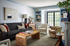
The sofa is custom in a performance Kravet velvet fabric. 'We wanted relatively straightforward shape so it wouldn’t appear too busy with the pattern pillows,' says Justin, referring to the Kelly Wearstler Rarity print used to dress the sofa.
The living room wall art continues the theme, while sized appropriately to balance out the extremely large windows of the apartment. 'The clients love summer and swimming so I included a large-scale photography print from Robin Rice Gallery in NYC.'
Dining room

The dining space features a table from Room & Board, with a vibrant blue base. 'The client's needed a piece that could be delivered within this tight timeline of 90 days,' says Justin, something that meant sticking only to products that were in stock to order. 'To add interest I took the base to an auto body shop and had it sprayed blue.'
The building also included the recessed window, and ledge, in which Justin created a long window seat, again featuring the Kelly Wearstler print. 'I played with the Kelly Wearstler pattern in the wallpaper, sofa pillows, and bench' he says. 'They help tie everything together, but are separated enough to not appear too thematic. In this space I wanted to create a feeling of elevated modernity.'
Kitchen

It may be a small kitchen, but it's an efficient one, which also adds some warmth to the open-plan living areas with a mix of oak and marble.
The cabinetry makes the most of the apartment's lofty proportions too. 'It’s very integrated and there is over 10 feet of cabinetry,' Justin explains. 'It provided abundant storage vertically.'
Primary bedroom
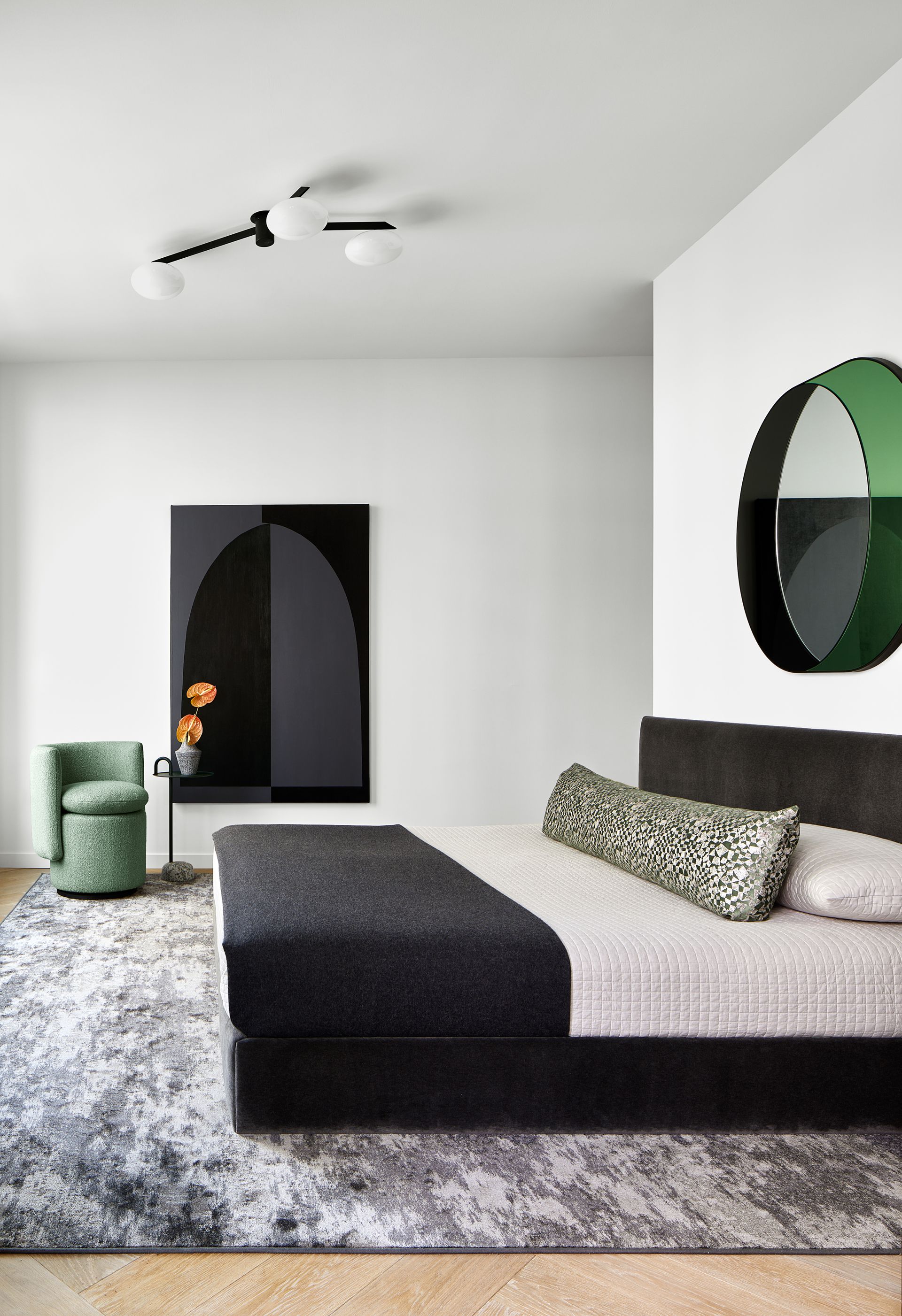
Just when you think you might suffer from blue fatigue, the primary bedroom offers a verdant relief. 'I didn’t want the apartment to appear like it was too thematic with only blue,' says Justin. 'I also wanted the space to have a sense of calm given the other rooms are heavier on pattern.'
While markedly different in many respects, this modern bedroom still captures the spirit of the other spaces through graphic choices and the use of white and black. Plus, green just makes more sense for this room, as Justin explains. 'The bedroom also has a view of the High Line which blooms in the spring to reveal much greenery,' he says.
Primary bathroom

The bathroom is a more pared-back space than much of the apartment, creating a relaxing spa-like feel by embracing the texture of marble and walnut.
Yet, even here, modern bathroom elements ensure the space feels design forward. 'I added black to the shower door, plant stand, and light fixture to add contrast,' Justin explains.
The freestanding bath stands in front of a gloriously large window, overlooking the homeowners' private terrace which can be accessed from the main bedroom.
Guest bedroom

Where vibrant, almost electric blues bring energy to the rest of the apartment, in the guest bedroom, a more relaxing palette of blues sets the right tone for the space.
Yet, it's not shy in delivering on the wow-factor the clients wanted to impress guests, with a beautifully intricate yet soft wallpaper on the walls. 'I kept everything relatively monochromatic while adding white to break it up in a meaningful way,' Justin says.
Home office

With the couple wanting a defined workstation each, this double desk built-in provided the right solution for the home office. In many ways, it's a set-up that feels perfunctory, providing a backdrop that gives them space to concentrate on the task at hand, but creative shelf styling adds the character that makes it feel at home with the rest of the apartment. 'They wanted it to be functional but styled in a way that would be some humor to the workspace.'
Hallway

The biggest, boldest use of the Kelly Wearstler Rarity print is undoubtedly the hallway, a foyer that links the separate areas of the apartment. 'I wanted something on the busier side that would tie all the colors into the space,' says Justin, 'but it also helps conceal a garbage chute, the electric boxes and more.'
You can find more of Justin's work at Justin Charette Design and on Instagram at @justin.charette.design
Be The First To Know
The Livingetc newsletter is your shortcut to the now and the next in home design. Subscribe today to receive a stunning free 200-page book of the best homes from around the world.

Hugh is the Editor of Livingetc.com. From working on a number of home, design and property publications and websites, including Grand Designs, ICON and specialist kitchen and bathroom magazines, Hugh has developed a passion for modern architecture, impactful interiors and green homes. Whether moonlighting as an interior decorator for private clients or renovating the Victorian terrace in Essex where he lives (DIYing as much of the work as possible), you’ll find that Hugh has an overarching fondness for luxurious minimalism, abstract shapes and all things beige. He’s just finished a kitchen and garden renovation, and has eyes set on a bathroom makeover for 2024.
-
 How to Thaw a Frozen Pipe — Learn Everything You Need to Know in 5 Minutes With This Guide
Winter storm caught you off guard? We asked an expert — just how do you thaw a frozen pipe?
By Hugh Metcalf Published
-
 The 12 Very Best Silk Bedding Pieces — As Our Style Editor Says: 'It's What Dreams Are Made Of!'
Slumber in lustrous luxury with the very best silk bedding sheets, duvets, pillowcases, and more — your sleep score will thank us later
By Julia Demer Published
-
 White walls, but never bland! This Italian apartment's colorful designer touches create an uplifting home
Studio Venturoni has transformed this Italian apartment, using vibrant color pops to bring character and charm to the space
By Oonagh Turner Published
-
 'It's a place to stay still and slow down' - how this Connecticut home took its cue from the 'slow living' trend
From a starting point of creating a home that was an antidote to the hustle and bustle of the city, the design of this project look to nature for inspiration
By Hugh Metcalf Published
-
 The 10 best living rooms of the year – our pick of the most beautiful designs we've seen
We've trawled through the archives to cherry-pick the living rooms that have stood out to us this year
By Oonagh Turner Published
-
 The more joy the better! This designer home shows how to do stylishly maximalist Christmas decor
Bursting with happiness, this colorful home is dressed for Christmas in the most abundant and beautiful of ways
By Mary Weaver Published
-
 This LA home shows how to do modern eclectic style perfectly - with a utility room of dreams
Creative director Dabito used his interiors know-how to treat his 1950s bungalow to a medley of pattern and color
By Emma J Page Published
-
 Can you decorate a home with just black and white? This modern cottage proves it's an option
For this guest house in Connecticut, the interior designers used a strict black and white color scheme. Here's how they made it work
By Hugh Metcalf Published
-
 This architect's apartment is a masterclass in how to make a small space feel luxe
Architect Nicholas Potts has turned every corner of his city apartment into an art-filled space that feels opulent yet homely
By Pip Rich Last updated
-
 This family home in Washington, D.C. is full of ideas to steal for displaying art in brilliantly personal ways
Designer Zoe Feldman has created a modern home full of contrast, clever color choices and inspiring ways to showcase art
By Pip Rich Published

