Before and after – 'muddied' by its previous remodels, this 1970s home now has a sense of clarity
How do you make an architecturally significant home feel modern, without losing its spirit? This Washington home is an example on how to handle a home sensitively


It's a sad sight when an architecturally impressive home starts to feel outdated for modern living, however, the renovations can be much worse. Overly modernizing a property can completely mask its character, charm and original features.. When done right, however, properties are given a new lease of life.
Floisand Studio Architects have achieved just that with this beautiful 70s-era home renovation on Mercer Island in Washington. Modernization has been added in small modest doses they are almost untraceable, yet breathe so much life back into the family home. Period features are enhanced subtly and effectively. The two worlds dance in harmony rather than fight for the top spot.
Originally designed by Seattle architect Ralph Anderson, the home is nestled amongst trees and is surrounded by nature. ' The home was built in the 1970s and was remodeled several times prior to our clients purchasing it in 2010,' explains Allison Hogue, co-founder of Floisand Studio. 'Our clients enjoyed the home for 9 years but, on the whole, found its layout and connection to the decks and yard lacking and the interior spaces dark.'
'The previous remodels had muddied the original architecture,’ Allison adds, which contributed to the disjointed nature of the property. As a result, the architects chose carefully detailed modifications to preserve much of what they loved while creating a more functional space with a fresh look. Both inside and out have been transformed by these calculated changes to make for a modern home.
Here, we take a look at how this dated home became a simple and stylish haven, combining 70s and modern style that is nothing short of luxurious.
Kitchen

Before
The kitchen was the starting point of this home's makeover. 'They started the project as a kitchen remodel but as they got into it decided to correct other aspects of the home that bothered them,' Allison Hogue explains.
Prior to renovations, this space was cluttered and tired. Poor placement and inadequate storage meant the space felt claustrophobic, despite having ample space.
It was suffocated by the clutter that quickly amounted due to its constant use - it is, after all, one of the brightest, most inviting rooms in the house - especially given that the kitchen door was used as a main entry point and there was no closet or mudroom nearby.
This busy family desperately needed a kitchen that suited their socializing and practical needs, one they would want to be in not out of necessity but enjoyment.

After
Allison and her team worked with the family to create a space that felt both functional and stylish, and they certainly achieved that. The space is now bright and airy, providing a welcoming environment for the whole family. The team managed to maximize natural light, enhancing the home's indoor-outdoor connection, a theme that runs throughout and that has transformed the flow of the home.
‘We opened up the living, dining, and kitchen areas so that each space could be used comfortably by the family, and while hosting guests,’ Allison explains.
The once drab kitchen is completely renewed by the use of light and modern design. 'We used natural materials such as quartzite, white oak, and walnut that are warm yet highly durable,' Allison tells us. 'The cabinets are detailed with blackened aluminum J pulls to keep the casework hardware unobtrusive yet easy to use.'
The floor-to-ceiling walnut cabinets add much-needed storage that has freed the surfaces from unnecessary clutter, leaving a modern minimalist kitchen that is understated and clean.
Dining area

Before
Poor lighting and layout meant the family only utilized the kitchen as a communal area - while the dining room, living room, and main entry was rarely used. The space felt purposeless, and the placement of the dining table and strangely placed armchairs made the room feel overcrowded and cumbersome.

After
With some simple changes, the space was reimagined to be a place the family would want to spend time in. With a natural connection to the kitchen, using the space feels a lot more organic and free-flowing than before. Natural light continues to uplift the room and natural materials contribute to a cohesive scheme between the kitchen and dining areas.
'While we maintained the classic proportions of the windows, we revamped their detailing, simplifying them to a clean sheetrock to wood liner detail on the interior,' Allison says. 'We eliminated the original heavy wood trim to lighten the space.'
The pony wall and level change provides a subtle divide between the living and dining area that sections the spaces without cutting them off completely. By placing the furniture away from the windows slightly it takes full advantage of the light that can evenly disperse through the open-plan space.
Living room

Before
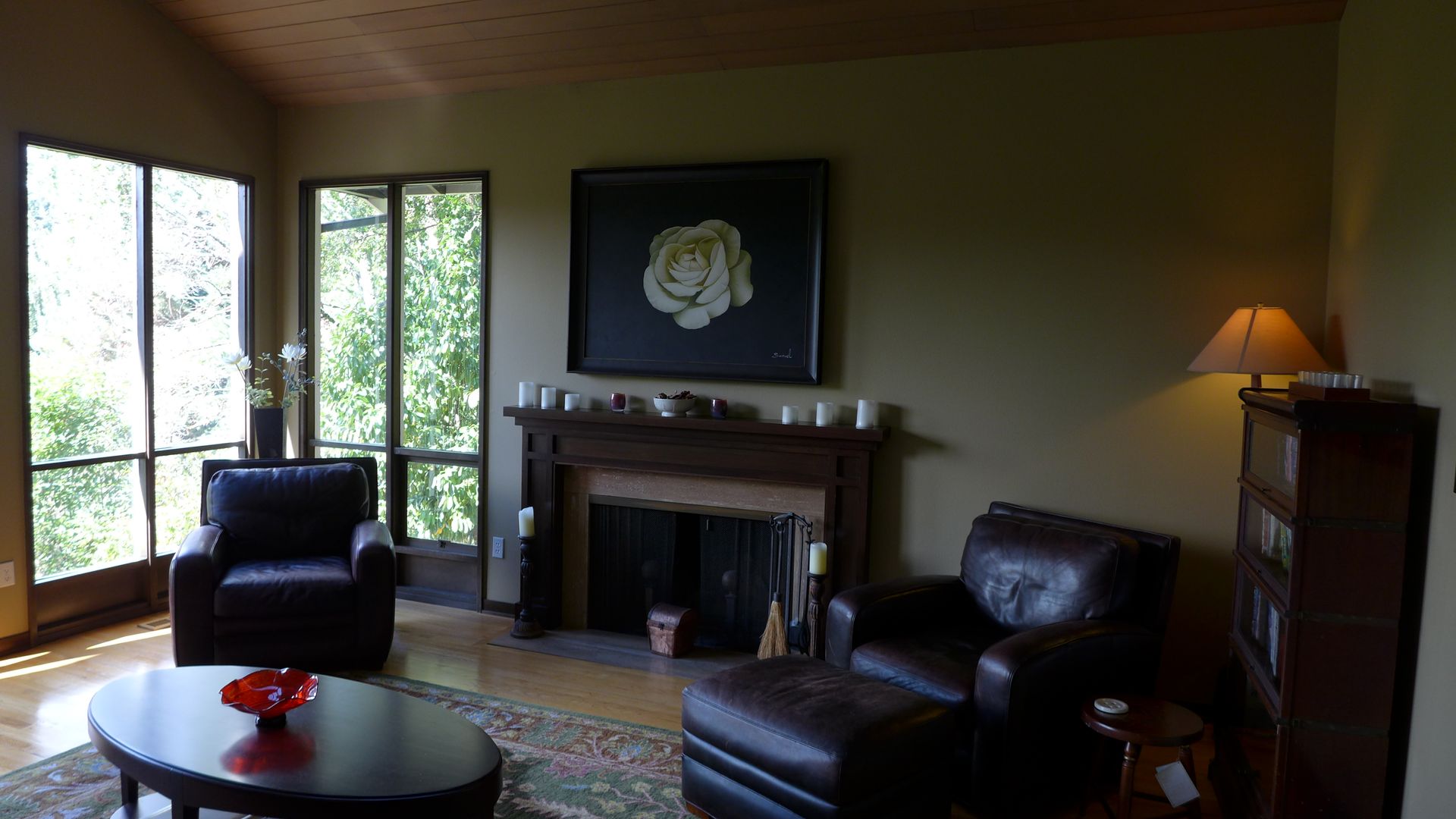
The living room suffered in darkness like other areas of the house, which meant the family wasn't drawn to use it. The bland decor and dark furniture only exacerbated this issue.

After
The new look living room feels like one of the most dramatic changes in the home.
‘We added new energy-efficient skylights, windows, and large sliding doors to maximize natural light—an attribute the home had been short of,’ she says.
Paired with the bright white walls the space feels a whole lot bigger and more inviting. Moving the living room sofa to the opposite wall completely opens up the space and means they can now enjoy the view, fireplace and TV simultaneously. Genius!
Bathroom

Before
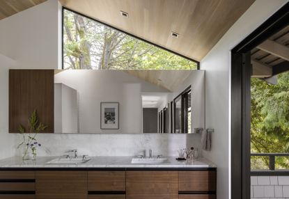
Like the rest of the home, the bathroom was dingy and dark. The muted mustard walls paired with mismatched tiles dated the space, but the architects were able to see its potential. ‘Despite its south-facing orientation, the primary bathroom was dark and not very inviting. Additionally, it sat awkwardly on the corner,’ Allison explains.

After
Luckily the teams were able to capitalize on the light and enlarge the space through some serious renovations of the upstairs which involved a complete rework of the layout.
‘The extra space allowed us to enlarge the primary bathroom,’ Allison says ‘We added a clerestory window for privacy from the street and a skylight along a shower wall that brings a skim of light down into it. Walls were relocated to create a more cohesive and streamlined interior space.’
Allison and her team were also careful to maintain some of the original architectural work that complemented the space. 'The architect that designed the original home had carefully aligned the tops of the windows with the underside of the pork chops, tracing the alignments consistently around the home. We embraced that approach and added our own twist when we expanded and revamped this modern bathroom.'
Exterior

Before
The home's exterior lacked a connection to the outdoor space, and also had no clear entrance. As a result, visitors would enter through the kitchen sliding doors, which was far from optimal.
'You couldn’t find the main entry from the street, and guests mistook the kitchen side doors as the front entry - the kids used it as a main point of access too,' Allison says. 'Unfortunately, without a closet or mudroom nearby, stuff was forever accumulating in the middle of the kitchen- an annoyance to the homeowners.'

After
Now, guests are naturally guided toward the correct entrance. 'A new concrete walkway and steps, steel planters, and an angled landscape wall guide guests through the tree-filled property to the front door,' Allison tells us. This makes for a seamless design that works well with the pre-existing features of the property.
The once sad-looking backyard deck has been revamped to make full use of their socializing space. 'New hard and soft scape elements create landscape moments around the home, buffering the walkway from the home and offering some privacy to the spaces inside where it was needed,' Allison explains.
As you walk down the driveway you are greeted by a beautifully refined home that feels modern and well-considered, with still the hint of the 70s charm that made this property so appealing.
Be The First To Know
The Livingetc newsletter is your shortcut to the now and the next in home design. Subscribe today to receive a stunning free 200-page book of the best homes from around the world.

Amy recently completed an MA in Magazine Journalism at City, University of London, with experience writing for Women’s lifestyle publications across arts, culture, and beauty. She has a particular love for the minimalist aesthetic mixed with mid-century furniture, especially combining unique vintage finds with more modern pieces. Her previous work in luxury jewellery has given her a keen eye for beautiful things and clever design, that plays into her love of interiors. As a result, Amy will often be heard justifying homeware purchases as 'an investment', wise words to live by.
-
 How to Thaw a Frozen Pipe — Learn Everything You Need to Know in 5 Minutes With This Guide
Winter storm caught you off guard? We asked an expert — just how do you thaw a frozen pipe?
By Hugh Metcalf Published
-
 The 12 Very Best Silk Bedding Pieces — As Our Style Editor Says: 'It's What Dreams Are Made Of!'
Slumber in lustrous luxury with the very best silk bedding sheets, duvets, pillowcases, and more — your sleep score will thank us later
By Julia Demer Published

