Before and after: A '70s bungalow with a problematic kitchen is now a bright oasis - with great tiling in every room
Calm curves and neutral colors transform a standard boxy space into a spacious and functional family home


A family of four with a growing business will have numerous needs for a property they can comfortably call home. Functionality is key, space for everyone to enjoy while spending time together, but also privacy when needed, as well as an overall feeling of warmth and an inviting atmosphere that one’s glad to come back to every day. At first glance, there was not much that a 1700 sq. ft 1970s bungalow could cross off that list. The building needed some serious TLC to turn it into an inhabitable space.
However, the project has recently been completed and the result is nothing short of achieving a truly modern home. Through clever use of curved shapes, beautiful tiling and a neutral color scheme, the interior design studio appointed to take on the challenge was successful in creating a family home that is functional, calm, and inviting.
A boxy home is given the curved treatment

The before pictures of this home show us boxy, square spaces full of straight angles and edges. Very little natural light, some ‘not for everyone’ color choices on the walls, and dated fittings and cabinets. The kitchen was in urgent need of renovating the ‘take it all out and start again’ way, and so were the bathrooms. However, Meghan Bannon and Tara Marshall, the founders of Mera Studio, were up for the challenge to turn this place around.
I asked the design duo why they chose to go from straight angles to curves, as it’s such a polar opposite direction. ‘With a square floor layout of 1700 sqft, we pushed ourselves to utilize each corner with a special moment,’ they tell me.

The curves give a unique look to the rooms, and especially the kitchen, which is the homeowners’ gathering space and needed to feel inviting. The curved design aided in saving and generating space both practically and visually and created a much softer, welcoming feel.

‘The kitchen is the heart of the home and gathering space for the clients, we wanted to incorporate some key details to make it feel unique and special. The curved end on the island greets you as you walk into a newly opened floor plan, and the rounded forms, mixed with soft tonal finishes naturally invite you into the space,’ explain Meghan and Tara.

But it doesn’t just stop at the kitchen. The theme is recreated throughout, and a sense of flow is created from room to room. ‘We added playful curves throughout the whole home. From the kitchen island and hood to the millwork ends, vanity ends and pony walls, the home is layered with subtle curves. They show up in different forms incorporating half-round dowels for the primary vanity front, sandwiched by a curved stone gable on the ends, and adjacent to the vanity an archway invites you into a wet room beyond.’

By the look of the ‘after’ pictures one will wonder why we don’t implement this in our homes as a standard instead of the angular shapes we’re used to.
The challenges of curved designs

The renovation didn’t come without its challenges. Curved designs are not necessarily the easiest to build, and there was pushback from the trades involved in the project, especially regarding the kitchen hood, the designers tell me. ‘We were working with tight constraints with the appliances and within the boundaries of the space. In the end, we did a few mock-ups to ensure it was a gradual curve and with that ended up shifting the end points a few times to make sure the hood had a soft curve. In the past, it was more common to add curves in drywall, and millwork ends, and is becoming more popular again, but it was a bit of a challenge to ensure these pieces were not eliminated by more "straight" forward edges.’

Adapting curves in a space as compact as a kitchen proved the trickiest, especially when as much storage as possible is needed. The designers explain ‘We chose to add small curves to this space on gable ends and on the hood, and island top instead of full curved cabinets so it would not hinder the functionality of extra cupboard/drawer space.’
The palette that achieved a calming look

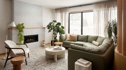
From yellow and dark blue walls that were aged with time and brought down the energy of the space, Meghan and Tara brought light in by using warm off-whites in a neutral color scheme that bounces off light. Natural wood, stone, and plants, as well as a touch of accent green in the living room really lifted the space to create a much more joyful environment that is really unrecognizable.

‘It was important for the clients to have a welcoming, unique home with a calming nature. We accomplished this with subtle hues, tone on tone, and overall a warm earthy palette. To make the tone on-tone feel more interesting we layered the space with plenty of texture and fun, unexpected details throughout,’ explained the creative duo.
It can’t be denied that the result is a zen, proper family home that exudes comfort. And when it comes to a modern home, comfort, light, space, and functionality are vital elements that were all successfully checked in this home transformation.
Get the look

Price: $800
This coffee table in a soft off-white stone, and rounded shape will add to an inviting living room, and will create a beautiful centre focal point.

Price: $1,098
The armrests of this chair are beautifully curved, and the boucle fabric will make it extra comfortable.

Price: $4,200
Keep to the rounded curves theme and opt for a curved sofa. Note you will need quite a lot of space for this.
Be The First To Know
The Livingetc newsletter is your shortcut to the now and the next in home design. Subscribe today to receive a stunning free 200-page book of the best homes from around the world.

Raluca is Digital News Writer for Livingetc.com and passionate about all things interior and living beautifully. Coming from a background writing and styling shoots for fashion magazines such as Marie Claire Raluca’s love for design started at a very young age when her family’s favourite weekend activity was moving the furniture around the house ‘for fun’. Always happiest in creative environments in her spare time she loves designing mindful spaces and doing colour consultations. She finds the best inspiration in art, nature, and the way we live, and thinks that a home should serve our mental and emotional wellbeing as well as our lifestyle.
-
 How to Thaw a Frozen Pipe — Learn Everything You Need to Know in 5 Minutes With This Guide
Winter storm caught you off guard? We asked an expert — just how do you thaw a frozen pipe?
By Hugh Metcalf Published
-
 The 12 Very Best Silk Bedding Pieces — As Our Style Editor Says: 'It's What Dreams Are Made Of!'
Slumber in lustrous luxury with the very best silk bedding sheets, duvets, pillowcases, and more — your sleep score will thank us later
By Julia Demer Published

