This is How You do 70s Interiors! 5 Lessons From a 'Groovy' Home That Still Feels Surprisingly Modern
How one designer created a 70s-inspired home in Austin, Texas, with the most eccentric home bar
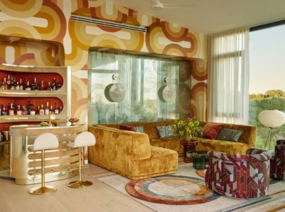

Home bars can be as simple as a stylishly curated tray or small bar cart accessorized with your favorite bottles. Or they can be as eccentric and dazzling as this entertaining space in the Austin hills. The homeowner of this party pad came to designer Sara Story with a simple brief: 'Create a groovy vibe with an opium den feel'. Sara recognized the client's love for entertaining and his admiration for sculptural lines, different shades of rust color orange, and plush fabrics that created that psychedelic oasis feel. The bar provides a glorious centerpiece to the entertaining space, a 1970's chrome bar by Willy Rizzo.
The setting couldn't be more perfect for the '70s vibe too. 'It is Lenny Kravitz meets Once Upon A Time in Hollywood vibe,' says Sara. The setting of the house is very similar to Hollywood Hills in topography and landscape as the house is cantilevered off the side of a hill. It inspired me to conjure up the vibe and atmosphere of the 1970s.' Here, we speak to the designer of this modern home to find out just how she created a slice of 70s Hollywood in Austin.
1. Furniture
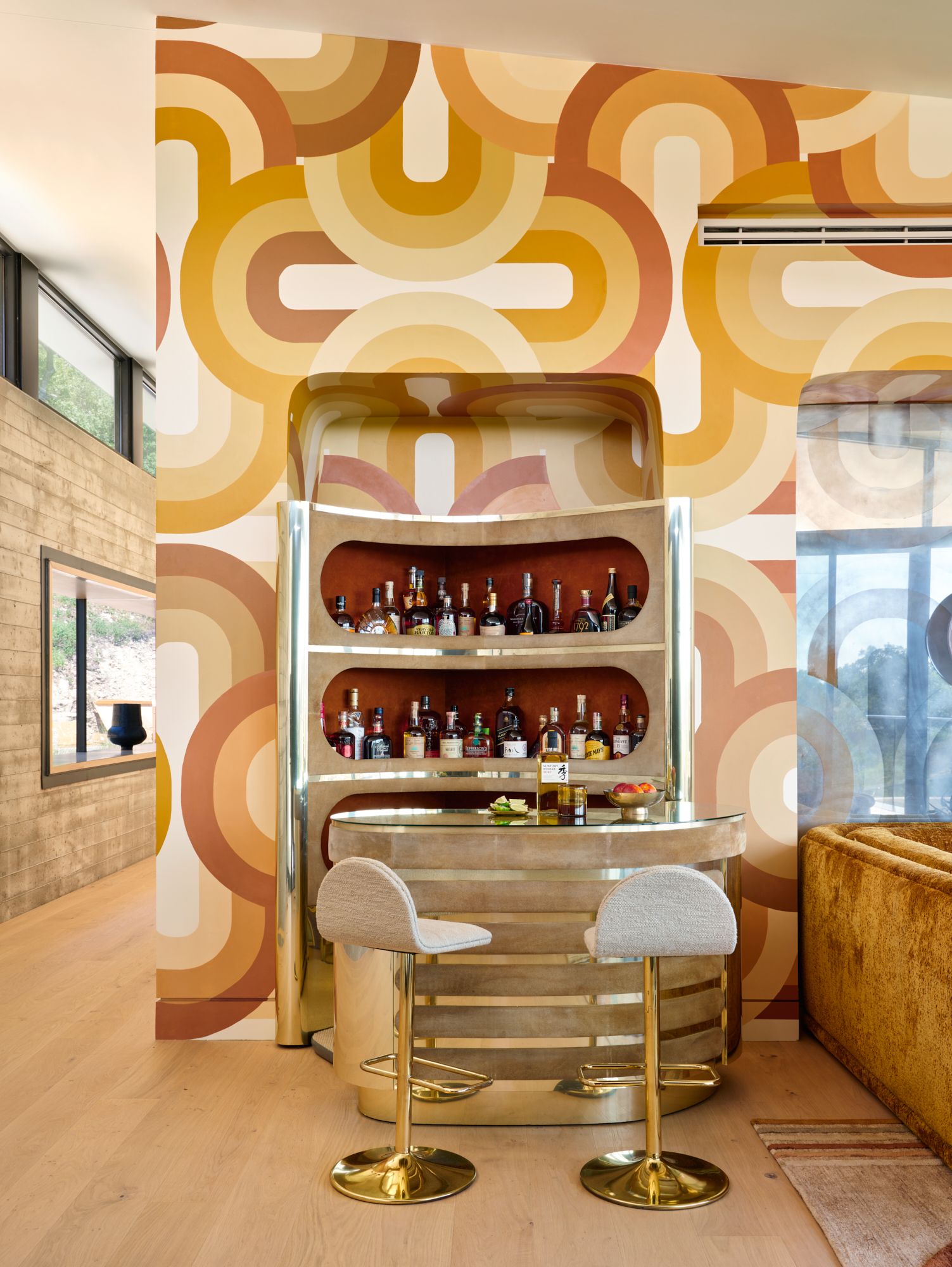
Furniture plays a vital role in the 70s theme and the stunning vintage cocktail bar by Willy Rizzo in the stylish home bar space is a clear highlight. Here, a golden sofa also takes the spotlight, the gold tones working together to deliver on the 'groovy' brief. 'We designed and fabricated this sofa and selected a super soft chenille,' explains Sara.
'My client really wanted each fabric to be very soft and have a nice pile height. The gold tones work well with the metal finishes on the bar and decorative lighting. The form of the sofa makes for a nice grouping of people to hang out and enjoy.'
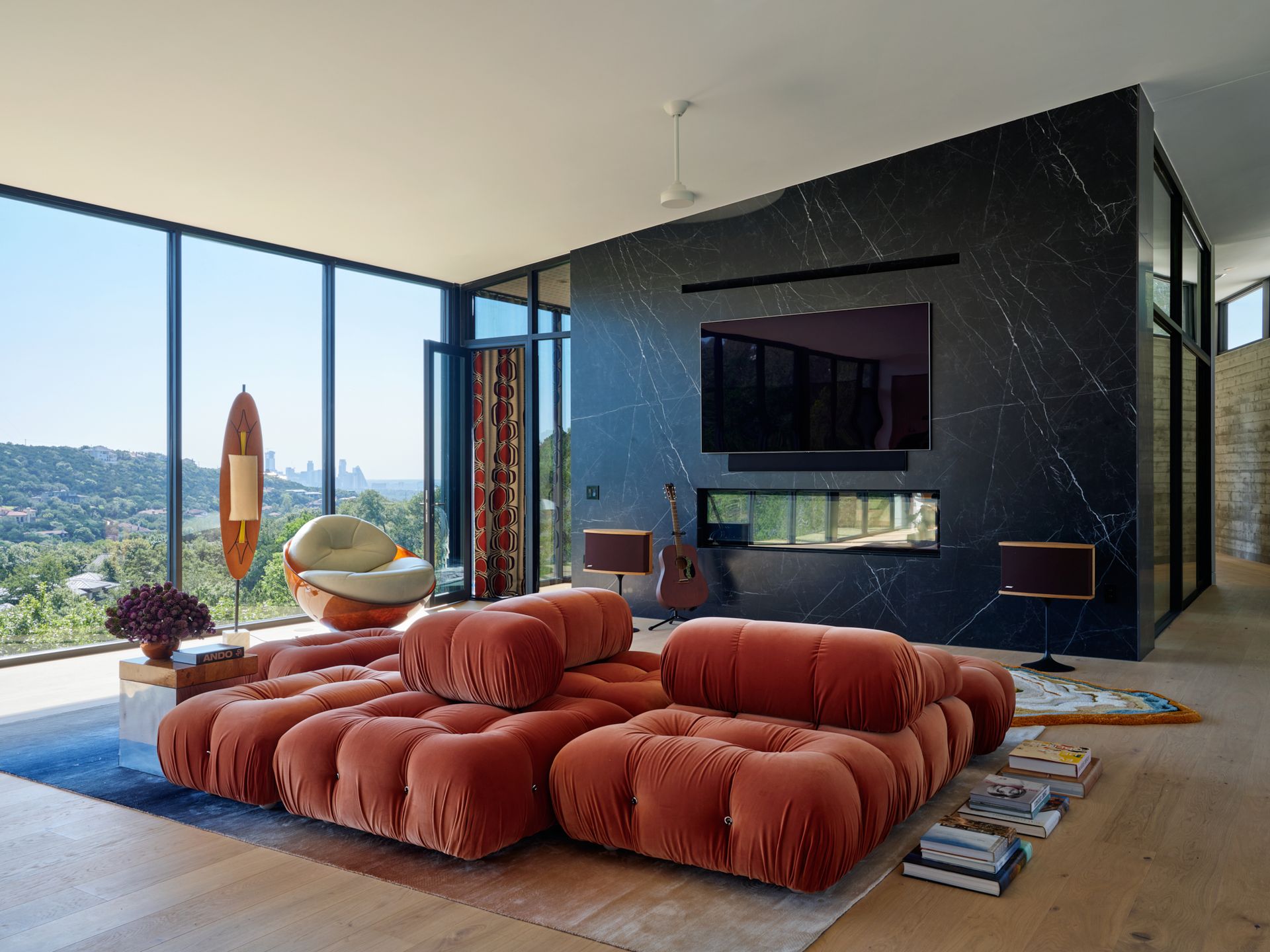
In the secondary living room, a multi-directional sofa gives you various views of the room. 'I envisioned the B&B sectional as an inverted conversation pit and played around with the configuration until it felt right,' says Sara Story.
'It encourages people to face each other or face the television or the view depending on how they are arranged. The sofa becomes the focal point of the room placed in the center versus sitting up against a wall and feels both multifunctional and visually dynamic.'
2. Pattern
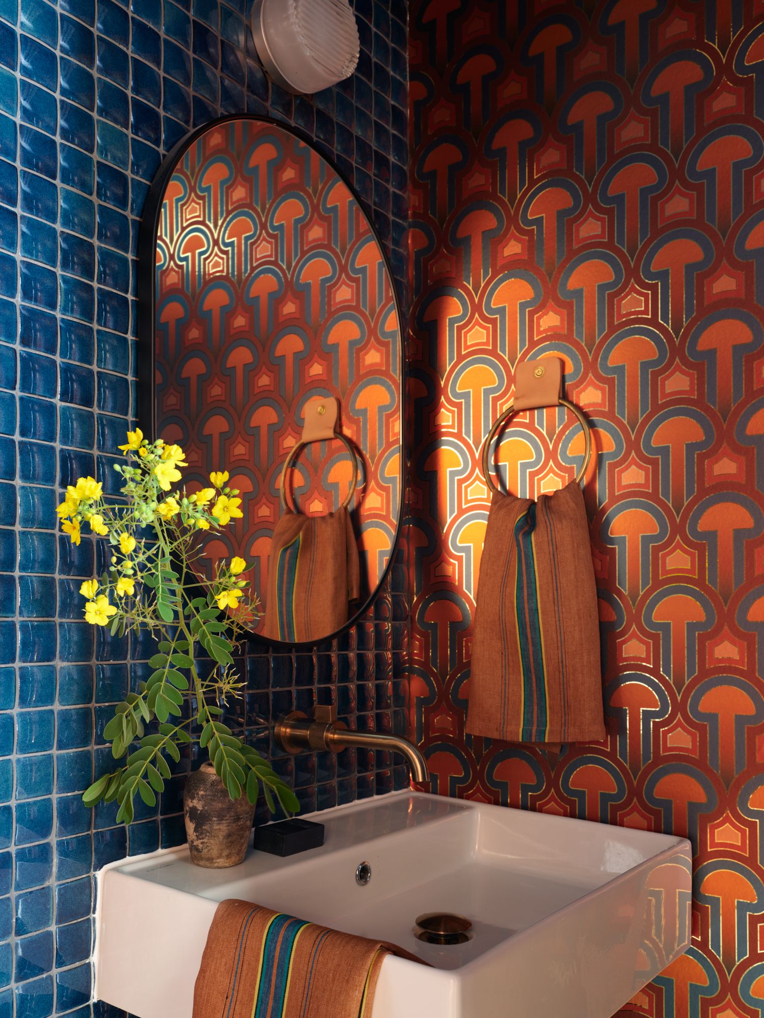
Sara approached pattern with gusto too, embracing pattern clashes and experimenting with interesting combinations as seen here in this bathroom. To get the balance right, Sara used neutrals as a reliable base. 'Most spaces have some pattern mixed with some more neutral colors,' she explains. 'I like there to be a showstopper but not to compete with each other.
The colors and patterns might seem off the wall, but they all have continuity with each other and throughout the house.
3. Texture
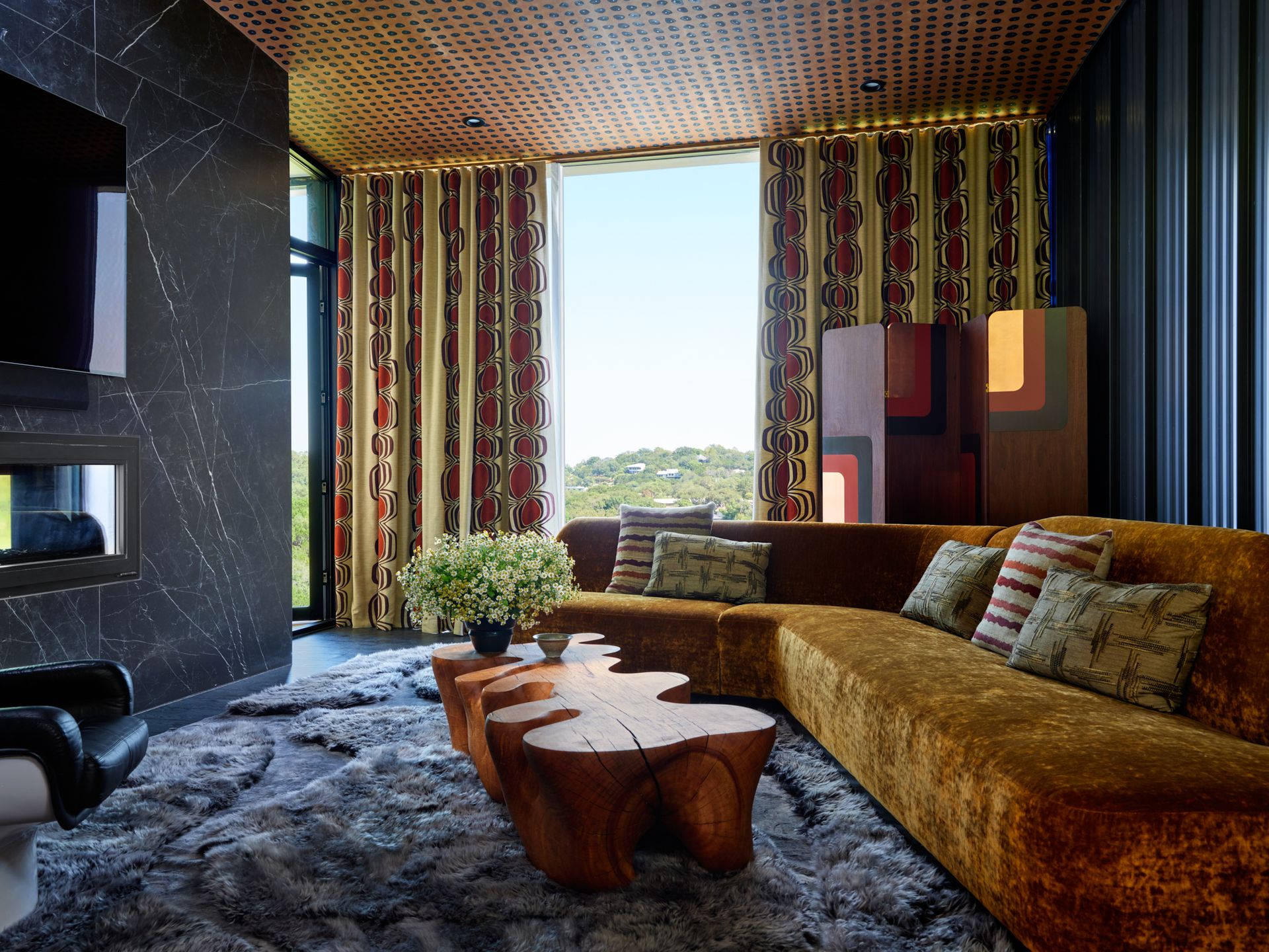
Moving around the house and there is a huge mix of texture too - crucial for coziness and again hinting at that 70s look with high pile shag rugs, velvet and leather used to transport visitors to a different era.
Sara gets the balance right without it being overwhelming. 'Texture is so important to a space as it is what you feel,' says Sara. 'Here, it envelops you and makes the interior enjoyable. Most of the upholstery pieces are cotton velvets, mohair and woven linens. The living room rugs are also plush and soft to your feet. When you pair the texture with organic and natural materials, it just feels special and right!'
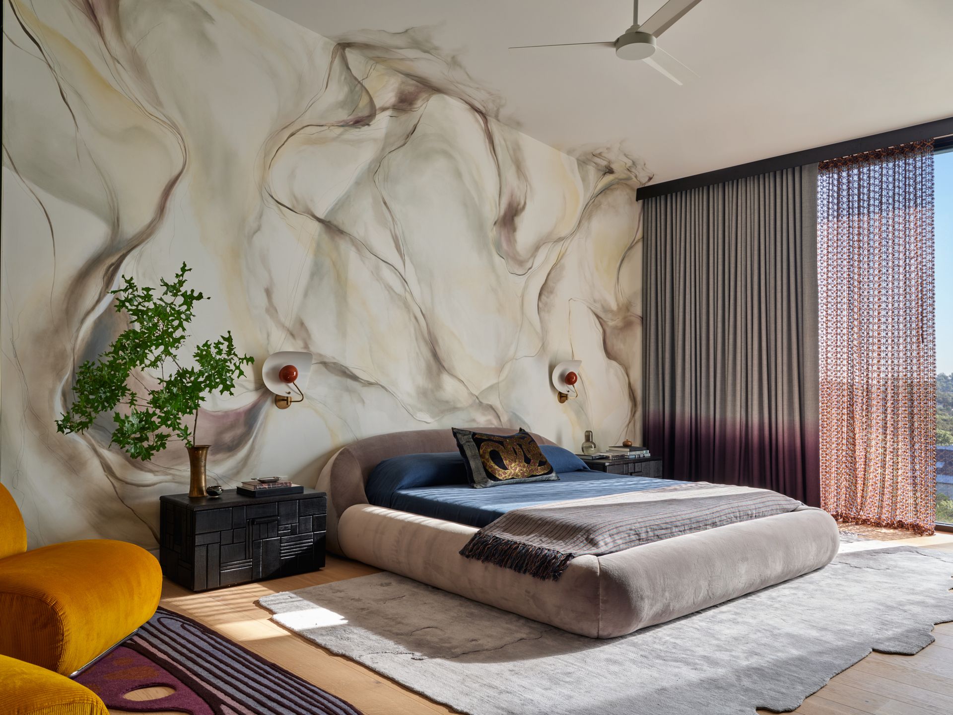
Another example of texture is in the bedroom, where crochet crochet curtains have a distinctive 70s feel, nodding to fabric and fashion trends of the time.
'The crochet fabric is actually from a fashion house that does a lot of couture fabric,' says Sara. 'I saw the colors and fell in love as I loved the aubergine mixed with yellow and knew it was the pop of color that the bedroom needed. The light filters beautifully through this fabric and casts incredible shadows too.'
4. Color
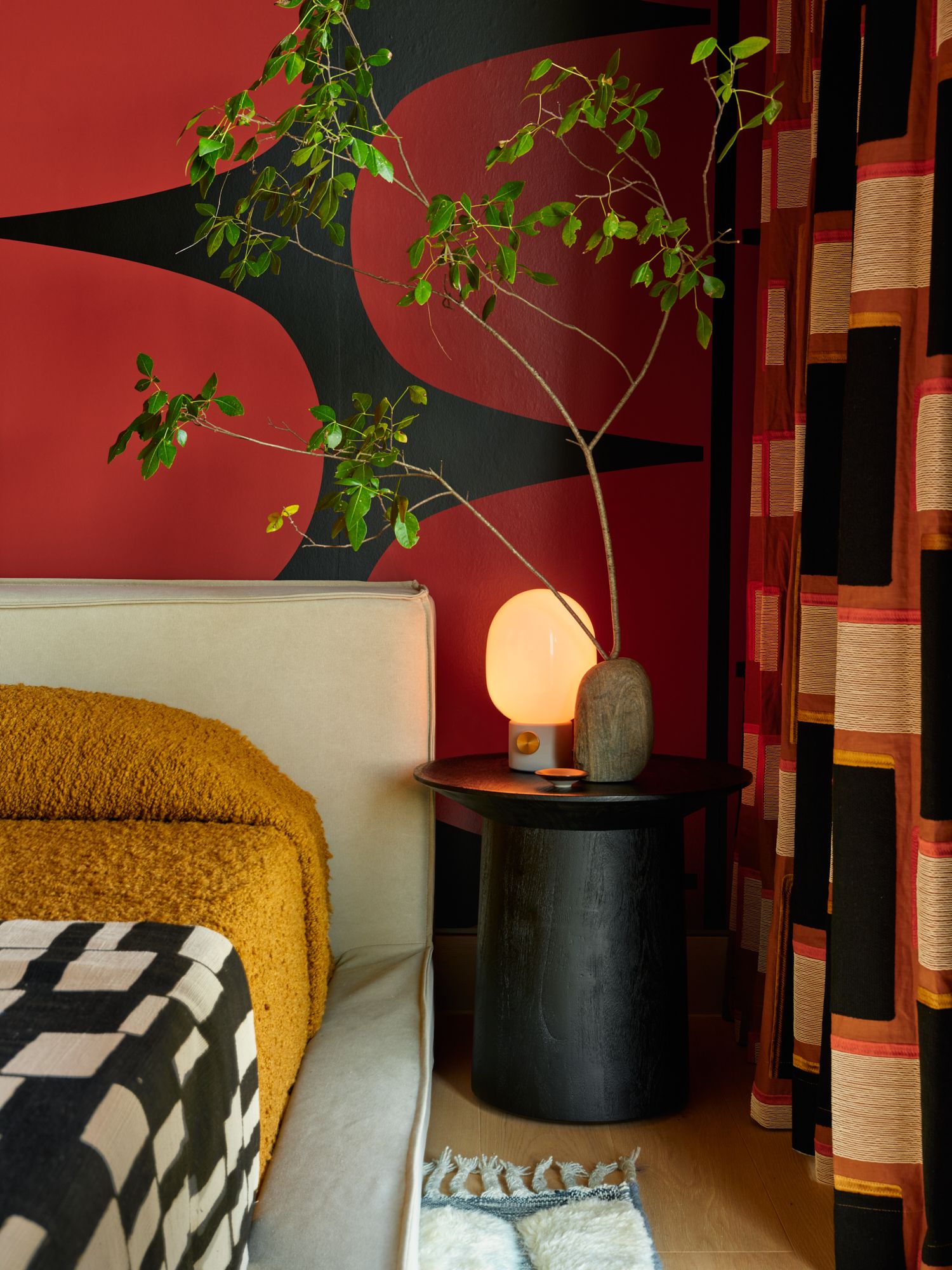
A warm color scheme is key in creating that coveted 70s vibe and features a blend of rust oranges, deep reds, sunshine yellows, and an earthy palette of brown hues. The color scheme almost creates a sepia tone as you move from room to room and gives the space a nostalgic feel.
'The color palette of the house is a mix of rust, copper tones and aubergines too,' says Sara. 'The primary bedroom has aubergines with a mix of more neutral greys.
The smokey greys are relaxing for a bedroom and the guest bedrooms have a bit more color and pattern, but the main living, dining, and den have the quintessential 70s rust tones.'
5. Decorative touches
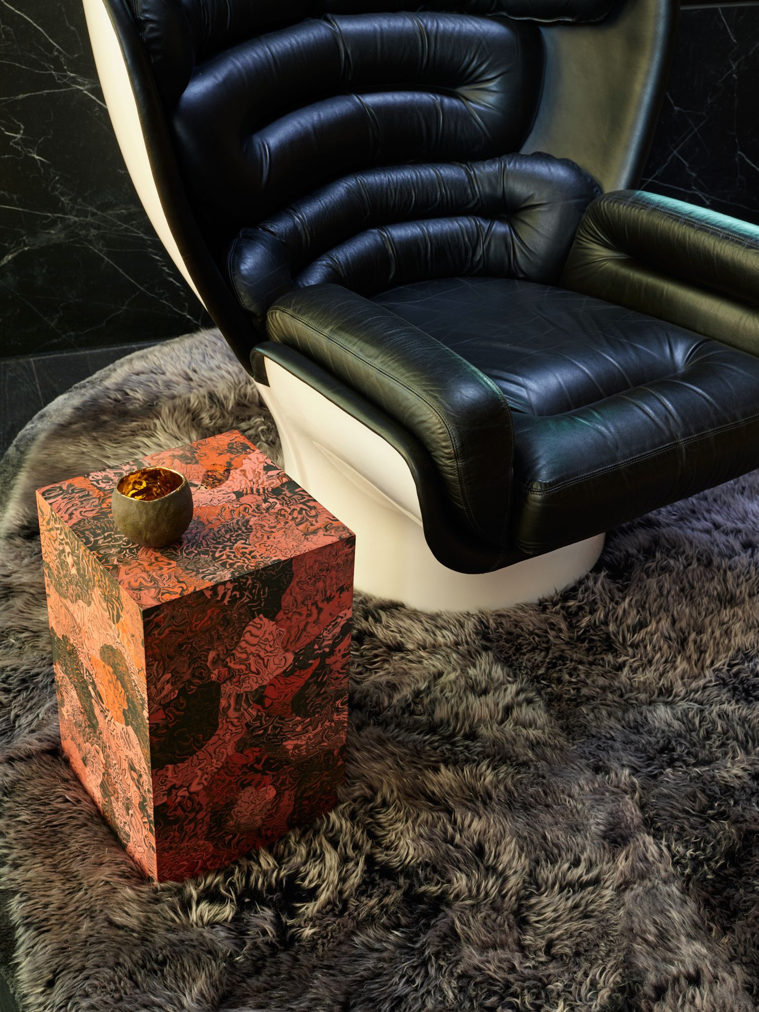
When sourcing furniture and decor, Sara found pieces that helped set up and mold the design of the entire room, such as the entry hall mirror by Sabine Marcelis, which plays with reflection, color, form, and texture.
In the bar area, which acts as the party room and opens to the pool, Sara collaborated with the artist to create a 70s-inspired wall graphic that picks up the swoops and chain-link motifs.
The living room has a sofa by Mario Bellini, a Brazilian chair, a vintage lamp, and Paul Evans block side tables. This room features jewel tones and mixed textures, receiving ample natural light from surrounding floor-to-ceiling windows.
Sara created a sculptural, cast plaster table that echoes the shape of the house for the dining room. In contrast, the media room features a wood block coffee table and a sheared fur rug with undulating rivulets and curvy sandbars.
Give your home a 70s makeover with these decorative buys
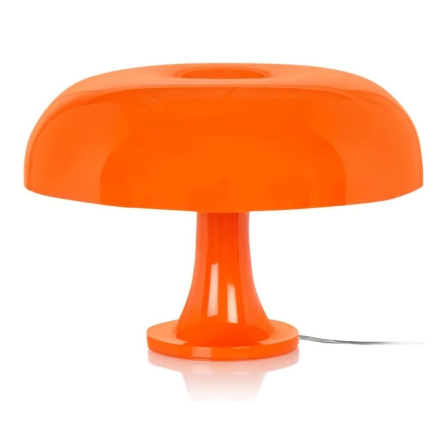
Price: $63.95
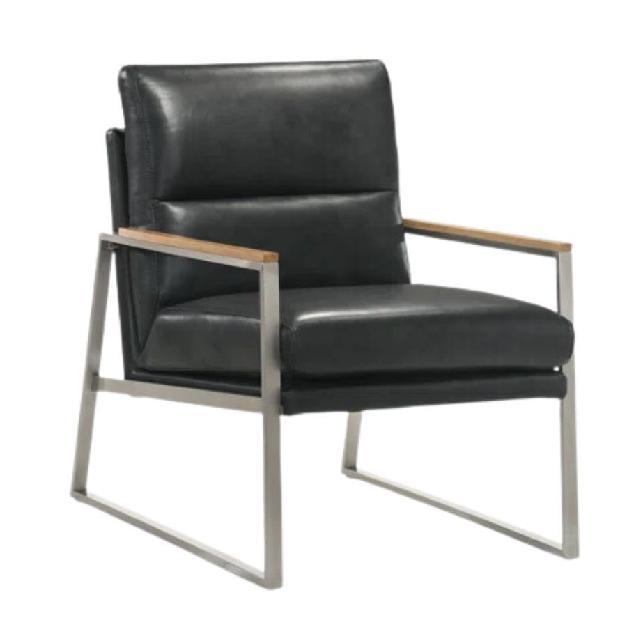
Price: $609.99
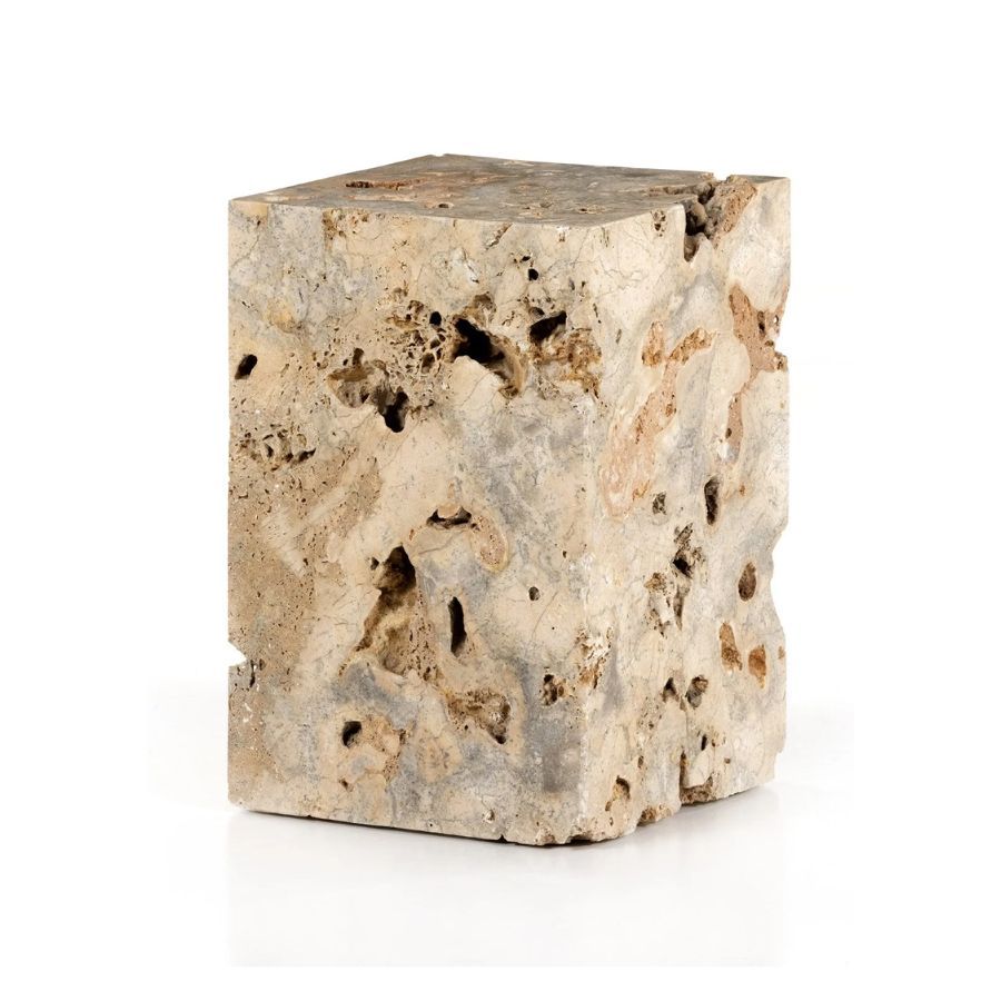
Price: $399
Be The First To Know
The Livingetc newsletter is your shortcut to the now and the next in home design. Subscribe today to receive a stunning free 200-page book of the best homes from around the world.

Oonagh is a content editor at Livingetc.com and an expert at spotting the interior trends that are making waves in the design world. Writing a mix of everything and everything from home tours to news, long-form features to design idea pieces on the website, as well as frequently featured in the monthly print magazine, she's the go-to for design advice in the home. Previously, she worked on a London property title, producing long-read interiors features, style pages and conducting interviews with a range of famous faces from the UK interiors scene, from Kit Kemp to Robert Kime. In doing so, she has developed a keen interest in London's historical architecture and the city's distinct tastemakers paving the way in the world of interiors.
-
 The 12 Best Table Lamps for Reading —I'm a Certified Bookworm (and Shopping Expert)
When it comes to table lamps for reading, I don't mess around. If you're the same, this edit is for YOU (and your books, or course — and good recommendations?)
By Brigid Kennedy Published
-
 "It's Scandi Meets Californian-Cool" — The New Anthro Collab With Katie Hodges Hits Just the Right Style Note
The LA-based interior designer merges coastal cool with Scandinavian simplicity for a delightfully lived-in collection of elevated home furnishings
By Julia Demer Published
