Warm color schemes – try these room palette ideas for a sumptuous, on-trend look
Warm color schemes can bring a sense of comfort and depth to your home. Here are 8 designer-inspired palettes to try


Warm color schemes are a great way to give your interiors a cocooning, cozy feel. This scheme can be created by combinations from all across the color spectrum. From dark and moody combos that give your room a snug feel, to bright fiery pops of color, there are multiple ways to get inventive with your color choices and some great combinations out there.
'A warm color scheme evokes a lushness into a space. It can open up a room while also creating depth,' explains Tiffany Howell of interior design studio, Night Palm. 'Typically, people feel more emotionally drawn to a warmer palette because it provides a sense of calm while primary colors tend to be more jarring.'
What's more, warmth is a scheme that can work for many spaces. 'I typically find clients like to use a warmer color palette in their bedrooms to create a sense of comfort and intimacy,' says Tiffany.
'Using warm colors is a nice way to create foundational moments throughout a home. I tend to use more bright colorways through art or objects.' However you want to inject a little warmth into your home, here are our favorite furnishing, wallpaper and paint color ideas to make your home a comfortable haven for relaxation.
How to create a warm color schemes
If you're looking to create a comfortable and cozy home, aside from texture, color is the way to achieve it. 'Colour is incredibly emotive and we have deeply rooted associations with certain colors and tones of color,' says Jo Littlefair, director and co-founder of luxury interior design studio Goddard Littlefair.
'Layered onto this is a joyfulness when you see color and pattern mixed in a skillful way that makes your heart sing a little.'
'It’s experiencing something refreshing and just a little bit different or unexpected that gives us all a mental lift. Think of your room as a canvas with areas in focus and areas in darkness and ask yourself what you want to highlight and what you want to knock back into shadow.' Here is how to use color to create warmth.
1. Go monochromatic with brown

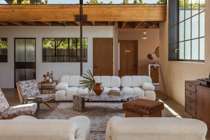
For a warm, 70s look, layer brown in a monochromatic color scheme. This example is by acclaimed designer, Tiffany Howell, of Los Angeles-based design studio, Night Palm, who transformed Mara Brock Akil's office space into an elegant and classic 70s oasis inspired by a Phyllis Hyman love song. The space is adorned with a combination of vintage and contemporary pieces, and every aspect of the room and piece of furniture is in a set colorway that matches the deep brown and white scheme.
'I saw Mara as a muse throughout this project,' says Tiffany. 'She was my foundational design inspiration and we went deep into a sensory study of things that moved her. I wanted to create a space that showcases her love for the playfulness and nostalgia of the 80s, but also reflects her poise as an elegant and classic woman. The whole office is a Phyllis Hyman 70s love song.'
'I wanted to create a space that felt like both a beautiful home and a sanctuary to foster creativity. To soften the industrial interior, I filled the space with vintage and contemporary pieces with ivory, camel, rose, and cognac hues interspersed with unexpected moments of burnt orange and chocolate brown.' The result is an inviting atmosphere with warm tones and textures like velvet and boucle to worn leather.
2. Tumeric yellow and neutrals

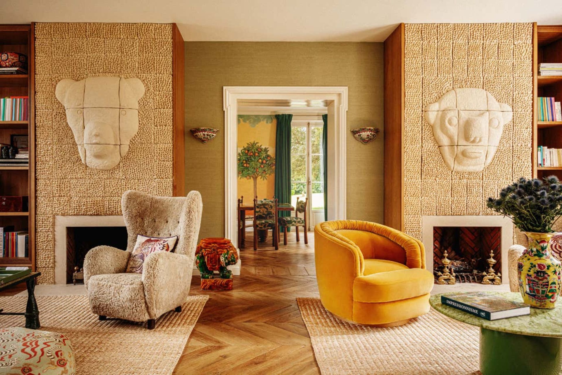
This colorful and eclectic French villa by interior designer, Laura Gonzalez, is full of charm, character and warmth. In this particular room, the yellow and neutral create a cheery palette that welcomes that French sunshine pouring in through the windows.
The warmth of the colors is reflected in the fabrics used in the chairs, as well as the rug underfoot and the textured wall. The coziness of the room is further magnified by the two fireplaces – it's a space for indulgence and relaxation.
3. Dark green and chocolate brown

A great place to inject a little warmth to your color scheme is in your bedroom ideas, where a dark and moody interior can feel like a warm hug as you drift off to sleep. This project was for a London home for a Chinese calligrapher. The aim of the designers, Holloway Li, was to bring traditional Chinese design principles to an Edwardian space. The colors used are deep greens and browns, with golden accents to add a touch of sophistication and lift the palette.
'We chose a hand-crafted Chinoiserie wallpaper by De Gournay for the master bedroom and paired this with a four-poster bed made in rosewood swathed in deep greens and golds.
'The result of these colors created a near royal feeling of quiet luxury, while adhering to Yuan Ye tenets dictating that the sleeping area should be compact, private and subdued.'
5. Red and yellow

For a more fiery scheme that will add real heat to your room, don't be afraid of going for a red and yellow combo. Here, the living room wall art is used as inspiration for the rest of the room and the room is tied together with cushions that mimic the artwork.
'This home was for the Chancellor of North Carolina State University, so it's a residence for someone who entertains often and is a leader in the community,' explains Judy Pickett of Design Lines Signature.
'Because of the purpose of the room, it was important to make the space feel warm and inviting. The oversized artwork in the rich, saturated orange-red hues instantly brighten the room and the pops of color on the sofa tie in beautifully to create a welcoming atmosphere,' she says.
5. Brown and white

Accentuate the deep chocolate nature of the brown by contrasting it with a stark white as seen in this project in St Tropez, by Parisian designer, Stephanie Coutas. The white provides a great background to also emphasize the textures and fabrics used in this earth tone living room, as well as interesting accents of color.
'Earthy tones are becoming more popular with more subtle and less bright colour combinations,' she says. 'I think that complementing soft nude tones with heavier colours, such as turquoise, can create a more striking effect against these natural hues. Adding pops of color to an interior creates an element of surprise but also introduces a warm and unique environment.'
'For most of my interior design projects, I tend to favour warm and neutral colour palettes, combined with a range of luxurious fabrics and textures to create a calm, sophisticated yet joyful atmosphere while providing a base for which artworks and design pieces can stand out against.'
6. Light pink and black

This geometric Kelly Wearstler scheme is made up of a range of pinky hues painted on the walls and contrasting black, with the bold color even used for trimming along the floor.
The final effect being a warm, dramatic and beckoning dining room space, perfect for entertaining.
7. Dark green and orange

The designers at White Arrow have created a cozy feel in a snug living room in a New York townhouse with their use of jewel tones. Orange has been chosen as an effective contrast color that goes with green in this emerald tone. The color scheme reflects the space, which is a movie room.
'We amplified the room’s coziness, and somewhat camouflaged a large screen television, with a rich color palette. The more traditional atmosphere was equally created with the mixture of antiques, contemporary pieces, and layered floral patterning in the block printed pillows and antique Chinese art deco rug,' explains Keren Richter.
'We love deep emerald green when paired with jewel tones and classic neutrals. Camel or marigold, wine, plum, and navy all work nicely with the hue. Deep green works particularly well with brass fixtures and faucets and feels historic, classic, and timeless.'
'The contrast between the dark colors and the lighter accents creates warmth and when paired with layered lighting or warmer accent colors it helps the room glow. Like a large plant or a bouquet in a home, green brings in life and easily connects to nature and reminds you of the outdoors.'
8. Lilac and yellow

For a cheery color scheme that acts like a ray of sunshine, this colorful living room idea has been given a lift with accents of yellow throughout the room, in the form of the curtains, the wall-mounted lighting fixtures, and a well-placed book on the purple sofa.
This use of color is what makes the interior warm and inviting. 'This design is my friend Jamie Clayton's penthouse. She is a very colorful person and she is not afraid of using color,' explains designer Davide Casaroli.
'My idea was to use color, as a rule, to balance the colors, to unite the palette in an ongoing dialogue. The beige, the orange, the mustard, and the pink are accents of this space, on the other side the grey, and the blue are the equilibrium.'
What rooms of the house work for a warm color scheme
When thinking about how to paint your home with a warm color scheme, consider the purpose of each room in the house.
'We strive to create a sanctuary space in the bedroom, somewhere calm, warm and welcoming yet clear and ordered, away from the hustle of communal areas,' says Jo Littlefair of Goddard Littlefair. 'Key to this is colour, materiality and form of all the elements in the room. So much of colour selection is personal so really question how you respond emotionally to a selection of colours before finally drilling down into a final palette. We tend to steer away from intense, strong colours with conflicting accents, however we have used colour in bedrooms to great effects and the right selection of a dusky tone can sometimes work brilliantly at producing a nighttime cocoon.'
For the bathroom, veer away from using too stark a scheme with white. 'Using a couple of colour tones on the walls in combination adds softness and layering.
'Keeping the ceiling and the majority of the walls off-white help retain that sense of space while dropping in some textured elements in colour help to layer in warmth and interest. Also, add softness and colour to your bathroom through houseplants perched on an antique side table or stool pulled up to the side of a bath.'
Be The First To Know
The Livingetc newsletter is your shortcut to the now and the next in home design. Subscribe today to receive a stunning free 200-page book of the best homes from around the world.

Oonagh is a content editor at Livingetc.com and an expert at spotting the interior trends that are making waves in the design world. Writing a mix of everything and everything from home tours to news, long-form features to design idea pieces on the website, as well as frequently featured in the monthly print magazine, she's the go-to for design advice in the home. Previously, she worked on a London property title, producing long-read interiors features, style pages and conducting interviews with a range of famous faces from the UK interiors scene, from Kit Kemp to Robert Kime. In doing so, she has developed a keen interest in London's historical architecture and the city's distinct tastemakers paving the way in the world of interiors.
-
 These 12 Best Table Lamps for Your Desk — Perfect Glows for a Creative Home Office
The best table lamps for your desk is have a soft, targeted glow. Elevate your WFH set-up with these stylish picks endorsed by Style Editor Brigid Kennedy
By Brigid Kennedy Published
-
 The Nespresso VertuoPlus is 30% Off for President's Day, and it's Kim Kardashian's Coffee Maker of Choice
This sleek and stylish coffee maker was spotted in Kim's home bar, and you can currently save $60 if you buy yours from Amazon
By Lilith Hudson Published

