What is the best layout for a galley kitchen? Expert advice on elevating this compact layout
The best layout for a galley kitchen can elevate the space - designers explain how

Galley kitchens get a bit of a bad rap as the most awkward of kitchen layouts. And yes, they might be on the more compact size and there are limits as to what you can do with the space, but we have seen (and owned) many beautiful galley designs. It's just a case of getting the most out of those two walls and knowing how to nail the perfect layout/s to ensure it functions well and looks lovely too.
So we asked designers, what are the best layouts for galley kitchens and what options do you have to inject some more interest into the classic two rows of cabinetry setup. From picking the most efficient places for your appliances to making a galley kitchen feel larger and more open, there are plenty of ingenious modern kitchen ideas here to inspire.
'There are many factors to consider when laying out a galley kitchen. How many cooks are in the kitchen at one time, are there children or pets in the home, do we need to incorporate seating of any kind, how long is the space, what types of appliances are we using and what are the sizes, how deep is the space, are there any specific zones we need to consider (coffee bar, prep area, appliance storage, pantry space, etc), where are the windows/natural light and artificial light located. All of these factors will heavily impact the approach that is taken to determine the best layout,' advises Bianca Betancourt, Kitchen Design Lead at Form Kitchens.
'Of course, there are countless variations but in most cases, the important objective is to be sure that there is enough circulation in the space. Galley kitchens are very narrow and don’t allow for much activity in the room so being sure that the cook/s can comfortably move around in the space, in a logical way is key.'
What are the best layouts for a galley kitchen?
1. Always be thinking about the golden triangle
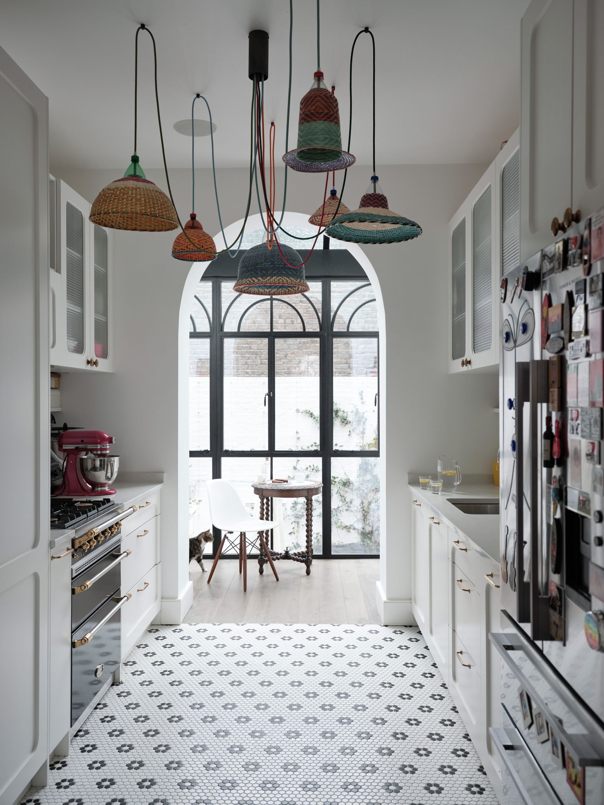
No matter what the shape or size of your space, we think this classic approach to a kitchen layout should always be applied.
'There are rules in place for a reason and the golden triangle works. Essentially this means that the kitchen’s three main work areas form a triangle. Your golden triangle consists of the sink, the refrigerator, and the stove. We still keep this in mind after 20 years of designing kitchens. There are multiple ways you can configure your kitchen while applying the golden triangle rule; it really becomes a matter of what works best for your particular space,' explains designer Sarah Rosenhaus.
Bianca Betancourt agrees the positioning of appliances comes first. 'Consider where is the cooktop/range/oven planned in relation to the sink. If they are planned on opposite walls, I tend to offset these areas rather than placing them directly back to back. We need to be sure there is enough comfortable space if two people (or more) are in the kitchen at one time. It’s also very important to be sure that the dishwasher is not placed directly across the cooking area. One person should be able to wash dishes or open the dishwasher completely without interfering with the cooking zone.'
She adds that 'Any areas defined outside of standard cooking activities should be located near the front end or opening of the kitchen. This area may be designed to function as a coffee bar/drink station, seating area or drop-off station. The idea is to keep these areas easily accessible to anyone else in the home such as children or guests so it can act as a self-serve station without interfering with the circulation within the kitchen space.'
2. Opt for a single galley layout
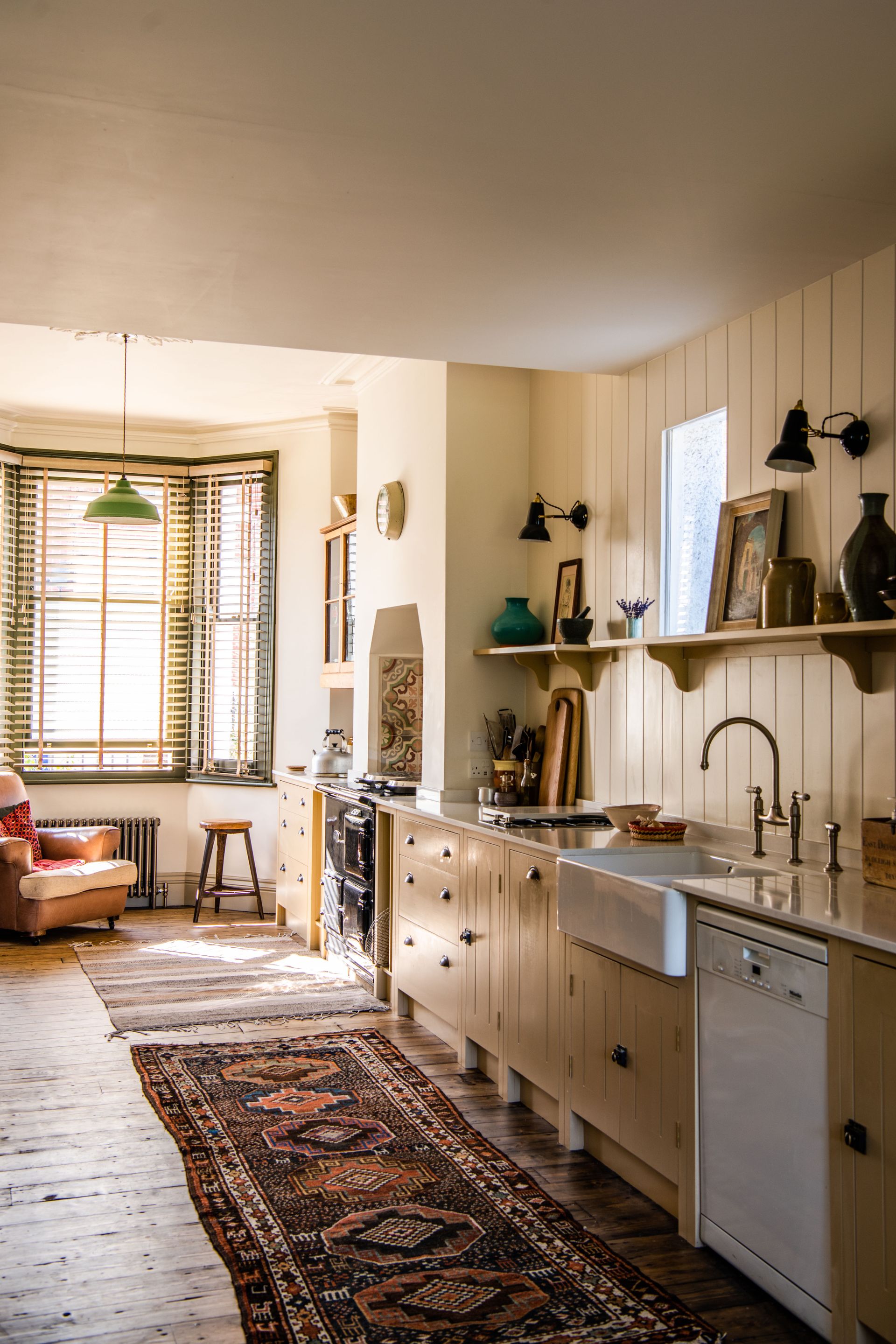
If you are dealing with a long narrow space, of course, a galley kitchen is the only option. But, if you have the luxury of not needing loads of storage, consider instead opting for a single galley design – ditch one whole wall of cabinetry and really open up the space as seen with this British Standard kitchen.
'A single galley kitchen layout with glossy, modern units works well, as the run of sleek streamline cabinets create the illusion of more space, while the light-reflective surfaces bounce the light around the room,' says Rhiannon Phenis, Head of Design of Sola Kitchens. 'Introduce the classic working triangle if there is room for a parallel run of units, by arranging the key task zones of cooker, fridge, and sink at separate points so it’s easy to move from one to the other.'
This is a far more sociable approach to a galley layout too. Forgoing all that cabinetry allows space for a dining table or even a small kitchen island to make it more of a place to gather than just cook.
3. Break with traditions
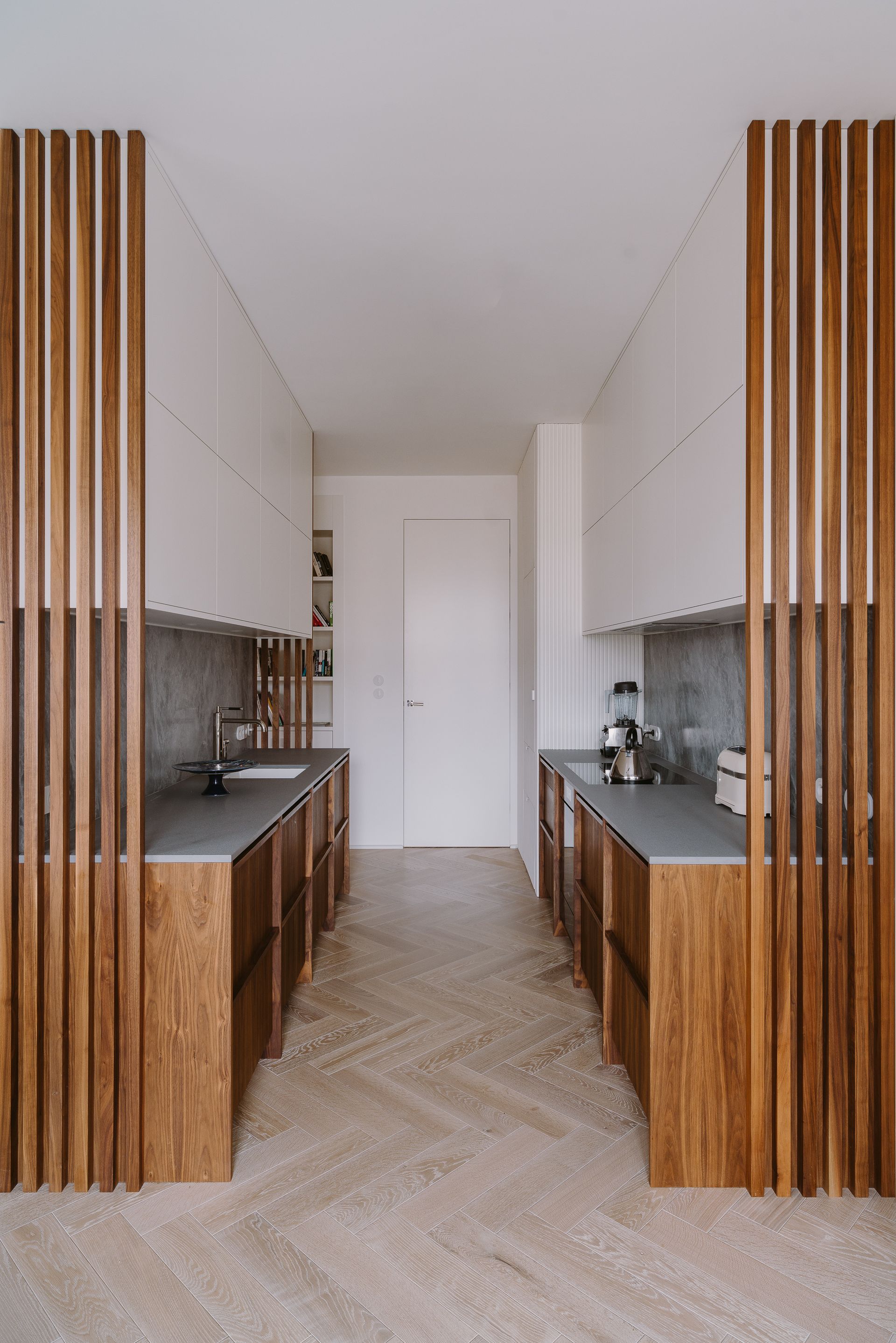
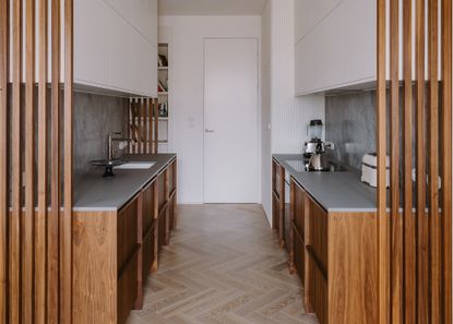
A galley kitchen layout as part of a larger open-plan space is something we are seeing more of, especially in small apartments where walls have been knocked down to give more of an open-plan feel. Now it might be more the norm to bring your kitchen into the main room so you can go bigger with the layout, and create a more sociable space. But one of the benefits of a galley is you still get that flow between rooms, and the sociable aspect but the kitchen itself, with its potential mess and cooking smells, is slightly hidden in its own 'room'.
We love how chic partitions have been used in this symmetrical kitchen to give a bit more structure and definition to the space, while still connecting the rooms and allowing plenty of natural lighting into the long narrow area.
'The interior is decorated on the basis of natural, well-aging materials. We used a walnut mass for the cabinets. The space itself is very narrow and there was only room for a row of two worktops. The partition is made of the same material as the cabinetry, which is supposed to visually separate the kitchen from the dining room, but not to block the access of light,' explains Marta Chrapka, founder of Colombe.
4. Avoid symmetrical layouts
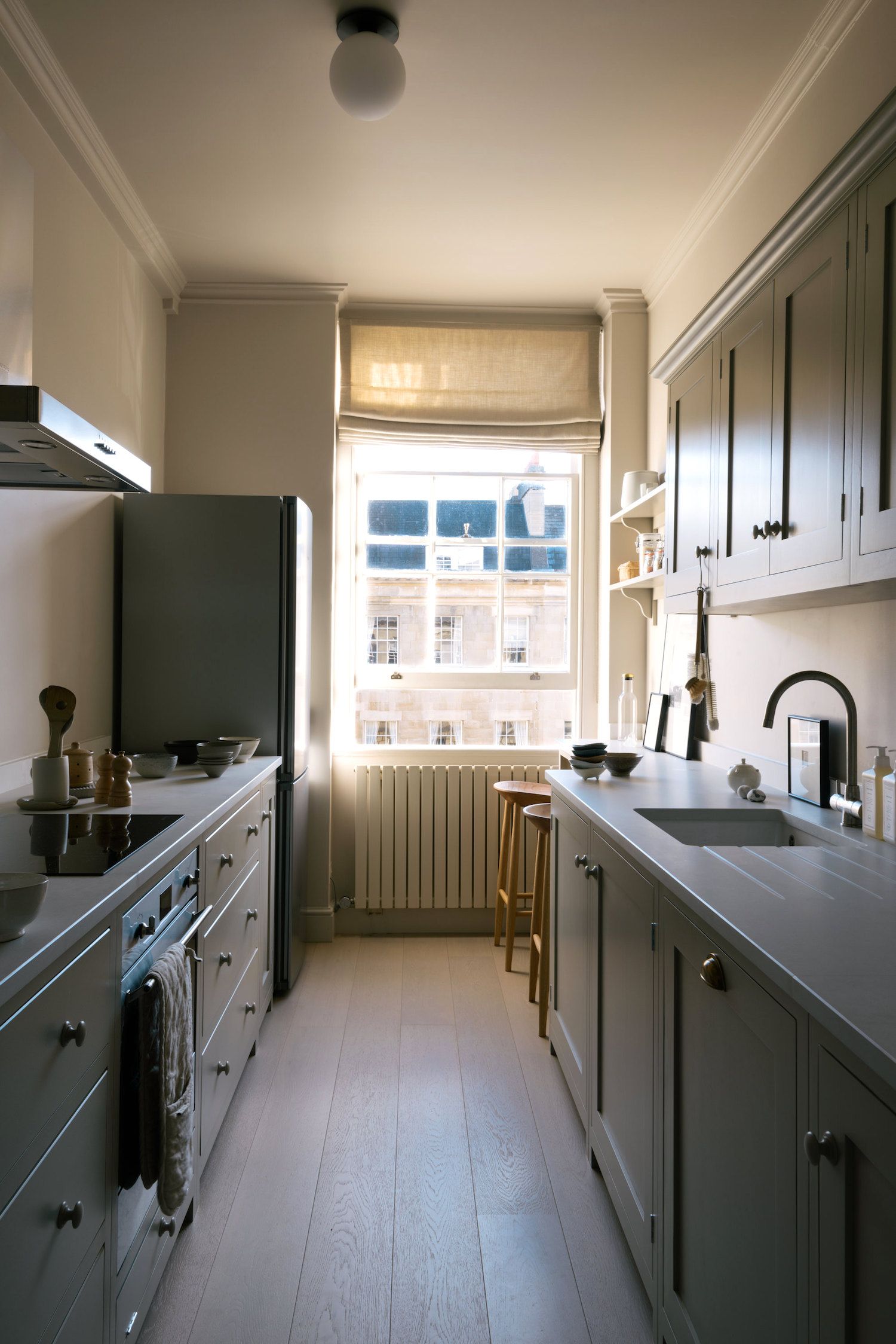
Traditional galley kitchen layouts can be quite claustrophobic, the mirrored sides create a kind of tunnel which makes the space feel cramped. So a way to make the corridor seem less cosy is to avoid any symmetry. Whereas on one side you might have shelving, have cabinetry on the other, or go floor to ceiling on one side, but leave the opposite wall bare. You can even vary the widths of your kitchen countertops to create interest and avoid such straight lines drawing you to the end of the space.
'Slim shelves can give you such good storage for glass wear and tall shallow objects and also create a nice visual where wall space and spots for ornamentation are in short supply. Staggering the depth of your worktops is another good option as it allows you to create small shallow areas for seating or slim cupboards, you need depth for sink and appliances, and if your kitchen is long and thin a staggered worktop is the perfect solution for a little breakfast bar, as galley kitchens rarely have enough width for a kitchen table,' suggests Helen Parker, Creative Director of deVOL Kitchens.
5. Squeeze in an island
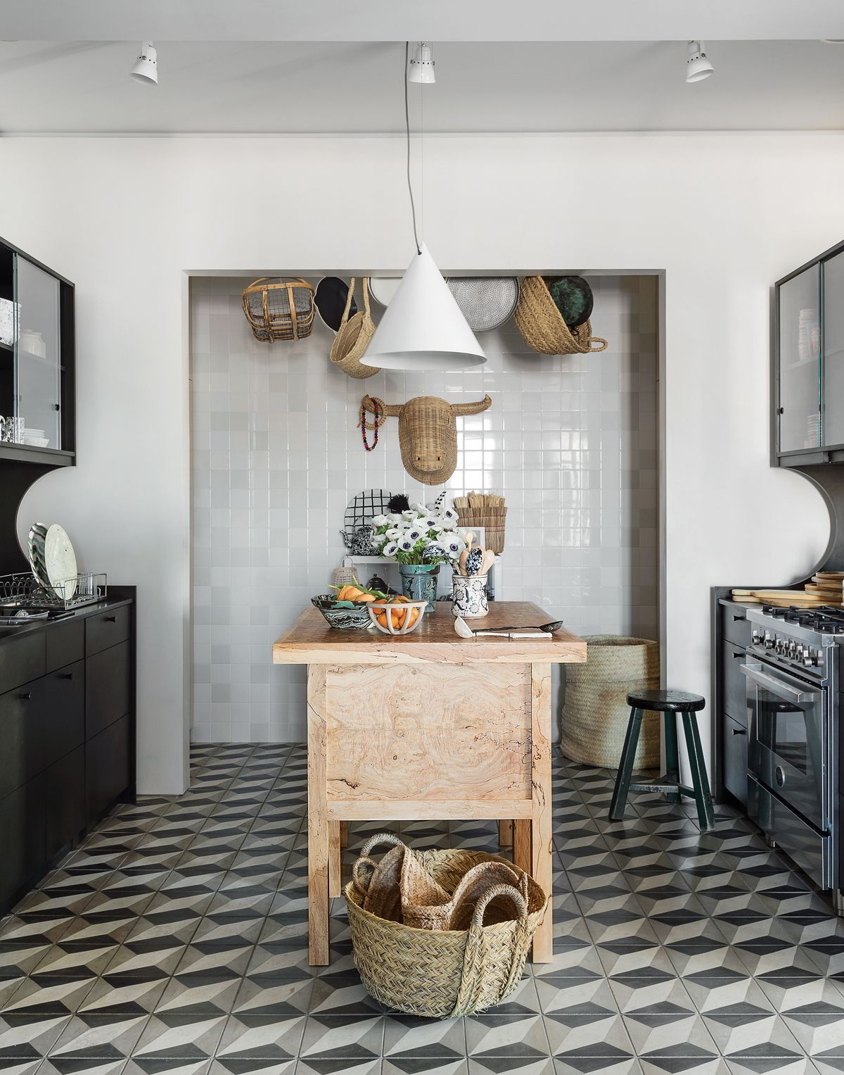
'The term galley kitchen usually suggests a narrow room with runs of joinery on the opposite walls but, if space allows between the runs, then an island or worktable can be a useful addition,' suggests Merlin Wright, design director at Plain English. 'The main considerations are that there should be sufficient space around the island to circulate and that it should not become an obstacle between key elements of the kitchen such as the sink and the cooking area.'
'A layout that can work well with an island is to have a run of low cupboards on one wall with the sink, range, and dishwasher then a run of tall cupboards on the wall opposite with fridges and larder cupboards as this minimizes the number of circumnavigations that have to be made around the island.'
6. Take your cabinetry to the ceiling
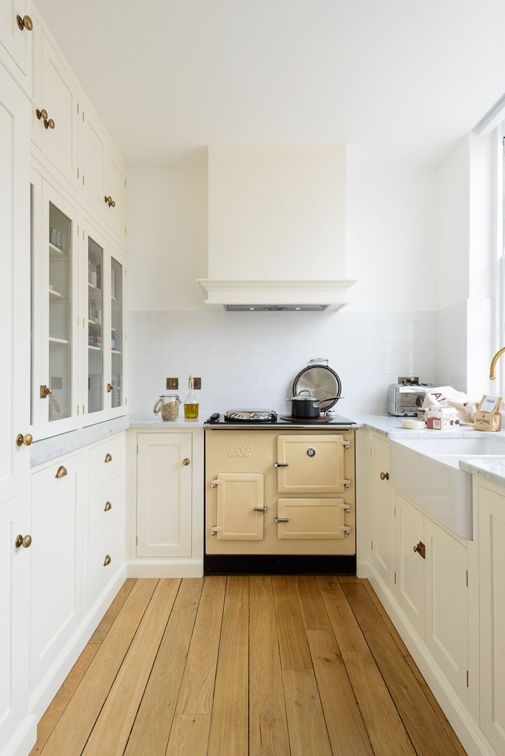
'If the ceilings are high then use this space too and create high storage with tall wall cupboards, they may be harder to reach but the space can be invaluable,' suggest Helen Parker. 'In this space, the fridge freezer, glazed and closed storage covers a whole wall from floor to ceiling and not only keeps everything neat and in its place but it gives a feeling of depth space, and quality. This wall of storage is so beautifully fitted, it gives a traditional and substantial feel to the kitchen, making the space feel so much more than just a little kitchen.'
Glass-fronted kitchen cabinets work wonders in a galley kitchen as they break up all that cabinetry and give the kitchen a much lighter, softer look. Plus, they give you a space to inject some character, which can be tricky in a galley kitchen as they have to be such practical, hardworking spaces.
7. Make it a U
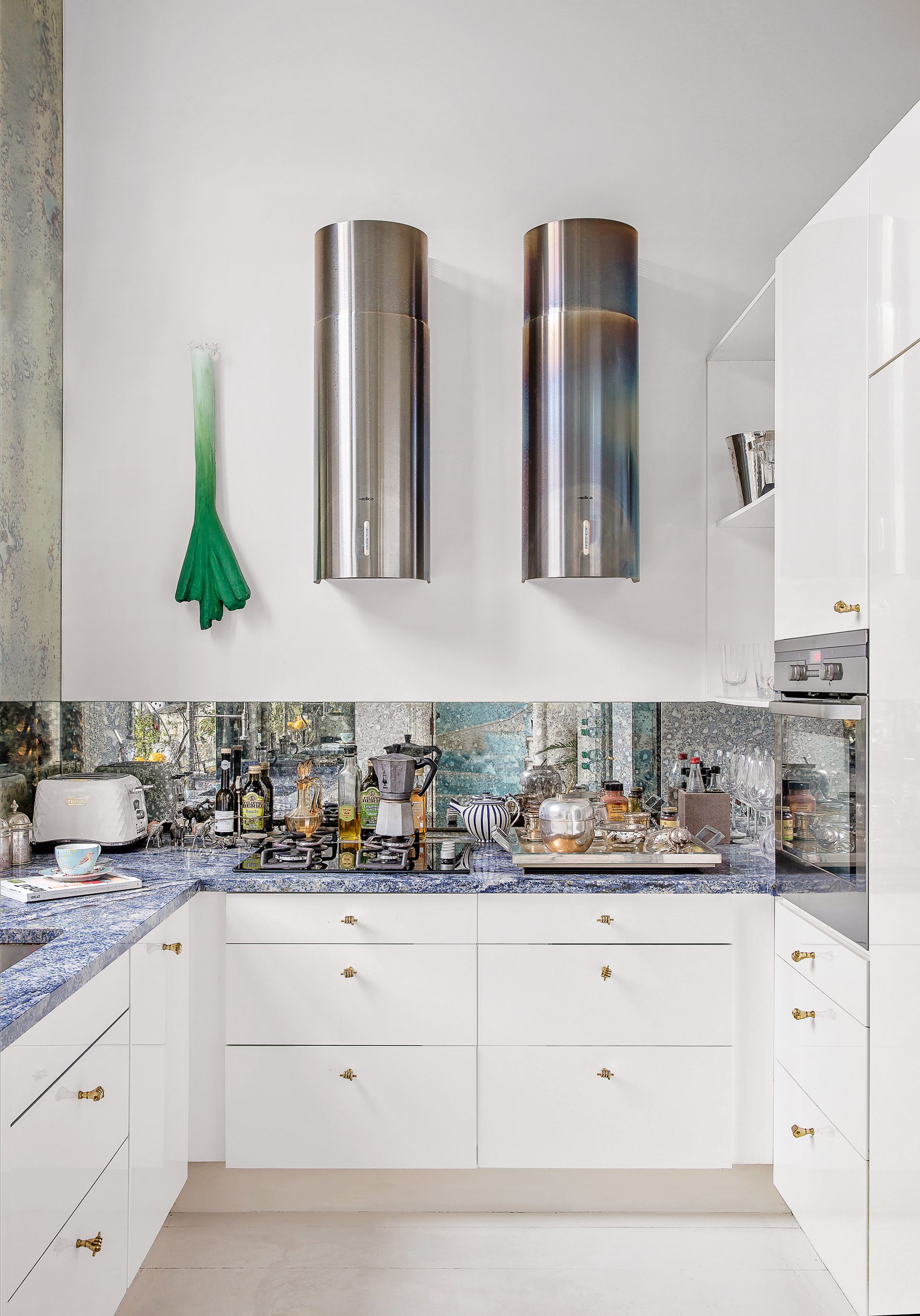
Not quite a galley kitchen, but an easy switch to make if you aren't limited by there being two doors at either end of your space. Closing off a galley with a U shape kitchen layout gives you more surface space and prevents that corridor-like effect.
'If we can push the definition of a galley then some practical variants are a U-shaped kitchen with one end ‘filled in’ or a galley with one longer run which terminates in a peninsula as this can provide a very useful surface between the kitchen and dining area as well as a degree of privacy for the cook,' explains Merlin Wright.
Be The First To Know
The Livingetc newsletter is your shortcut to the now and the next in home design. Subscribe today to receive a stunning free 200-page book of the best homes from around the world.
Hebe is the Digital Editor of Livingetc; she has a background in lifestyle and interior journalism and a passion for renovating small spaces. You'll usually find her attempting DIY, whether it's spray painting her whole kitchen, don't try that at home, or ever changing the wallpaper in her hallway. Livingetc has been such a huge inspiration and has influenced Hebe's style since she moved into her first rental and finally had a small amount of control over the decor and now loves being able to help others make decisions when decorating their own homes. Last year she moved from renting to owning her first teeny tiny Edwardian flat in London with her whippet Willow (who yes she chose to match her interiors...) and is already on the lookout for her next project.
-
 The 12 Best Table Lamps for Reading —I'm a Certified Bookworm (and Shopping Expert)
When it comes to table lamps for reading, I don't mess around. If you're the same, this edit is for YOU (and your books, or course — and good recommendations?)
By Brigid Kennedy Published
-
 "It's Scandi Meets Californian-Cool" — The New Anthro Collab With Katie Hodges Hits Just the Right Style Note
The LA-based interior designer merges coastal cool with Scandinavian simplicity for a delightfully lived-in collection of elevated home furnishings
By Julia Demer Published

