The kitchen trend designers love that creates a calming, clutter-free space
Symmetrical kitchen layouts and designs can help create a coordinated, streamlined, organized and timeless space


Symmetry in kitchens is essentially balancing scale, color and proportions for a timeless and calm space. It is a style of design that allows your interior to look crisp and neat at all times, no matter how chaotic it may be at different times of the day.
A symmetrical kitchen, due to its calm visuals, also encourages you to spend more time in it. Coordinated cabinets, lighting, seating and colors make up the key factors that help build such a space.
If this is the style for you, then tune into these modern kitchen ideas, and take back some great insights given by top designers in the world.

Aditi is an experienced homes writer and editor. She has written hundreds of articles for various international titles helping readers make the best home design choices, and spends her days interviewing interiors industry experts to bring the latest ideas to her readers. For this piece she spoke to the world's best designers to learn about different ways to design a symmetrical kitchen.
What is symmetry in kitchens?

Have you ever walked into a room and felt that something was off about its design? Maybe the room had too much negative space, an oversized TV, a lopsided sofa, or felt off kilter somehow. Symmetry is all about visual balance, where all scale, proportions and even visuals of all elements coordinate and complement each other. Quite simply, a symmetrical kitchen will feel 'just right.'
'Incorporating symmetry into the design of a kitchen is a sure way to achieve visual balance within the space,' says Reena Sotropa, founder of Reena Sotropa In House Design. 'Balance is the visual principle of making a design appear equally weighted throughout the composition. Subconsciously, balance conveys a sense of order and harmony to which we are instinctively drawn to and find aesthetically pleasing.'
One thing to keep in mind about a symmetrical kitchen is that 'within the context of kitchen design, it is much easier to achieve balance with symmetry, but the inherent rigidity of this framework can make it very difficult to also accommodate all the functional and practical requirements of the design,' says Reena. 'However, humans are attracted to symmetry on a subconscious level and so symmetry in kitchen design will always be a popular option.'
How do you achieve symmetry in kitchen design?
1. Coordinate the lighting

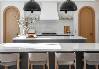
To build a symmetrical kitchen, an important factor to keep in mind is the mid point of the space, which centers and aligns the rest of the scheme. Objects on either side of it need to be proportionally symmetrical or coordinated. Kitchen pendant lighting can be that one hook that anchors the room.
Usually, other objects in the room will support and not compete with the focal point, although, in big kitchens, the space might benefit from having multiple focal points.
'In this kitchen, we sought to create a balanced, symmetrical layout,' says interior designer Lisa Staton. 'We started with the fridge and freezer and treated them as separate 'columns', placed on either side of the windows. Aligning these two elements on extreme ends were the series of three repeating pendants, set up such that they centered the room.'

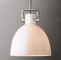
Glass cloche pendant from RH
This piece with a classic domed cloche shade, held in place by a sleek geometric metal yoke can work wonderfully well in a modern and traditional kitchen. Available in several finish options, it can match the decor of any space.
2. Unify the color scheme

If there's one element you need to carefully coordinate in your kitchen, it is its color. This is also integral in creating a streamlined kitchen. While it may be tempting to bring in that bright red coffee machine or those quirky, multicolored cabinet handles, the inclusion of a variety of colors could create an unbalanced kitchen with little symmetry. Instead, make your decorating choices carefully.
Choose a unified kitchen color scheme that washes over the space and makes the room look streamlined. Alternatively, choose coordinating colors for all the storage, leaving the backsplash and counters muted.
'Colors are a great way to enhance and complement a symmetrical kitchen,' says Alex Morrison, founder of Alex Morrison Interiors. 'If you want to make bold choices, consider using them as only highlights, while softer tones can compliment the intention of the symmetry, making a room feel calm and balanced. In terms of hues, I feel a space doesn’t need to be perfectly symmetrical and matching to the T, but it should be balanced with one or maybe two complementing hues.'

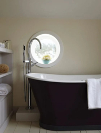
White Tie from Farrow & Ball
Want a white kitchen but not one that looks too clinical? The White Tie has a creamy undertone and can add warmth to any room due to a touch of black pigment in it.
3. Go for symmetrical cabinets

Symmetrical kitchen cabinets are especially helpful in a fairly busy kitchen, that has several elements and falls prey to clutter. In that case, symmetrical cabinets will be able to help bring your kitchen back to having a harmonious and cohesive look. Also if your kitchen's layout is slightly unconventional with corners, alcoves, or exceptionally high ceilings, coordinated cabinetry will be able to bring visual order.
Symmetry in cabinets can be achieved in several ways; via color, design, material, finish, hardware, or architectural features.
'The curved shapes were our guideline throughout this project, seen in various other spaces as well,' says Hélène Pinaud, founder of Heju Studio. 'These are a reminder of modern art and the modernist movement. We used this element to create symmetrical kitchen cabinets. Also, the arched designs hide handles. To soften these geometric shapes, we painted the cabinets a light beige color.'
4. Balance the seating

The kitchen island seating can contribute as much functionally as it can aesthetically. For a streamlined look, choose a set of matching bar stools, and make sure you have at least two or three at a time, and not one, as that will throw off the room's symmetry.
Also choose chairs that are either in the same material or color tone as the kitchen, for an even more unified look. Sleeker designs are better as they will not add a bulky edge to the space, and can also be tucked under the island to make the room look even more compact and put together.

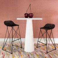
Carbon Bar Stool from 2Modern
Choose these stools with a lean and light form for fitting into a symmetrical kitchen – bring in at least three to make the visual streamlined.
Is it better to have a symmetrical or asymmetrical kitchen?

If you're remodeling a kitchen, then it's best to take all the aspects of the room and your style into account before conceptualizing it as a symmetrical or asymmetrical design. The latter is pointedly not 'matchy' and is unexpected. There is no mirroring or duplication of elements, and it creates an unanticipated visual, making a space feel fresh and on-trend. Symmetry on the other hand is timeless, clean, and graceful.
'Because of the strong presence of symmetry in nature our brains recognize it as familiar,' says Reena. 'This sense of familiarity equates to stability and order that many find visually pleasing, but others may interpret as predictable and boring. Asymmetry tends to read as more dynamic and interesting and within the context of kitchen design, this option allows the designer a more flexible framework to meet both the practical and aesthetic requirements of the design.'
One thing to note is that to design the perfectly symmetrical kitchen, you do need a large footprint, 'enabling you to not only achieve symmetry in the layout but also work within the context of adjacent spaces and accommodate all requirements about workflow, storage, and appliances,' says Reena. 'It is for this reason that a perfectly symmetrical and functional kitchen is difficult to achieve without it having been considered at the earliest stage of the home’s design.'
Both designs have their pros and cons, and the overall decision should be made on the look you want, as asymmetrical spaces tend to be more experimental and trendy, while symmetrical kitchens have a more classic look. If you'd like to include interesting paint techniques or several colors, then an asymmetrical kitchen is a better bet. Symmetrical kitchens tend to use every inch of space to streamline the look of the interior and work better as open kitchens.
Be The First To Know
The Livingetc newsletter is your shortcut to the now and the next in home design. Subscribe today to receive a stunning free 200-page book of the best homes from around the world.
Aditi Sharma Maheshwari is an architecture and design journalist with over 10 years of experience. She's worked at some of the leading media houses in India such as Elle Decor, Houzz and Architectural Digest (Condé Nast). Till recently, she was a freelance writer for publications such as Architectural Digest US, House Beautiful, Stir World, Beautiful Homes India among others. In her spare time, she volunteers at animal shelters and other rescue organizations.
-
 The 12 Very Best Silk Bedding Pieces — As Our Style Editor Says: 'It's What Dreams Are Made Of!'
Slumber in lustrous luxury with the very best silk bedding sheets, duvets, pillowcases, and more — your sleep score will thank us later
By Julia Demer Published
-
 The 12 Best Wayfair Table Lamps Are All Under $200 — And Our Style Editor Wants The Lot
These 12 best Wayfair table lamps are the perfect excuse to get a head start on your President's Day sale shopping. With discounts up to 78% off
By Julia Demer Published

