Small kitchen extensions ideas and expert design advice for getting the most when you're adding just a little
Small kitchen extensions ideas mean you can get a big addition to your home
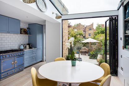

Small kitchen extensions ideas are something many homeowners find themselves grappling with. To expand or not to expand? It’s one thing to reconfigure a kitchen, take down an interior wall to create an open floor plan, or borrow space from an adjacent room to enlarge a small kitchen. Going through the process of pouring a new foundation to extend a home’s structure, however, is entirely different ball game that requires more of an investment in terms of time, planning, and money. With so many factors—such as zoning, the architecture of the existing structure, natural light, and usage—tackling an extension can be overwhelming. There are so many design solutions for transforming a small kitchen into the workspace of one’s dreams, so we’ve asked some experts for their top tips and tricks. “The goal,” says designer Denise Davies of D2 Interieurs, “is to give the client the most space for the least amount of work and investment.”
Most people look for small kitchen extension ideas because of a lack of space, or because it’s dark or the existing kitchen is an awkward shape. Getting an architect and designer involved at an early stage is essential, before you go off on a tangent then realise you can’t have all the things you wanted. An architect, designer or sometimes a clever builder can even create the best kitchen extensions, spaces you hadn’t even thought about.
Howard Miller, Architect and Owner of bespoke kitchen designers H. Miller Bros. says “Think of a kitchen extension as adding quality not quantity, by adding the things the existing room is missing - such as natural light, ceiling height, an interesting view, access to the garden etc. You can transform an existing room by adding just 3m2 if that space has a nice tall ceiling with a skylight, places to hang lighting or plants, a big picture window with a window seat or a beautiful view through a set of doors to the garden."
Yanic Simard of Toronto Interior Design Group says "In a small extension/addition, rather than a typical cabinet-based island, try using a cart-style island with open sides. Island carts give a barely-there look that makes the kitchen appear more open while still giving useful storage you can access from all sides. If the island is moveable, it will also allow you to pull it up to the back counters or push it away when convenient, or even roll it over to another area of the home to serve as a buffet station or drink cart.”
Yanic adds: "Upper kitchen cabinets typically start about 20 inches above the counter, but starting them a little higher (24 to 30 inches) can help you feel a lot less boxed in as you work at the counter below. If you’re tall or don’t mind using a step stool, the extra elbow room below and visual break can mean a world of difference.”
Small kitchen extensions ideas
1 Construct a small bump out
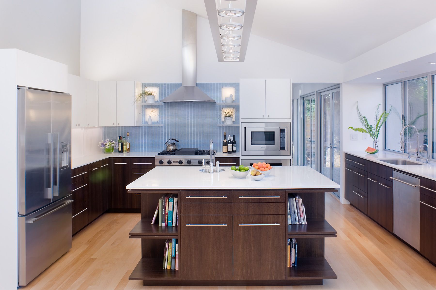
Design by John Lum
For the remodel of this ranch house kitchen, architect John Lum of John Lum Architecture pushed out the exterior wall two feet, allowing for more kitchen storage ideas, additional workspace, a dishwasher, and a second sink (a smaller prep sink is located in the island).
Windows above the counter not only bring in more natural light, but they slide open to reveal a bar counter on the adjacent outdoor terrace. This connection between indoors and outdoors helps make the kitchen feel even larger while serving a practical purpose. “Even with a small extension, we try to include as many windows as we can for added light,” says Lum.
2 Add Light

British Standard by Plain English, average kitchen from around £8000, British Standard
A galley kitchen is commonly extended as it’s narrow and there is really only space for one person to work at a time. By extending this room and fitting glazed doors to the garden, it immediately feels lighter and less confined. Not having wall cabinets also helps the airier feel, along with a light colour scheme with cream for the cabinets and an interesting wood grain becoming a dynamic kitchen splashback idea.
3 Build a bay window

Design by Michael Ferzoco of Eleven Interiors
Wondering how to plan a kitchen extension can be tricky in condo buildings, but one creative workaround to add just a bit more space is a bay window. Plus, a cantilevered window simply requires a building permit and a little structural work, as opposed to zoning permissions. The additional space is perfect for tucking in a banquette and small dining table to create a comfortable eat-in kitchen.
In this historic condo, designer Michael Ferzoco of Eleven Interiors expanded the space further by removing a wall that divided the original gallery kitchen and the dining room, creating one large room with a deep island, plenty of storage, and a unique dining area. “It’s often difficult to create an extension in a multi-unit building, but this is a great way to get around that, as well as any zoning issues,” explains Ferzoco.
4 Think Laterally

White Linear Kitchen, Harvey Jones
If you are short on space, utilise the side return, common in Victorian houses. It’s not a huge space but look what can be fitted into it - an L-shaped cooking and preparation zone with roof lights to bring in added light. It makes a huge difference.
5 Mind your proportions

Design by D2 Interieurs
A kitchen should be proportional in size to the residence as a whole, and the kitchen in this large family lake house just wasn’t cutting it. With the help of designer Denise Davies of D2 Interieurs, the homeowners more than doubled the size of the existing kitchen. The extension contains the majority of the work area, including an eight-foot island with a prep sink, a wall of lower cabinets, and the range. A second island, located in the old kitchen space, features seating for casual dining and a view of the television in the adjacent family room. Thanks to these expert design tips for your kitchen extension, the space can handle three young children and large gatherings with extended family.
6 All The Angles

Design by Uncommon Projects. Image by Jocelyn Low
If there is a sloping ceiling, the best small kitchen extension ideas would make a feature of it. Place all of the tall cabinets on the right- hand side where there is the most height then place the sink and hob on the left in the lower section, a downdraft extractor is the best choice in a situation like this. Use visual tricks like a narrow shelf unit placed in the corner where the roof meets the wall and ties up to the door frame on the other side. Painting the wall a different colour to your modern kitchen cabinet ideas accentuates the angle and makes it a design feature.
"Keep your materials to a minimum to make the room look larger and less cluttered - architects generally limit this to 3," says Andy Ramus of AR Design Studio. "Simplify things further by avoiding obstructive extractor fans, a flush ceiling extractor or downdraught keeps things out of sight. To bounce light around, use a reflective splashback or mirror.”
7 EMBRACE SHALLOW STORAGE

Sometimes even a foot of extra space can do wonders for the functionality of a kitchen. As part of a recent project where there wasn’t enough cabinetry or space for a large island with barstools, designer Michael Ferzoco pushed one wall back to accommodate a mix of custom cabinetry and shelving. And a little goes a long way: Although shallow, the cabinetry—measuring 11.25 inches overall with just 9 inches of shelf space—is actually the perfect depth for to fufill all your kitchen pantry ideas.
“There wasn’t room for a pantry before, and this makes the kitchen so much more functional,” says Ferzoco. “The cabinetry is fully outfitted for canned goods, boxes, and other cooking supplies. And because it’s not deep, things won’t get lost. Everything is sitting right in front of you.”
8 Light From Above
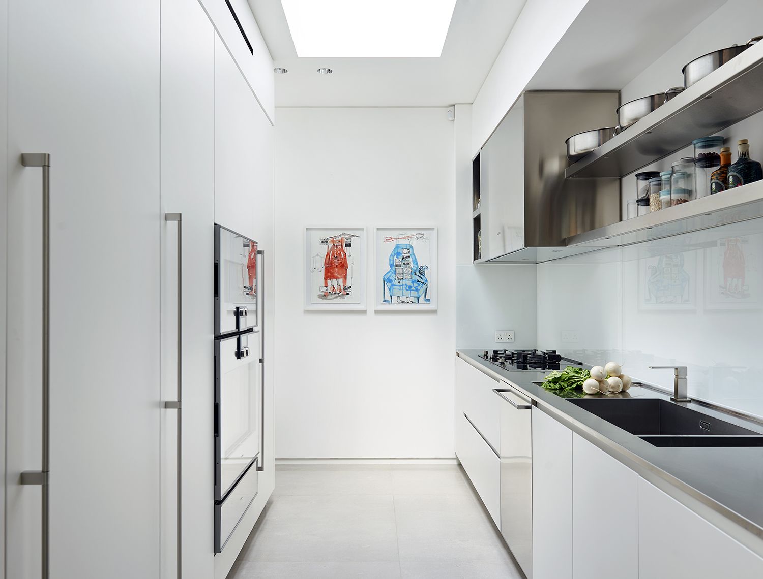
Modulnova Twenty Kitchen collection in White Satin Lacquer and Stainless Steel from £25,000 Design Space London
This ‘back’ kitchen is in an extension at the rear of a Victorian house. The main space is used for dining and entertaining then this fully functional family kitchen leads off. A big skylight was incorporated to bring light in and a large extraction system to vent out cooking smells.
Senior Interior Designer, Ashley Baker at Vesta Interior Design has shared her tips for small kitchen extensions ideas. "Add skylights where possible to bring light in, it’ll give the illusion of a more spacious area," Ashley says. "Think about what configuration works best for your room layout. Don’t try and squeeze in an island if it won’t fit, work with the space you have." She has some suggestions for placement, too. "Always try and keep the fridge, oven, hob, and sink no more than a few steps away from each other; it’s better for functionality," Ashley says. "Plan your lighting carefully. Utilise spotlights, wall lights and pendant lights that work independently so you can create different moods, for example add spotlights in the kitchen but use pendant lighting above the dining area."
9 Wow with a modern glass box

Glass kitchen extension ideas are a very modern approach. Instead of trying to match the aesthetic of this 1910 townhouse, architect John Lum conceived a striking contemporary glass structure to house this kitchen addition for a couple with two kids.
“The clean modern box is a nice contrast to the traditional architecture,” says Lum. The homeowners wanted to replace their small traditional kitchen with a contemporary eat-in kitchen, so the architect removed the wall between the original kitchen and dining room, tore down an existing enclosed porch and replaced it with this new structure, and incorporated a folding door system to make the room feel even more open and airy. An island with a lower table-height section provides an area for informal meals.
10 Keep it light

Elemental kitchen from Mowlem
This stylish fascia/upstand made from Marmara marble creates a high impact design statement and is one of the best small kitchen extension ideas because it separates the kitchen from the dining space, but whoever is cooking still feels part of the action. Crittall style doors bring much needed light in and a large skylight does too. Keeping to a white colour scheme keeps everything bright.
11 Rethink the layout
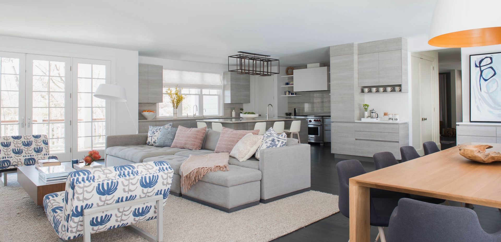
If you're wondering how to design a small kitchen floorplan, the best way to gain more kitchen space is often a combination of an addition and an expansion into another area of the home. Case in point: designer Denise Davies not only removed walls separating the kitchen, dining room, and family room in this residence, but she also advised her client to bump out the portion of the far wall that was to house the renovated kitchen.
The narrow extension allows for more storage as well as the space for a large island. With the walls gone, the kitchen is open to the family room and dining area. “This part of the home now serves as command central,” explains Davies.
12 Old Meets New

Design by Studio Indigo
Although this home is in a conservation area and is Grade II listed, architect and designer Gemma McCloskey of Studio Indigo wanted to maximise the use of space, and obtained permission to open up and extend a hallway at the back creating a new kitchen with a glazed wall and roof. The glass allows the houses’ original architectural style to still be a feature in the design.
13 CREATE A SEAMLESS TRANSITION

By the time designer Michael Ferzoco’s client purchased this townhouse—which had remained in the same family since it was built in 1865—it was severely dated and in need of a major upgrade. Wanting to focus on modern kitchen ideas, and to accommodate a larger kitchen with enough space for a sitting area, the project team removed a former addition and replaced it with a bigger extension that boasts a vaulted ceiling. And although the additional ceiling height, skylights, and wall of windows lends airiness and grandeur to the space, it still complements the rest of the home—especially thanks to the wood beams, which lend a sense of history and character to the space. “We wanted the addition to speak the same language as the rest of the house,” says Ferzoco. “We scaled it to feel appropriate with the existing historic structure.”
14 Make the most of an L - SHAPE
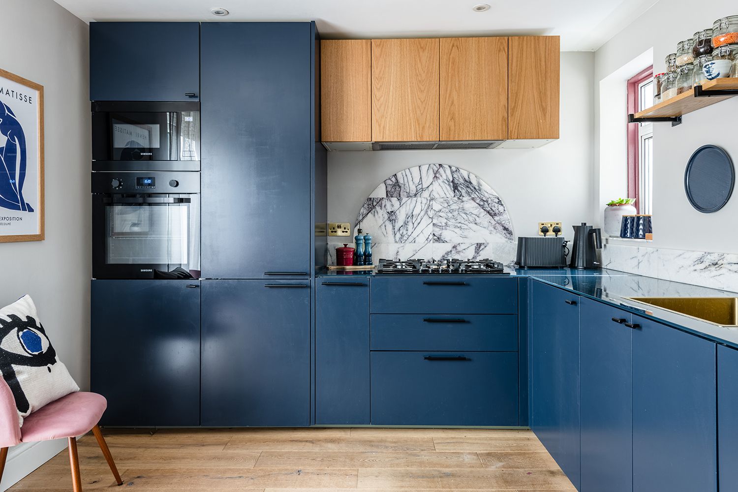
Design by Barbara Cortesi Interiors
As far as smart small kitchen extension ideas go, this kitchen was re-configured into an L-shape as it was the only suitable layout to allow enough useable workspace whilst leaving room for a dining table. The narrow window is the only one in the room, so Barbara of Barbara Cortesi Interiors designed semi-circular marble splashbacks to add a stylish focal point and painted the cabinets in gloss paint so the available light bounces around.
15 INTRODUCE COMFORT WITH A SITTING AREA

Enlarging a kitchen doesn’t necessarily mean that you need to create more prep space or storage. Sometimes they can be about dining room ideas, too, and all a small kitchen needs is a “hang out” area for family and guests. In the case of this Victorian townhouse, there was a dilapidated back porch off the kitchen that architect John Lum replaced with a sitting area that serves as both a cozy family room or a chic entertaining area during dinner parties. A beautiful complement to the sleek kitchen, this sitting area features 10 foot ceilings sheathed in warm wood, a steel fireplace, and tall windows that bring in as much southern light as possible. The additional light is key, notes Lum, since the prep area itself “is more interior bound. It’s very narrow and has just one window.”
16 TALL ORDER

Brushed Oak Laminate flooring, £31.49 m2 from Quick-Step
This narrow but tall extension lends itself to the kitchen being placed on just one wall. A microwave has been set on a high shelf so it doesn’t take up valuable space on the work surface. There is storage, a sink and faucet and a large fridge freezer on the opposite wall. The tall Crittall-style doors allow in lots of light so it’s possible to have a dark polished concrete wall, which sets off the elegant brass and glass pendants perfectly.
Rob Lessman, founder and head designer of interior content design agency, Design’d Living says "When it comes to small kitchen extensions, it’s all about storage. When you’re planning the space, you need to think about how your kitchen extension can maximise on storage, without being too overpowering." Rob also has some ideas for lighting. "Lighting is also really important," he says. "Make sure you consider placement of task lighting such as overhead spotlights where you will be cooking, mood-lighting such as dimmed LED strips on cupboards and secondary mood lighting such as pendants over a breakfast bar/dining table."
Lastly, he has invaluable advice for the palette. "Keep colour tones neutral as it makes the space look larger," Rob says. "And go for a glossy finish, as the reflection and shine will create more light."
17 VIEW THROUGH

Bubblegum & Liquorice Sagres flooring from £16 per m2, Avenue Floors
This colourful kitchen has been created in one side of a kitchen extension. A galley kitchen with a glass roof has a glazed door at the far end as a focal point. The bold geometric flooring seems to lead your eye to it. Check out the funky spoon door handles as well.
18 GO DOWN

Design by Herringbone Kitchens
This basement conversion is one of the smartest small kitchen extension ideas because it wasn’t without its problem. Obviously it was dark, so a large roof light was put in, and the floor was on different levels, there was also the staircase to take into consideration. But this clever design has made the most of the space available, with tall cabinets tucked under a recess on the left hand side with the main cooking zone on the left. It’s compact but has everything you need including a breakfast bar. There is a half wall separating the dining area which is on a raised level.
Is it worth extending my kitchen?
According to designer Michael Ferzoco, there are many factors that need to be considered when deciding whether or not to extend a kitchen. The most important, however, is how the homeowner inteds to use the kitchen. For example, if the client is avid cook, the size of the appliances, storage, and the amount of workspace are critical pieces of the puzzle that need to be figured into any potential design. “For me, a nice size room measures at least 180 square feet,” notes Ferzoco. Designer Denise Davies suggests thinking about the flow as well as the cost. “Sometimes bumping out a wall just six feet can help tremendously,” she says. “But anything less than six feet probably isn’t worth it.” Architect John Lum, however, would be happy with as little as a two-foot bump out, depending on the project. “Solving the problem of a dysfunctional kitchen and improving circulation is worth every penny,” he says.
How do you extend a small kitchen?
“When planning for a kitchen extension, I start by thinking about how the new space works with the existing footprint of the home, how one will travel through the house to get to the kitchen, and how much sense it makes for something new to be in that location,” explains Michael Ferzoco. There are several factors that impact that actual layout, too. “Site conditions, views, sunlight, and the number of people using the kitchen should drive the design,” says architect John Lum. “If we’re talking about a townhouse, the only options are building in the rear of the home or on the side. In the past, we have expanded into light wells and then added a skylight to retain the natural light.”
How do I get the most out of a small extension?
“To get the most out of a small kitchen extension, be sure the addition has a clear purpose, whether it’s more counterspace, storage, or natural light,” says designer Denise Davies. Designer Michael Ferzoco suggests customizing the cabinets in order to avoid wasted space. “There are so many semi-custom lines available that will allow you to dictate the size of the cabinets themselves,” he explains. “Every little bit of space counts.” Ferzoco also likes to increase the ceiling height when possible. “The added height can be used for extra storage accessed by a library ladder, which lends architectural interest.”
Do kitchen extensions need planning permission?
The short answer is yes, most kitchen extensions will require planning permission because they require pouring a foundation. There are often legal restrictions on how much space can be added onto a particular property, and it’s possible you might already be at the limit. There are a few exceptions, however, depending on the jurisdiction. All projects need to be plan checked and comply with building code, but certain small projects may bypass the planning permissions. One example in which there are no zoning issues is a cantilevered bay window that hovers about the ground. And while a bay window may seem like too small a gain, it could very well be worth it if it allows for a new seating area.
Be The First To Know
The Livingetc newsletter is your shortcut to the now and the next in home design. Subscribe today to receive a stunning free 200-page book of the best homes from around the world.
Alyssa Bird is a New York−based freelance writer and editor with experience covering architecture, interior design, travel, hospitality, and real estate. She has held editorial positions at Architectural Digest, Elle Decor, Hamptons Cottages & Gardens, and New York Cottages &Gardens. When she’s not writing about dreamy spaces, you can find her tweaking the decor in her own Brooklyn home, honing her green thumb, testing out a new recipe, or scouring for antiques.
-
 The 12 Best Table Lamps for Reading —I'm a Certified Bookworm (and Shopping Expert)
When it comes to table lamps for reading, I don't mess around. If you're the same, this edit is for YOU (and your books, or course — and good recommendations?)
By Brigid Kennedy Published
-
 "It's Scandi Meets Californian-Cool" — The New Anthro Collab With Katie Hodges Hits Just the Right Style Note
The LA-based interior designer merges coastal cool with Scandinavian simplicity for a delightfully lived-in collection of elevated home furnishings
By Julia Demer Published

