Should kitchen cabinets match your wall color? These are the pros and cons of going monochromatic
Curious about whether painting kitchen units in the same shade as the walls is the sure path to design success? We asked the experts to find out
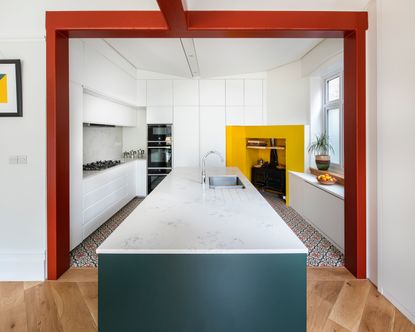

If you’re keen to create a sleek, uniform look in your kitchen, then matching the shade of your cabinets to the walls could be one way to achieve your design goal. In a space where there are so many different surfaces and textures, minimizing the number of different shades can establish a clean, unified aesthetic.
'Sticking with the same palette can help you to avoid lots of visual breaks and disruptions. It helps unify the different elevations,' says Liz Caan from Massachusetts-based Liz Caan & Co. 'It can create continuity within a space with many different surfaces and materials that help aid the function of the kitchen.'
Of course, color is one of the best tools in your arsenal for establishing a wow-factor, tailor-made look in a modern kitchen – in which case, painting everything in the same shade may not be the best route forwards. We asked the design experts to find out the pros and cons of each option.
Is it a good idea to match the color of your cabinets to the walls?
Painting kitchen cabinetry and walls in the same shade can pack a powerful aesthetic punch, as well as giving the units a bespoke, built-in look. In some scenarios, it can make the space feel bigger, too.
'It generally suits two types of style – Ultra Classic and Ultra-Modern,' says Rachael Green, co-founder at the Pickleson Paint Co. 'For a classic country style kitchen, for instance, using a neutral color on cabinets and walls can create a gorgeous finish. It makes the space feel classic and cozy,' says Rachael.
In a modern kitchen, selecting a bright, bold shade may offer the best approach to creating design wow-factor – think kitchen color schemes that include acid greens, hot pink or peachy oranges and yellows.
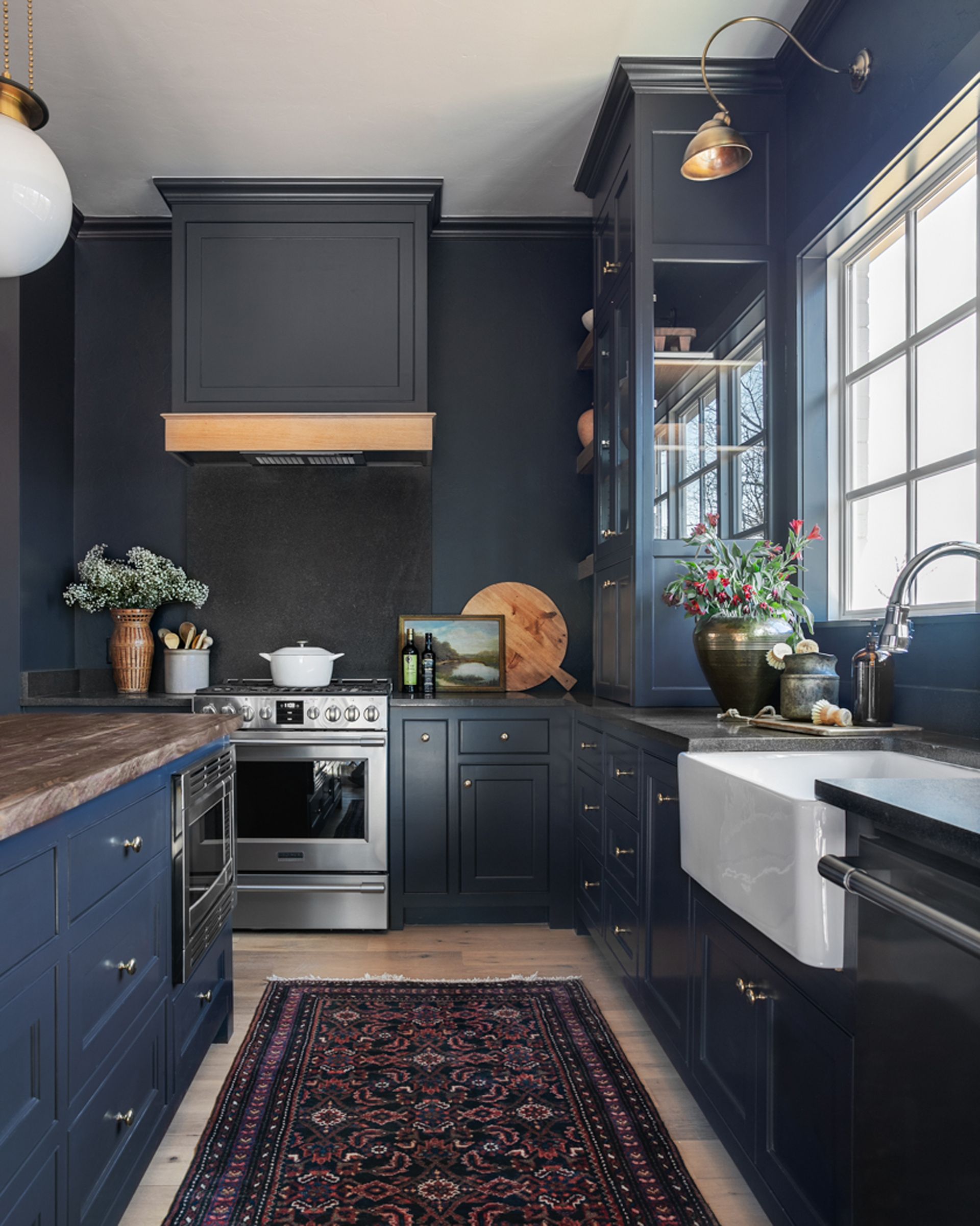
According to Annie Kersey, lead interior designer at Annapolis-based Purple Cherry Architects, selecting the same shade for cabinets and walls can infuse the space with a bright, fresh feel. “It can work especially well if you’re going for an all-white kitchen aesthetic. Opting for a monochromatic look will make the space feel larger, uniform and clean.”
Incorporating different textures provides an alternative way of infusing the space with design panache. For example, the varied surfaces of exposed brick, wood and stone can work beautifully together in kitchens where cabinets have been color matched to the walls.
What are the advantages of choosing contrasting colors?
There’s a strong argument for selecting contrasting shades of color in the kitchen – especially if you want to get playful with a colorful kitchen design. The wealth of different surfaces and textures can be a real advantage when it comes to crafting your color scheme. Plus, it means honing your decorative strategy can be a fun exercise, too. 'The beauty of kitchens is that they often allow you to be a bit more extrovert with your color choices, without being too overpowering. It’s a brilliant way to achieve something that’ll draw your eyes around the space,' says Rachael from the Pickleson Paint Co.
When it comes to mixing and matching hues, Liz Caan of Liz Caan & Co recommends switching up the color of the units depending on where they sit in the room. 'For instance, you can have a different island color than the perimeter units, or different upper and lower cabinets,' she says.
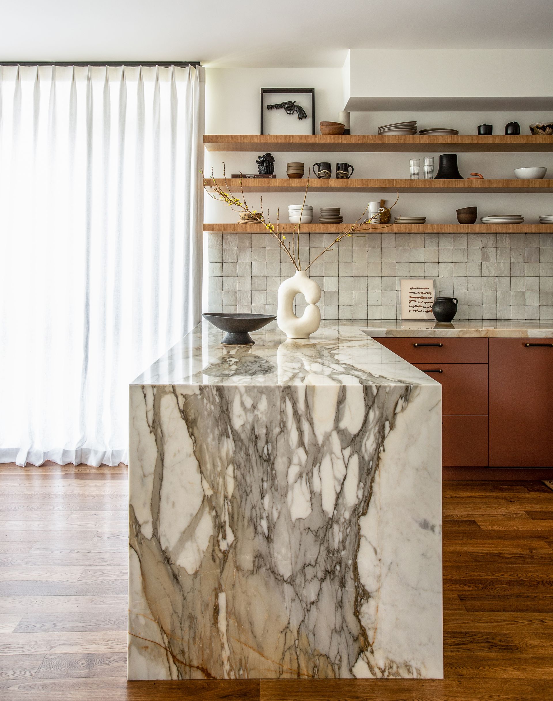
However, there are a few pointers to bear in mind if you want to execute your contrasting color scheme perfectly. While there’s no need to play it safe when picking out paints, it’s still important to choose hues that work well together.
'Whatever colors you choose should be complementary in their tone,' says Gabrielle Aker, owner and principal at LA-based Aker Interiors. 'Commit to a cool or warm color scheme for the tones you choose.'
On a practical level, Gabrielle also recommends getting samples of every contending shade before committing to a specific color scheme. 'Get samples of everything before ordering so you can compare all the colors in person to make sure everything plays nicely,' she advises. 'I think it goes without saying but the colors online aren’t accurate!'
Tying everything together
An effective and well-rounded scheme should bring in appliances and accessories, too. 'It’s important to tie in any similarities in materials and colors between the cabinetry and the rest of the room so that they work sympathetically together,' says Amy Chan, design manager at London-based Kitchen Architecture. 'For example, if there is a dining table, it may be a good idea to bring in a similar wood for the kitchen breakfast bar.'
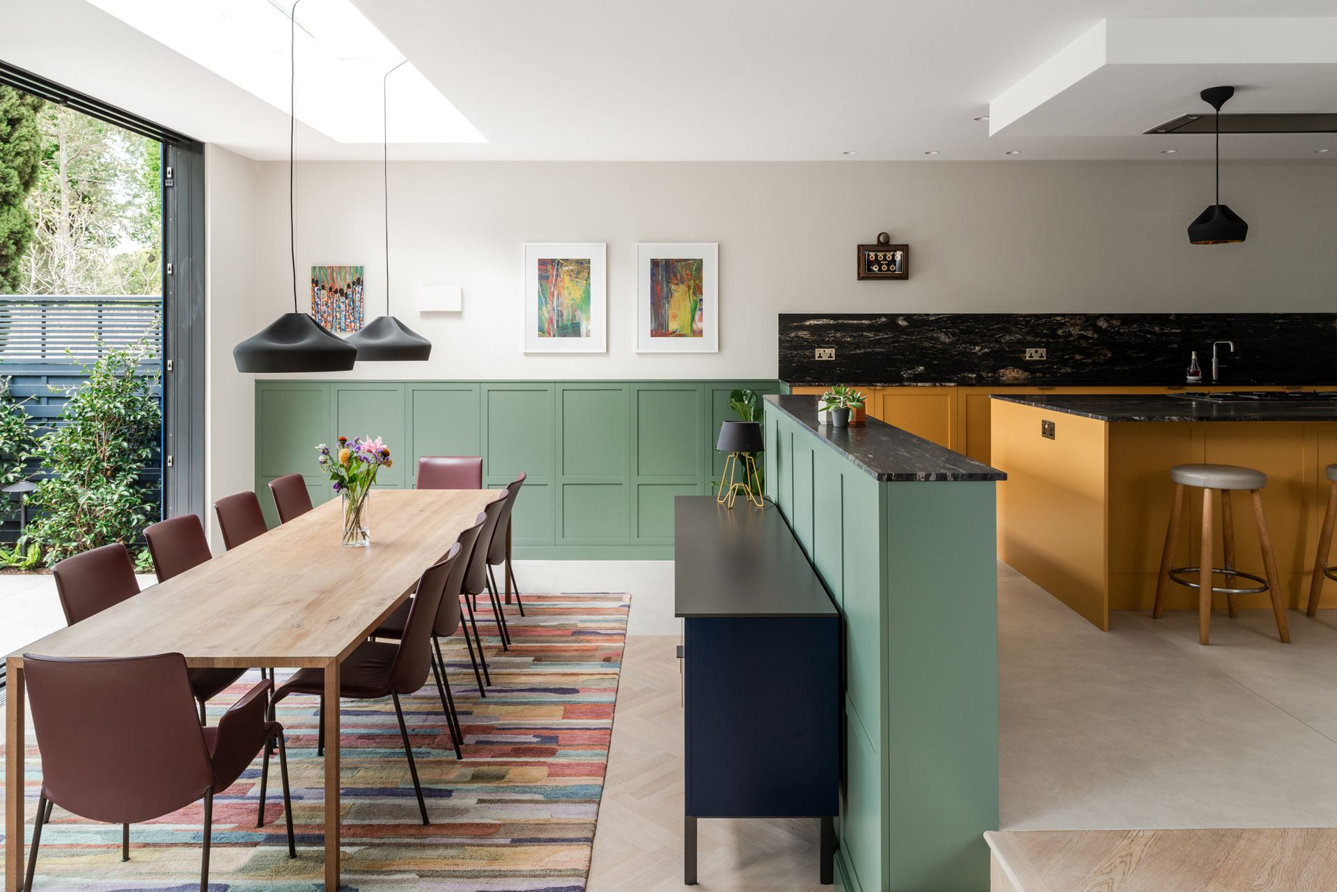
With so many considerations to factor in, the process of crafting a color scheme can seem daunting – which is why it’s important to establish a clear starting point and allow your kitchen color ideas to evolve. For instance, if you pick one finish first – such as the flooring or countertop material – you can shape your decisions for wall and cabinet colors around that.
Be The First To Know
The Livingetc newsletter is your shortcut to the now and the next in home design. Subscribe today to receive a stunning free 200-page book of the best homes from around the world.
After starting my journalism career at a luxury property magazine in Bangkok, I re-located to London where I started out as a sub-editor and features writer. I later became the features editor of a popular self-build and renovation magazine, where I delved into the world of structural systems, eco tech and smart homes. I went freelance in 2017 to pursue my dream of becoming a yoga teacher, but I still write for numerous titles in the homes and interiors sector, including Grand Designs, Ideal Home, Livingetc, Homebuilding & Renovating and Build It. I write a range of articles, from design-focused features to real life case studies.
-
 The 12 Best Table Lamps for Reading —I'm a Certified Bookworm (and Shopping Expert)
When it comes to table lamps for reading, I don't mess around. If you're the same, this edit is for YOU (and your books, or course — and good recommendations?)
By Brigid Kennedy Published
-
 "It's Scandi Meets Californian-Cool" — The New Anthro Collab With Katie Hodges Hits Just the Right Style Note
The LA-based interior designer merges coastal cool with Scandinavian simplicity for a delightfully lived-in collection of elevated home furnishings
By Julia Demer Published
