This architect-approved trick for tiny spaces might also help you create your boldest-ever interiors
This hack for small homes, favored by architects, explains one of the biggest decorating trends of the year, too


When you're dealing with a small space, there's a magic in keeping it simple. But even more than not overwhelming a small space with too much texture, pattern or too many contrasting colors, designers and architects are taking an even more drastic approach to simplisticity when decorating an apartment with a micro floorplan.
To give it a name, Melbourne-based architect Douglas Wan calls it 'reduced materiality' – but what does that mean, and what effect does it have on small rooms?
We asked architects, many of whom specialize in designing the tiniest of spaces, to explain the idea behind the trend, and how to use it to best effect.

Hugh is Livingetc.com's deputy editor, and an experienced homes and property journalist. While researching the world's best micro apartments, he spoke to designers and architects about the ideas behind simplicity in design and reducing down materials.
What's the idea behind 'reduced materiality'?
This idea might sound complicated, but in actual fact, it's quite simple. 'This is architect speak for using as little types of materials as we can,' explains architect Douglas Wan of WHDA, 'as well as making them cover more surfaces.'
It's an idea we're seeing being embraced throughout interior design trends at the moment. It works by helping to blur the outlines of your space, creating visual trickery that can help a small room feel bigger. 'Having one material go from floor-to-ceiling or wall-to-wall makes for more unbroken lines the eye has to travel,' Douglas explains.
It's part of the reason that the 'color drenching' trend has become such a phenomenon in recent times. The idea, which sees the ceiling painted the same color as the walls, millwork and more, is being used as a clever paint tricks for small rooms that can help soften the lines and make them feel larger than they actually are.
However, in many of the very small apartments architects use this idea in, paint isn't always the answer. Filled with clever built-in ideas, unifying the entire house with a single color and texture can create a scheme that feels flat, where texture and depth can also enhance the sense of space in a tiny room.
The result? Architects experimenting with textured boards, wall paneling and cladding for a bold, modern look. Here's just a handful of ideas as to how it can be used, in bold, unexpected ways.
1. Opt for an unexpected material

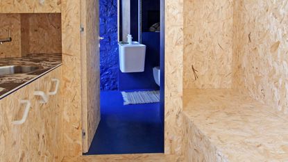
You might better know OSB board as a construction material than as an interior finish. It's a cheap timber sheeting with a recognizable patterning and a generally rough finish, but it can be finished with varnish for a smooth, durable finish.
It's what Italian architect and designer Francesca Perani chose to clad the main living space of this small apartment, from the floor to the ceiling, including the walls, kitchen and built-in storage. 'Having to deal with an extremely narrow space, I was looking for an effective-cost material capable of enlarging the living area without showing any additional lines,' Francesca tells us. 'Moreover, OSB panels can add warmth through their mesmerizing and continuous texture and pattern,' the architect adds.
This material has a lofi quality, which undoubtedly means its not for everyone, but as an interesting alternative to ply or other timbers, used for cladding a space, it certainly brings a boldness to the design.

Blue is the Coolest Color, Backdrop Paint
The one contrast Francesca used to this OSB board was a vibrant, cobalt blue. For a similar look, try this invigorating blue shade from Backdrop.
2. Take a more luxurious route

You'll often see cheaper materials like OSB or particularly plywood used in small apartments - and for good reason. Not only are these materials affordable, but they lean into a certain relaxed, unpretentious aesthetic that many people love.
Many, however, view these materials as cheap, but reducing materials in a space can still be done in a luxurious way using more expensive, elegant timbers or materials like stone.
This home office, fitted with beautiful walnut panels, is the perfect elevated example, but also highlights another benefit of reduced materiality - the ability to minimize features and streamline a room by hiding doors, storage and more in plain sight.
'The room conceals a walk-in closet - outfitted to the gils in office supplies - adjacent to the desk behind a hidden door clad in the same burled walnut that wraps the rest of the space,' explains Greg Howe, co-founder of Chicago-based architecture firm Searl Lamaster Howe.
3. Keep the detailing simple, too

For Douglas Wan's micro apartment, the idea of simplicity didn't just apply to the ply volume as a material that made up the structure of the space, but also in keeping this millwork simpler, too. 'Detailing becomes a little more careful at the joints,' he explains. 'There are no cornices or skirtings, and the builder carved out the ply edges to fit around the existing brick walls.'
In a space like Douglas', it lends itself to a minimalism that goes hand in hand with reduced materiality.
Be The First To Know
The Livingetc newsletter is your shortcut to the now and the next in home design. Subscribe today to receive a stunning free 200-page book of the best homes from around the world.

Hugh is the Editor of Livingetc.com. From working on a number of home, design and property publications and websites, including Grand Designs, ICON and specialist kitchen and bathroom magazines, Hugh has developed a passion for modern architecture, impactful interiors and green homes. Whether moonlighting as an interior decorator for private clients or renovating the Victorian terrace in Essex where he lives (DIYing as much of the work as possible), you’ll find that Hugh has an overarching fondness for luxurious minimalism, abstract shapes and all things beige. He’s just finished a kitchen and garden renovation, and has eyes set on a bathroom makeover for 2024.
-
 How to Thaw a Frozen Pipe — Learn Everything You Need to Know in 5 Minutes With This Guide
Winter storm caught you off guard? We asked an expert — just how do you thaw a frozen pipe?
By Hugh Metcalf Published
-
 The 12 Very Best Silk Bedding Pieces — As Our Style Editor Says: 'It's What Dreams Are Made Of!'
Slumber in lustrous luxury with the very best silk bedding sheets, duvets, pillowcases, and more — your sleep score will thank us later
By Julia Demer Published

