Planning a modern kitchen redesign? Architects share their advice
For a modern kitchen redesign, look no further than these expert tips
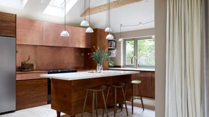
Whether updating on a budget or undertaking a complete kitchen redesign, breathing new life into your kitchen can have a surprisingly big impact on how you live. Creating an open-plan kitchen-living space, for example, might allow you to spend more time with family. Upscaling your appliances, and adding in more storage for essential kit, could make it easier to prepare healthier home-cooked meals and rely less on convenience food.
Whatever you want from your kitchen ideas, it’s important to factor your needs in at the start to ensure the finished space functions exactly as you’d hoped. We asked 10 architects share their expertise on planning a kitchen remodel, from devising a layout to choosing off-the-shelf cabinets, maximizing storage and experimenting with color.
Get creative with your floor plan
When tasked with updating the cramped and boxy ground floor of this 1960s suburban home with a new, open-plan layout, we designed an angled kitchen counter to create a dynamic play between the various zones. The kitchen is now positioned at the centre of the space, with a large white terrazzo worktop orientated to draw people in and frame views of the garden.
The effect of placing the units on an angle results in a more fluid floor plan, and helps the room to feel more spacious. Earthy hues and tactile surfaces balance the open feel with warmth and texture, resulting in an inviting, materially rich kitchen-living space.

Nimtim Architects
Zone a small space with a kitchen cube
The kitchen in this compact apartment was conceived by Bradley Van Der Straeten as a room within a room, designed as single, sculptural piece of furniture that’s both separate from and connected to the living space. Every millimetre counts in a small floor plan, so all units were carefully planned to make use of all available space, with concealed radiators placed inside and easily accessible storage on both sides of the cube. The exterior is clad in dark grey MDF, which has been applied as panels to create the impression of a box. If you want to enhance this effect, use shadow gaps where the structure meets the floor and ceiling.

Bradley Van Der Straeten
Bring the outside in with an internal courtyard
If you’re thinking of adding an extension to your home, introducing an internal courtyard is an effective way of creating a relationship between the existing house and the new architecture.
For this project, Fraher and Findlay's research led the studio to the use of a Tsubo Niwa in Japanese design, which is an external space, entirely enclosed by rooms or garden walls. Integrating a space like this between the kitchen and the living areas creates a pivot point and serves as an environmental tool to bring in lots of light and aid ventilation. In addition to a garden view, a courtyard such as this is a daily reminder to engage with the natural world outside.

Fraher & Findlay
Keep the aesthetic clean-lined and simple
The more you spend on a high-end kitchen, the simpler it tends to look. When designing its own kitchen, McClelland Design replicated all the best qualities of premium suppliers – symmetry, simplicity and clean lines – and sourced off-the-shelf cabinets from IKEA.
McClelland Design chose Ekestad cabinet fronts with solid oak lippings that belied their price for the lower units and contrasted these with crisp matt-black Kungsbacka cabinets above. The full stave oak worktop provided a more natural finish than standard thin-strip options, the offcuts from which were used to frame the cabinets and doorway for an integrated feel.

MCLND
Build a wall of storage
For this home, Blakes London created a multi-purpose hub that enabled the family to live and work together harmoniously. The materials used in this design were intentionally kept honest, pared back, and organic in style and finish. A key part of the project is the strip-panelled oak wall that runs the length of the kitchen and living space, which helps to fuse the two areas. The wall comprises a series of stack-away doors, which conceal a larder, a bar, an office space and air-conditioning units. As well as being beautiful, it also offers enormous flexibility and versatility.

Blakes London
Include space for display
I renovated this house for my father-in-law when he moved from his former home of 45 years," says Neil Dusheiko of Neil Dusheiko Architects. "By allowing the kitchen redesign to go on around all of his beautiful things, I hoped to make the move a little easier. To this end, the kitchen features an entire wall of shallow oak shelving that serves as a gallery for a treasured collection of ceramics, glassware and art."
A framework of columns extends to the ceiling, supporting the shelves and the skylight above, which bathes the display in natural light. The effect imbues the space with warmth and personality, and helps the newly renovated kitchen to feel instantly welcoming.

Neil Dusheiko Architects
Play with contrasts
Combining materials in surprising and contrasting ways is a great way to blur the perceptions and boundaries of a space," says Eryk Ulanowski of Studio Ulanowski. "In this project, we wanted the cabinetry to be seen a bespoke, intricately detailed piece of solid wood furniture, rather than as a kitchen."
The fluting on the lower units was introduced to add an element of tactility to the deep-blue fronts, which were painted by hand to highlight the grain of the wood. The upper units were painted off-white to make help them to blend in with the walls, highlighting the blue cabinetry as a feature.

Studio Ulanowski Photography / Michelle Young
Try a fresh take on tradition
"For this London kitchen, which is located in a period apartment, we took inspiration from traditional shaker proportions but adapted it with clean lines and finishes to modernise the whole feel," says Lionel Real de Azúa of Red Deer. "We added an arch to the space to help frame the kitchen area and soften the otherwise rectilinear forms."
Patinated brass mesh was added to offer both a decorative and utilitarian touch, while the dark-blue decoration and Arabescato marble suggests a sense of maturity in the space, which we liked.

Red Deer project Photography / Billy Bolton
Harness the beauty of salvaged materials
This kitchen is made from a combination of salvaged iroko worktops from school laboratories and large sheets of lustrous copper. Salvaged iroko is incredibly durable and brings with it a unique patina from its original use. The copper is un-lacquered so develops its own patina that counterbalances that of the timber next to it.
"When working with reclaimed materials, a good craftsperson key," says Anthi Grapsa. "In this project, the iroko had to be meticulously cleaned to remove its original varnish without affecting the graffiti and markings. Then it had to be taken apart and rejoined before being refinished with a clear sealant suitable for use in the kitchen."

Anthi Grapsa
Experiment with colour
By choosing a classic design in a warm, bright colour (Paint & Paper Library’s deep Indian Yellow, ‘Muga’), this kitchen makes an interesting feature but still sits comfortably within the living space. I always recommend picking a colour that you truly love as the kitchen is typically the heart of the home and must feel as such.
"In this flat, I prevented the bold colour from overpowering the room by opting for a glazed cupboards and an antique shelf rather than a block of wall-hung cabinets," says Lonika Chande. "This also gives the kitchen a freestanding look, and makes it feel like it has come together organically over time."

Lonika Chande Photography / Simon Brown
What are good materials for a modern kitchen splashback?
First and foremost, a splashback needs to be practical. Choose a material that’s easy to clean, non-porous and will either remain unscathed or age beautifully with time and use. If your kitchen is small, opt for something with a lustrous quality, such as stainless steel, copper, marble or Corian. If you want to create interest in a larger space, there are a wealth of textural and patterned tiles to choose from to enliven your scheme.
How to choose the right flooring for a modern kitchen
Kitchens are high-traffic areas, so it’s worth investing in a high-quality, durable floor. Think about the materials you’ll be using elsewhere and how your chosen flooring will interact with these. A hardwood floor will add instant warmth, while natural stone tiles lend a rustic touch and feel wonderful underfoot. Poured concrete is a great match for an industrial-style kitchen, and can easily be softened with a rug. Try Weaver Green for washable rugs made from recycled plastic.
How to get the lighting right in a modern kitchen
Modern kitchens are all about versatility, which should be reflected in the lighting scheme. Installing task lighting in key prep areas, such as under wall cabinets or over an island, will mean the rest of the space can have an atmospheric feel rather than being harshly lit by bright overhead lights. Create ambience for evening meals and on gloomy days with table lamps, wall sconces and statement ceiling pendants.
Be The First To Know
The Livingetc newsletter is your shortcut to the now and the next in home design. Subscribe today to receive a stunning free 200-page book of the best homes from around the world.
Tessa Pearson is an interiors and architecture journalist, formerly Homes Director at ELLE Decoration and Editor of ELLE Decoration Country. When she's not covering design and decorative trends for Livingetc, Tessa contributes to publications such as The Observer and Table Magazine, and has recently written a book on forest architecture. Based in Sussex, Tessa has a keen interest in rural and coastal life, and spends as much time as possible by the sea.
-
 These 12 Best Table Lamps for Your Desk — Perfect Glows for a Creative Home Office
The best table lamps for your desk is have a soft, targeted glow. Elevate your WFH set-up with these stylish picks endorsed by Style Editor Brigid Kennedy
By Brigid Kennedy Published
-
 The Nespresso VertuoPlus is 30% Off for President's Day, and it's Kim Kardashian's Coffee Maker of Choice
This sleek and stylish coffee maker was spotted in Kim's home bar, and you can currently save $60 if you buy yours from Amazon
By Lilith Hudson Published
-
 25 bathroom trends for 2024 - from the color to the quick buy that is making a big design splash this year
The bathroom trends for 2024 include the warmth of honeyed tones to the quick storage fix everyone needs now. Design experts explain how to use these new ideas in your own space
By Pip Rich Last updated
-
 Design-forward living room ideas to give your home a refresh
Living room ideas from our favorite homes, filled with designs and trends to inspire
By Amy Moorea Wong Last updated
-
 Bathroom tile ideas – 23 creative ways with color, pattern and installations
Use these bathroom tile ideas to add texture, pattern and even a touch of glamor to this very important room
By Hebe Hatton Last updated
-
 16 living room wallpaper ideas that'll convince you patterned wallcoverings are the way to go
These brilliant living room wallpaper ideas offer up inspiration for how to apply print, pattern and texture to different areas of your scheme
By Hugh Metcalf Published
-
 Crittall-style doors – 20 ideas that prove this timeless trend is here to stay
Fall for the charm of crittall-style doors, windows and room dividers all over again with our gallery of the best ideas
By Lotte Brouwer Published
-
 Florist Angela Maynard on how to care for dried flowers and how to style them in a modern home
Knowing how to care for dried flowers means you can have stylish arrangements that last for years. Author and florist Angela Maynard shares her tips
By Angela Maynard Last updated
-
 15 cozy living room ideas – how to create a stylish den-like space in your home
These cozy living room ideas are sure to make you want to curl up, surrounded with throws and cushions, no matter what the time of year
By Hebe Hatton Last updated
-
 Bathroom wall tile ideas – from bold and bright to subtle and sleek
Bathroom wall tile ideas are what give your bathroom personality, adding color, texture and depth – here are our favorite looks
By Hebe Hatton Last updated


