How do you zone a room with color? 10 genius ideas that will make open concept feel cozier
Color is one of the most powerful tools at your disposal when it comes to zoning a space. We spoke to the experts to find out how it’s done
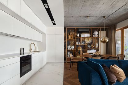

Trying to create a sense of order within a busy space that performs multiple roles can be tricky – especially in a post-lockdown world where the home functions as a place for living, working and socializing. Color is an effective tool for creating a sense of structure and organization.
'As well as bringing a sense of functional clarity to a space, zoning your home with color can provide depth, add a focal point and bring a sense of visual organization,' says Nathan Fell, director at New Orleans-based Nathan Fell Architecture.
With so many options for crafting a dazzling scheme that oozes wow factor, the process of refining a zoned color scheme as part of your home's interior design can be daunting – which is why we asked the experts for their top tips on how to get it right.

Rebecca is an experienced homes and property journalist, who has worked for numerous self build and interiors magazines. Here, she talked to designers and architects about how they approach using color to create zones within open concept spaces.
1. Paint the walls to define a zone
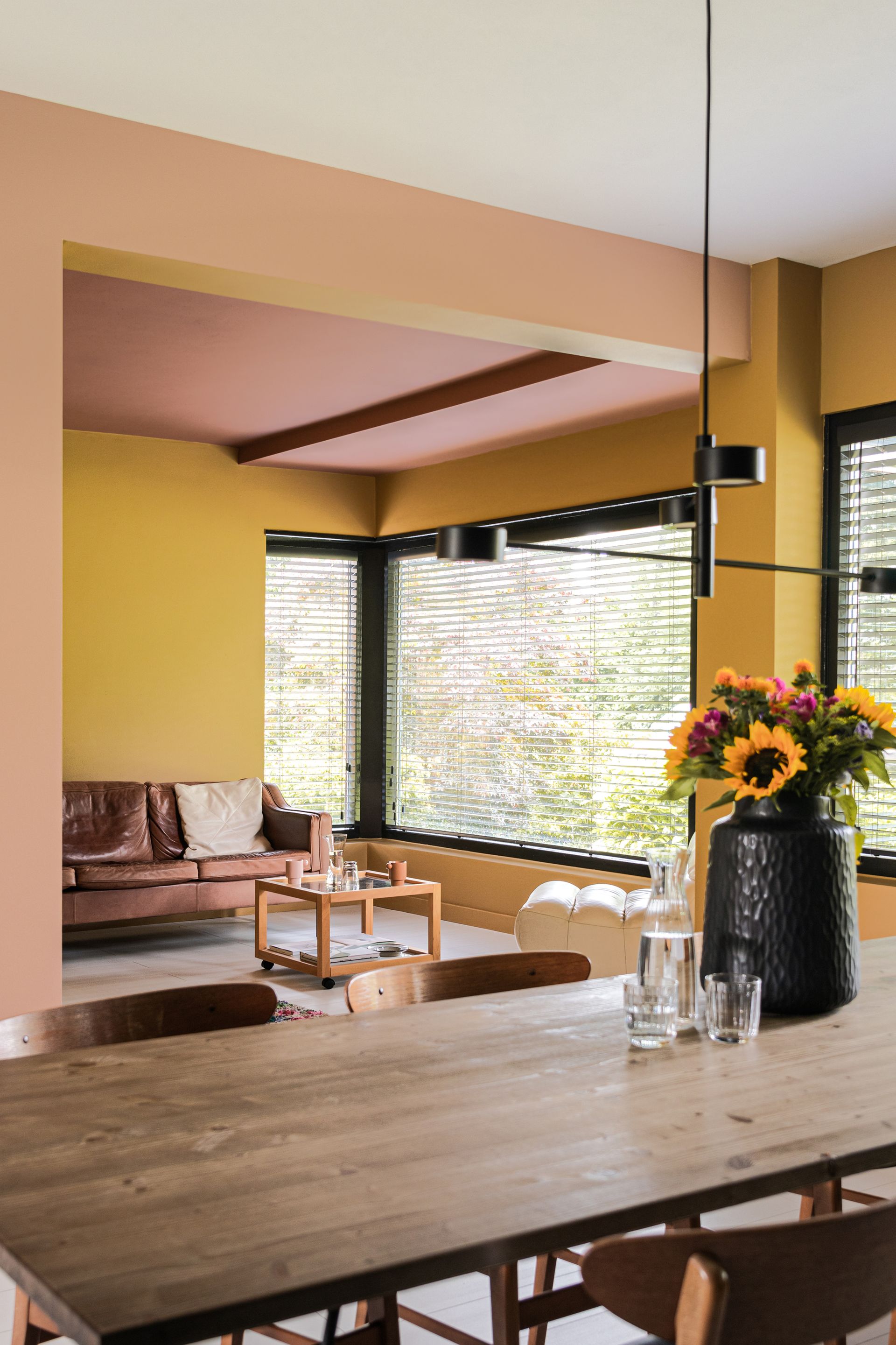
One advantage of using paint ideas as the basis for zoning a space (rather than structural elements or built-in items) is that you can create a design talking point for a relatively low cost, when considered as a proportion of your whole renovation budget. This means you can afford to get adventurous with your color choices, as you’ll be able to fix anything you don’t like with another tin of paint.
For a bold look, it’s important to commit to your color theme 100% to get the best results. 'Wrapping a room in full color – including walls, ceiling and even floors – can be a highly impactful way to define the zone and create a true element of surprise,' says Chelsea Hing, director of Melbourne-based interior design practice Chelsea Hing.
'Embrace color, go deeper than you think and test, test, test the color on the walls in multiple spots to see how it feels,' says Chelsea. 'Look for murkier-based colors that aren’t too clean, as they adjust more subtly to light and are easier to live with.'
2. Use millwork to outline an area

Don’t be afraid to use vivid colors as a finish for your home’s built-in millwork. 'Using a strong color on joinery to make a statement is a good option – but it’s not for the faint-hearted,' says Chelsea.
This technique can work particularly well in an open concept space, where kitchen cabinetry is painted in a shade that sets up a sharp contrast with built-in shelving or bench seating in the dining/living area. Employing this technique is a smart way to achieve a wow-factor, bespoke feel.
In this design by SGKS Arch, different colors have been used for the millwork on either side of this open concept space. The warmer rust tones define both the living room and entryway, while the muted grey-blue outlines the transitional spaces.
3. Zone spaces using texture, too

Crafting a sensational color scheme across a whole space isn’t just about the hues you pick – it’s about the textures, too. 'Using similar colors in varying textures will establish a layered look,' says Henry Sgourakis, principal and founder at Victoria-based SGKS ARCH.
If you want to create a subtler aesthetic, getting creative with textures rather than bold hues can make all the difference. Experiment with materials, gloss/matt paint finishes and rough vs soft as a way of creating plenty of variation.
In this design by Poland-based Mistovia, a bold, black-and-white marble tile works to contain the living room in the open concept space, while a pillar also clad in the same finish ensures this finish feels connected to the room.
4. Color block your room

Pairing two or more vivid shades and incorporating them across an open-plan space is a lively way to delineate the function of different zones. According to Rachael Green, co-founder of Pickleson Paint Co, this technique has become incredibly popular over the last few years – though she admits it’s not the best approach for everyone.
'We’ve seen some of our customers create wild spaces using bolder colors to great effect. It’s an approach that can really grab your attention and we love that it allows you to use seven of your favorite colors in one space, should you choose,' she says.
If you prefer a more understated look, you can still use the color-blocking technique to zone your space. Picking out one hero shade and stacking it alongside other hues from the same family will create more of a subtle distinction in tone from one area to the next, resulting in a calm, tranquil scheme.
5. Keep it cohesive

If you’re planning a color scheme for more than just one room, it’s important to create a sense of cohesion across the entire space, rather than treating each area in isolation. For instance, an open concept kitchen-living-dining area that connects to the hallway and staircase beyond should be considered as a whole, rather than broken down into separate entities.
'A great way of connecting spaces is to use pops of color seen in other areas,' says David Puckering, an interior designer at Melbourne-based practice The Stylesmiths. 'For example, if the main kitchen color is yellow with blue accents, the living room can be predominantly blue with yellow accents.'
In this open concept living space designed by Here Studio and The Stylesmiths, the green tiled fireplace helps define the living area, but the tones captured in this wall covering can be seen throughout the space, ensuring it doesn't feel unrelated to the rest of the scheme.
6. Be bold in color choices

If you’re going down the color-blocking route, half the battle can be selecting the best contrasting shades to zone your space. This is where consulting color theory can prove particularly useful. 'Starting with one color and then using the opposite hue in smaller, judicious pops creates a lively scheme that doesn’t clash,' says David Puckering.
Of course, for this strategy to be successful, you still need to select a hero color as your starting point. Picking out individual hues from your favorite pieces of artwork or ornaments and letting those shades unravel into your wider color scheme is a smart way to achieve cohesion.
7. Think about areas of relief
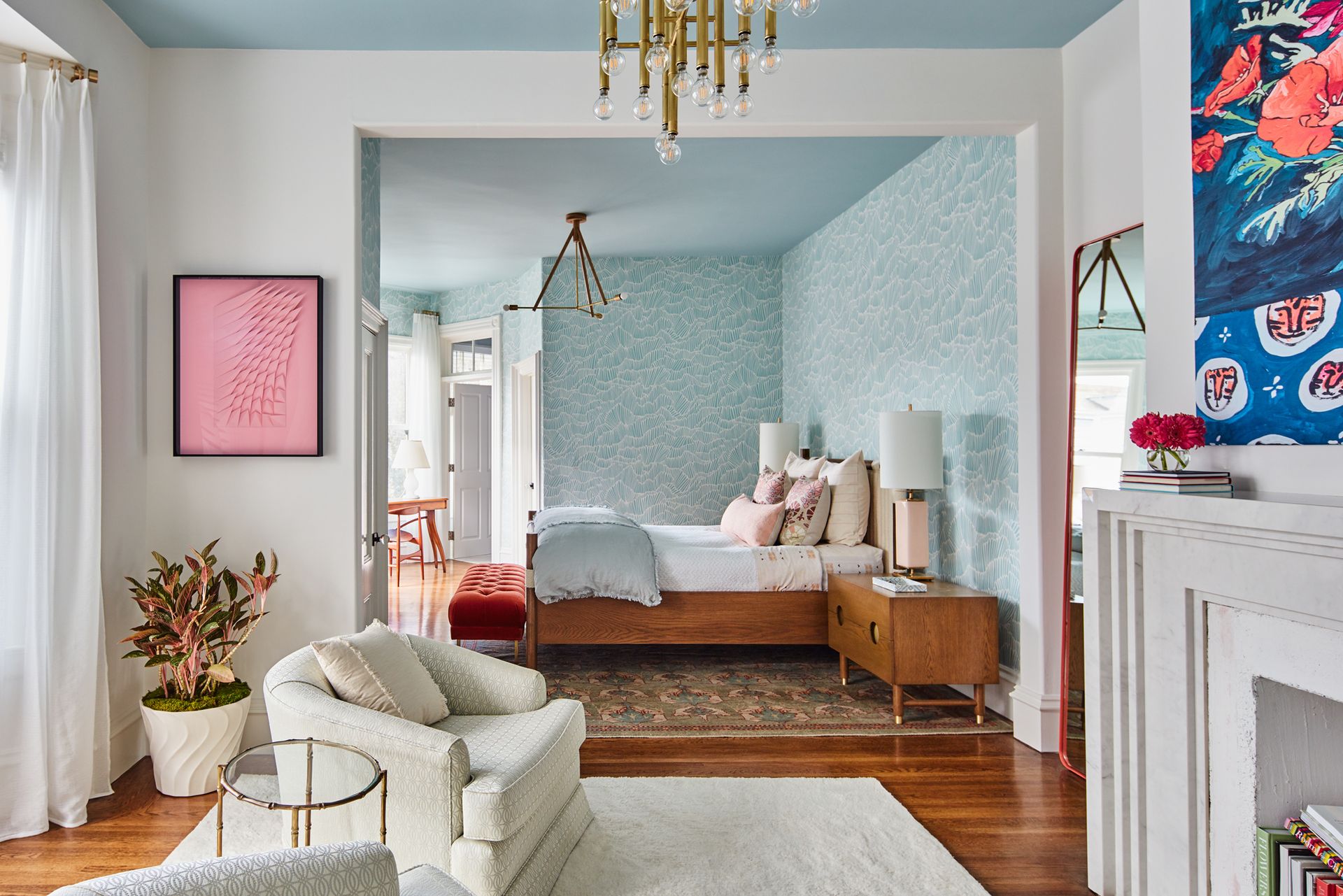
If you’ve chosen a bold color scheme for the main living areas, incorporating some areas of relief to contrast against splashes of deeper color is often the key to success. 'Generally, color needs relief to be appreciated, so stacking colors within main zones and creating relief through circulation spaces celebrates the moments of entry and reveal throughout your floorplan,' says Henry Sgourakis from SGKS Arch.
According to Henry, there’s no need to over-complicate this strategy. 'Flecks and accents will be your friend,' he says. 'You can also use living room furniture and soft furnishings to tie it all together.'
8. Create divides with structural features

Use structural elements such as beams, rafters and columns to your advantage, by painting them in a shade that contrasts from the surrounding walls and ceilings. This will help you delineate the boundary from one zone to the next in a seamless way.
This works especially well in open-or broken-plan zones, as you won’t end up with any clunky dividing lines that are at odds with the seamless flow of the space. Plus, by choosing a standout shade, as in this design by Can Studio, you can make add a creative colorful feature to an open plan kitchen.
9. Highlight zones on the ceiling

Rather than using color on the walls to zone a space, consider the ceiling as a canvas, too. This can be an effective trick for zoning an entire space, especially where a home has been opened up with walls removed to make it more open concept.
In this home designed by Yasmine Ghoniem, founder of YSG Studio, Marmorino - a type of Venetian plaster, has been used rather than a painted ceiling, but it's effect is the same in zoning the dining area.
'Blushing aubergine ceilings in the formal lounge and dining areas mingle with pistachio and soft toffee hues,' Yasmine tells us. 'They were my way of defining spaces to create a sense of ‘open enclosure’ without the need to partition them with walls.'
Marmorino Berlina Venetian plaster, Amazon
This beautiful textured plaster comes in an array of colors, and introduces a tactile texture to walls and ceilings which begs to be touched.
10. Try an understated color contrast for zoning
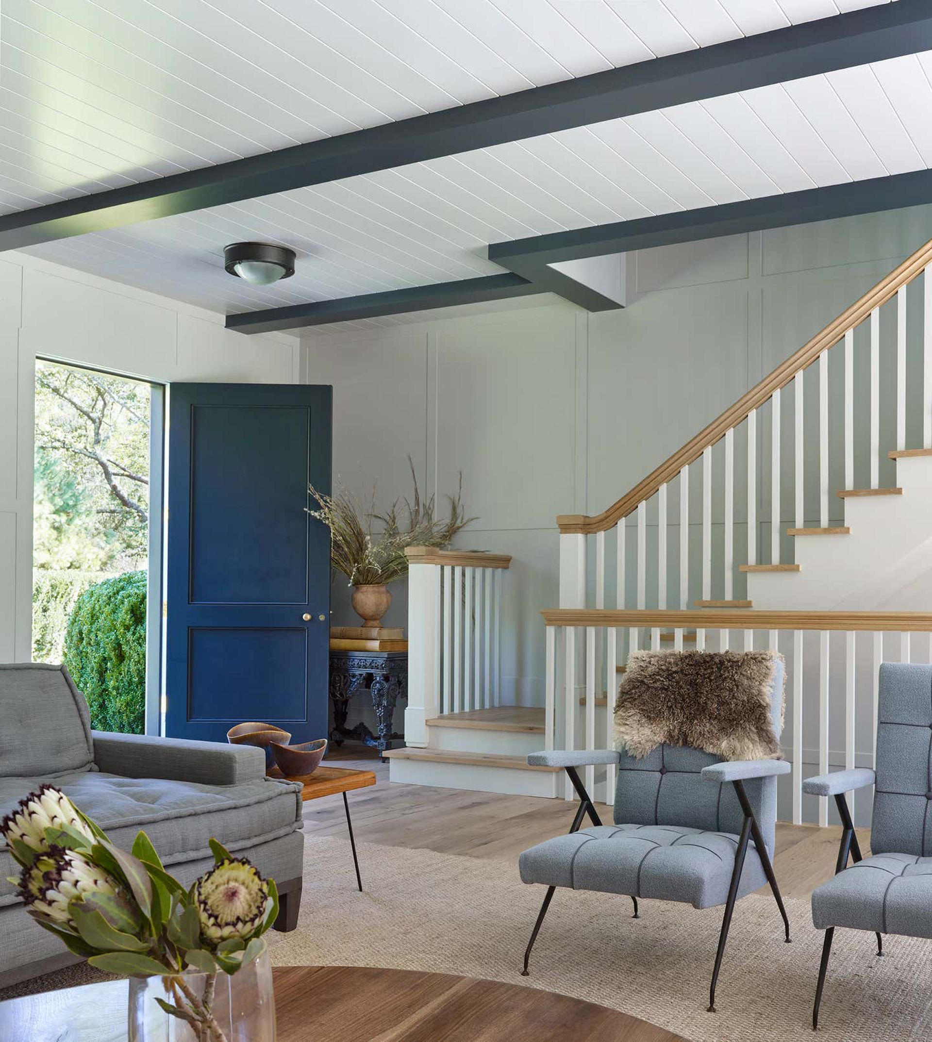
Establishing an understated aesthetic doesn’t necessarily mean you need to avoid vivid, punchy colors at all costs. 'It’s not about trying to find a color that’s more toned down or less saturated. In fact, I’d suggest the opposite,' says Nathan. 'An exciting, impactful color in a small and clever location with walls that are otherwise white/untreated is more subtle than painting every wall in baby blue.'
You don’t necessarily need to pick bright or bold hues to create a wow-factor color scheme that zones your space effectively. According to David Puckering from The Stylesmiths, layering several shades of the same color within one zone can pack a powerful aesthetic punch.
'For instance, you can incorporate a feature wall that’s only one or two shades darker than the main color in the furnishings and décor,' he says. 'This creates depth and interest, while maintaining the soothing zen effects of a monochromatic color scheme.'
Be The First To Know
The Livingetc newsletter is your shortcut to the now and the next in home design. Subscribe today to receive a stunning free 200-page book of the best homes from around the world.
After starting my journalism career at a luxury property magazine in Bangkok, I re-located to London where I started out as a sub-editor and features writer. I later became the features editor of a popular self-build and renovation magazine, where I delved into the world of structural systems, eco tech and smart homes. I went freelance in 2017 to pursue my dream of becoming a yoga teacher, but I still write for numerous titles in the homes and interiors sector, including Grand Designs, Ideal Home, Livingetc, Homebuilding & Renovating and Build It. I write a range of articles, from design-focused features to real life case studies.
-
 These 12 Best Table Lamps for Your Desk — Perfect Glows for a Creative Home Office
The best table lamps for your desk is have a soft, targeted glow. Elevate your WFH set-up with these stylish picks endorsed by Style Editor Brigid Kennedy
By Brigid Kennedy Published
-
 The Nespresso VertuoPlus is 30% Off for President's Day, and it's Kim Kardashian's Coffee Maker of Choice
This sleek and stylish coffee maker was spotted in Kim's home bar, and you can currently save $60 if you buy yours from Amazon
By Lilith Hudson Published

