How can I make my ceiling look higher? 7 decorating ideas that will fool the eye to make any room feel bigger
How can you make a ceiling look higher? Interior designers weigh in on creating an illusion of space through clever design


If the ceilings in your home feel low, it can really mess with the proportions of your room. However, ,aking your ceiling look higher than it is is a lot simpler than you may initially think, and it doesn't involve a total reconstruction of your home.
There are so many things you can do with color, paint, furniture, and the proportion and lines of a room that will help draw the eye upwards and create optical illusions that "lift" the ceiling.
If you're trying to work out exactly how to make more space, whether it's a small living room or dark, low-ceilinged bedroom, these ideas will help you create a roomier-looking and feeling space.

Oonagh is an interiors writer and editor, and expert at keeping up with trends from the world of interior design. For this story, she's spoken to the interior designers to find out practical tips for making your ceiling look higher than it is.
1. Paint below dado rails in different shades to break up the space
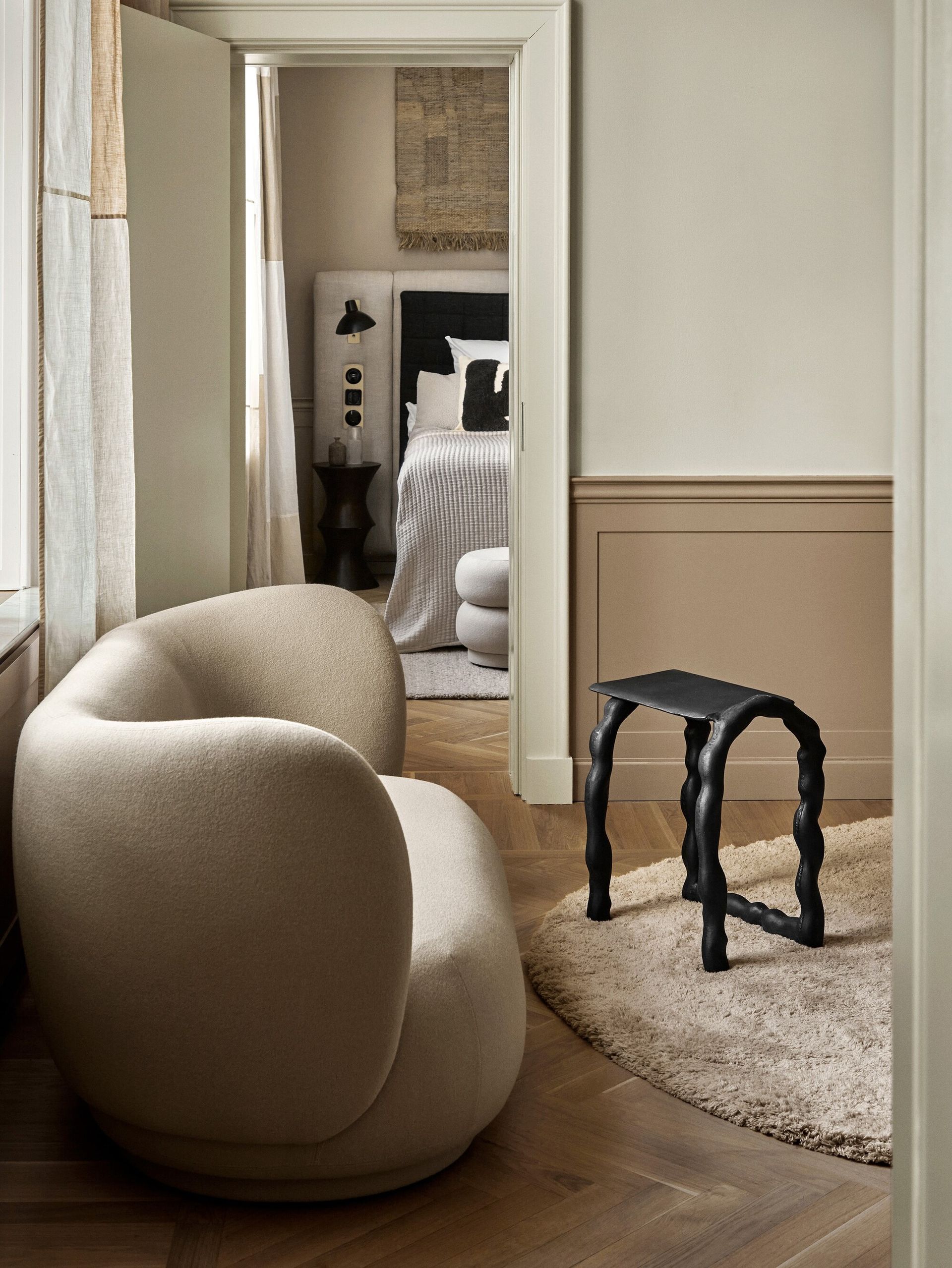
The humble dado rail might seem like an architectural leftover, but it has withstood the test of time for a reason. This type of wall molding holds a lot of power to break up wall space, and if you go for a subtle difference above and below the rail, this can stress the horizontal layering of the room and drawing attention to the shape and size, helping to create the illusion of more space.
‘Go darker under the dado rail with fresh white woodwork and light colors above the wall to hide any scuffs and marks,’ advises Martin Waller, founder of luxury furniture brand Andrew Martin. Think off-white paired with light pink, two different shades of grey, or even different material, with shiplap paneling under the rail for added texture. The same effect can be achieved with wainscoting, too.
You might want to think about painting the rail itself in a different finish. ‘At Elicyon, we like to finish the dado rail with the same color or tone as the wall but in a different finish to create contrast,’ says Charu Gandhi, founder of the architectural studio Elicyon. ‘For example, the top half of the wall can be decorated in a pale green colour and the bottom half in a darker green, both in a matt paint; the dado rail can be in a shade of green but in a high gloss finish.’
2. Go for low-profile furniture and consider floating
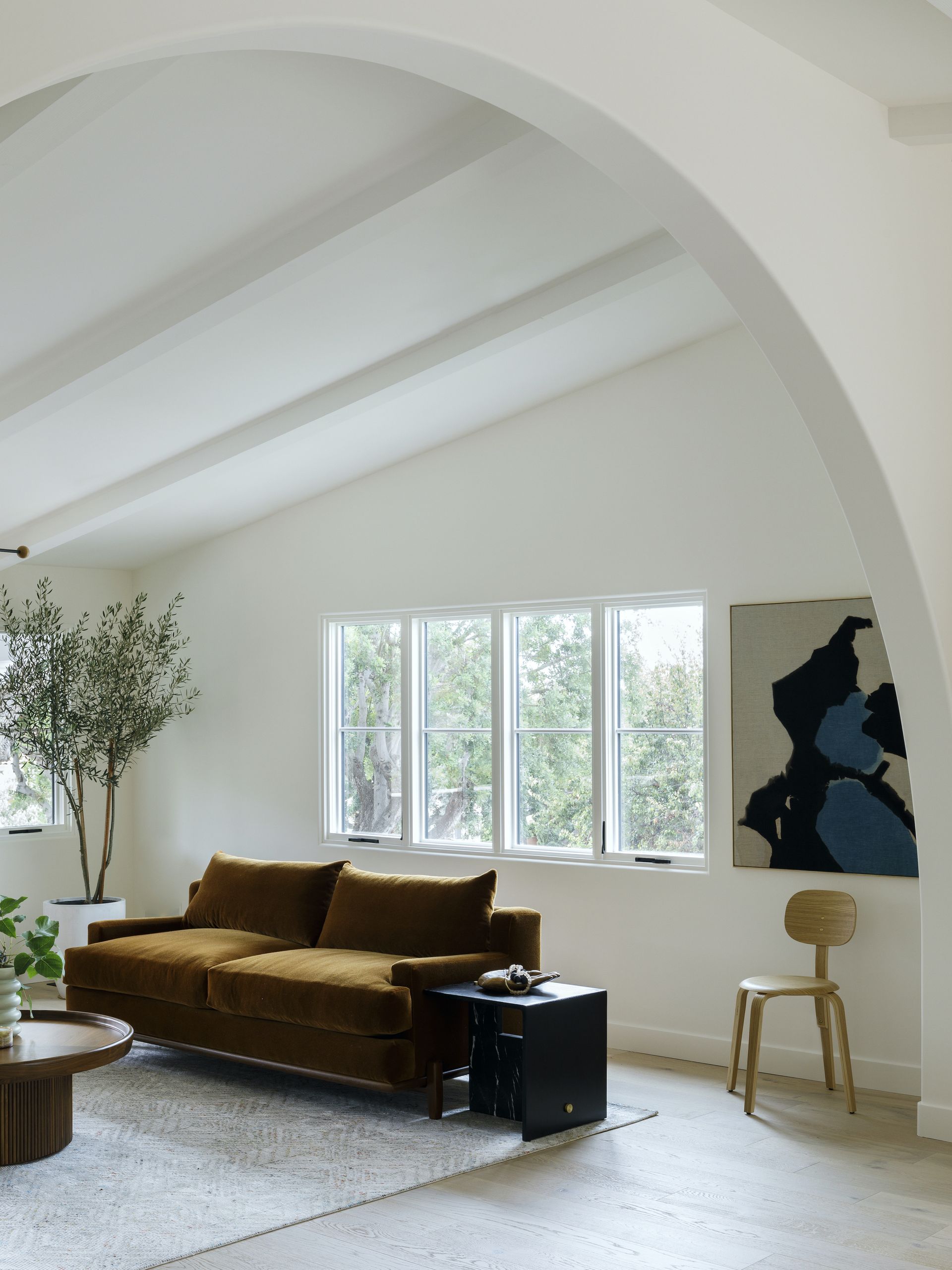
Think about the proportions of the wall and how your furniture height divides up the space. The golden ratio in interior design is a theory of thirds, and applies to how far up your wall your furniture should come for a pleasing aesthetic (also how high up a traditional dado rail should go).
The standard height of a sofa is around 30" - 36", but you might want to go lower than this to help skew the dimensions of the room. You also might want to float furniture away from the wall, as per this example from LA-based studio, Byrdesign, meaning you can see more wall when you come into the room.
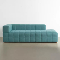
Wendall sofa, Urban Outfitters
If you're looking for a low-profile sofa that doesn't take up much wall space, this slouchy number from Urban Outfitters is just the ticket. It's quite the bargain for a sofa and will slot neatly into any cozy corner. With its low backrest, it has the power to really alter the proportions of the room.
3. Draw the eye up with vertical lines
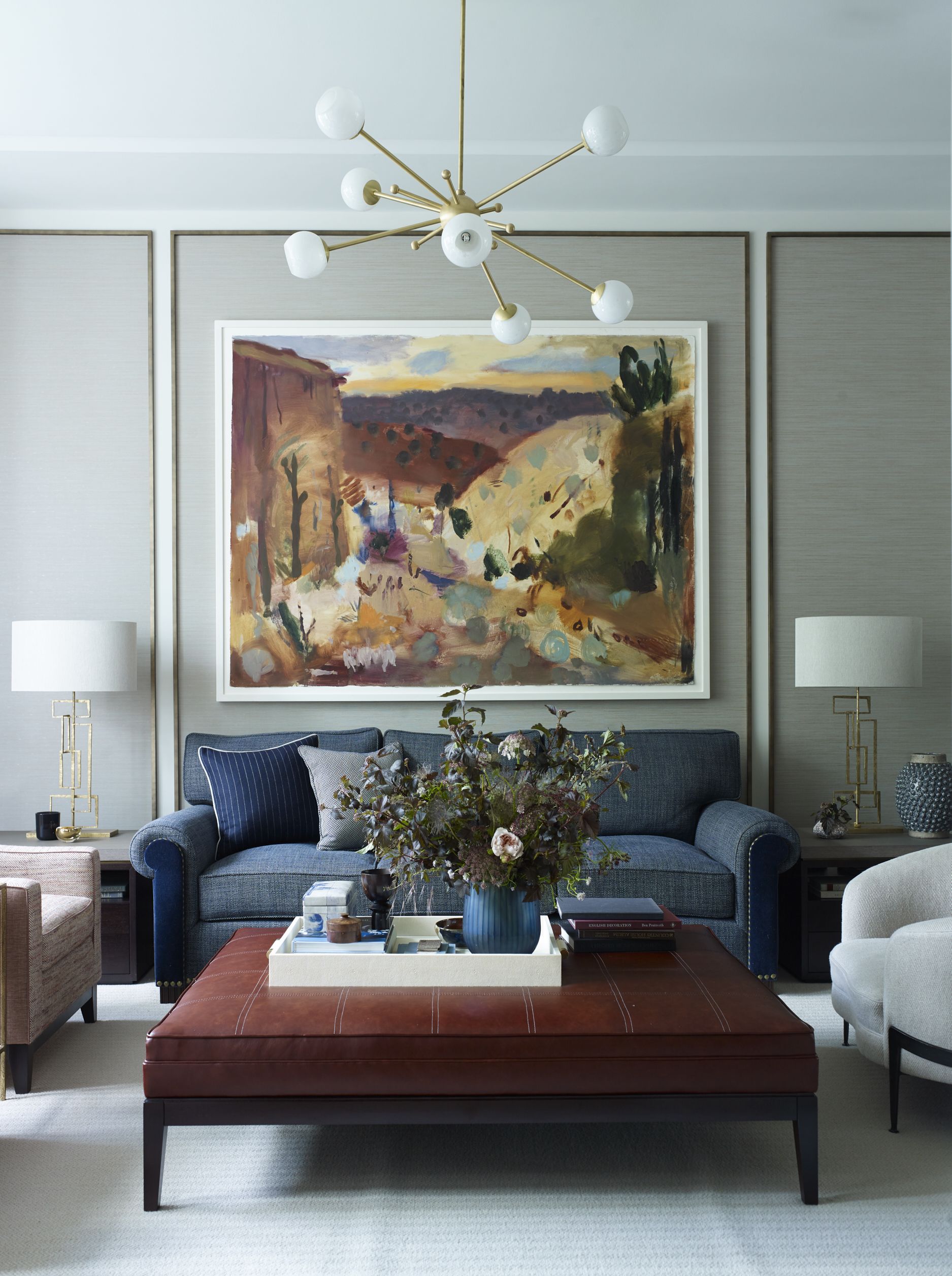
Vertical lines are a cheat's way to drawing the eye upwards, distracting you from noticing the actual size of the wall and instead emphasizing the long, vertical lines, casting the eye upwards towards the ceiling.
‘Wall-framing is fast becoming a trend and rightly so, we believe,’ says Irene Gunter of international design studio, Gunter & Co. ‘It’s a great way to add a decorative aspect to a scheme and you can use it to frame living room wall art and key aspects of your room, like this sofa, it also adds symmetry.’ Wall paneling might be a cheap and easy way to create this wall framing effect, or for an even more budget friendly option, try painting vertical lines.
4. Go monochromatic with paint
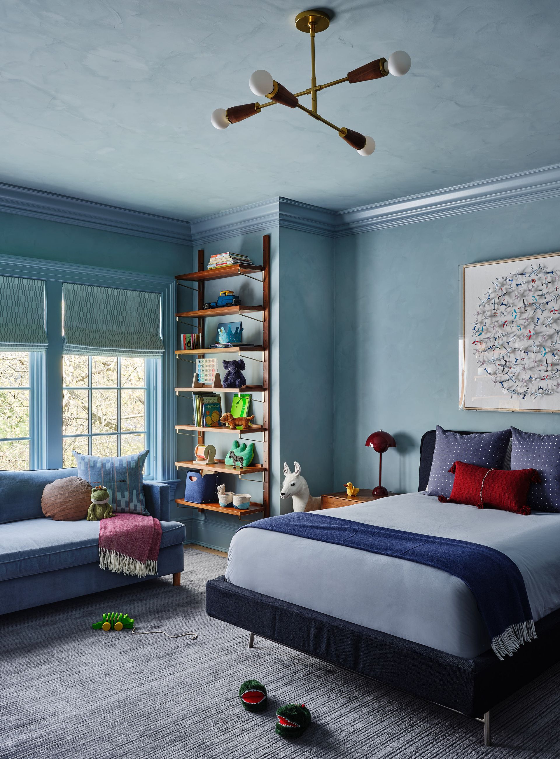
Try a monochromatic color scheme with your paint, ensuring your trim, ceiling, door frames and crown moldings are all the one same color.
'By continuing the color on the walls and ceiling you do create an infinity effect,' says Annie and Jordan Obermann, founders and principals of interior design studio Forge + Bow. 'But this is a good thing because it makes the room feel bigger.
'However people are often concerned that they will experience a cave effect. If this seems too bold for you, dilute the ceiling paint by up to 50 percent to maintain the tone but allowing less visual weight on the ceiling.'
Kittiwake, Farrow & Ball
I'm really enjoying a light blue monochromatic scheme right now. It's somehow warm and cozy instead of cold and sterile and helps those ceilings feel taller by mimicking nature and the open sky. This from Farrow & Ball is the perfect light blue.
5. Go floor-to-ceiling curtains
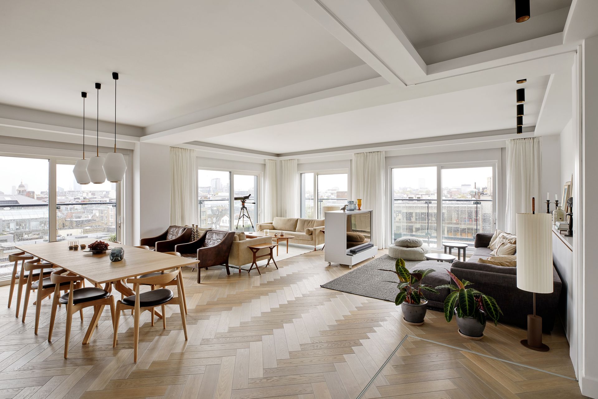
Avoid breaking up the wall where possibly and keep your curtain rails as high as possible. The standard distance from the ceiling to the top of the window is around 16 - 18 inches, but when it comes to how high to hang a curtain rod, it's better to keep them high and allow the fabric to go all the way to the floor, making sure you go for extra material to create that coveted puddling effect.
Window treatment this high can also hide curtain rod brackets and unsightly rails too, meaning no visual clutter in an already tight space.
6. Try a dark feature wall
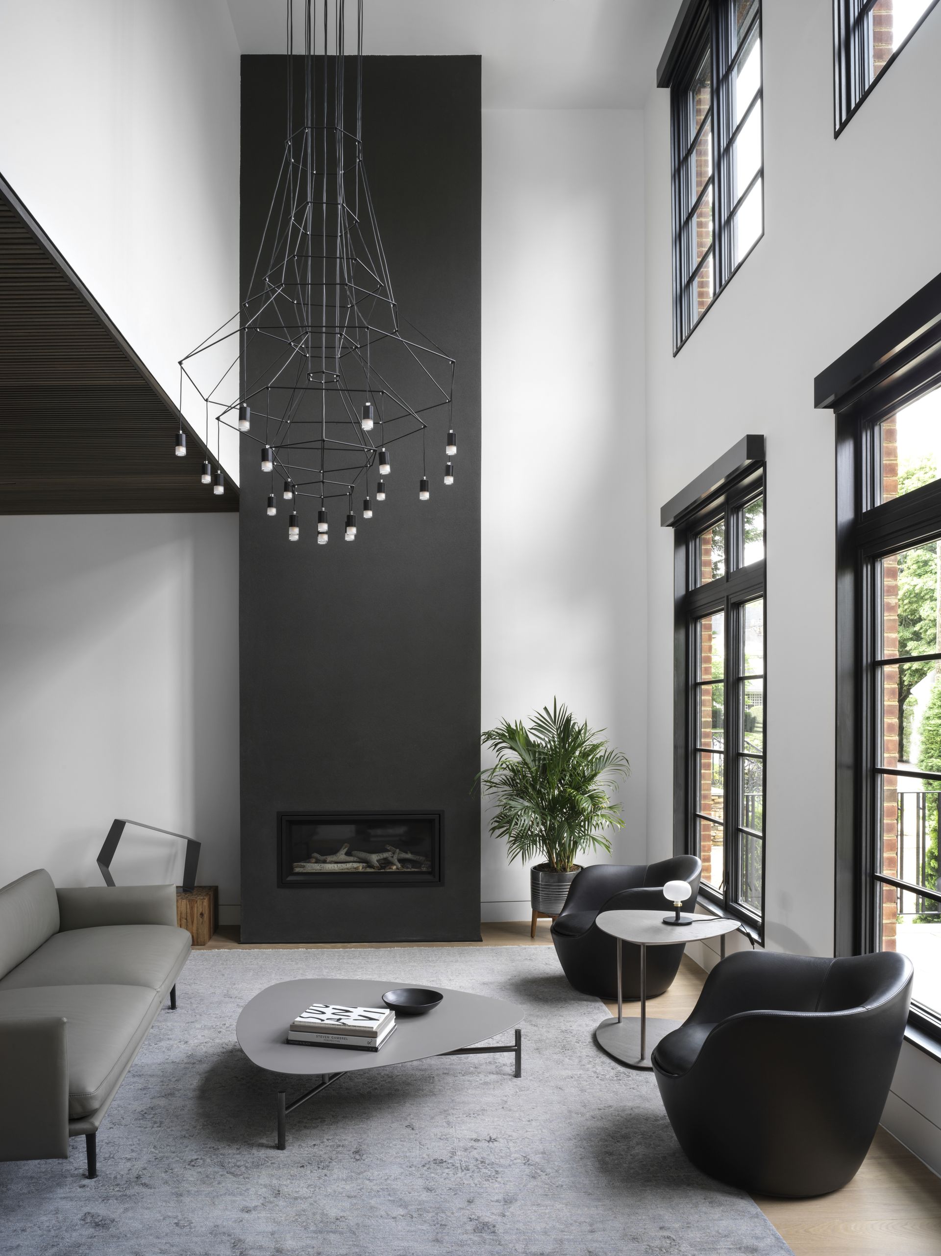
Feature walls are a great and simple way to draw the eye, and by picking the furthest wall in the room you can force your eyes to look ahead. Contrast is your best friend when painting a feature wall, and can be used as a visual aid to make the room seem even larger.
In this example of a living room accent wall, the ceiling is already high, but the team at Brooklyn-based OAD Interiors wanted to emphasize the height of the space even more so, so they chose to have the fireplace in black to provide contrast and a wow factor.
7. Try a clean white space
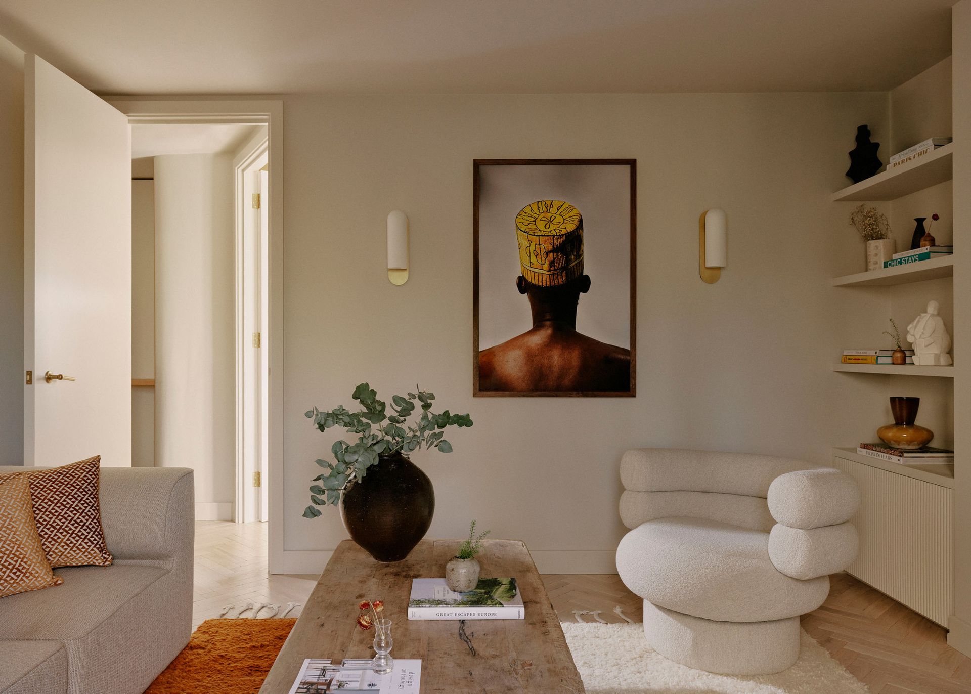
Finally, if you have a small, dark space, going for clean white might be the best way to create more height, grandeur, and space. It creates a feeling of flatness and works as a canvas where your eyes concentrate on the detailing and decor instead of the size and shape of the walls.
In this example from London/Paris-based Atelier Ochre, the same white is used on the trim, bookcase, and ceiling, and the design duo decorated the room with white walls with the African art of the well-traveled collector. White allows the detailing to come to the fore, all the while helping the space feel more open and airy.
Be The First To Know
The Livingetc newsletter is your shortcut to the now and the next in home design. Subscribe today to receive a stunning free 200-page book of the best homes from around the world.

Oonagh is a content editor at Livingetc.com and an expert at spotting the interior trends that are making waves in the design world. Writing a mix of everything and everything from home tours to news, long-form features to design idea pieces on the website, as well as frequently featured in the monthly print magazine, she's the go-to for design advice in the home. Previously, she worked on a London property title, producing long-read interiors features, style pages and conducting interviews with a range of famous faces from the UK interiors scene, from Kit Kemp to Robert Kime. In doing so, she has developed a keen interest in London's historical architecture and the city's distinct tastemakers paving the way in the world of interiors.
-
 The 12 Best Table Lamps for Reading —I'm a Certified Bookworm (and Shopping Expert)
When it comes to table lamps for reading, I don't mess around. If you're the same, this edit is for YOU (and your books, or course — and good recommendations?)
By Brigid Kennedy Published
-
 "It's Scandi Meets Californian-Cool" — The New Anthro Collab With Katie Hodges Hits Just the Right Style Note
The LA-based interior designer merges coastal cool with Scandinavian simplicity for a delightfully lived-in collection of elevated home furnishings
By Julia Demer Published

