Wainscoting ideas – designers are rediscovering how this ancient millwork can uplift modern interiors
Classic wainscoting ideas are being given a bold update with modern colors, contrasting decor, bespoke designs and more
If wainscoting sounds like a thing of the past, that’s because it is – the architectural feature has been around for centuries. But if you think wainscoting ideas don’t have a place in modern interiors, think again.
Traditionally, wainscoting was a system of durable, decorative wooden panels that protected walls from scrapes and scuffs. The millwork typically stops halfway up the wall (where the back of a chair might bump against the plaster) but often rise up three-quarters of the wall, too. In today’s interior design trends, wainscoting still serves as a seasoned wall protector, but these wall paneling ideas are more than just reliable relics.
Modern wainscoting can actually trick the eye, making a room appear taller, while even a minimal wainscoting can add texture and charm to clean-lined interiors. Better yet, simply painting tired wainscoting with a refreshingly modern color can quickly update the entire vibe of your interior – think of it like a blank canvas.
Whether you're planning to update classic wainscoting in your home or you're hoping to install a modern design that builds character, we've pulled together a number of novel designs to help give you an edge.
Wainscoting ideas
1. Update classic wainscoting with modern colors
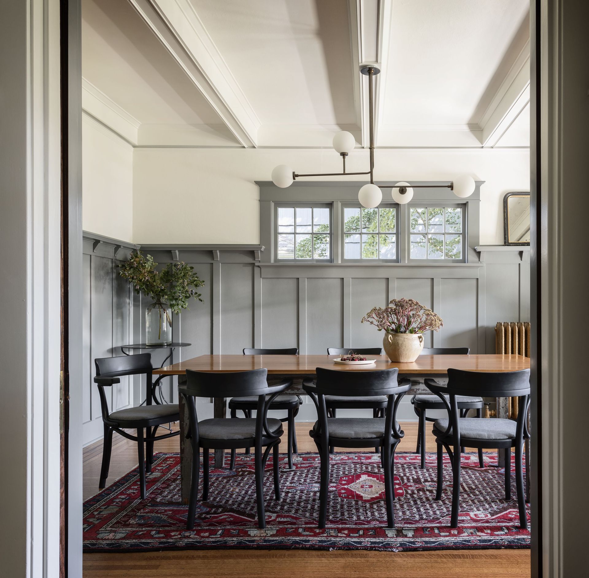
If you have original wainscoting in your home, chances are it could use a refresh. Luckily, painting your panels in a modern color will bring it up speed. Can't decide what color to choose? When in doubt, a moody neutral color scheme will ease classic wainscoting into the present day.
In the grey dining room above, a refreshed color scheme brings new life to the space. “We kept the original paneling for this classic Craftsman house in the dining room, but introduced a moody modern gray to give it a fresh update,” says interior designer Lisa Staton. “The chairs are vintage, the black silhouette of them stays clean lined. We then mixed an older antique rug with a light fixture that is new and more modern but with an aged brass patina to wink to the old house.”
2. Use gloss paint to reflect light
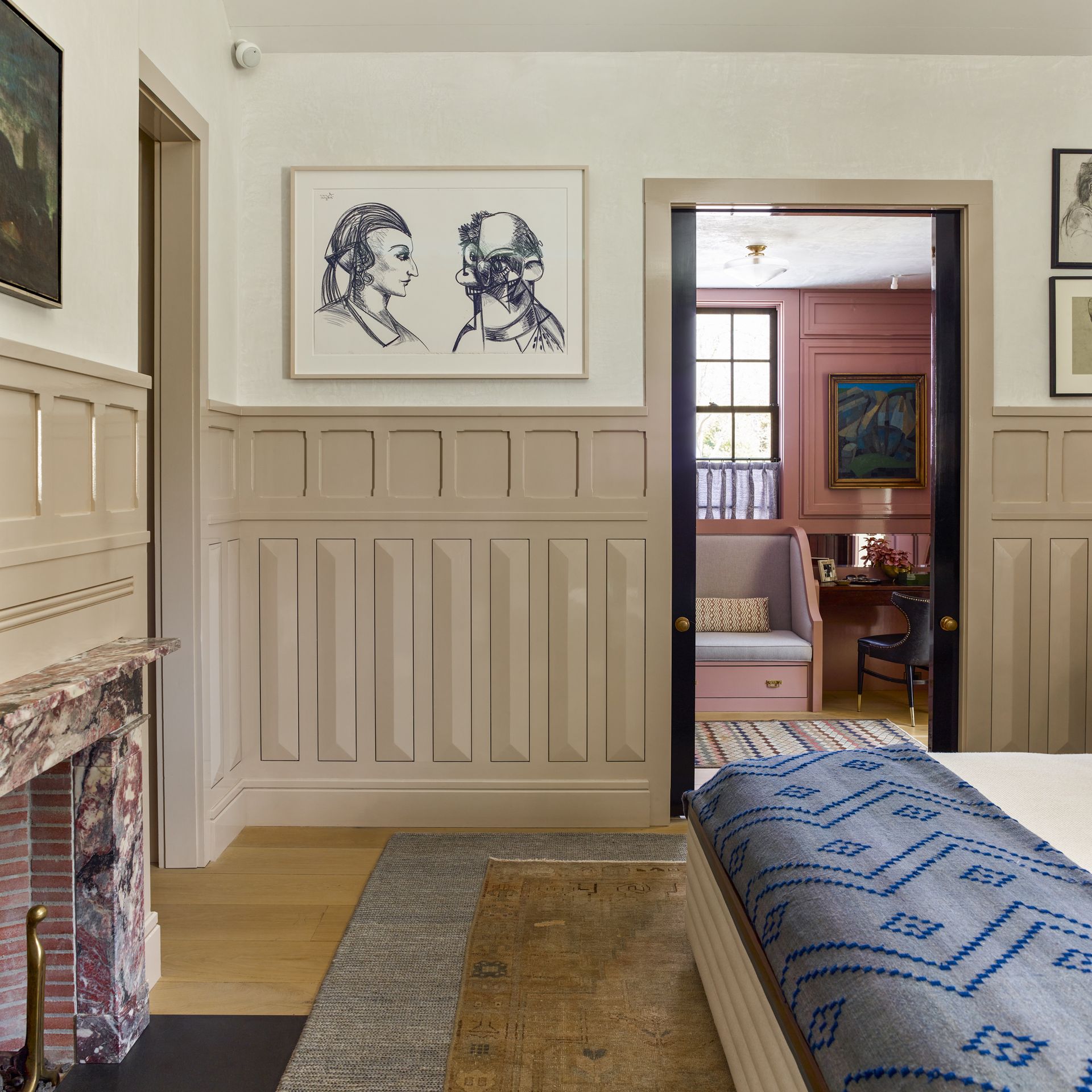
Nodding to their original function, you’ll often find wainscoting in gloss paint. As it's more durable than paints with less sheen, gloss paint adds yet another layer to wainscot’s function as a shield against nicks. But there’s also another perk: glossy wainscoting can also reflect light.
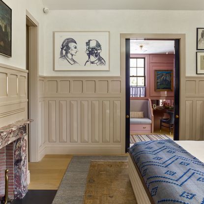
In the serene bedroom above, a bespoke wainscoting highlights modern shapes with elongated beveled panels. The layered design, painted in a pale beige gloss, serves a dual purpose. “We painted the bedroom wainscoting in high gloss paint to reflect light,” says designer Bryan Graybill. “In the East Hampton winter where the sun is low and the days are short the bevels help reflect and enhance the light.”
3. Pair traditional wainscoting with a modern wallpaper
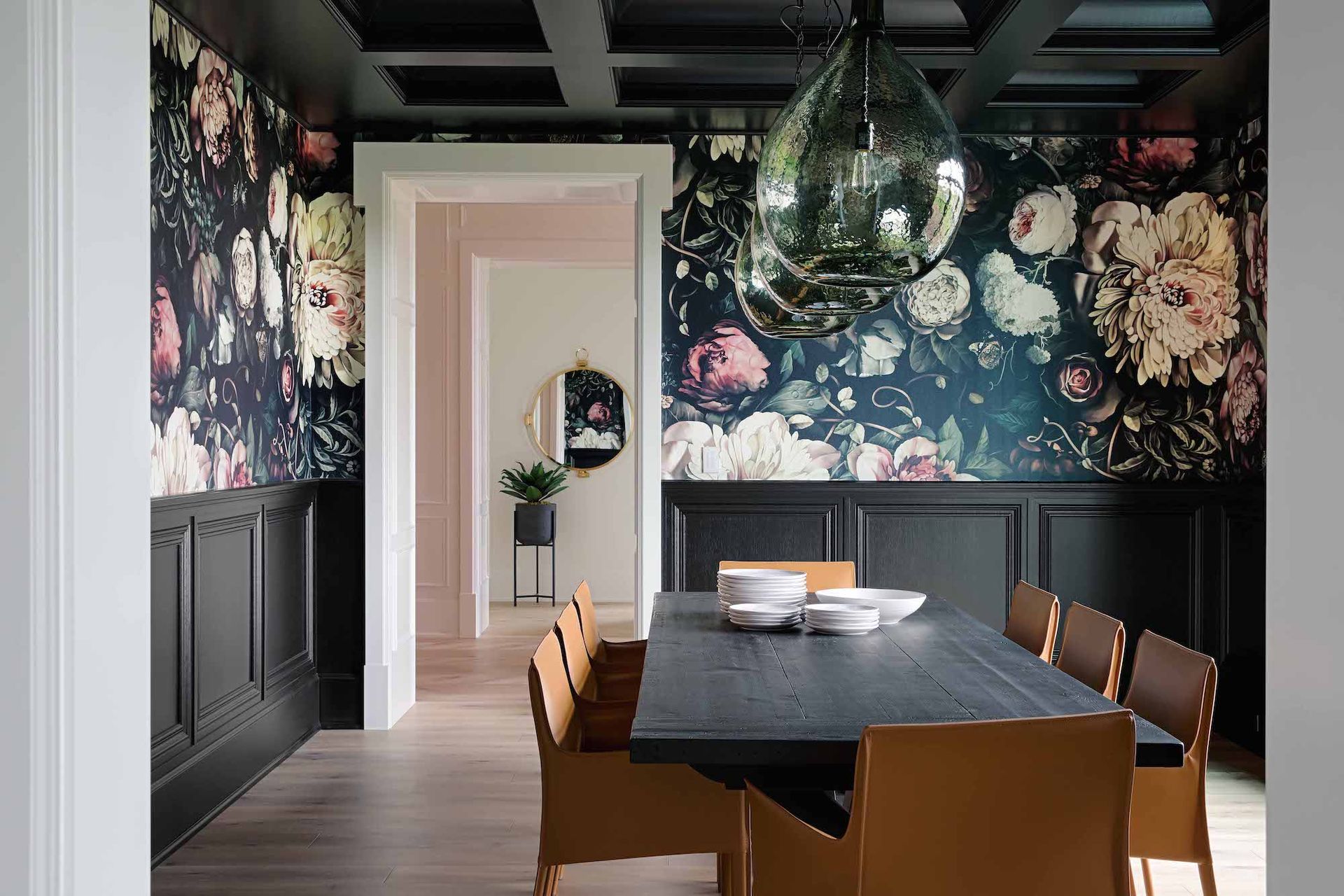
Wainscoting and wallpaper: not only do they sound lovely together, they work beautifully together, too. Painting or staining your wainscoting in a solid color works like an anchor for even wildly patterned wallpaper ideas, while the millwork acts like a frame, highlighting or contrasting existing colors from the print itself.
In the chic dining room above, a shaker panel wainscot works perfectly to balance out the raucous, oversized floral wallpaper. “The opaque black stain for this white oak millwork was selected from the wallpaper – we knew we wanted to create a moody and dramatic space and are thrilled with how this space came together,” says Alanna Dunn, interior designer at Reena Sotropa In House Design Group.
4. Use bold wainscoting to balance out an accent
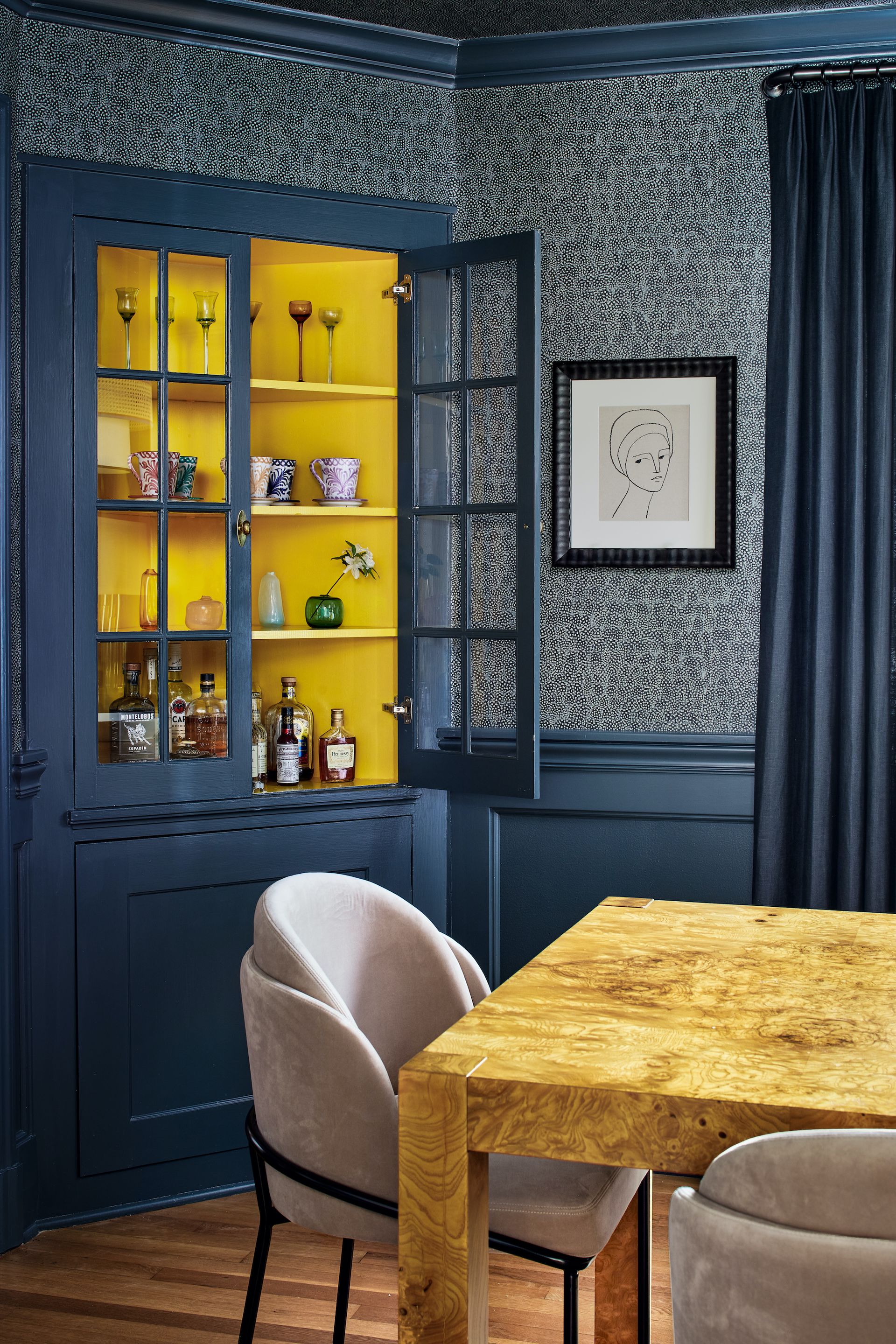
In the same way it can anchor a bold wallpaper or print, wainscoting can complement a bright accent wall. Using a paint that weighs down the scheme creates an opportunity for bright splashes of color elsewhere.
In the dining room above, a moody blue palette across the wainscoting, molding, wallpaper, and curtains work to contrast a bright splash of yellow. “In this space we were looking to create a pop that felt cohesive with the rest of the selections in the room,” says designer Zoe Feldman. “While the blue and green in the wallcovering and paint lean cool, the burl wood table and blush dining chairs offer a juxtaposition with warmer hues. Adding a warm pop of yellow to the inside of the built-in serves as a direct contrast to the moodier walls while still relating to the rest of the room.”
5. Contrast old and new materials
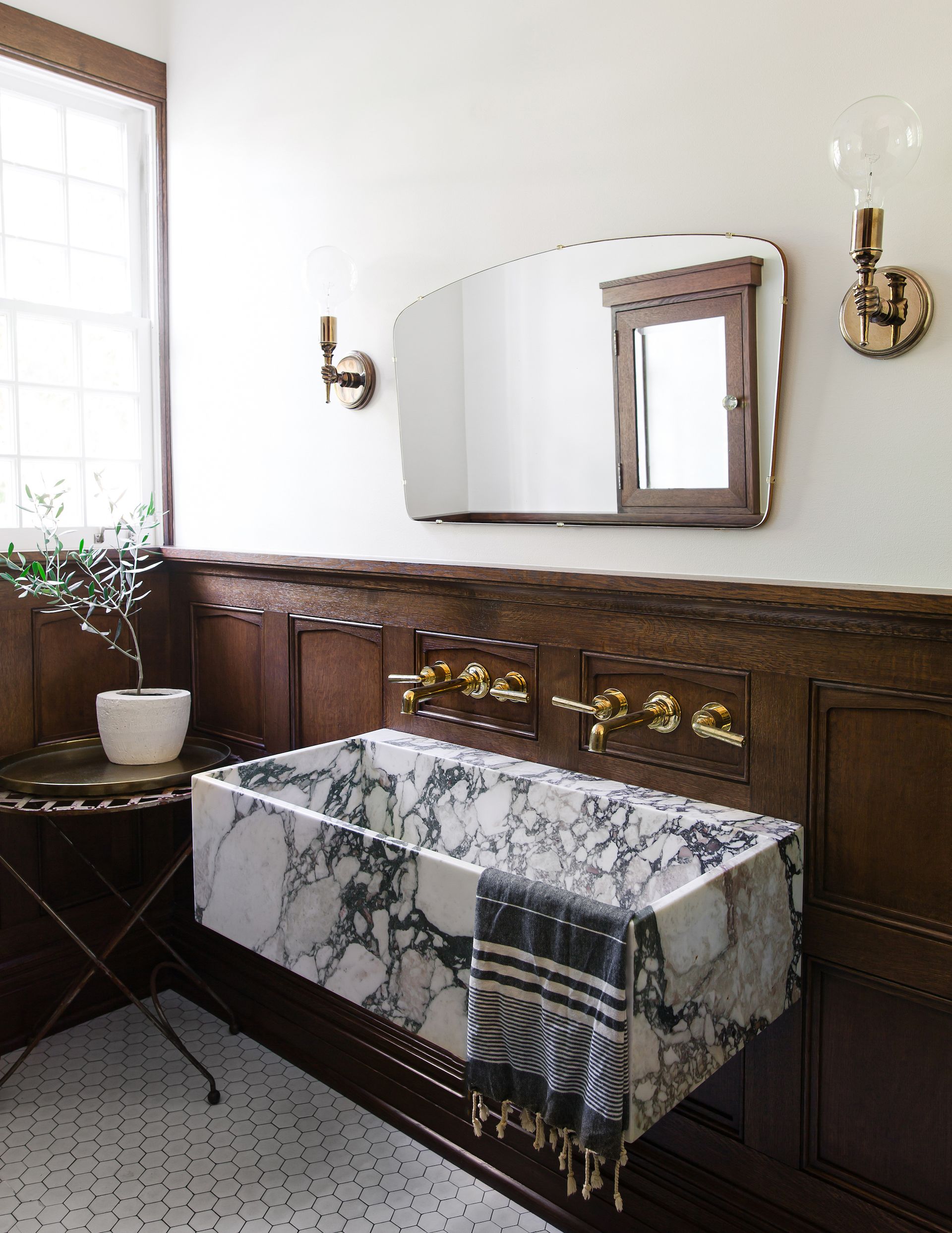
If you’re renovating an older home, original wainscoting has the tendency to lean a tad traditional. So, if you’re hoping to give your space a modern look, you can create contrast by juxtaposing classic wainscoting with contemporary materials and fixtures.
In the bathroom above, part of a 1920s Tudor style house, designers used wainscoting as a backdrop for modern accents and silhouettes. “We took inspiration from their Entry Hall existing paneling to install ‘new made to look old’ paneling in the bathroom,” says designer Lisa Staton. “But the sink is a bolder, clean lined shape to keep the bathroom feeling more fresh and modern, less old and fussy. Sconces and mirrors were also kept to simple shapes but with vintage pieces to have crisp clean lines while still having the warmth and patina of age and history to balance.”
6. Go all out with one color
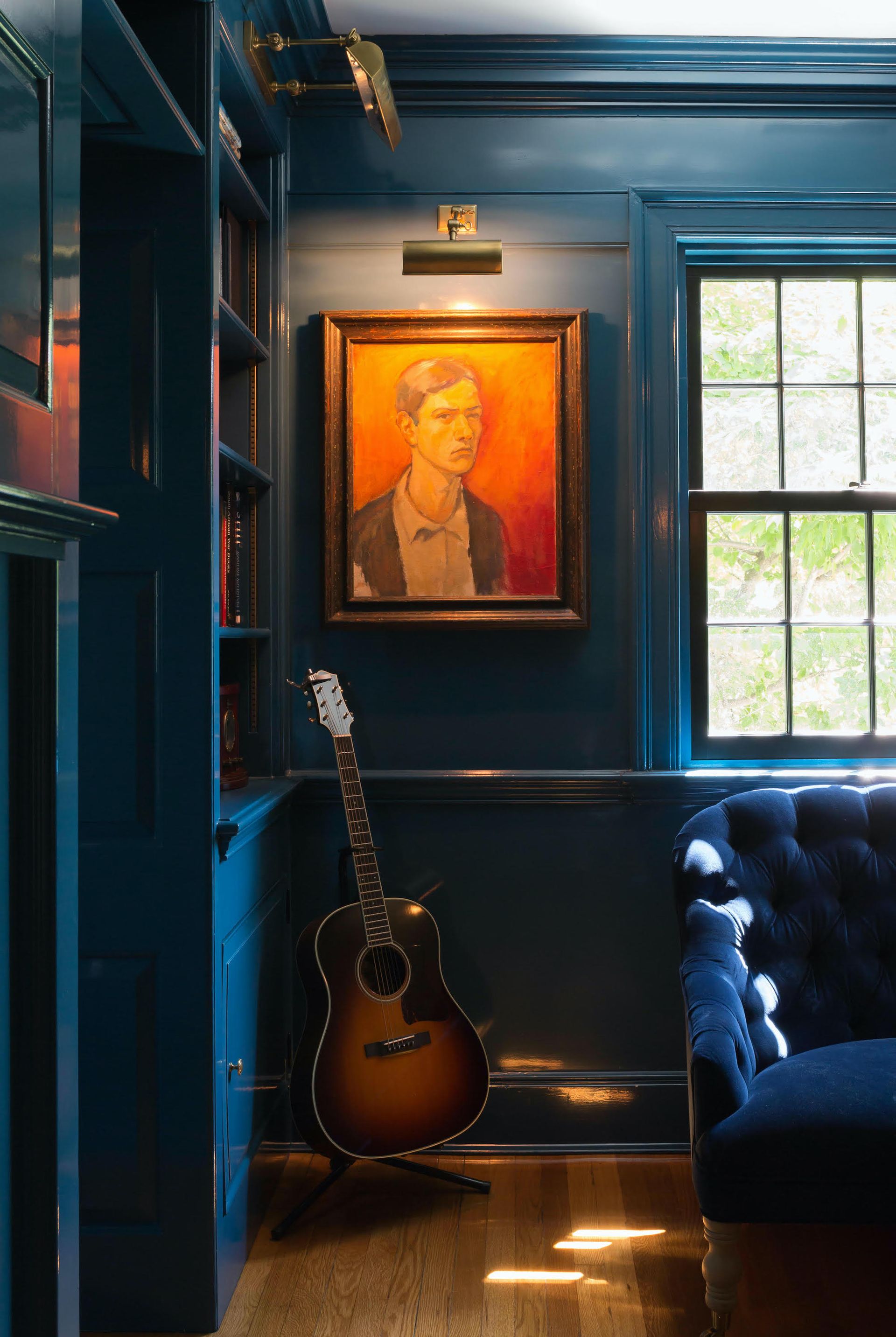
If you’re embracing the increasingly popular ‘color drenching’ trend, rooms with wainscoting offer a worthy canvas. Wood wainscoting breaks up an otherwise flat palette, offering a textural surface to apply the same color in a different sheen (like gloss paint). “Walls with wainscot can be painted all the same color but it still offers a layer of texture that organizes cabinetry and window sills while protecting walls from furniture scuffs,” says Jennifer Marsh of Mowery Marsh Architects.
In the handsome living room above, the same color in a variety of sheens pulls off a layered, monochromatic look. “Typically moldings and wood wall panels would have a sheen, either semi-gloss or high gloss as seen here,” explains Marsh. “Note that high gloss is best on trim in good condition as the reflectivity highlights all imperfections. Ceilings, plaster trim and sheetrock walls look best with a contrasting flat or matte finish.”
7. Go high to go big
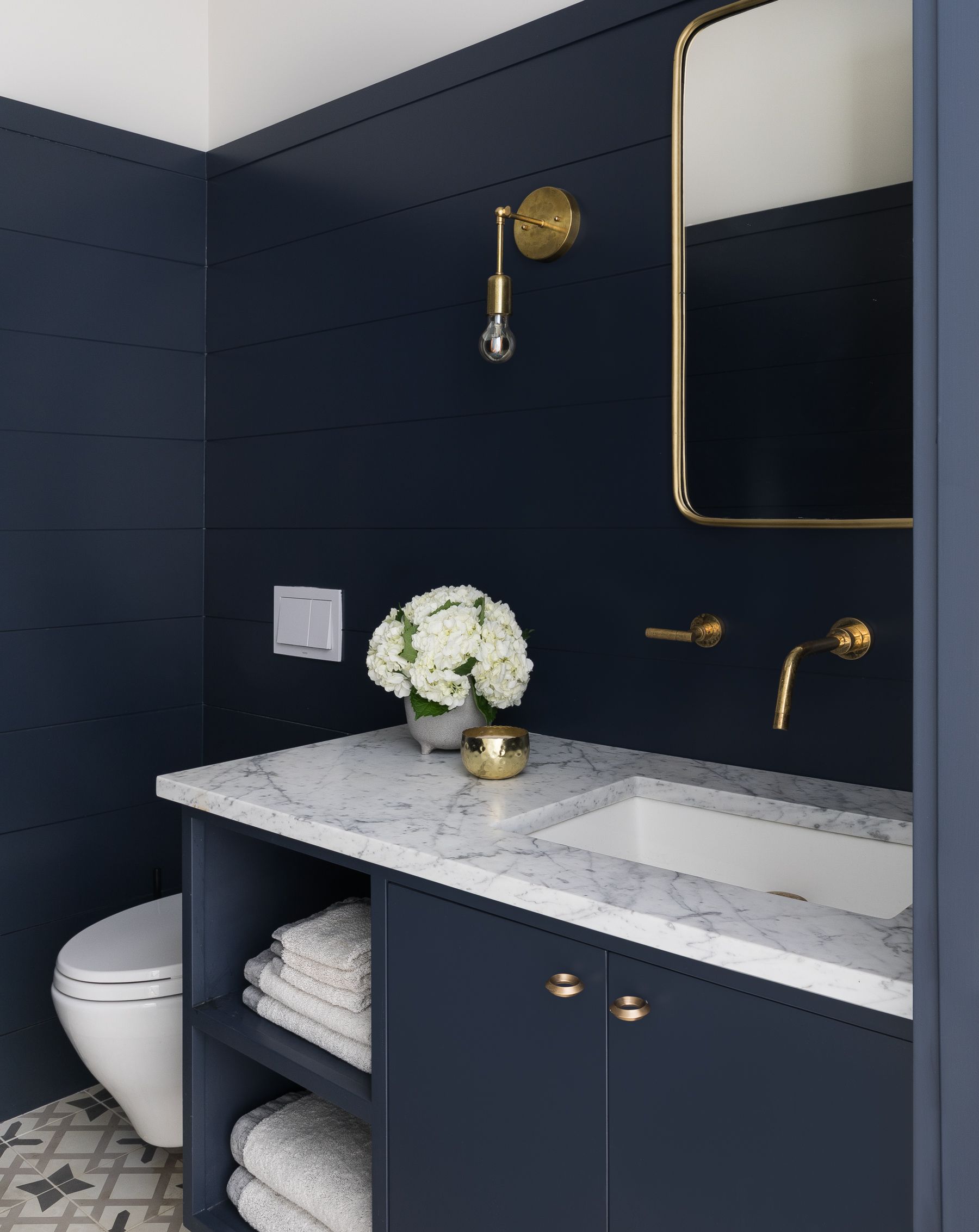
If you’re following all the rules, traditional wainscoting stops one-third of the way up a wall. But if you’re aiming higher, bringing your wainscoting up three-quarters of the wall isn’t just an aesthetic choice – it can also affect your perception of the room’s height.
“Wainscoting has the ability to trick our eye depending on its height and direction, making a low ceilinged room feel taller or by giving a tall space a sense of human scale,” explains Jennifer Marsh of Mowery Marsh Architects. “An approximate 2/3 ratio is more dynamic than cutting a wall in half vertically. For example, a low wainscot can give height to a space as it anchors the base but makes the upper wall feel more expansive, just as a high wainscot of bead board can draw your eye up to give a feeling of verticality.”
Marsh employed this ratio as a tall, dark and handsome bathroom idea in the interior above. “High wall paneling can make a room bigger, give better protection to the walls and in this case allows for a brighter upper wall and ceiling to keep the room feeling fresh and airy even with a dark color,” says Marsh.
8. Create contrast with playful, quirky decor
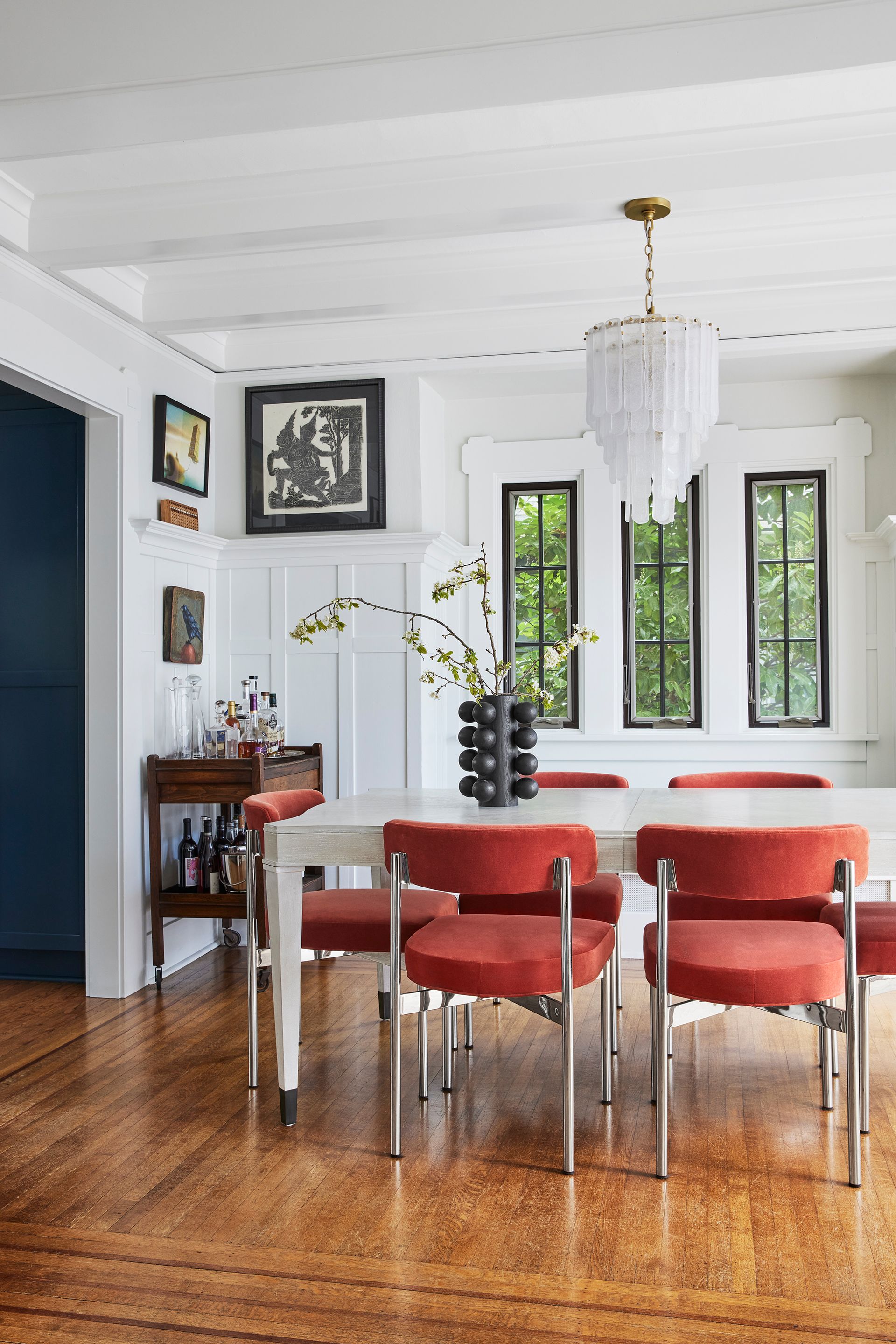
While wainscoting has the tendency to lean serious and old-school, you can easily lighten the mood with eclectic decor and furnishing. From modern ceramics with playful shapes to retro chairs with bold pops of color and even mismatched framed artwork, the contrast won’t be missed.
In the dining room above, designers livened up the space with handpicked decor. "We incorporated a rather eclectic design around the homes' original wainscoting to create a unique combination of quirky and traditional,” says designer Beth Dotolo of Pulp Design Studios. “With that being said, simplicity was key while painting over the texture, as we used a bright and modern white to seal the deal."
9. A simple painted line is affordable and durable
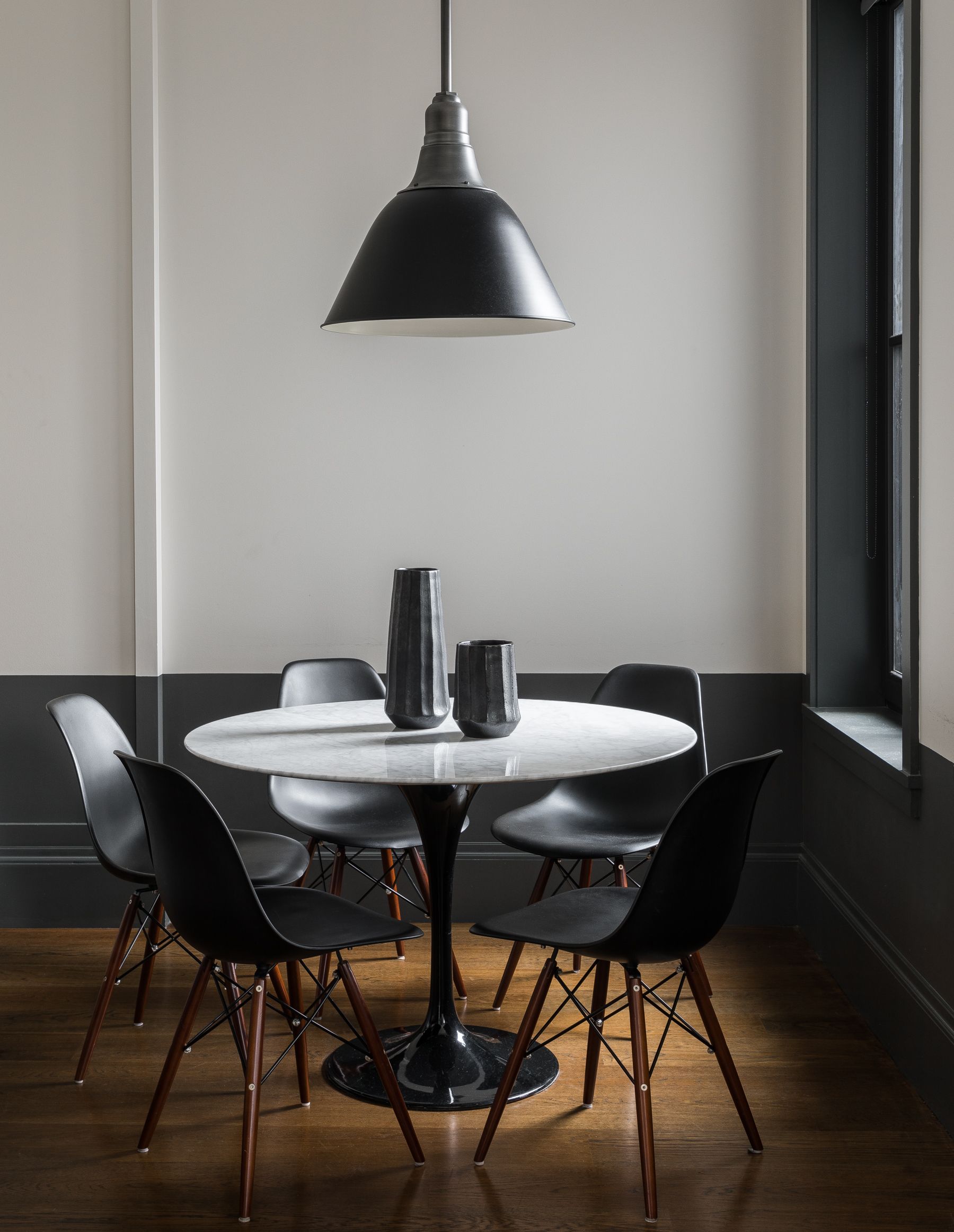
For the most minimal approach to wainscoting, a simple painted line does the trick (while tricking the eye, too). Like color blocking, choose a bold paint and ‘color in’ the area where wainscoting would be installed – it’s the most inexpensive wainscoting available.
In the above interior, dark grey paint skirts the breakfast nook, giving the appearance of wainscoting without a single panel. “[It] still anchors the room, gives proportion and scale to your walls and is a practical way to show less scuffs,” says Jennifer Marsh of Mowery Marsh Architects. “A common approach we saw on a family trip to Portugal, it offers a traditional European sensibility coupled with modern lines.”
Not sure where to paint the line? Let other architectural features guide the way. “We align it with window sills to give more ‘depth’ to the color and mass to the wall,” recommends Marsh. “We also run it across doors and the trim for continuity.”
10. Use wainscoting to create a crafty headboard
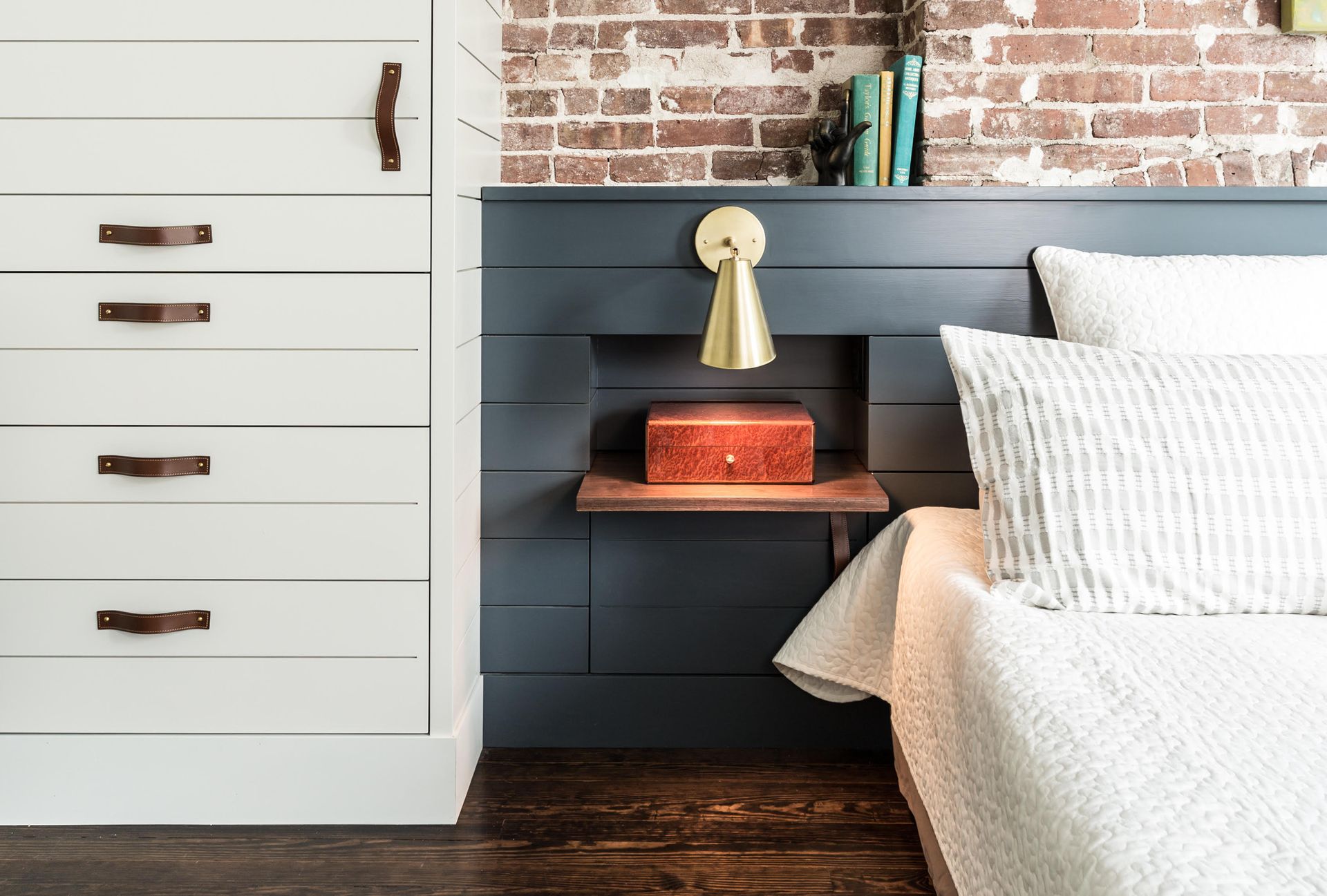
While wainscoting is a perfect kid’s room idea (where walls are easy targets for bumps and bruises), a riff on wainscoting also presents the opportunity to integrate built-in features and storage as a brilliant headboard idea for all ages.
In the crafty bedroom above, designers mimicked wainscoting to create a bespoke, space-saving headboard. “Convenient side tables integrated into the horizontal board detail of a custom headboard, visually organizes a bed wall where side tables would have been tight,” says Jennifer Marsh of Mowery Marsh Architects. “The smooth painted headboard relieves the heavy texture of the exposed brick and set at chair rail height, the datum could continue around the room as wainscot paneling for a cohesive look.”
11. Create an all-contemporary design
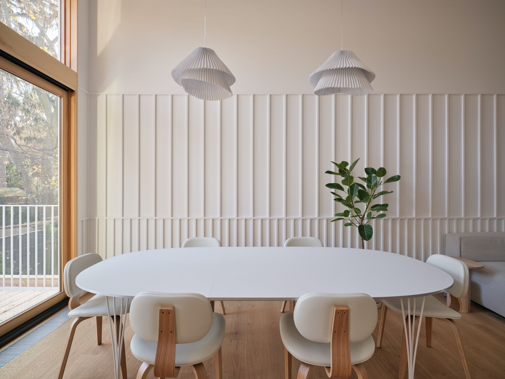
While there are plenty of traditional wainscoting types – from board-and-batten to beadboard and flat-panel designs – you can also go fully bespoke, creating your own wall paneling idea altogether.
So was the case for Odami, an architecture and design studio that created a minimalist wainscot for the beach house above. A slender riff on board-and-batten wainscoting complete with two tiers, their design reaches toward the high ceiling. "The interior design was rooted in elements typical of a traditional beach house — light, airy tones; the simple use of natural materials; and walls clad with painted wood paneling — reworked to reflect the contemporary taste and lifestyle of its owners," says Odami.
12. Break traditional with colorful wood patterns
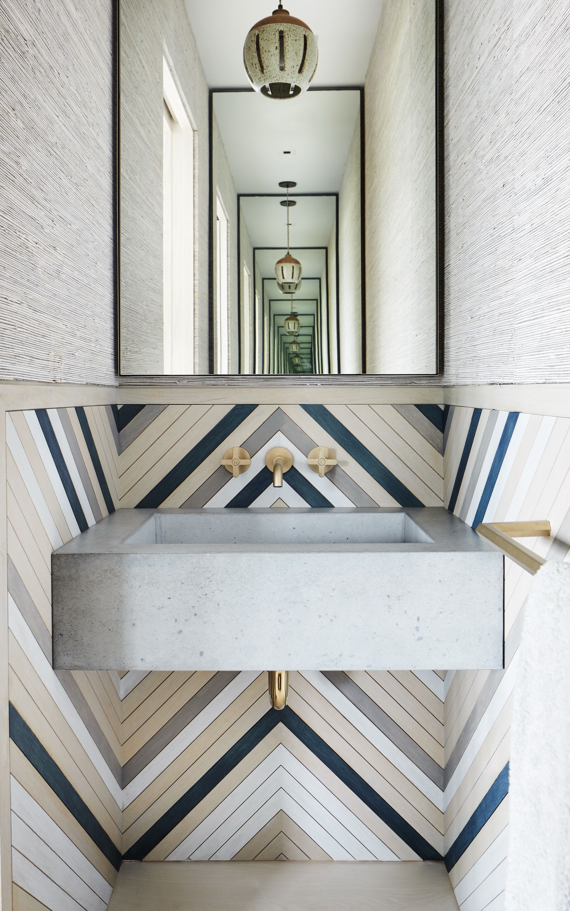
Taking it one step further, you can also play with geometry and woodwork to bring color and pattern into any space with a bespoke design. Case in point, the custom design above embraces a striking bathroom wall panel that turns a traditionally clinical space into a contemporary artwork.
While the wainscoting bears little resemblance to the types of traditional patterns used throughout history, it's all the better for it; stopping about midway up the wall, Workshop/APD installed thin wooden boards in various colors (white, blue, beige, and grey) that zigzag across the bathroom, hugging the sink with a modern dose of geometry.
Be The First To Know
The Livingetc newsletter is your shortcut to the now and the next in home design. Subscribe today to receive a stunning free 200-page book of the best homes from around the world.
Keith Flanagan is a New York based journalist specialising in design, food and travel. He has been an editor at Time Out New York, and has written for such publications as Architectural Digest, Conde Nast Traveller, Food 52 and USA Today. He regularly contributes to Livingetc, reporting on design trends and offering insight from the biggest names in the US. His intelligent approach to interiors also sees him as an expert in explaining the different disciplines in design.
-
 The 12 Best Table Lamps for Reading —I'm a Certified Bookworm (and Shopping Expert)
When it comes to table lamps for reading, I don't mess around. If you're the same, this edit is for YOU (and your books, or course — and good recommendations?)
By Brigid Kennedy Published
-
 "It's Scandi Meets Californian-Cool" — The New Anthro Collab With Katie Hodges Hits Just the Right Style Note
The LA-based interior designer merges coastal cool with Scandinavian simplicity for a delightfully lived-in collection of elevated home furnishings
By Julia Demer Published
