How can I make my entryway look more expensive? 5 small touches designers always use for a luxe first impression
Give your entryway more wow-factor with these surefire ways to introduce a luxury look
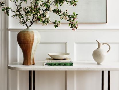

All too often, our entryways get overlooked and become a bit of a dumping ground for clutter. Typically small or narrow, and used solely as a transition space, we often overlook the entryway's potential to make an impact.
These small spaces should in fact pack a punch, welcoming guests and introducing the style of your home. Make your space feel luxurious and expensive with these top five entryway design pointers.
1. Go for a lighting fixture that packs a punch
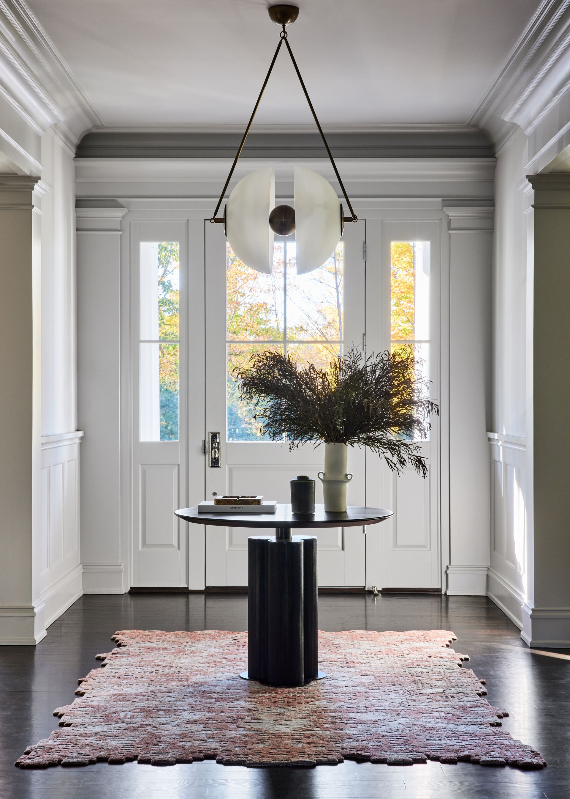
Lighting the entryway well is a surefire way to give the space a luxe feel. Because these spaces are typically so small, homeowners might feel more tempted to go for spotlights that don't take up any physical space, or LED lighting that is set along the crown molding of the ceiling, as opposed to larger statement-making light fixtures.
But if you're looking to make an impression, the aesthetics of the light fixture can have a profound impact. Go bold with a dangling pendant or an intricate chandelier, this will draw the eye upwards, helping to emphasize the height of the space and not the narrow width. Make sure you go for impact but don't go too big. The size of the pendant or chandelier should be proportional to the space. Make sure your pendant or chandelier doesn't dip too low either.
The hallway lighting should have 2-3 inches of height for each foot of ceiling height, so for an entryway ceiling that is 10 feet high, go for a chandelier or pendant that has around 20 or 30 inches height.
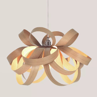
Tom Raffield Skipper Oak pendant
I love Tom Raffield's delicate wooden designs, and Anthropologie have just started selling them. Make an impact in your hallway with on of these on entry - it would look great in a minimalist entryway with a neutral palette.
2. Use a console table to create a decorative moment

Even if you have a small entryway or apartment entryway, it doesn't mean there is no room to be decorative. Long and narrow spaces call for a console table to really ramp up the luxury look. Place your console table flush against the wall and use the surface area to create a curated decorative moment to welcome guests into the space while establishing the style of your interiors.
'Regardless of the size of your entryway, it's a perfect place to create a visual moment in your home,' says Shauna Glenn of Shauna Glenn Design. 'Practically speaking, an entry table should have a lamp, a bowl for keys and change and a mirror for last-minute reviews before heading out the door. As a design vignette in your home, an entry table provides an opportunity to have a little fun.'
When it comes to how to decorate an entryway table, think about curating the perfect vignette by mixing and matching objects of varying heights, including interesting shapes and items that are personal to you, and remember the power of the odd number. A candle might be a nice decorative addition, and can also bring a sensory experience to a corridor.
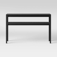
Warwick narrow console table
This inexpensive console table from Target is a great buy. Long and slender, it gives you a chance to display your favorite things for guests to enjoy as they come into your home, and it's also available in wood if you want something that calls to nature.
3. Embrace boldness

All too often, we go neutral and minimalist in our entryways, fearful that anything too strong will highlight how these areas of the home typically tend to be small and narrow spaces. But making an impact can really help to make the space feel luxurious and high end. 'While powder rooms have seen a bold transformation in recent years, entry foyers have remained bright and airy, with most designers thinking this space needs to be light-colored to appear bigger and create a traditional welcome' says Andrew Bowen, partner of Ash NYC.
Instead, going bold could be the best color for entryways, and a great way to impress guests. In this example, at The Astor, a circa 1901 home on Manhattan's Upper West Side, Andrew paired historic pre-war details with modern upgrades.
Ash designed the home with contemporary yet timeless pieces to balance the traditional layout, but took a bold spin on the entry. Bowen says painting the hall in this near-black moody grey 'adds intrigue to a space that might otherwise be overlooked.'
'Hallways are often overlooked, but we thought of this entry foyer as a defining characteristic, the artery that connects every room in the home,' says Andrew. 'We elevated this hallway by painting it a luxurious, near-black color — Midnight Oil by Benjamin Moore — which adds drama and mystery, creating a moody yet incredibly elegant experience balanced by the lightness in the rest of the home.'

Midnight Oil by Benjamin Moore
This inky, bold shade has a luxuriousness and depth to it that could make quite a statement in your entryway. While it looks like a black color it's actually more of a deep, dark blue.
4. Use your wall as a space to exhibit framed prints

Keep things interesting in your entryway by using the wall space as a new home for a collection of wall art or a gallery wall. A collection of independent art or your favorite prints in beautiful frames makes the space highly personal. Don't be afraid to go large to introduce a luxe look like this impactful piece selected for the entryway of this San Francisco home designed by ABD Studio.
'For the hallway of a recent project, we wanted to create a space that was modern but timeless - playfully understated - which would set the tone for the rest of the space,' says Sophie Ashby, founder and creative director of Studio Ashby. 'As you enter, you're immediately met with the energy and rich color of Ben Crase's 'The Alarm Was Set', flanked by two of Gubi's 'Cobra' wall lights.'
5. Focus on decluttering

Entryways in the everyday home are small and intimate spaces that don't typically accommodate more than one or two people at a time. While they're small spaces, they are tasked with doing a lot. To make your entryway feel like a luxurious space, you want to create a space for a peaceful transition from the outside to the inside.
The luxury look starts with decluttering the space. 'The hallway is the first space we see when we enter a home,' says Jo Littlefair, co-founder and director at Goddard Littlefair. Having a place for everything is absolutely critical. Look for unobtrusive places to put shelves, and possibly some hallway furniture to make it easier for you and guests to de-robe and store things neatly.'
Think about clever storage that doesn't encroach on the space too much. Benches with under-seat storage, making use of the walls with hooks that can look like a fun piece of wall art when not in use like this example from Studio Nato.
'A small mirror is an essential item on the route out of the house, ideally with a small shelf for a pen, hairbrush or lipstick. Children will unintentionally overwhelm you with coats and school bags, I’ve designed furniture pieces for the home to hide these items as much as possible!'
Be The First To Know
The Livingetc newsletter is your shortcut to the now and the next in home design. Subscribe today to receive a stunning free 200-page book of the best homes from around the world.

Oonagh is a content editor at Livingetc.com and an expert at spotting the interior trends that are making waves in the design world. Writing a mix of everything and everything from home tours to news, long-form features to design idea pieces on the website, as well as frequently featured in the monthly print magazine, she's the go-to for design advice in the home. Previously, she worked on a London property title, producing long-read interiors features, style pages and conducting interviews with a range of famous faces from the UK interiors scene, from Kit Kemp to Robert Kime. In doing so, she has developed a keen interest in London's historical architecture and the city's distinct tastemakers paving the way in the world of interiors.
-
 These 12 Best Table Lamps for Your Desk — Perfect Glows for a Creative Home Office
The best table lamps for your desk is have a soft, targeted glow. Elevate your WFH set-up with these stylish picks endorsed by Style Editor Brigid Kennedy
By Brigid Kennedy Published
-
 The Nespresso VertuoPlus is 30% Off for President's Day, and it's Kim Kardashian's Coffee Maker of Choice
This sleek and stylish coffee maker was spotted in Kim's home bar, and you can currently save $60 if you buy yours from Amazon
By Lilith Hudson Published
