5 colors to paint your entryway interior designers swear by for the best first impression – and the one to avoid
Looking to create a bold first impression or welcome guests to a calming space? Color is key, and these are the best tones to try at home


Choosing the perfect shade for your entryway can throw up quite a conundrum. Typically narrow spaces lacking in light, our entryways often get forgotten and overlooked, when really they present the perfect opportunity to inject some personality into a small space and create a warm first impression.
'They are often the darkest room in the house with filtered light coming through from other rooms rather than a generosity of natural light permeating the space,' says Patrick O'Donnell of international paint brand, Farrow & Ball. 'But fear not, lean into it and just remember a few basic rules.'
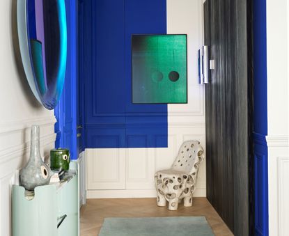
When it comes to the best entryway colors, sometimes going loud and bright can really pay off, bringing personality to your home and creating an impression. Meanwhile, classic and more neutral tones on your walls might also create a calming feeling when entering the home. It's all about the mood you want to evoke when you enter a space.
To help you pick the best color for your entryway, we've spoken to interior design experts who have selected these five colors as the go-to trending shades.
What are the best colors for entryways?
'In the real world, color does not exist if there is no light, and even if there is light, color is only our perception, so it depends on what kind of space we have, do we have windows or not, or whether the area is enough large or very tiny,' says Rusudan Tumanishvili of The Wall Design Studio.
'Before you start picking paint and swatch your walls, it’s important to analyze space’s qualities like the amount and direction of light coming from outside into your area. Are we looking for warm or cool tones, or will the homeowner wish for any accent colors? Also, paying attention to whether the room has enough natural sunlight to choose any color is essential. After getting all the answers, it's time to pick your ideal shade.'
1. Green

In one shade or another, green is always on trend. We've seen an obsession with forest green as well as silvery sage tones, but as trends come and go, you can bet that any green shade will give a timeless look to your hallway.
‘I always like to make a moment out of the welcoming area, to keep it separate than the rest of the home and make it feel more private,' says Lucia Galeano of Studio Galean. 'Usually darker tones can set an intimate mood. Lately, I have been using muted green a lot,’ says Lucia.
Going darker with your green will make your hallway seriously stand out too. 'Go with the flow and consider darker colors,' says Patrick O'Donnell of Farrow & Ball. 'Halls are transitional spaces so making a bold statement can be great fun - dark greens or near blacks will all add drama and create a great backdrop for pictures such as a stair flight gallery wall.'
If you don't want to go too dark, consider taking your dark green up to the height of your dado rail - this can provide interest and break the space up nicely.

Green 09 by Lick
This sage colored green is light and balanced, with yellow and grey undertones and a matt finish. It's super soothing and can create a tranquil welcome into your home.
2. Off-white

If you want something that feels calming and airy, going light and for a neutral color scheme is a timeless option. A simple beige can feel warm - with those brown undertones - yet tranquil and calming.
'First impressions count. Allow the tones in the entranceway to coordinate with the rest of the house,' says Jacqui Mitchell, interior designer at Twill Interiors.
'Off-white neutrals work with most color palettes and will make a space feel bigger. Perfect for entranceways without a lot of light.'
If the entrance is small, consider painting skirtings, architraves and coving a couple of shades lighter than the walls. This will expand the look of the space. 'Keep it neutral - off-white, but not cream,' says Jacqui. 'Alabaster by Sherwin Williams is a paint that work well.'

Off-white by Farrow & Ball
This mid tone off white is timeless classic. Its underlying green gives it an edge, pairing beautifully with natural materials and bouncing light around your entryway.
3. Pink

If you want to introduce some warmth - opt for light pink. 'Colors that have an underlying red or yellow base through them from gentle neutrals such as Farrow & Ball's String or romantic pinks like Templeton will add just a hint of warmth,' says Patrick.
Pink is the perfect tone also because it has the perfect amount of color and saturation too, handy in such a busy part of the home. 'Entranceways can be high traffic areas with busy families. Use a wall color with enough of an undertone to hide the occasional dent or bash,' adds Jacqui.
This entryway area designed by Shawn Henderson Interior Design perfectly exemplifies why pink is the perfect entryway color, it omits a slight glow and warmth to a space that can often feel empty.

Muted blush paint by Graham & Brown
I love this muted pale pink from Graham & Brown, with just enough warmth to bring a glow to the room, but nothing too rosy or sugary.
4. Earth tones

Another way to create a calming entryway is to go for darker earth tones that call to nature. 'We love to use earth tones like warm browns, muted and soft terracotta,' says Amy Hart of The Little Brick Studio.
'Earth tones bring a natural and grounded feel to the entryway. They evoke a sense of calm, warmth, and coziness, providing a welcoming atmosphere.'
To bring the space to life, complement the color choice with natural materials. 'We often suggest indoor plants to compliment this style of entry, either within the space or via adjacent glazed areas.'

Virtual Taupe SW7039, Sherwin Williams
This calming earthy brown grey shade creates a nature-inspired aesthetic. Take it monochromatic and across the ceiling for even more of a cocooning effect.
5. Light blue

Light blue is a color that is replacing grey as a hallway staple. In a light form, it can feel welcoming and cheery, instead of cold and sterile, while the grey tone we've been painting on our walls for decades feels like a drab alternative.
I love the trend of taking it monochromatic, wrapping the hallway paint around the ceiling, and painting the crown molding as seen in this entryway painted in Farrow & Ball's Selvedge.
'Blue tones create a cool and clear look and the atmosphere of work and meditation enlarges the room and decreases appetite. Calm, secure, comfortable, noble, but a little melancholic,' says Rusudan.

Selvedge by Farrow & Ball
This shade of denim blue has a grey tint to it. In low lights it feels moody, but when flooded with light you can really see the blue come through.
What colors should I avoid?
Sometimes we want our entryways to deliver a bold look, but picking strong colors like red can often be a little overwhelming for a small entryway.
'Red is known to increase appetite, heart rate and blood pressure but sometimes it gives aggressive vibes,' says Rusudan Tumanishvili of The Wall Design Studio. 'It's better to use it for accent, not for the base.'
Be The First To Know
The Livingetc newsletter is your shortcut to the now and the next in home design. Subscribe today to receive a stunning free 200-page book of the best homes from around the world.

Oonagh is a content editor at Livingetc.com and an expert at spotting the interior trends that are making waves in the design world. Writing a mix of everything and everything from home tours to news, long-form features to design idea pieces on the website, as well as frequently featured in the monthly print magazine, she's the go-to for design advice in the home. Previously, she worked on a London property title, producing long-read interiors features, style pages and conducting interviews with a range of famous faces from the UK interiors scene, from Kit Kemp to Robert Kime. In doing so, she has developed a keen interest in London's historical architecture and the city's distinct tastemakers paving the way in the world of interiors.
-
 The 12 Best Table Lamps for Reading —I'm a Certified Bookworm (and Shopping Expert)
When it comes to table lamps for reading, I don't mess around. If you're the same, this edit is for YOU (and your books, or course — and good recommendations?)
By Brigid Kennedy Published
-
 "It's Scandi Meets Californian-Cool" — The New Anthro Collab With Katie Hodges Hits Just the Right Style Note
The LA-based interior designer merges coastal cool with Scandinavian simplicity for a delightfully lived-in collection of elevated home furnishings
By Julia Demer Published

