How can I make my small bathroom feel more minimalist? 10 design tips to reduce clutter in tiny spaces
Small bathrooms are prone to feeling cramped and cluttered, but with these tips from designers and declutterers, you can make yours a more minimal space
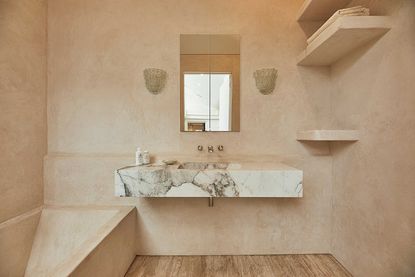

To help your small bathroom feel organized and uncluttered, the minimalist style is the way to go. This interior design style focuses on a clean and pared-back look, enlists the help of a neutral palette to help your room feel relaxing and stress-free. It's about streamlining your design and keeping things uniform.
‘It’s difficult to achieve a designer look if there your lotions and potions strewn around,’ says Emma Joyce, brand manager, House of Rohl. Storage then, evidently, is part of the process of making a small bathroom less cluttered.
But it's also about balancing the elements and making sure nothing takes up too much visual space. 'Too many elements in a small bathroom will create visual clutter too, leading to the experience of an even smaller space,' says architect Cagla Akguner-Taylor of Cheg Architecture. With this in mind, we've come up with some modern bathroom ideas to help you keep a small bathroom look and feel minimalist.
1. Maximize the vanity cabinet to tidy away bathroom clutter

First up, tackle the bathroom vanity cabinet - an optimum tool for storage in a small space that will help you achieve your minimalist bathroom goals. Choosing a vanity with ample storage space, and hidden compartments is a game changer in a small bathroom. This may sound obvious to some, but the trick is to find a piece with deep-tiered drawers and built-in compartments.
The first step to organizing is to pull everything you have out and start again, recycling anything that you don't use or haven't used - you'll be surprised about how much space you reclaim after this task alone. Remember your storage organizers too, ideal for a small bathroom where you can store multiple items on a layered surface. Giving everything its rightful compartment means you're unlikely to fall back into the habit where you end up throwing near-empties back into the cabinet out of ease.
What's more, 'keeping vanity units off the floor gives the illusion of greater space in a small bathroom,' adds Stephanie Dale of Studio Webster Dale. Here, this design from Cheg Architecture have done just that - meaning you get storage and space all at once.
2. Go for a mirror-fronted cabinet

The cabinet above the sink is also a perfect place for extra storage. If you can combine it with a bathroom mirror, as Labscape have done in this penthouse apartment in Brussels, it's a genius way of combining form and function. 'Mirrors are incredibly good at brightening up a room by reflecting light,' says Emma of House of Rohl, so mirroring an entire wall helps make the room feel bigger, and you've got extra space for storing those excess toiletries at the same time.
3. Make use of small niches into the shower

Niches are a great little hack in the bathroom. They can make for an aesthetic architectural function, and is a simple way to use the space we have readily available to us. 'Typically, bathroom niches are created by framing out and then carving back into it,' says Tom Klaber, founding partner of K-da, the boutique architecture and design firm specializing in contemporary high-end bespoke residential in and around New York.
'In the case of this shower, we worked to capture the space above the foundation wall to create a ledge; then ran this ledge aligned with a traditional niche in the back of the shower.'
4. Fit shelves in alcoves

Another small storage solution is open bathroom shelving, which can make for a smart addition and can provide a surface for you to have fun with the aesthetics of the room, adding pretty potted plants that thrive in a bathroom environment, and candles and beautiful bottles that make the room feel more of a relaxing space.
‘I love incorporating storage into the heart of the design,' says the principal and designer of MR Interiors, Michald Rubin. 'Mounting floating shelves on walls and using them for small folded hand towels, extra toilet paper, lotions and potions. Shelves create storage, and also depth and design into a space.'
Incorporating the shelving into an alcove means no exposed edges stick out into the room and make it feel more claustrophobic. The shelves are compact within the wall so you can store everything you need in a neat and organized way.
It might also be wise to invest in containers or cute wicker baskets to house toiletries if you find too much build-up on the shelves - this will keep the space uncluttered and orderly.
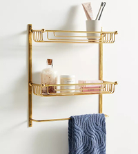
Maison two tier bathroom shelf, Anthropologie
This cute shelf from Anthropologie will make for a quick fix if you're needing some extra shelf space. In gold it'll add a touch of glamor to the space and also has a handy bar for hanging a hand towel.
5. Install cabinets that stretch to the ceiling

Make the most of the wall space you have with closed bathroom cabinets that stretch all the way to the ceiling, maximizing the space. 'Bathroom cabinets only need to be narrow and building to the ceiling maximizes the storage opportunity,' says Stephanie, 'allowing you to remove clutter and keep it clean and tidy.' Also consider combining your custom cabinetry with a wall-hung WC for an even sleeker look.
'Bathroom cabinets don't have to be boring,' Stephanie adds. 'We chose a bold terracotta color with fluted panels for our bespoke storage units to tie this scheme together and inject some personality.'
6. Eliminate visual clutter

Too many things going on in the bathroom cause visual clutter that will make a small room feel cramped. 'Ensure the space feels clutter-free and calm with details concealed cisterns, a wall recess and frameless shower screens,' says Cagla of Cheg Architecture. 'This will eliminate visual clutter and allow the bathroom to breathe and feel more spacious.'
As well as boxing off and concealing certain details hink tactically and ensure your bathroom lighting takes up as little visual clutter as possible too. Go for recessed bathroom lighting in the ceiling and consider wall lights make. These make for a nice addition, coming off the wall or ceiling to light the zone by the mirror. These can be a nice design feature too, as seen here in this elegant swan-like light fixture by Regan Barker Design.
7. Decant supplies into more cohesive containers
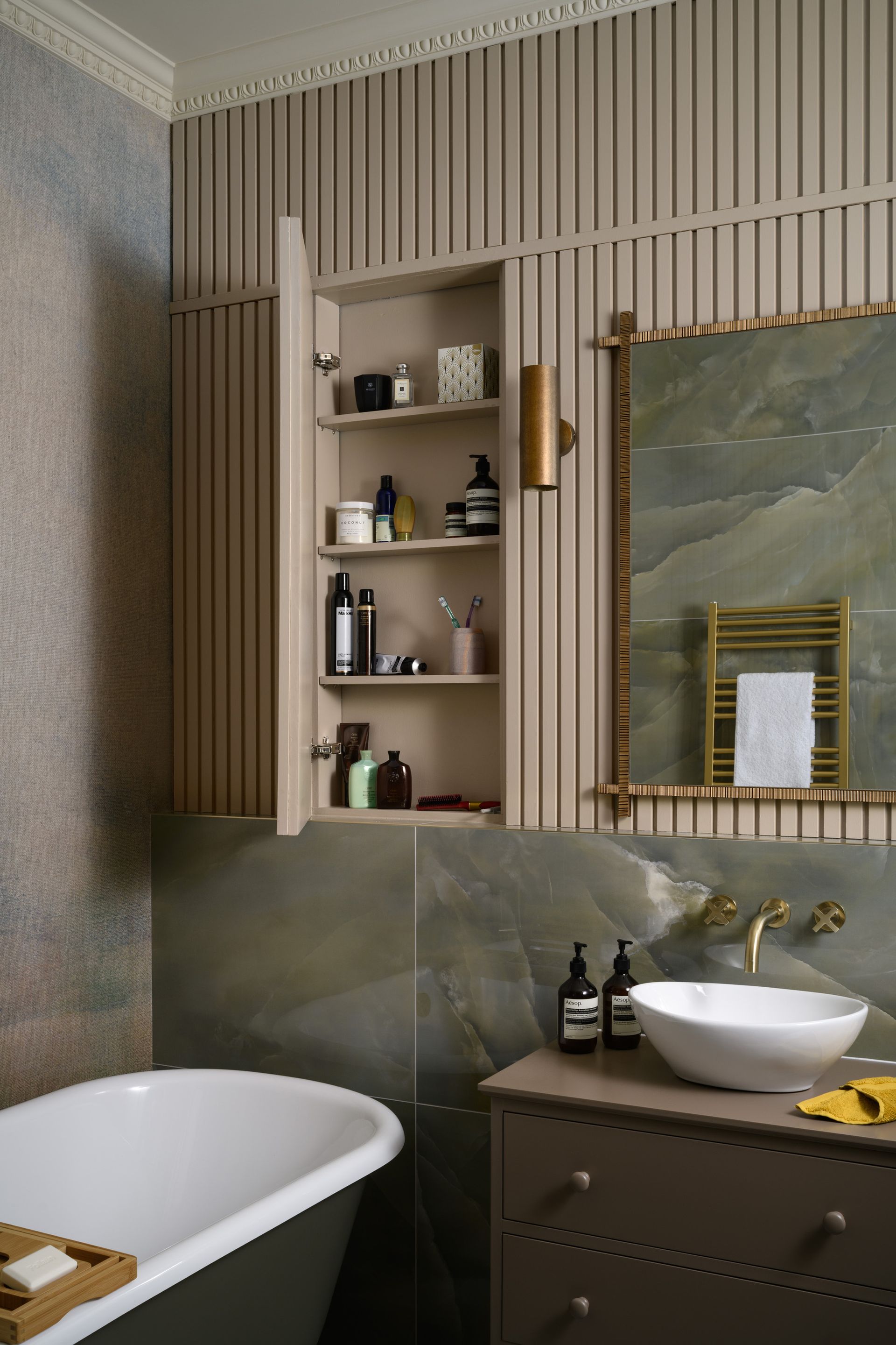
Think about how to organize your toileteries and organizing bathroom cabinets. 'When easy-access storage is too limited to accommodate all the items you use daily, I recommend decanting items into smaller containers to save space and keeping your full stock of products in a less prime location,' says Meredith Goforth, professional organizer and founder of House of Prim.
'For example, put a handful of Q-tips in a small glass jar and give the family-sized value pack a home in a closet!' Refillable bottles are a good addition to an eco-conscious household.
Make sure the bathroom decanter bottles you used are uniform in style to avoid visual clutter, rid the space of those bright-colored packaging that might jar with a calming design. We like amber glass bottles that give a spa feel, just don't forget to label to avoid mixing the shampoo and conditioner up.
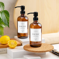
2-pack amber glass soap dispenser, Amazon
Super cheap but with an expensive feel, these amber glass dispensers from Amazon are a steel and will have you feeling super organized.
8. Keep the color palette pared-back
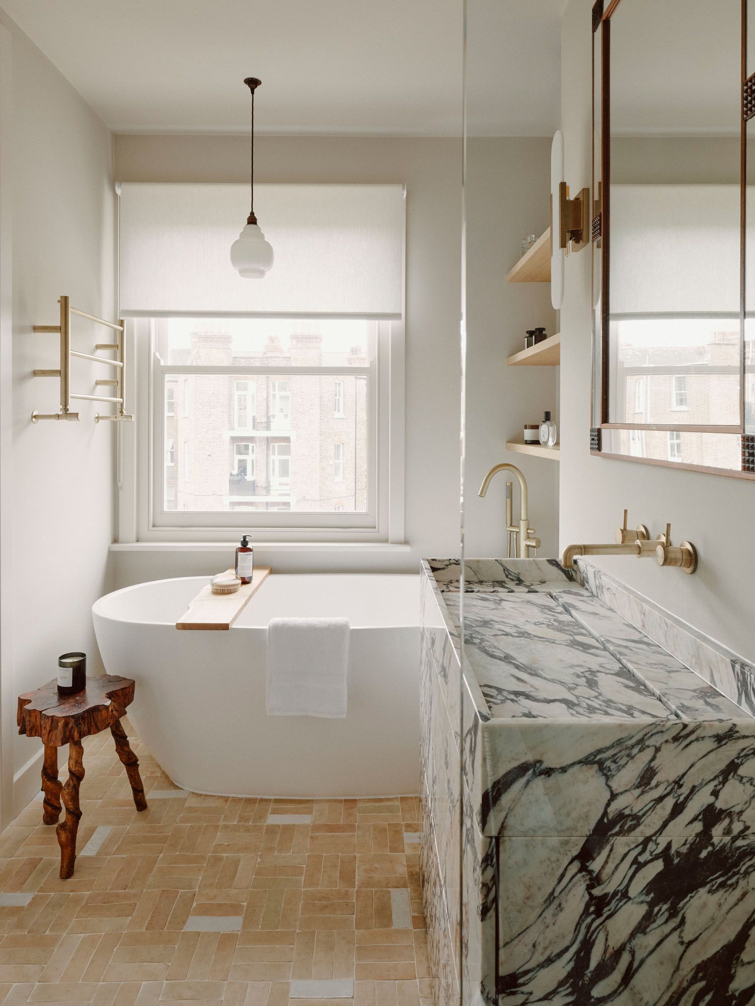
A simple way to create a more minimalist space is all down to the color palette of the room. If you keep the space neutral and pared-back, it will feel organized and uncluttered. Make sure linen colors coordinate for a clean and put-together look, and remember that lighter neutrals can help a small space appear brighter and more open in small spaces.
This beautiful design by Atelier Ochre has a restricted palette in a small space that makes it feel like a stress-free environment.
9. Chose fixtures with clean lines
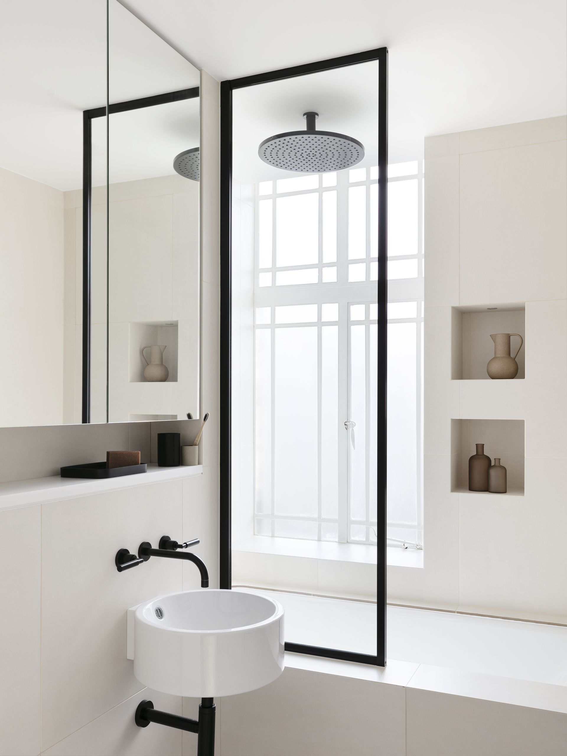
Choosing fixtures and fittings that are unfussy and fit your minimalist aesthetic is key to making a space feel less chaotic, especially in an area like a shower, where various door openings and sliding mechanisms can ruin your sleek aesthetic.
This could meaning opting for a simple walk-in enclosure, or choosing a design without a frame so that the glass shower screen fades into the background .
For this small bathroom shower and bath combined, a simple shower screen brings the overall scheme together, without adding visual clutter to this modern and minimalist space.
10. Unify the space with one material

There are many types of material used to bring texture to a modern bathroom, but to help clear the visual 'noise', reducing this down to a limited palette can help. For a space like a bathroom, this could mean looking to a wall finish like tadelakt, a Moroccan, waterproof plaster, that can be used across all surfaces, as in the small bathroom by Huxley Architects.
'The brief for the bathroom aesthetically was to create a space with a sense of relaxed luxury with a focus on natural, artisanal finishes,' explains Richard Huxley, founder of Huxley Architects. 'Tadelakt lime render was specified for the walls and bespoke bath to limit the palette of finishes in order to allow conversation between the texture and tonality of marble, travertine and tadelakt to take place.'
Spatially, the brief required that the bathroom felt as large as possible, too. 'In a small space this is very hard to do - to create a sense of space greater than the physical constraints allow.' However this reduced use of material helps the small bathroom look bigger and less cluttered by blurring the boundaries of the walls.
Be The First To Know
The Livingetc newsletter is your shortcut to the now and the next in home design. Subscribe today to receive a stunning free 200-page book of the best homes from around the world.

Oonagh is a content editor at Livingetc.com and an expert at spotting the interior trends that are making waves in the design world. Writing a mix of everything and everything from home tours to news, long-form features to design idea pieces on the website, as well as frequently featured in the monthly print magazine, she's the go-to for design advice in the home. Previously, she worked on a London property title, producing long-read interiors features, style pages and conducting interviews with a range of famous faces from the UK interiors scene, from Kit Kemp to Robert Kime. In doing so, she has developed a keen interest in London's historical architecture and the city's distinct tastemakers paving the way in the world of interiors.
-
 The 12 Best Table Lamps for Reading —I'm a Certified Bookworm (and Shopping Expert)
When it comes to table lamps for reading, I don't mess around. If you're the same, this edit is for YOU (and your books, or course — and good recommendations?)
By Brigid Kennedy Published
-
 "It's Scandi Meets Californian-Cool" — The New Anthro Collab With Katie Hodges Hits Just the Right Style Note
The LA-based interior designer merges coastal cool with Scandinavian simplicity for a delightfully lived-in collection of elevated home furnishings
By Julia Demer Published
