Designers are going bold with bathroom niche ideas – here's how to hop on the trend
Take inspiration from these bathroom niche ideas which see this major design trend taken to fresh, exciting realms
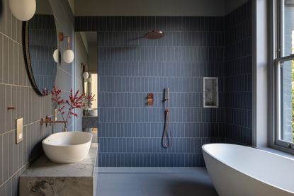

Can you remember a time before bathroom niches? While once even bathrooms in luxury homes had to suffer the indignity of a shower caddy, the answer all along was to make a small recess in your bathroom wall to house your shampoo and conditioner. Sometimes the best solutions are the simplest ones.
Having said that, now that you see niches in almost every new bathroom you see, it's only to be expected that the design of these recesses is getting more experimental and interesting. And, of course, it's interior designers who are leading the way with these modern bathroom ideas, putting them center stage in their designs.
Take a look at these real bathrooms where the designers have innovated with a bathroom niche design to make it a defining feature of the space.
What are the latest trends in bathroom niches?
To say that a bathroom niche is just a spot to put your bathroom sundries is an over-simplification.
'A recessed wall niche can transform the function and aesthetics of your shower,' says Tess Lovell of ABI Interiors. 'These nooks act as their own striking focal points, adding dimension to a uniform wall, as well as offering a characterful home for your bathroom essentials.'
It's undoubtedly why niches are such a popular interior design trend, so why not experiment with some of the bold ideas for bathroom recesses?
1. Add lighting to your niche
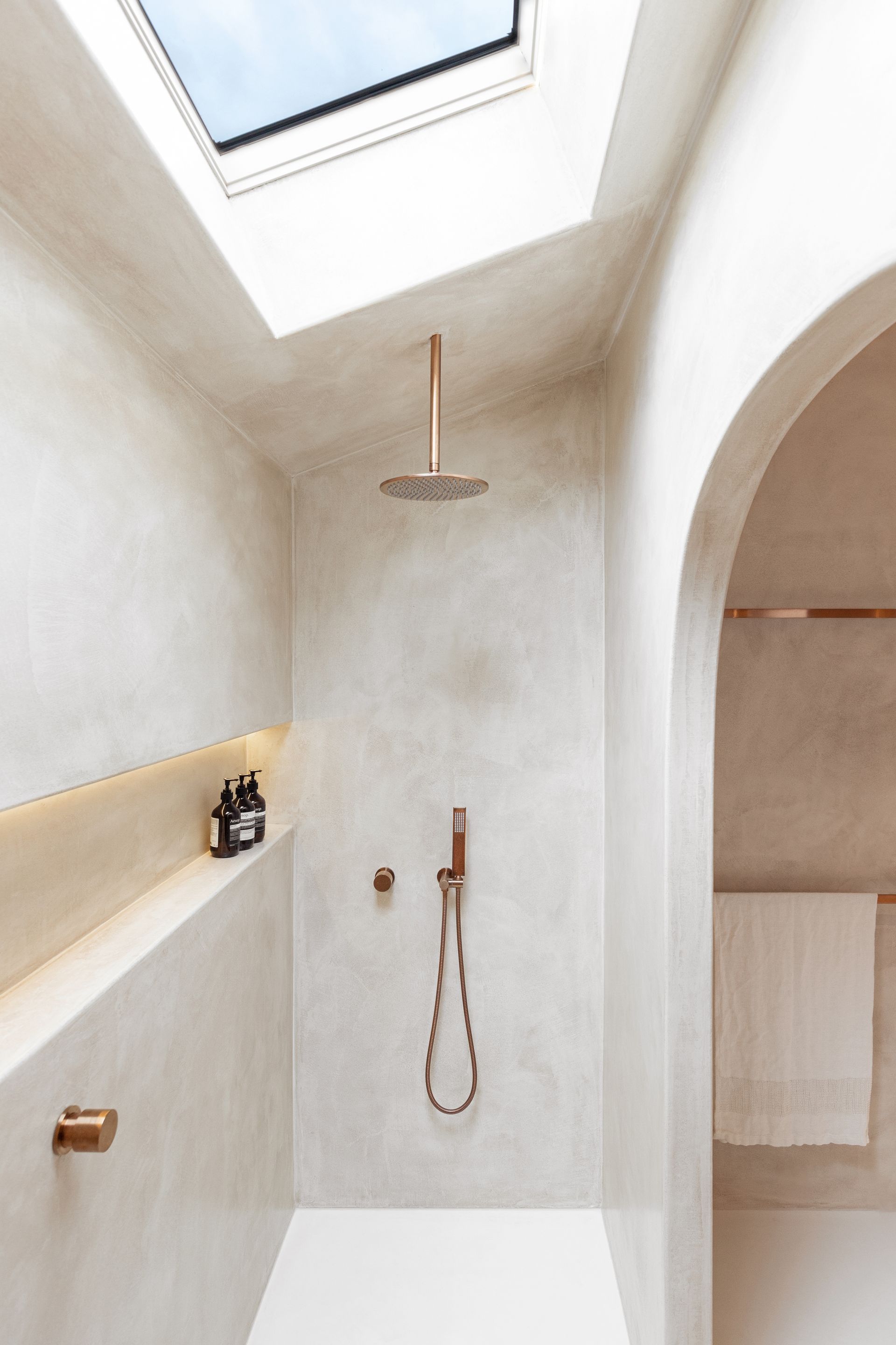
This bathroom designed by Matt Jamieson and Emma Sweeny, the Australian designers and developers behind Project X, hits the style trifecta with the bathroom design of this property, affectionately known as Ruin X.
Not only does the micro cement finish, a feature throughout the property, create a beautiful, textured look in the bathroom, but a bathroom niche also spans the length of the wall in this tactile shower room. The cherry on top? Concealed LED bathroom lighting beautifully illuminates the space, highlighting this architectural feature while also making it a dreamy spot for a nighttime shower.
2. Embrace the arch trend
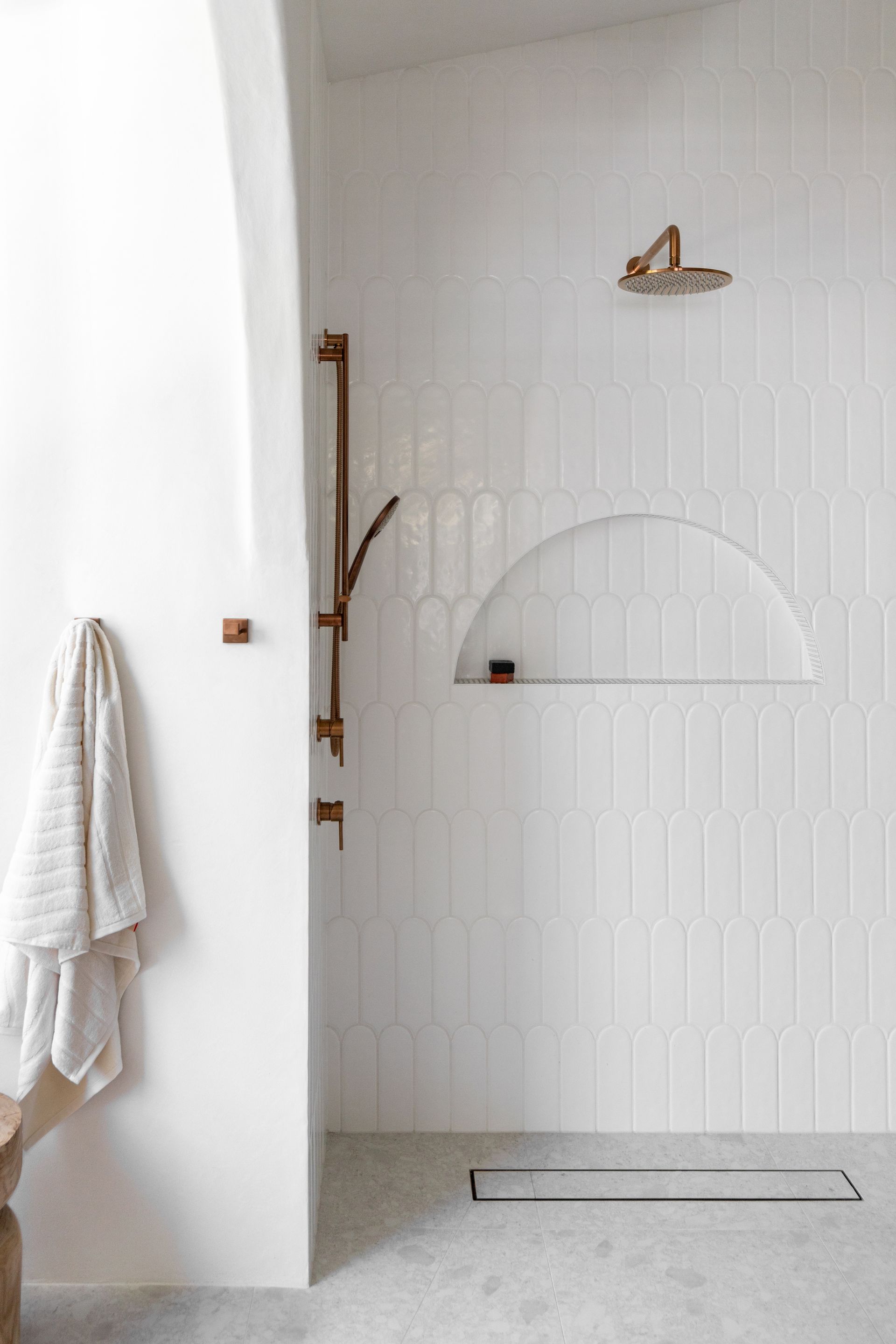
Arches are everywhere right now, so it's no surprise that we're seeing this motif pop up in the bathroom as well. They provide a much needed softness to the bathroom, which is often characterized by the straight lines of tiled walls, introducing an organic feel to what can be a clinical space.
Of course, introducing fluid lines when working with tiles requires a fair bit of craftsmanship, and this bathroom, which belongs to Beth McKenzie of Sunshine Beach Reno is as impactful as it is impressive.
Arches don't have to be included on tiles walls, however. This bathroom trend can make a great feature for bathroom walls outside of the shower, as a decorative element to style your space, or just as an extra bit of storage, as and where you need it.
3. Or try this modern pill shape
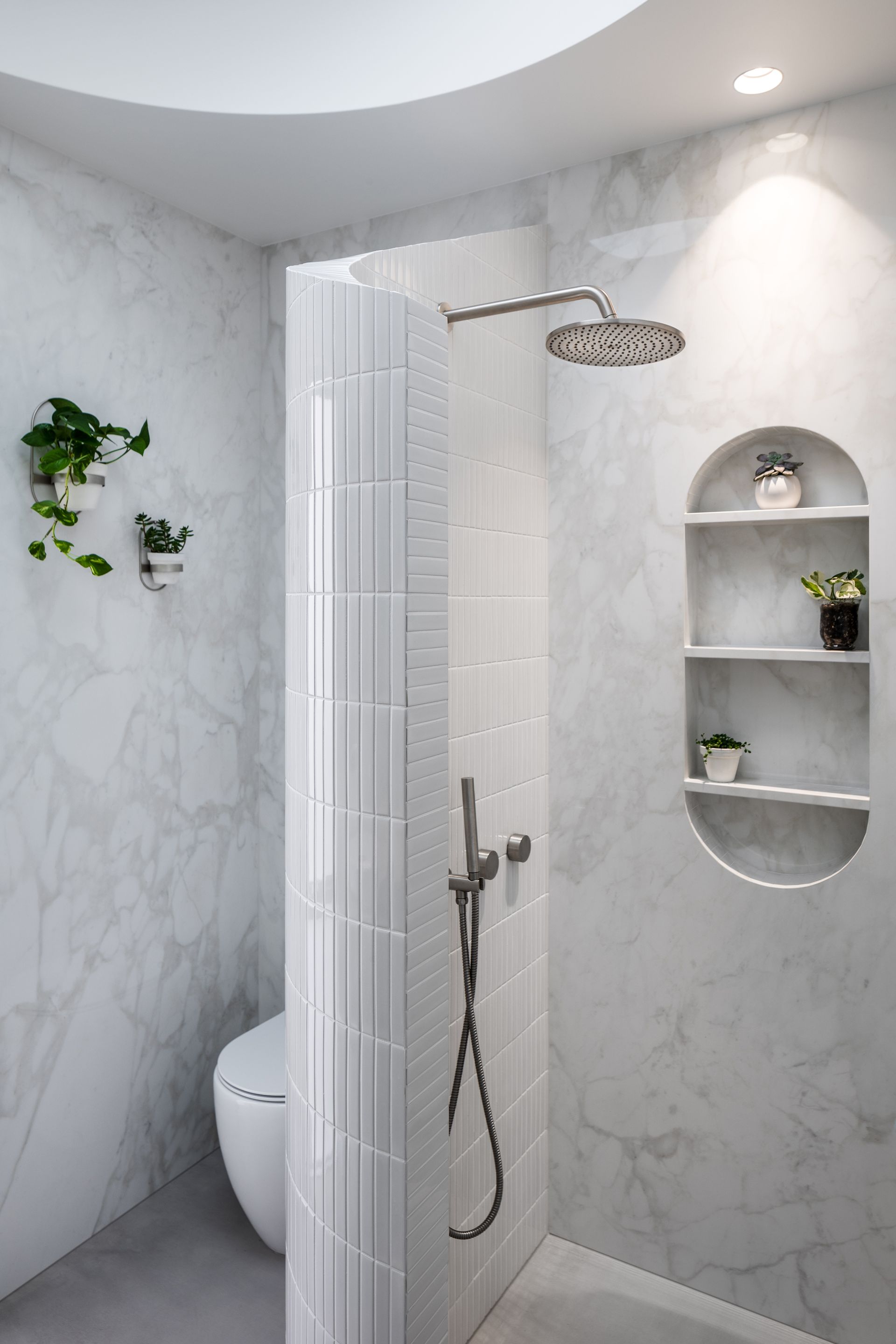
Another shape we're crushing on right now is the oblong, more affectionately known as the pill shape. In this marble bathroom design by Lux Interiors, a large recess has been created with three shelves for the shower wall, mirroring the curvaceous forms used throughout the space.
'Round elements are found throughout the design, says Pen Melis, senior designer at Lux Interiors. 'A unique custom curved wall creates a divider between the shower and toilet, while the shape of the niche has been replicated in the form of a mirror above the basin.'
4. Experiment with this hexagonal niche idea
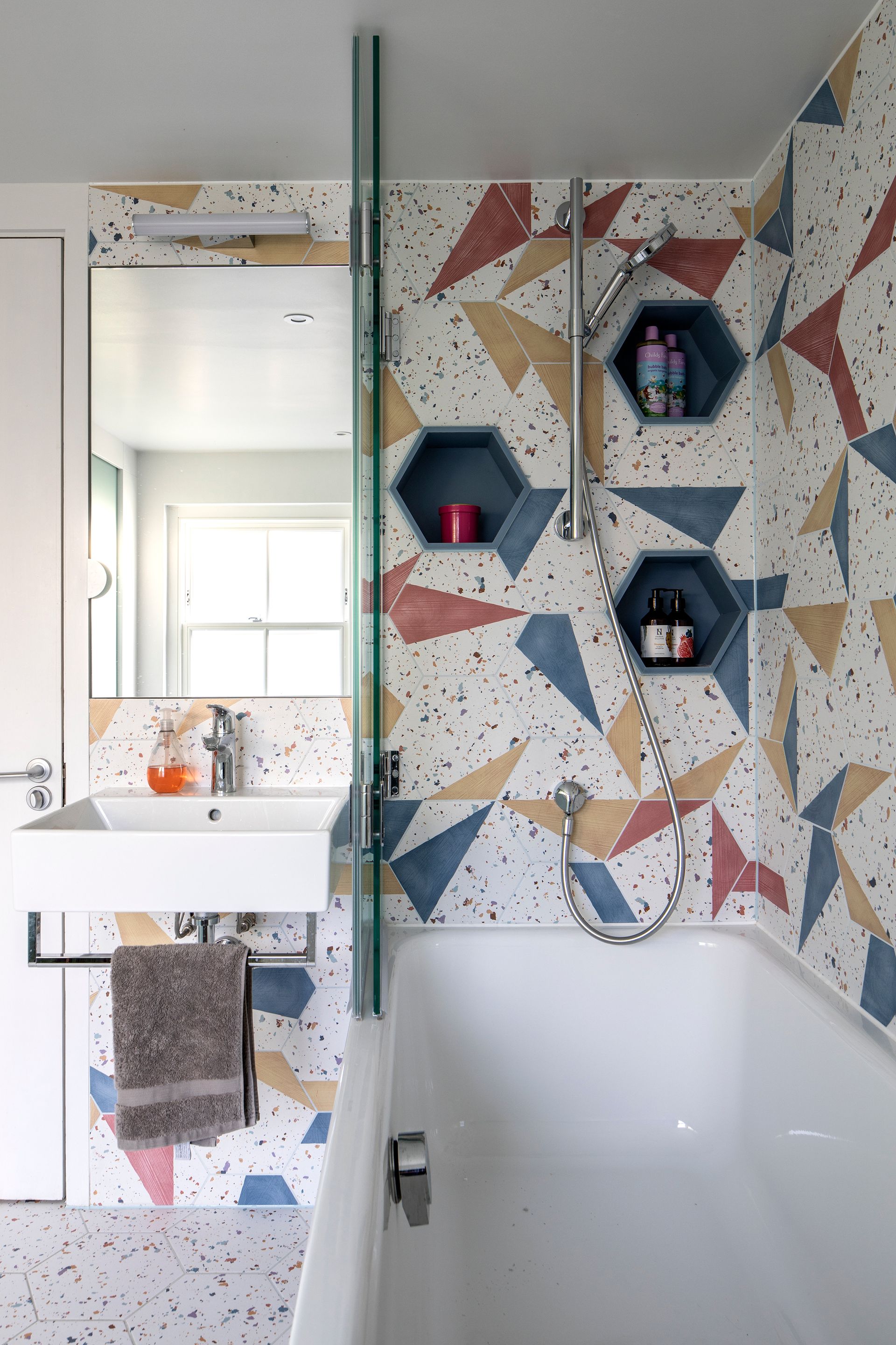
After specifying these decorative hexagonal tiles for this colorful bathroom, Jo Edwards of Edwards Rensen Architects decided to highlight their form with matching niches. 'Because the lovely tiles are hexagonal and we thought it would be rather wonderful to have hexagonal niches in a wall of hexagonal tiles, explains Jo, 'but they were really tricky to make.'
'We couldn’t line the niches with the wall tiles because they don’t have glaze on the ends,' Jo adds, 'so they would need tile trims, which would be very hard to do neatly around a hexagonal shape.'
After a bit of experimentation, the site manager created these bespoke niches from colored acrylic resin and, happily, they were the perfect size to fit shampoo and shower soap bottles.
5. Use a natural stone as a niche accent
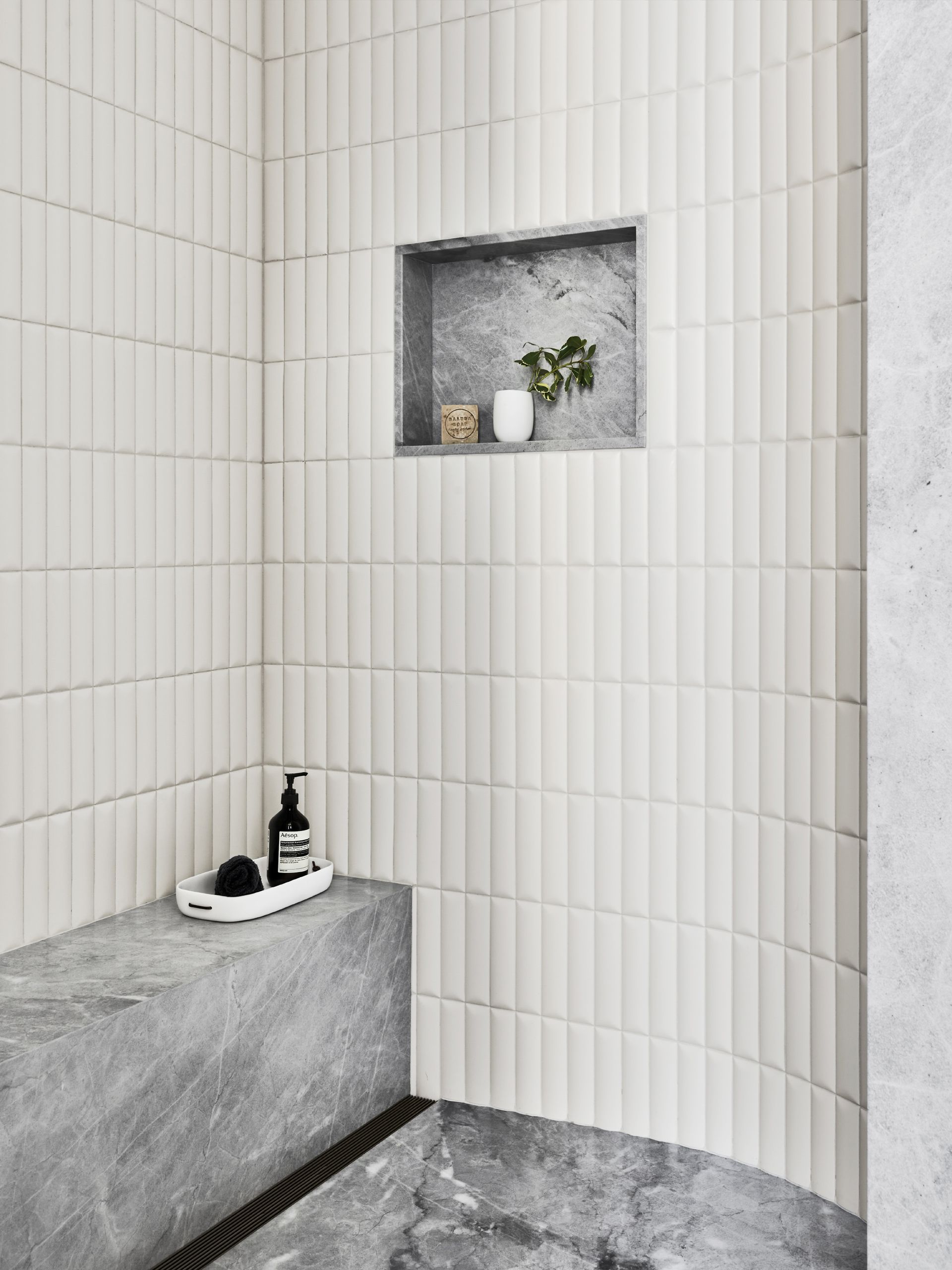
Natural stone is the brilliant choice for an elegant bathroom, but where budgets might not stretch to cladding your walls in luxury stone slabs, a niche provides a perfect spot to create a focal point of a beautiful marble.
In this bathroom, designed by design studio Colony in collaboration with architects Worrell Yeung, an elevated off-white tile has been used in tandem with a niche made from beautiful Blue de Savoie marble, also used for the shower bench and floor.
The recess has also been perfectly sized to the bathroom tiles, ensuring a satisfyingly sleek design with no half tiles around the niche.
6. Use wood to add warmth to your bathroom
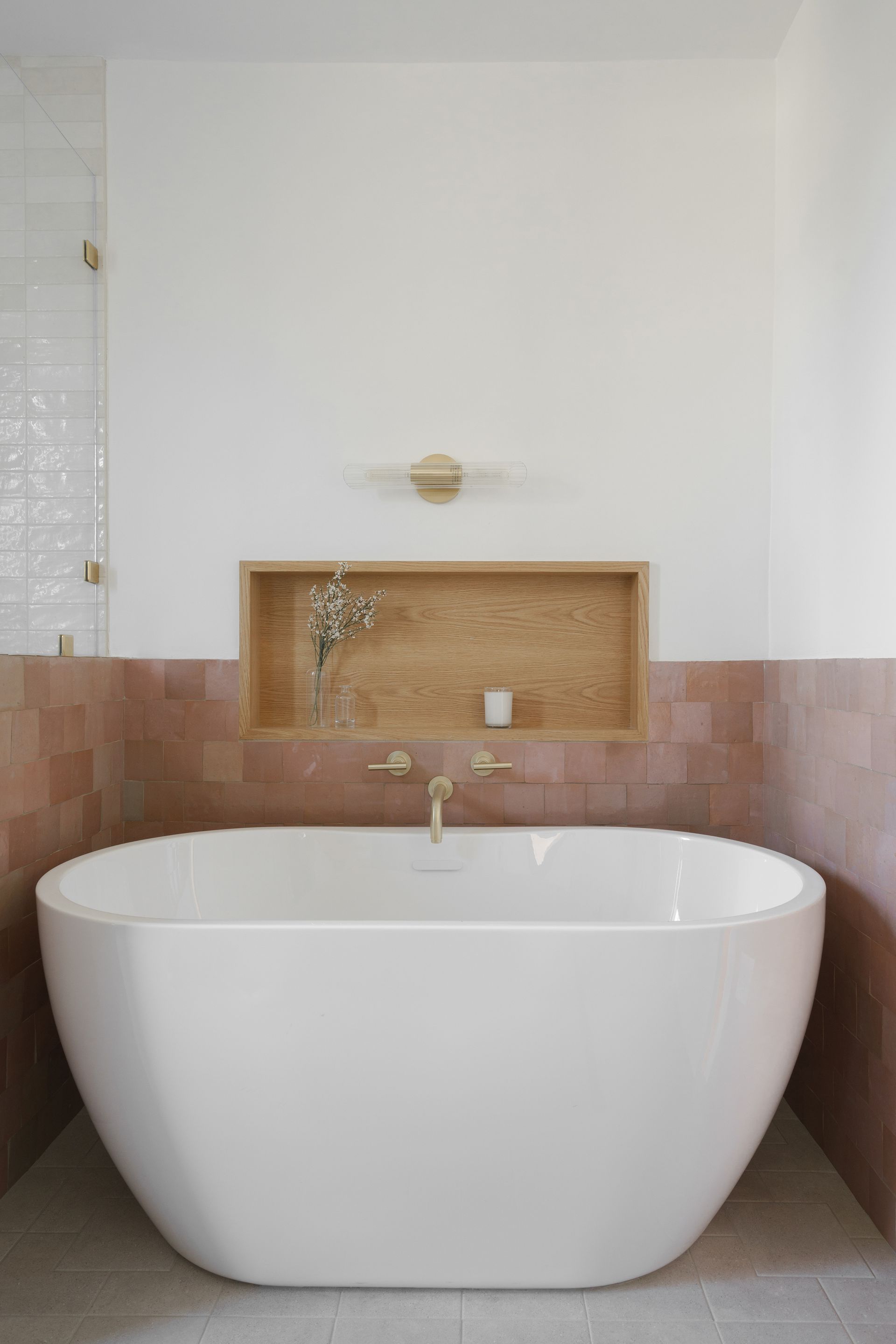
Bringing in natural materials to your bathroom is a great way to benefit from the principles of biophilic design, and there's no better choice than wood to add this grounding touch. So, while it's much more common to see tile and stone in niches, why not consider the charm of timber for your space?
'This was a white oak niche built by Rice Modern,' interior designer Abbie Naber, founder of a Naber Design tells us. 'We love the warmth that it added, and the idea that it's veering from the predictable path of tile niches.'
This white oak also matches the custom bathroom vanity in this space, tieing the material into the wider scheme.
7. Match your tiles to your niche
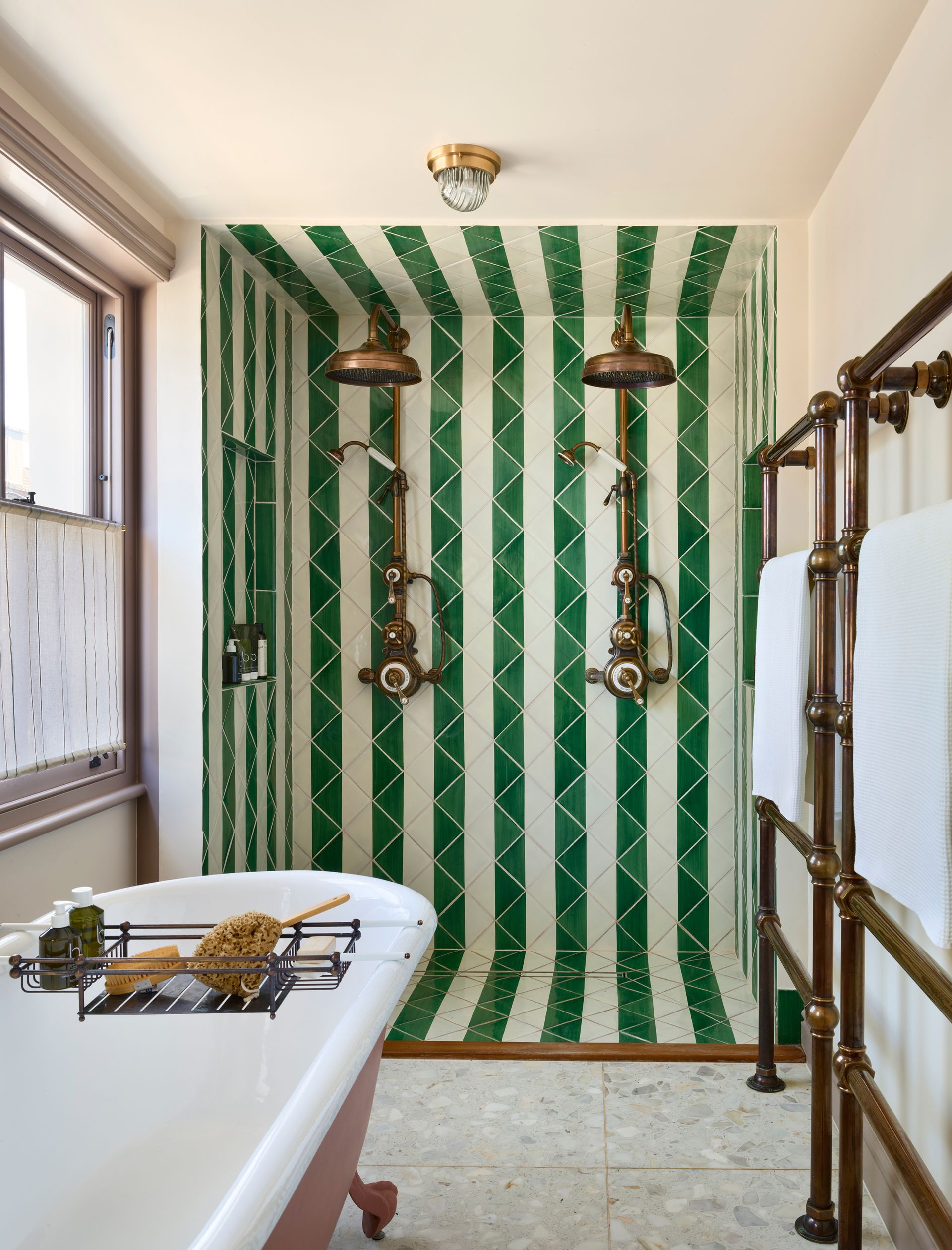
There are two schools of thought when it comes to choosing a finish for your bathroom niche. The first of them is to use the same tile as for your shower wall. While this won't make your niche the focal point of your feature, it still gives your space a sense of depth, avoiding tiled walls feeling too monolithic.
Also, not all bathroom tile ideas call for a niche to be a feature. Take this bathroom designed by Orla Read, for example. The creative stripe design has been extended into the double shower niches, ensuring this bold use of pattern is allowed to be the star of the show, alongside beautiful fixtures from Drummonds.
8. Or create a contrast
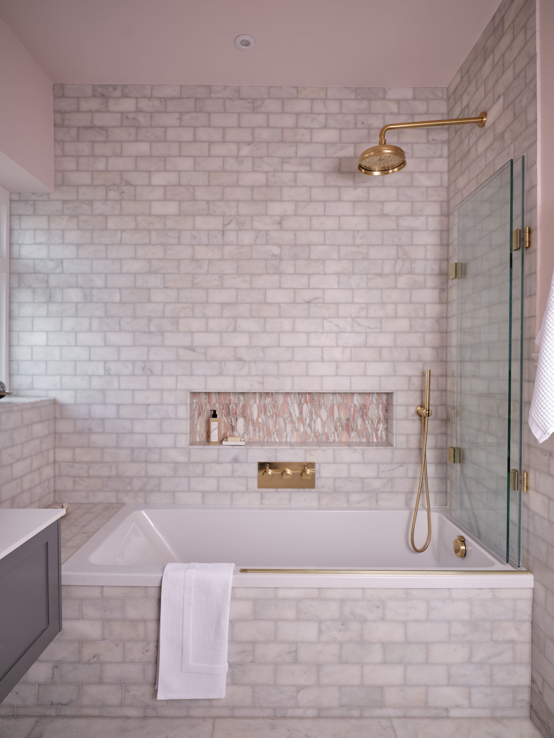
If your bathroom could stand some extra wow-factor, a contrast niche is the way to go.
‘Installing a contrasting tile in storage niches adds a decorative element to the space and another layer of interest, so the area almost becomes wall art,’ says Laura Popek, a bathroom designer for Ripples.
Plus, the contrast doesn't have to be stark. In this marble bathroom design, a soft pink tile contrast with a white marble one. Consider different shapes, and contrasting solids and patterned tiles, as options too.
9. Make a design feature of a niche
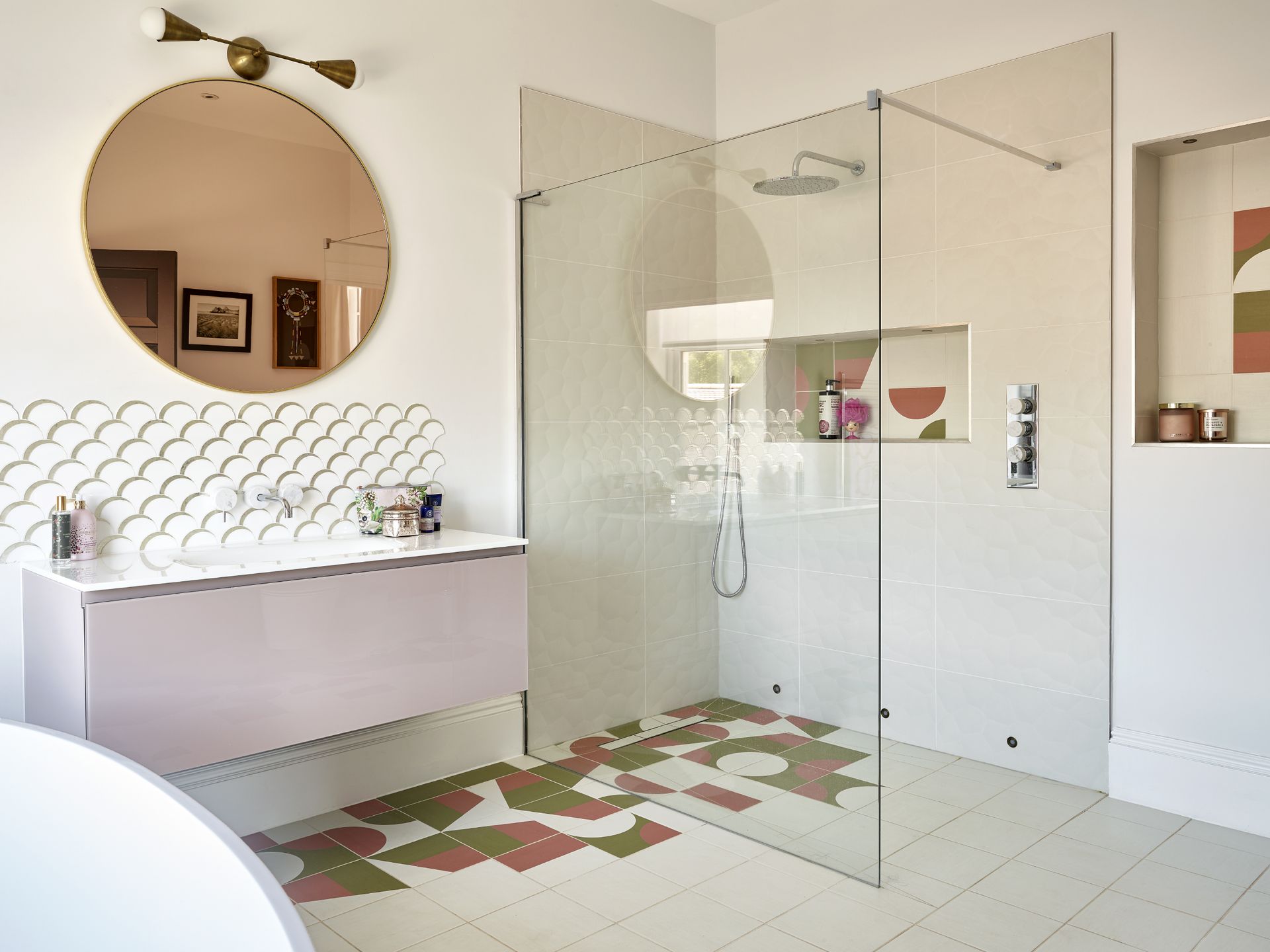
Bathroom niches can also provide a canvas for a more creative approach to tiling. Take this walk-in shower design by Caz Myers Design, for instance. By mixing a plain tile with matching patterned tiles, the interior designer has created a wall mural effect, both in the shower niche and on the floor surrounding the basin.
While this idea might have been a little too chaotic played out across the whole room, the recess provides a way to fence in this focal point.
What's the best position for a bathroom niche?
The most common spot to find a recess in your bathroom is in the shower, providing your a useful spot to keep shampoo and other toiletries close at hand. The exact positioning of it depends on both aesthetics and function. For reaching your bathroom essentials comfortably, you want to position the base of a niche around shoulder height.
Of course, if you're small or super tall, this might not feel in proportion with the room, so it may suit your space better to work on an average.
Another great spot for a bathroom niche is above the bath, especially if you have a freestanding tub as you won't have surface area to keep your toiletries when soaking in it as you would with a built-in bath. A niche for a bath simply has to be reachable when lying down in the bath. If possible, get your tub in place and test it out before deciding on the location of your niche.
Be The First To Know
The Livingetc newsletter is your shortcut to the now and the next in home design. Subscribe today to receive a stunning free 200-page book of the best homes from around the world.

Luke Arthur Wells is a freelance design writer, award-winning interiors blogger and stylist, known for neutral, textural spaces with a luxury twist. He's worked with some of the UK's top design brands, counting the likes of Tom Dixon Studio as regular collaborators and his work has been featured in print and online in publications ranging from Domino Magazine to The Sunday Times. He's a hands-on type of interiors expert too, contributing practical renovation advice and DIY tutorials to a number of magazines, as well as to his own readers and followers via his blog and social media. He might currently be renovating a small Victorian house in England, but he dreams of light, spacious, neutral homes on the West Coast.
-
 The 12 Best Table Lamps for Reading —I'm a Certified Bookworm (and Shopping Expert)
When it comes to table lamps for reading, I don't mess around. If you're the same, this edit is for YOU (and your books, or course — and good recommendations?)
By Brigid Kennedy Published
-
 "It's Scandi Meets Californian-Cool" — The New Anthro Collab With Katie Hodges Hits Just the Right Style Note
The LA-based interior designer merges coastal cool with Scandinavian simplicity for a delightfully lived-in collection of elevated home furnishings
By Julia Demer Published
