How to decorate large walls - leading designers explain just how to do big well
Expert advice for how to decorate large walls, from the colors and textures to the patterns that create the biggest impact


Strangely, I'm finding how to decorate large walls to be more difficult than it might seem. I've got to the point in my house renovation when the paint colors are chosen and the rooms decorated and - mostly - furnished. Yet I'm struggling to choose what to go on the walls.
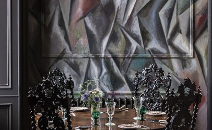
'People do tend to worry about the walls,' says the internationally acclaimed interior designer Russell Sage. Among many of his artfully curated projects there is The Fife Arms, a hotel in Scotland known for its clever interior decoration. 'I tend to get carried away, and I think that's the best way. Just keep going, never stop, and take the color up and over the ceilings too. For a really big space I'd happily commission an artist to do a mural that covers everything.' This he did to great effect in the Clunie Dining Room of the Fife Arms, pictured above, and the result is a dramatic space that changes what you think you know about how period features should be presented.
But for everything else, from paint ideas big and small to what to hang on decorated walls, these suggestions should help you - and me - get over the potential hurdle of what to do if you're lucky enough to have a large expanse to decorate.
A note on large walls. Obviously size is relative, and we're not talking huge ballrooms here. These decor suggestions apply to anything bigger than a downstairs closet, anything you might look at and think 'there is enough space to really do something here.' And these are the things you should do.
How to decorate large walls
1. Pick the right neutral - and use it on details, too

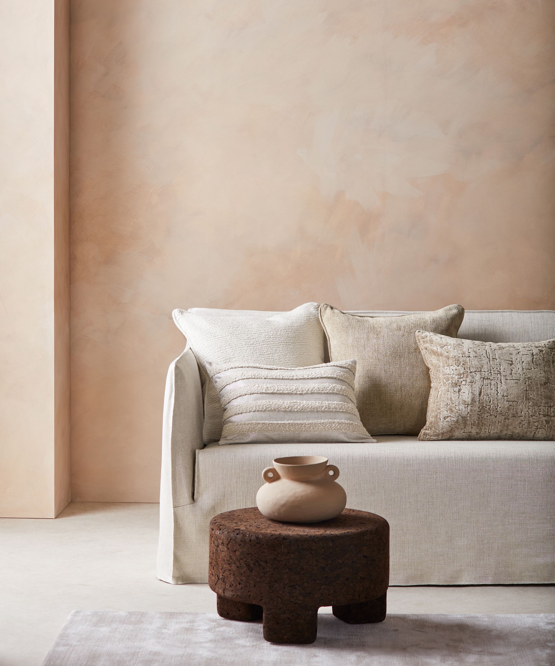
When the choice is overwhelming, it can seem easiest just to go white. But interior designer Kelly Hoppen suggests that's not quite the way to go - and in fact, it can seem a bit too cold on a large expanse. She is now suggesting going warmer, and thinking of how beguiling beige living rooms can be when it comes to large walls.
'Beige has evolved and is here to stay,' Kelly says. 'Simple, soft and soothing, it's what people want and need right now. For beige walls, make sure you paint your skirting boards, architraves and ceilings in the same color, not in white.'
2. But if using color, go for the right tone

If you're avoiding Kelly Hoppen's advice and going big on color, designer Russell Sage says there's only one caveat. 'When it comes the walls, any hue you use should have a touch of the earth to it,' he says. 'So if you fancy pink, don't go plastic pink but a plastery shade. Peach instead of orange. Slate grey instead of brilliant white. Primrose instead of banana yellow. Look for brown or grey tones and the wall color will just work.'
The reason for this? When a bright color is used over a large expanse it dominates the room completely. This can be wonderful, in a maximalist kind of way, but for an elegant, grown up - yet still exciting space - think slightly more muted. Limewash paint works particularly well here.
3. Pay attention to where the windows are

Whether you're going to a neutral or earthy tone, let the space help you decide exactly which color to go with. There is more to how to paint a wall than just the brush strokes.
'Design decisions should never be undertaken in a vacuum,' says the interior designer Brigette Romanek. 'It’s about going into a building and just feeling it first. I particularly like to pay attention to where the windows are. If you take them in, you'll notice how the light will bounce around the room, and what colors would work best. Often, what's outside the window can inform the choices, too. A green paint can be a great choice for walls if there are lots of trees outside.'
Here, this chartreuse paint was chosen perfectly for a space in which the light falls through the windows for most of the day. The sun enlivens its earthy tones, adding a gentle richness.
4. Add detail with paneling

So often in new builds or modernized spaces, large walls can make a space feel like a box. This is where the texture you add in can reinvent the feel of the room. But that doesn't always mean going for Victorian-effect cornicing to a house built 100 years later.
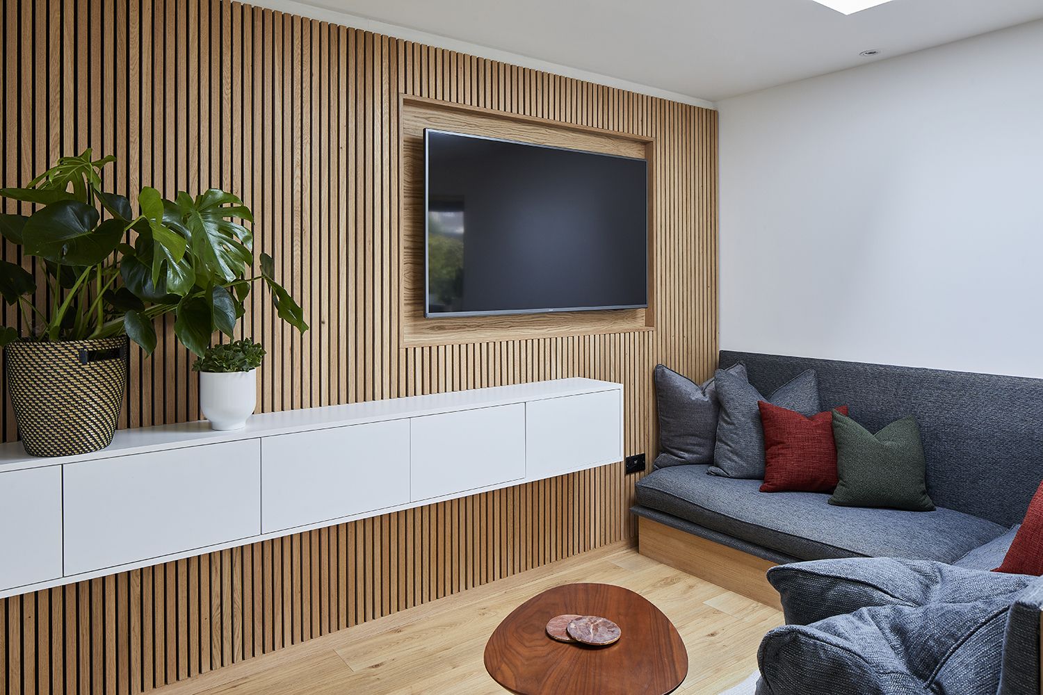
'Why not try an on-trend and contemporary wood-clad feature wall?' says the interior designer Alexandria Dauley. 'It’s a surprisingly effective way of changing the architectural aesthetic of a living room. A wooden wall can instantly create a focal point and add texture and pattern to a space.’
The smaller the slats the more the vibe feels like Scandinavian design - and less like a period copycat.
5. Create a salon wall - and change it frequently

The simplest thing to do with any wall is hang art on it, right? Wrong, sadly. Speaking from personal experience, these finishing touches can feel like the hardest part. 'People tend to be a bit worried to hammer a nail into a wall,' says Russell Sage. 'Especially if it's newly decorated. But art creates a focal point, and I'm really happy to hang galore. If it doesn't work out you can patch it up and start it again.'
The key to any gallery wall is to keep re-energizing it by changing what you're displaying. 'Own twice as much art as you need,' Russell suggests. 'And swap the pictures over as your mood changes. Think of it as having a Spring collection and a Fall one. After all, we're not in a minimalist era, and people generally have a lot of possessions. So mix them up, move things in and out. It's the easiest way to feel like you're mastering a large wall.'
6. If framing, match them to walls

Knowing how to pick the perfect picture frame can feel as daunting as getting the art right. But for large walls, you want the art to be the hero, not what you've hung it up in.
'I'm forever tinkering with picture frames,' says Russell Sage. 'Painting them, customizing them, even papier mache-ing them. I often think they should be the same color as the walls, so that the art really stands out.'
Above, all the frames are covered in the same white paint as the walls resulting in the vibrant art being the main thing you see.
7. Create your own datum line

Wall in Preference Red (below) and Jitney (above), both by Farrow and Ball
While we would generally counsel using one color on everything - and indeed Kelly Hoppen did at the top of page - there are exceptions. And Joa Studholme, the main color genius at Farrow and Ball enjoys suggesting ideas that go against the rules.
After all, large walls often come with high ceilings. 'And if you have high ceilings, you can go white on them, instead of taking the color up and over,' Joa says. 'If you have low rooms, you should always use the same color on the walls and ceiling so your eye can’t tell where the wall ends.'
So, with this expanse to play with, you can use paint effect like datum lines - the modern version of a picture rail. 'I love to do red up to dado level, which is about 8 feet high,' Joa says. 'As soon as you walk in, it feels confident. It's like a sense memory of a time you were confident, and will really effect your mood.'
Surprisingly, brown-tinged yellow is a great color to go with red, bringing out its most sophisticated tones. So use that shade to separate the wall from the ceiling, as seen above.
8. Make a 3D installation

Raineri in Falco / Pavone, hand-painted onto teapaper, Fromental
When you have the space to play with, anything you decide to hang on the wall can be big, too. 'I do like to make an art wall three dimensional,' says Russell Sage. 'I have recently covered a wall in a mural by Fromental, a scene full of trees and branches. On top of that I have added some vintage stuffed birds in cages to really pop out of the scene.'
Sadly I couldn't get an image of this newly decorated wall, but here's a Fromental mural, above, to give you an idea. And while the taxidermied feathered friends might not be to everyone's taste, there is a lesson here. Why should your gallery wall be flat works of art? Inject life into the space by making your installation in relief. It's a little bit unexpected, sure, but it will add personality in spades.
How do you dress a blank wall?
If you're starting from scratch with a blank wall, the best way to dress it is by layering. And while it may seem scary to bang lots of nails into your home, there are tricks to get around this.
'I like to hang a mirror on the wall, and then artwork on the mirror, in a layering effect,' says Russell Sage. 'This can just be done with sticky pads, which allow you to fix smaller pictures to bigger frames.'
Vintage photographs, postcards or small prints can be used like a collage to dress a blank wall that is filled with personality.
What do you put either side of a large painting?
The best thing to put either side of a large painting is lighting, angled cleverly, so as to illuminate the art. 'I like to spread the light out around the room,' says the designer Tom Dixon. 'Instead of having spot lights, it's about washing the space with light. This creates balance, and highlights the surfaces and features you want to make the most of.'
Either side of an art work, you could fix angled wall lights or even fix invisible sticky tape LED strips. These will make your painting the hero, and ensure that all eyes are firmly on it.
Be The First To Know
The Livingetc newsletter is your shortcut to the now and the next in home design. Subscribe today to receive a stunning free 200-page book of the best homes from around the world.

The editor of Livingetc, Pip Rich (formerly Pip McCormac) is a lifestyle journalist of almost 20 years experience working for some of the UK's biggest titles. As well as holding staff positions at Sunday Times Style, Red and Grazia he has written for the Guardian, The Telegraph, The Times and ES Magazine. The host of Livingetc's podcast Home Truths, Pip has also published three books - his most recent, A New Leaf, was released in December 2021 and is about the homes of architects who have filled their spaces with houseplants. He has recently moved out of London - and a home that ELLE Decoration called one of the ten best small spaces in the world - to start a new renovation project in Somerset.
-
 The 12 Best Table Lamps for Reading —I'm a Certified Bookworm (and Shopping Expert)
When it comes to table lamps for reading, I don't mess around. If you're the same, this edit is for YOU (and your books, or course — and good recommendations?)
By Brigid Kennedy Published
-
 "It's Scandi Meets Californian-Cool" — The New Anthro Collab With Katie Hodges Hits Just the Right Style Note
The LA-based interior designer merges coastal cool with Scandinavian simplicity for a delightfully lived-in collection of elevated home furnishings
By Julia Demer Published

