Colors that go with purple - the expert guide to decorating
Here's everything you need to know about the colors that go with purple, packed with expert advice on how to apply it in your home


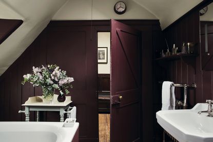
Colors that go with purple have long been sought after for anyone wanting to create a rich, sumptuous scheme. Purple has a long-standing association with wealth “alongside spirituality”, comments interior designer and founder of Bergman and Mar, Petra Arko.
Why does purple have a longstanding connection with royalty? It is because the pigments required to make the color purple were, for many centuries, difficult to source, meaning only the very wealthiest were able to afford purple fashion or interior decor. Flash forward to current home trends, and you will find that purple is now more widely affordable, and as a result, popular. Color theory experts like to use it to add a note of richness to decor.
Colors that go with purple
Deep purple interiors have an undeniable energy to them, whilst the lighter shades - those in the realms of lavender and mauve - have an association with femininity and delicacy, and tend to be looked at alongside colors that go with grey. So whether you are planning to create a deep, enveloping aubergine snug for those cosy winter nights, or alternatively intend to hone in on a paler shade of lilac for a softer and more whimsical decor scheme, purple should be on your radar as a strong and worthy choice for decorating.
Let’s take a closer look at the different kinds of purple available, and, with expert commentary and advice, how to apply purple colors at home.
What color goes with light purple?

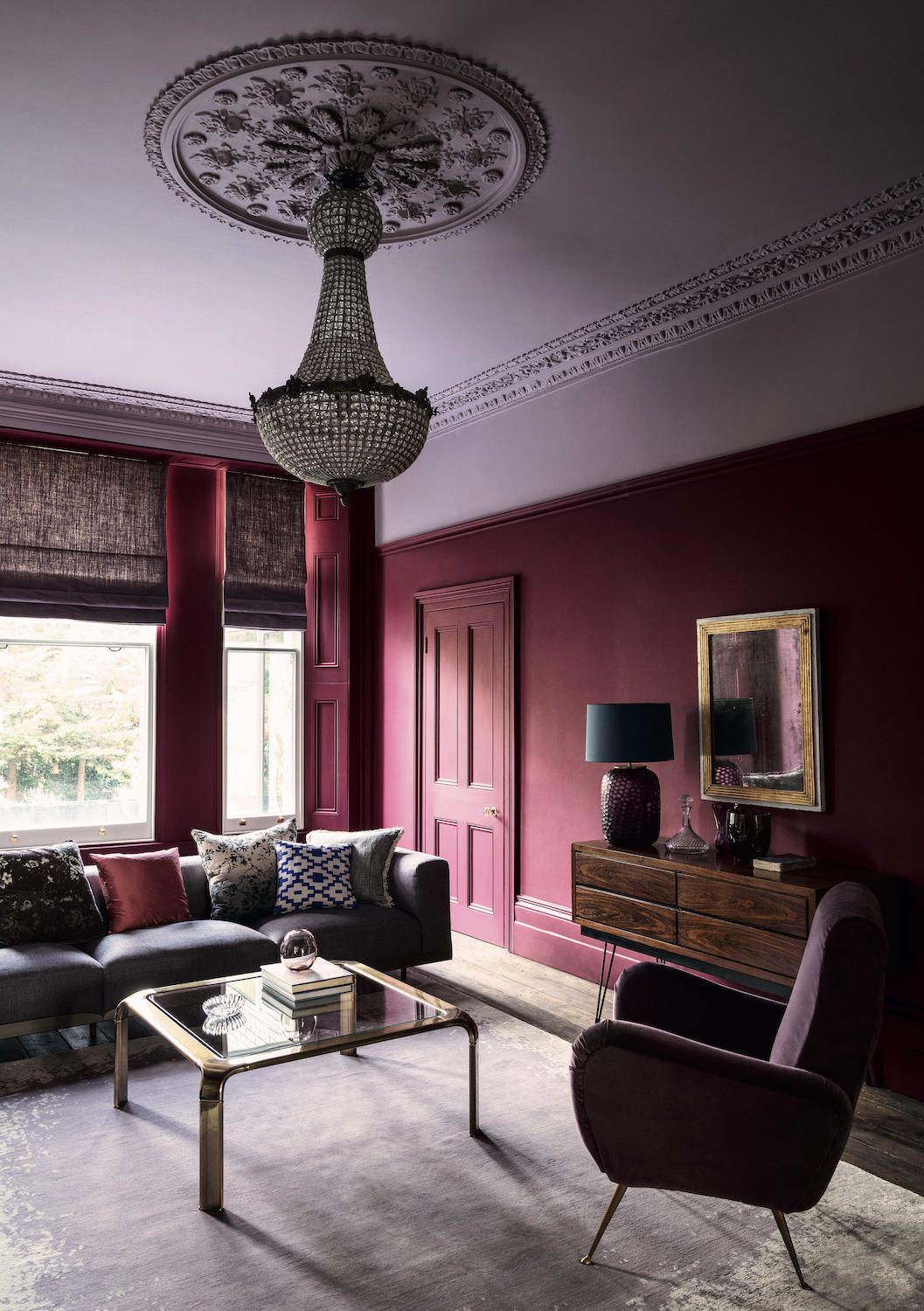
Little Greene - Wall: Grenache 372 – Pure Flat Emulsion, Ceiling: Lady Char’s Lilac 368 – Architects’ Matt, Woodwork: Grenache 372- Architects’ Eggshell
Light purple, such as those pale shades of lilac and mauve, are surprisingly versatile. When applied correctly in decor the paler shades of purple are easy to live with, and undeniably pretty, too.
Ruth Mottershead, creative director of paint brand Little Greene, is an expert in paint and pigment for decor. Speaking particularly of lilac, one of - if not the - most popular tone of pale purple. “Soft pastel tones such as ‘Hortense’ and ‘Lady Char’s Lilac’ are a gentle and calming pale lilac tone," Ruth says. "You can use a pale lilac by itself in a room for a pale and pretty scheme, or, thanks to their powdery pale finish, it’s possible to be a bit more daring and match lilac with a deep plum or aubergine color of purple (such as Adventurer or Grenache) for an impactful yet intimate living room atmosphere.” When you see how striking lilac can look when applied with Ruth’s decor advice (see image above), it is very tempting.
Looking to keep it all that bit lighter?

Mauve floor tiles compliment marble veining, in a project by Interior Fox
Founders of interior design studio Interior Fox Jenna Choate and Mariana Ugarte comment that, “When a client loves purple tones we usually suggest a soft mauve as it feels fresh and neutral. In a previous project we used a really cool mauve floor tile as one of our modern bathroom ideas to offset the soft grey tones found in the veins of the marble. Of course, a pale mauve or lilac also looks equally fresh, crisp, and clean, when paired with a neutral shade of white or cool-undertone shade of cream.”
What color goes with royal purple?

Wall painted in Empire Violet No.80, Mylands
Royal purple is, as the name possibly suggests, purple in its richest and purist tone. It’s bold and it’s dominant, but can be used sparingly in decor as a less dominant accent colour, or for maximum wow factor by wrapping a room completely. Dominic Myland, ceo of paint brand Mylands, has broken Royal Purple down for us. Dominic comments, “Royal purple is loved for its rich intensity and opulence and many people love to use it on its own because it looks so powerful. Admittedly, some might find this concept or bold application a bit overpowering. In which case, they can always use smaller amounts of it at first, say in a room lots of different people spend time in. For example, try painting some woodwork, cabinetry or feature walls with it initially in a living room or hallway.”
Feeling confident and playful? Dominic says, “If you have the decorating confidence then a room immersed in head-to-toe rich royal purple tone, such as our new Empire Violet™ No.80, looks highly sophisticated and original when applied correctly.”
“For maximum effect try using it in a gloss finish - this has a particularly rich and luscious effect in a dining room, as the light bounces around the space and plays with the pigments within the colour royal purple color”, says Dominic.
“Because purple is made up of both blues and reds, both of these colour pigments work really well with a royal purple tone.” Indeed, you can see how a cobalt blue candle stick can look contemporary and striking when sat within a royal purple colour scheme. Dominic says, ‘You can bring out its warm undertones by pairing it with red or pink, or cooling it down by using blue hues. A good partner for royal purple often depends on personal taste. I’ve seen it used with green and bright orange to great effect, but that takes some confidence, or equally, with an ochre yellow. If you want to pair royal purple with a safer bet then choose a shade of grey which compliments it and harmonises’, the trick to the latter being to choose a grey that has purple undertones within it. Which rather nicely brings us onto the next question on purple...
Does grey go with purple?

Brinjal and Skimming Stone, Farrow and Ball
In short, yes it does. In fact experts say a considered grey shade can go particularly well with a purple hue, allowing for a two-tone color palette to be used to great effect. It’s all about the undertone, and working with the purple tone, not against it. Essentially, to get it right you need to look for a grey which has a warmer and softer characteristic to it.
Farrow and Ball Color Curator Joa Studholme explains in more detail, “Grey works particularly well with purple, but you need to make sure that the grey has a warm base," Joa says. "Here at Farrow and Ball we developed the Contemporary Neutrals color shades specifically to work with shades like Brinjal purple - ranging from the stronger neutral of Dove Tale to the lighter and paler tone of Skimming Stone.”
When you see this warmer shade of grey in practice, Joa's advice to keep with a warm grey or neutral shade makes great sense. People often make the decorating decision that a cool shade of grey will suit a purple room, but often this leads to a room looking too cold and gloomy, especially if it’s already north facing with a cool natural light source, or has no natural light at all. So, go for a warm grey like Dove Tail or Skimming Stone if you’re looking to combine it with a purple tone.
Does black go with purple?

Paean Black and Sulking Room Pink, Farrow and Ball
Very much so! As demonstrated by this beautiful living room scenario from Farrow and Ball, where they have matched a mauve shade of purple (which is admittedly called Sulking Room Pink) with the Georgian-inspired color of Paean Black. The softness of both colors bring a great deal of depth to this particular decor scenario.

A Fitzrovia project by Bergman and Mar
Petra Arko, interior designer and founder of design studio Bergman and Mar, says of black and purple color schemes, “balance, as always, is the key to getting black with purple just right! If black is used sparingly, it gives the space a very sophisticated and established feel.”
Does green go with purple?

Witton Bright by Jonathan Saunders for The Rug Company
We’re guessing that when considering colors that go with green, the majority of people would think that the suggestion of purple would be a design and decor disaster, but think again. Joa Studholme, Farrow and Ball color curator describes the combination as “a classic colour combination choice" and one “very much inspired by nature.”
It’s all about the pigment and the shades that you match together in a decor scheme, and whilst stronger shades of purple and green might clash and look somewhat too rich and sickly, paler shades in both the purple and green spectrums look rather wonderful together. Whilst the combination can be classic (especially if applied via a traditional floral wallpaper) they can also embody a somewhat mid-century color-palette energy. Think Palm Springs chic and you’re on the right track if you want the combination to have a more contemporary vibe.
Keep your choice of green soft, pale and with blue-ish undertones. Now, look for a borderline-pinkish shade of lilac on your color chart. Ok, so you now have a wicked decor combination.
If you are looking to ramp up your design application of the colour scheme though, then try bringing the purple tone in via a bold and geometric pastel rug like this one from The Rug Company. With its dashes of lilac and citrine, it looks fabulous in a soft green painted room adorned with architectural items of mid-century furniture.
Opt for an ombre purple tiled wall, for kitchen and bathroom decor with a difference!

Herringbone Tile, Otto Tiles
You might not immediately think of applying purple by means of tile, but it’s absolutely a decorating option. We particularly approve of the way in which tile experts Otto Tiles have demonstrated a bold and contemporary application of colors that go with purple, with a mix of different plain purple, pink and golden yellow rectangular tiles. The look is striking, distinctive and totally modern and if you are looking for a fresh approach to bathroom or kitchen decor then we think this should be on the list of options to consider.
Damla Turgut, founder and creative director of Otto Tiles and Design, says, “Deep moody shades of aubergines are one of favourite shades of purple to work with. To ensure that darker shades don’t overwhelm an interior, especially when used on wall or floor tiles, an ombre effect can be a fun and interesting way to add what I call ‘quiet pattern’ and instant visual interest to a space.” Damla says , “You can achieve this by choosing a plain tile, such as our Herringbone tile which is a narrow cement encaustic tile, and building up lines of tiles in varying tones from light to dark either in the same colour or mixing in complementary shades.”
Be The First To Know
The Livingetc newsletter is your shortcut to the now and the next in home design. Subscribe today to receive a stunning free 200-page book of the best homes from around the world.
Rory Alastair Robertson has a long-standing history working across the interiors industry. Raised in Morningside, Edinburgh, Rory grew up surrounded by classically grand Scottish Georgian and Victorian architecture.
His first appreciation for interior decoration sparked when his mother hired scaffolding and decorated their three-storey Victorian staircase in Farrow & Ball Picture Gallery Red, by herself. She then painstakingly gold leafed the drawing room - by hand - over a base coat of Sudbury Yellow. This was the era of Jocasta Innes and Kenneth Turner, when paint techniques and maximalist style were the decorating raison d'être.
With this inherited gene of creativity, Rory went on to study Interior Architecture at the University of Edinburgh, and later, Theatre Set Design and Architectural Illustration at The Rhode Island School of Design on America's East Coast.
Rory's foray with the editorial world started a decade ago at Livingetc magazine, a title which he regularly contributes to today. Specialising with a deep-seated appreciation for historical homes and interiors, Rory often travels far and wide to be inspired by unique properties with a fascinating history.
If he’s not uncovering an unusual National Trust property in the UK, then he’s seeking out a Neo-Classical clifftop villa in Capri or a Palazzo in Florence.
Based in London’s Shoreditch, working as a Senior Interiors Editor and Consultant, Rory's portfolio of work is a creative melting pot of residential and commercial interior design projects and a plethora of editorial writing work. Rory is also Guest Interiors Lecturer at the prestigious KLC School of Interior Design in Chelsea, London. His most cosseted possession is a ramshackle Citroen Deux Chevaux, which he has reupholstered in Pierre Frey yellow and turquoise silk fabric.
Discover more at roryrobertson.co.uk and @rory_stylist.
-
 The 12 Best Table Lamps for Reading —I'm a Certified Bookworm (and Shopping Expert)
When it comes to table lamps for reading, I don't mess around. If you're the same, this edit is for YOU (and your books, or course — and good recommendations?)
By Brigid Kennedy Published
-
 "It's Scandi Meets Californian-Cool" — The New Anthro Collab With Katie Hodges Hits Just the Right Style Note
The LA-based interior designer merges coastal cool with Scandinavian simplicity for a delightfully lived-in collection of elevated home furnishings
By Julia Demer Published

