OUR 10 MOST LIKED INSTAGRAM POSTS FROM APRIL

We might be getting closer and closer to summer, but judging from our top ten posts below, dramatic Yves Klein inky blues and warm, smokey greys aren't going anywhere just yet.
Most of these spaces have successfully used a dark colour palette in a new, refreshing way; navy blue window panels frame a light and airy hallway and inky walls are given a lift with a bright white ceiling and doorways,grey is paired with pink to lighten the mood in a sultry living room, while exposed brick walls together withthe timeless Tulip table and Eames dining chairs keep the colour modern and fresh in a dining space.
Take a look at the top pictures that have inspired you this month.
DOOR FRAME
Painted wood double doors are not only a great alternative to Crittall style, they also flood this hallway with light and chime perfectly with the original monochrome tiling.
A photo posted by on
GORGEOUS GREYS
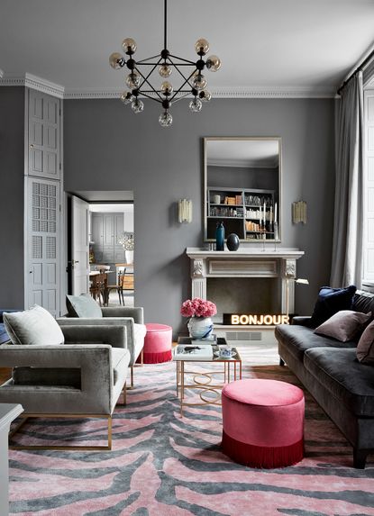
Pretty pink hues add punch to the grey and blue tones of this smart yet relaxed living space. And of course, who can resist that fabulous zebra-stripe rug....
A photo posted by on
OLD MEETS NEW
The raw surface of the exposed brick wall adds a dash of edginess to this modern, greyscale dining room.
A photo posted by on
PATTERN HIT
Despite this kitchen's cool contemporary feel, numerous touchstones – like the Kilim style rug and country style dining table and benches add a note of history and tradition.
A photo posted by on
MATERIAL MIX
Bricks, concrete and timber combine in this indoor/outdoor room for a space thats’s endlessly easy on the eye.
A photo posted by on
INKY BLUES
The inky blue living space of this 19th century habour-side home has been given a modern classic look with striking built-in storage and eye-catching patterned rugs. Large windows to the side flood the room with light, preventing the darker wall colours becoming too dominant. Gorgeous!
A photo posted by on
YVES KLEIN
Unadulterated decadence reigns supreme in this Yves Klein blue dining room. The curvaceous table has a retro fifties feel, while the futuristic lighting over head brings a space age vibe.
A photo posted by on
BATHROOM ART
Why confine your gallery wall to your living area or staircase? A picture display in your bathroom helps personalise what can sometimes be a cold space, and antiqued mirror-glass wall tiles give a luxe finish while helping make the room appear bigger.
A photo posted by on
LAID BACK
You don’t have to be on the White Isle to nail the laid-back style of the Balearics (although a white-walled casa and lashings of sunshine always help). Layer pastel tones and folksy prints with macramé, pom-poms and natural textures to bring the Ibiza vibes home.
A photo posted by on
SO FRESH & SO CLEAN
This light filled, blissed-out, top floor study is a beautiful and functional secret hideaway for the house owners, who transformed it from a dark and dreary attic.
A photo posted by on
Be The First To Know
The Livingetc newsletter is your shortcut to the now and the next in home design. Subscribe today to receive a stunning free 200-page book of the best homes from around the world.
The homes media brand for early adopters, Livingetc shines a spotlight on the now and the next in design, obsessively covering interior trends, color advice, stylish homeware and modern homes. Celebrating the intersection between fashion and interiors. it's the brand that makes and breaks trends and it draws on its network on leading international luminaries to bring you the very best insight and ideas.
-
 These 12 Best Table Lamps for Your Desk — Perfect Glows for a Creative Home Office
The best table lamps for your desk is have a soft, targeted glow. Elevate your WFH set-up with these stylish picks endorsed by Style Editor Brigid Kennedy
By Brigid Kennedy Published
-
 The Nespresso VertuoPlus is 30% Off for President's Day, and it's Kim Kardashian's Coffee Maker of Choice
This sleek and stylish coffee maker was spotted in Kim's home bar, and you can currently save $60 if you buy yours from Amazon
By Lilith Hudson Published

