The art of using white paint, but making it cozy - this warming home has the secret
Using a palette of whites might not seem like a go-to for creating cozy interiors, but these hotel bedrooms indicate the opposite
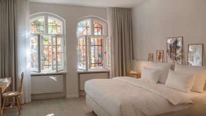

It’s that time of year when we’ve accepted the passing of summer and we’re fully embracing the opportunities that fall decor has to offer. It’s time to introduce some coziness to make us feel relaxed, calm, and comfortable at home which, considering we’ll be spending more time indoors, is vital. Using white paint ideas might not seem like the obvious choice to achieve that, but these hotel bedrooms indicate that a pale palette can indeed be made to feel like a warm hug.
We're often led to believe that a cozy interior automatically means deeper tones of darker colors and rich materials, and that's definitely one way of doing it. However, this renovation of Wilmina, a Berlin hotel, shows us the power of design to turn the norm on its head and serve us an incredibly inviting, light, and warm interior where a palette of off-whites was used almost entirely.
The use of natural materials and textures together with curated objects, all enveloped in a white palette complemented by warm natural light, create an incredibly inviting and soft interior. I spoke to the architects of this beautiful renovation to learn how they achieved this effect and to help you recreate the look in your own modern home.
Use white as a foundation and layer with pops of color
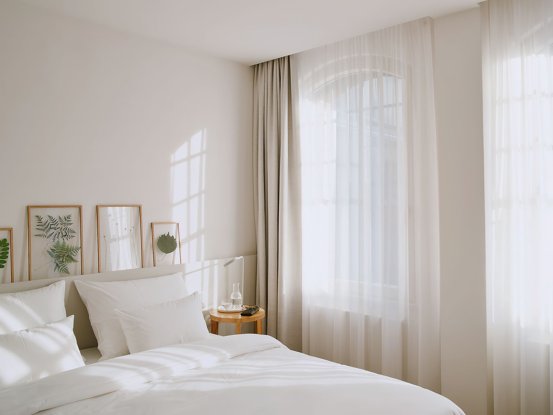
Walk into this heaven-like interior and you’ll immediately feel a sense of calm envelop you. The lightness all around transports you to what feels like a different world, enveloping you fully. You'll notice minimalism in the design and a color palette of predominantly white. However, there is an undeniable feeling of coziness, and that of being 'at home'.
Berlin Architects Grüntuch Ernst, the team behind the hotel renovation, tells me that there are in fact more subtle hues used here, and the color is not plain white at all. ‘To define the matching tone of white was indeed challenging,' the team told me. 'We used a series of mock-ups on various surfaces. The goal was to create a light, airy atmosphere to overcome the gloomy feeling that was dominating when we first entered the historic building.'
Walking through the space and into the bedrooms you'll notice that different shades of white marry harmoniously to create a very warm look that's miles away from the coolness or clinicalness we usually associate with pure white. This is soft and warm, almost as if it’s been touched by sunlight. An inviting white we love that's perfect for replicating the look is Sand Dollar from Benjamin Moore, with its warm pink tone.
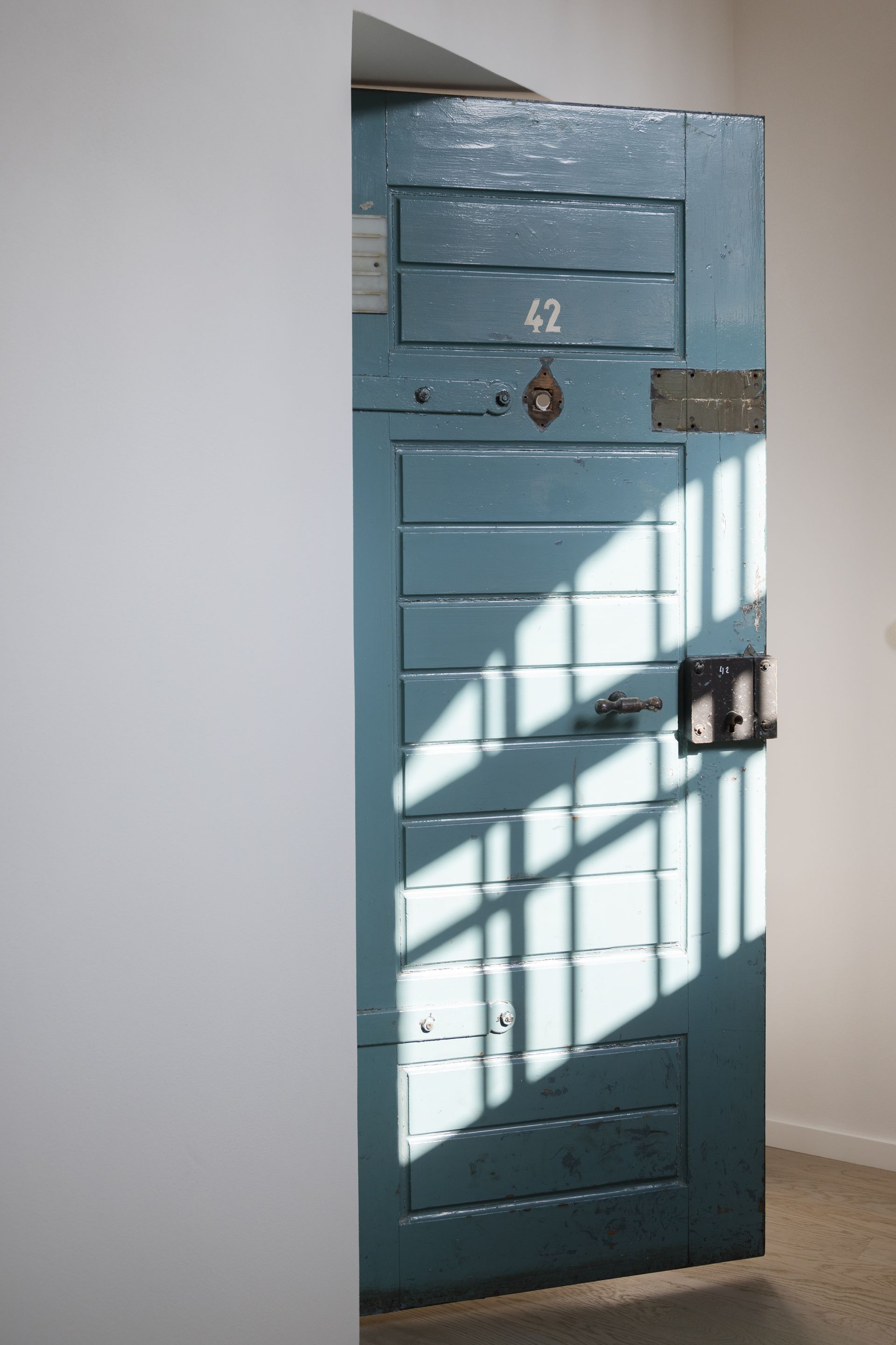
The surprise element here comes in discreet and unexpected pops of color dotted throughout the space. ‘Many of the original objects kept their original color, like the cell doors, and the handrails of the staircases,' explains the team pointing out the fact that color doesn’t have to shout or take over a space in order for its presence to be felt. 'The whole ensemble is dominated by the strong warm red of the original bricks, complemented by the many greens of the lush gardens.’ I love the idea of thinking of color not purely in the sense of paint, but actual elements of the building, like the red brickwork, or the natural environment with its shades of green.
Opt for whites with warm undertones
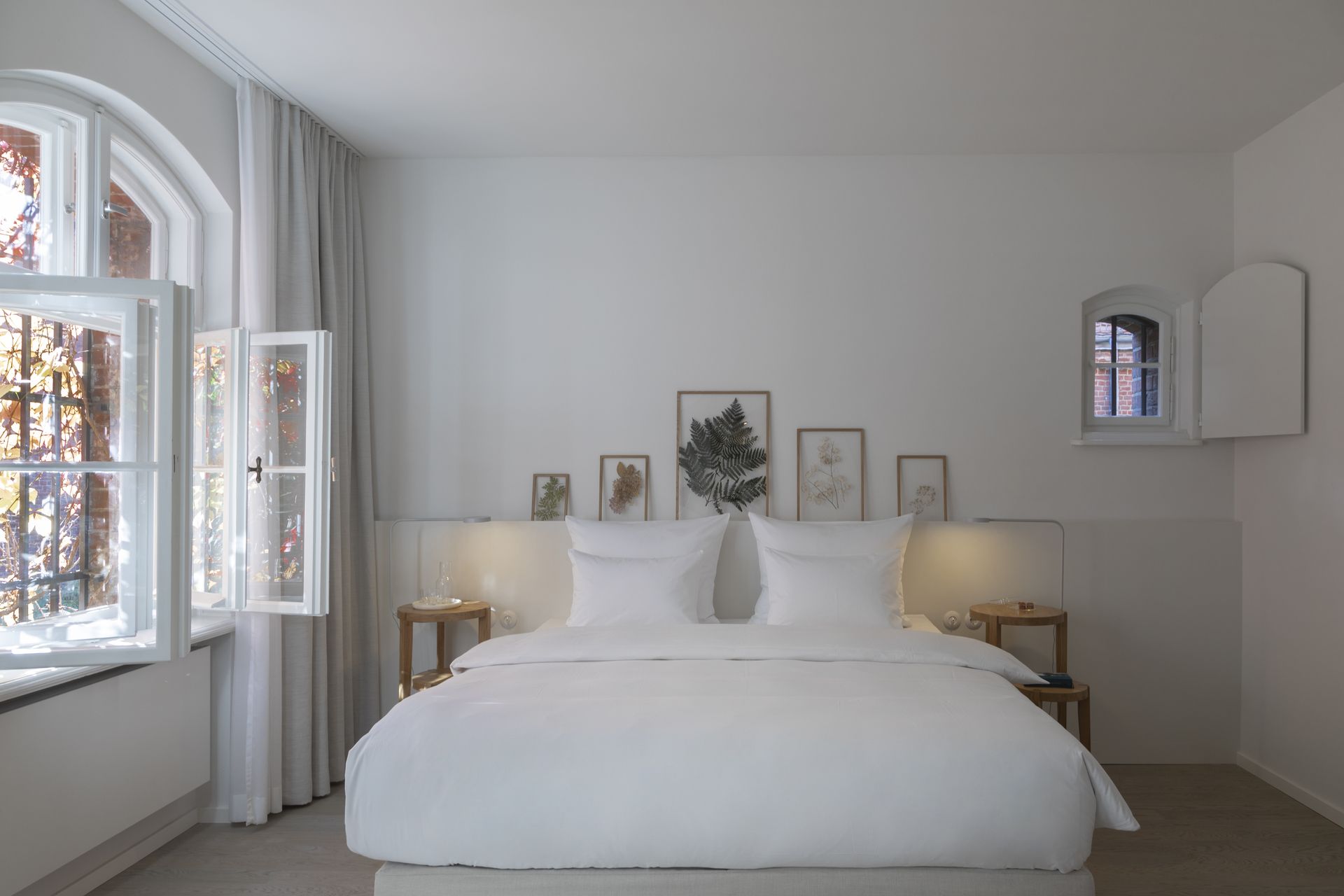
Before seeing the interiors of Wilmina, I thought white should be avoided when looking to create a cozy look, believing it to be too sterile or modern. And, in some instances, it can be. ‘To be completely surrounded with white and no other colors creates an under-stimulating space which ultimately is not calming for an individual,' explains architectural color consultant, Amy Krane. 'The lack of variety in hue, chroma (purity), and value ( lightness/darkness) is too monotone and can lead to stress reactions.'
What the team at Grüntuch Ernst did so beautifully here was use a variety of different warm whites that made the space feel welcoming. Using cool tones would have achieved the opposite effect. ‘Warm whites with hints of yellow, orange or red in them are more approachable whites while cooler, blue-toned whites feel more cold and sterile,’ explains Amy.
If you're looking to find the best white paint for interior walls, think of all the details and decide where you can play with different undertones. We love these bedsheets from Brooklinen because of their soft cream color which would look great paired with this comforting scheme.
Use a variety of different white tones
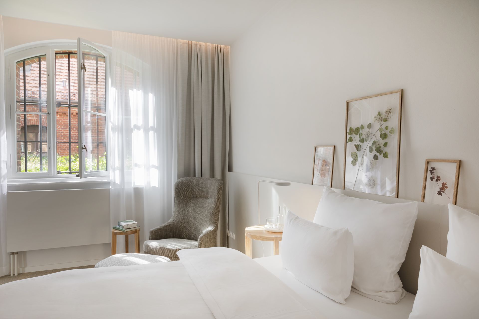
‘The amount of white also greatly influences how we receive it as well as the type of white,’ Amy explains. This plays out in Grüntuch Ernst design through the variety of white hues to create visual interest, mixed with natural colors like the light blue of the original doors, the deep red of the building’s brick, and stone-colored soft furnishings, and green (from the outdoors pouring in, or from botanical artwork). This brings a real warmth to the space.
‘It was important for us that the rooms should not be decorated with superficial opulence but radiate a certain lightness, openness, and a sense of calm instead,' the team explains. 'This meant light colors, soft textures, and warm, high-quality materials.’ This stool from Lulu and Georgia will be a great addition to an interior in white, be that a bedroom or white living room, due to its warm and natural wood tone.
This reno is a lesson in how a palette of off-whites can be used skillfully to achieve an unexpectedly warm interior that feels like home. It’s all in the balance of mixing a variety of whites with warm hues, allowing natural light in, and bringing in subtle touches of natural color to create a cozy space where one can truly relax.
Create a cozy white interior with these buys
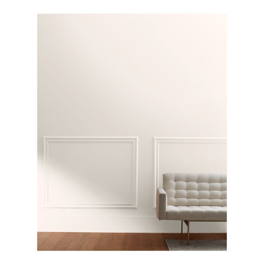
Price: $98.99 for a gallon
When decorating with white make sure you use whites with different hues, in this case, a delicate pink-grey cast. Use more than one white for variety and subtle depth.
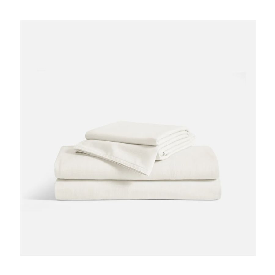
Price: from $325
These sheets will look beautiful in a white scheme bedroom. The creamy white will add to that white variety needed to create a cozy look.
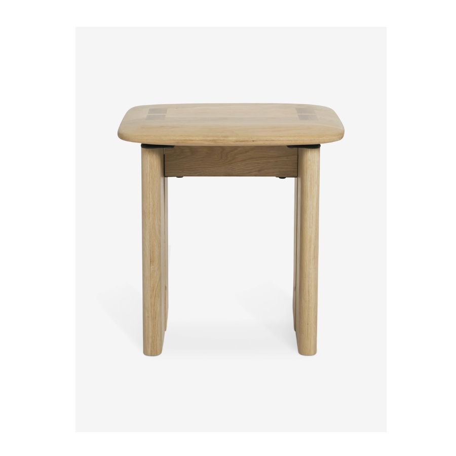
Price: $199
In a mainly white color scheme, bring natural tones such as wood for a warm effect. This stool can also be used as a bedside table.
Be The First To Know
The Livingetc newsletter is your shortcut to the now and the next in home design. Subscribe today to receive a stunning free 200-page book of the best homes from around the world.

Raluca is Digital News Writer for Livingetc.com and passionate about all things interior and living beautifully. Coming from a background writing and styling shoots for fashion magazines such as Marie Claire Raluca’s love for design started at a very young age when her family’s favourite weekend activity was moving the furniture around the house ‘for fun’. Always happiest in creative environments in her spare time she loves designing mindful spaces and doing colour consultations. She finds the best inspiration in art, nature, and the way we live, and thinks that a home should serve our mental and emotional wellbeing as well as our lifestyle.
-
 These 12 Best Table Lamps for Your Desk — Perfect Glows for a Creative Home Office
The best table lamps for your desk is have a soft, targeted glow. Elevate your WFH set-up with these stylish picks endorsed by Style Editor Brigid Kennedy
By Brigid Kennedy Published
-
 The Nespresso VertuoPlus is 30% Off for President's Day, and it's Kim Kardashian's Coffee Maker of Choice
This sleek and stylish coffee maker was spotted in Kim's home bar, and you can currently save $60 if you buy yours from Amazon
By Lilith Hudson Published

