Designer Profile: Martin Brudnizki
WHEN DID YOU FIRST FALL IN LOVE WITH DESIGN? I grew up in Stockholm where my father wasa civil engineer and my mother a visual merchandiser – she was an incredibly stylish woman and our home was very visual, surrounded by elegant things and my father’s drawings.
HOW DID YOU GET YOUR BIG BREAK?
I’d studied business at university and then did modelling, but it wasn’t until a friend studying interior design showed me what he was doing that I thought, ‘I could do that’. I moved to London at 23 to study interior design at what’s now The American University in London – I liked the architectural influence in what we learnt – and I got my first job working with one of my former teachers, Philip Michael Wolfson.

WHAT’S YOUR DESIGN ETHOS?
I start by looking at the building, the neighbourhood and the way we want people to feel in the space – from this, I gather together ideas and then think about how we can do it differently. It’s about balancing tradition and modernity in a super-layered, yet pulled-back way, creating something that feels familiar. I like it when someone says my interiors feel like they ‘belong’.
HOW DO YOU ACHIEVE THIS?
At The Beekman hotel in New York, the extraordinary building really helped us to tell the story – we used all its quirky details and reproduced them, with a mix of Victorian lamps, Sixties desks and Thirties sofas, so they look like they’ve always been there, but not in a pastiche way. We took it all as inspiration, but moved it into the 21st century.

DO YOUR INTERIORS OOZE A PARTICULAR MOOD?
The furniture and fabrics might be different with each project, but there’s always a sense of warmth and colour and a relaxed and nurtured feeling. For me, these things never change. I like layers – first creating the room, then looking at the furniture, fabrics and cushions, then objects and finally art.
WHAT’S YOUR STARTING POINT?
How a space flows is key, because it informs the softness of layering and lighting – so the layout of a room rather than the style comes first. When we designed Dean Street Townhouse, we intentionally made entering the restaurant awkward, so that as you come through the door, you have to bunch up together and then you step into the main space and it reveals itself. It was about being packed, fun and noisy.

HOW HAVE YOUR SCANDI ROOTS INFLUENCED YOUR DESIGNS?
For the Nordic restaurant Aquavit in London’s St James’s,I wanted to prove that Scandi can be glamorous and chic. I played with Kolmården marble, pale oak and polished brass – all materials I grew up with. When I went shopping with my mother at Svenskt Tenn, it mixed modern and classic together in a way that wasn’t too hard or unfeeling.
WHAT DOES HOME MEAN TO YOU?
Home is intimate and constant, much harder to design than a restaurant because it’s so personal. I think homes should show your history, so don’t go and buy everything all at once – books should be ones you’ll read and details should feel personal and curated over time. I want a home to feel full of life.

WHAT’S YOUR OWN HOME LIKE?
When I renovated my flat, I made sure every square inch worked – every room gets used every single day and there’s a place for everything. It’s layered with books, art and objects – there’s a kitchen island where we can cook and eat, a wardrobe in the hall for all our coats and a table to put our keys. I don’t believe a bedroom should have anything more than a bed and bedside table – I’ve turned the second bedroom into a study-cum-dressing room with a vintage table from Fiona McDonald, armchairs for sitting in and a chaise for laying out clothes. The whole flat flows.
HOW DO YOU DEFINE YOUR COLOUR PALETTE?
I like to restrict myself – it can be as simple as shades of blue, but for neutrals, I’d never do beige: I might work with a white, pale grey or silver. I’ve just launched a range of fabrics with Christopher Farr Cloth that reflect my favourite hues – they’re rich and sophisticated, allowing me to team yellow with green or burgundy, blue with coral and pink with green, but in tones that are pulled-back slightly, so they mix harmoniously.

HOW ABOUT LIGHTING?
Lighting is everything – we can design a cute, sexy red bar, but a harsh white light won’t do it justice. We like to use Segula LED bulbs, which get warmer when dimmed. I like lighting at all levels – from a glam chandelier to illuminating a dado rail. Even a little lamp on the floor can shed a fantastic pool of light across a hardwood floor. The only thing I don’t do is recessed downlighting – that’s a total no-no!
WHAT ABOUT WALL LIGHTS?
For And Objects, we designed the Wherewell wall light for The Ivy – the shape of the glass and the way light goes through it give a lovely, glamorous glow, even when it’s not lit.

DO YOU HAVE ANY FAVOURITE MATERIALS?
For flooring, I like Schotten & Hansen. For fabrics, Jim Thompson has the best slubby silks and Robert Allen patterns and weaves. I also love Fox Linton’s glamorous mohair velvets.
HOW DO YOU WORK WITH PATTERN?
For the new four-storey Annabel’s, every floor will have a different feel, playing with the themes of flora and fauna. I’m mixing lots of plush geometrics and florals alongside animal prints, de Gournay panels and Lalique glass. Fringing, tassels or piping from Samuel & Sons will help break up this eclectic mix of materials.

WHAT ELSE IS BIG NEWS AT THE PRACTICE?
I’ve recently designed a range of lamps for Porta Romana and a capsule furniture collection for George Smith. The Wigmore at The Langham hotel has just opened – taking gastro-pub luxe to new heights – and the Bullion restaurant for chef Bruno Davaillon in Dallas is opening soon.
Be The First To Know
The Livingetc newsletter is your shortcut to the now and the next in home design. Subscribe today to receive a stunning free 200-page book of the best homes from around the world.
The homes media brand for early adopters, Livingetc shines a spotlight on the now and the next in design, obsessively covering interior trends, color advice, stylish homeware and modern homes. Celebrating the intersection between fashion and interiors. it's the brand that makes and breaks trends and it draws on its network on leading international luminaries to bring you the very best insight and ideas.
-
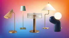
 The 12 Best Table Lamps for Reading —I'm a Certified Bookworm (and Shopping Expert)
When it comes to table lamps for reading, I don't mess around. If you're the same, this edit is for YOU (and your books, or course — and good recommendations?)
By Brigid Kennedy Published
-
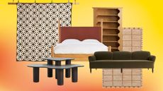
 "It's Scandi Meets Californian-Cool" — The New Anthro Collab With Katie Hodges Hits Just the Right Style Note
The LA-based interior designer merges coastal cool with Scandinavian simplicity for a delightfully lived-in collection of elevated home furnishings
By Julia Demer Published

