Designer Profile: Tom Barlett
WHAT WAS YOUR FIRST TASTE OF DESIGN?
My dad was a builder and my mum worked at Biba – they were eccentric and eclectic and I remember us moving into a run-down house in Notting Hill after Biba closed and Mum bringing all the shop furniture with her. We lived on the top floor for three years until the house was finished – it had blood-red walls and was filled to the brim with antiques.
HOW DID YOU GET INTO THE INDUSTRY?
During a year out from studying architecture in Manchester, I worked with interior designers Justin Meath Baker and Christopher Neville. They were redoing a big historical house that had burnt down and I really connected with the way they combined architecture with interior design, working with conceptual rigour and whimsy too. It inspired me to finish my studies at The Bartlett School of Architecture at UCL.

HOW DOES WALDO WORKS APPROACH EACH PROJECT?
We try to connect the heritage of a place with the mood of the present – throwing stuff around just to look nice doesn’t feed a home’s soul. We like giving a space a heart by creating a story that helps to guide every decision, from walls to door knobs.
HOW DO YOU DO THAT?
We spend as much time as possible getting to know the client – we’re incredibly nosy – it can sometimes be almost like therapy! We use their interests and passion as a starting point. For example, one young Russian couple loved travelling, so we created a theme for the colours and geometries of the house inspired by Russian Constructivist posters. On the other hand, for a big glass apartment overlooking the Thames, the way light felt across the space, from day to night, gave us the celestial idea of using milky hues for dawn light at one end, warmer shades in the middle and darker colours at the other end.

WHAT ARE THE PRACTICAL CONSIDERATIONS FOR DESIGNING A SPACE?
Seventy-five per cent of what we do is about creating good architecture – getting the bones of the house right and dividing the place into sanctuaries for retreat and public areas for enjoying with family and friends. Think about the things that are most important to you – and don’t underestimate the importance of spaces such as the bathroom. If you love having a bath, but decide to skimp on this in favour of an expensive kitchen (which you’ll barelyuse), how annoyed will you be?
HOW DO YOU STAY TRUE TO A BUILDING'S ROOTS?
For The Laslett, we combined five Grade II-listed buildings. When we ripped everything out, we found old details hidden behind the plasterboard, which weused as templates for the cornicing and skirting. It lent the redesign an honesty and respect, but with contemporary furniture and lighting, it felt modern – like staying at a cool friend’s house rather than a hotel.

DO YOU HAVE ANY SIGNATURE TOUCHES?
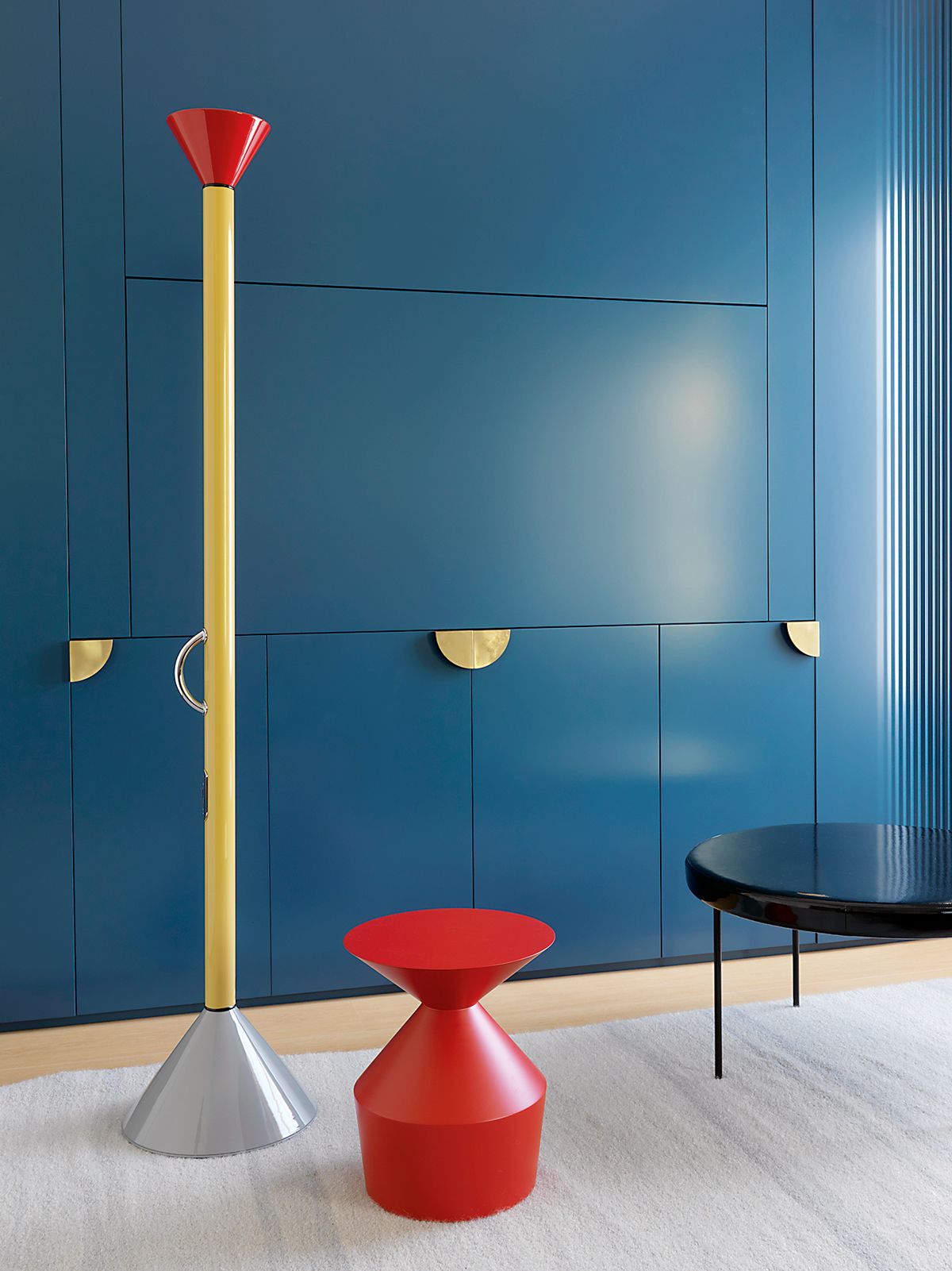
I like to keep things loose – unfitted furniture helps to make a room feel relaxed. There’s always a bit of red to draw the eye and a statement chair too, such as Fratelli Boffi’s Lui5. Connecting rooms with a detail also takes people on a journey – in one house, we designed some grooves like sound waves into the panelling of one room, which then reappeared elsewhere as a pattern for the fireplace. Geometrical shapes such as cones are a useful repetitive tool, especially in different scales, to remind you of a theme from one room to the next.
WHAT DOES HOME MEAN TO YOU?
Home is the old spice warehouse I bought years ago, often a huge mess of pieces coming and going because I like to really test things out and know how they really work. Home should reflect who you are, surrounded by things that aren’t just for show but have meaning, like the pair of funny old wonky candlesticks, which were my granny’s pride and joy.

IS THERE ANYTHING YOU CONSIDER ESSENTIAL TO EACH PROJECT?
Always prepare for the unexpected: allow for a contingency fund that covers 10-20 per cent of the proposed total building cost, so you can cope with any nasty surprises.
WHAT'S A GOOD DESIGN TIP IF YOU'RE WORKING TO A BUDGET?
Don’t pay out for expensive paint – I go Dulux all the way. Spend money on one thing and do that one thing well – whether it’s the walls, floors or a bathtub.

WHAT'S A GOOD WAY OF ADDING INTEREST TO A SPACE?
We designed a wall of storage in the apartment in Neo Bankside to be both graphic and practical – it holds the collected objects within a simple design that’s also a statement in itself. It’s this mix that makes a home feel dynamic but personal.
HOW DO YOU DECIDE ON COLOUR SCHEMES?
Paintings are a great source for ideas on what colours work together. Pick a painting you love (you don’t have to own it, it can be any painting) and extrapolate from that – but it’s not about matching colour schemes with a piece of art, it’s more about creating harmony between walls, floors and furniture.

WHAT ARE YOUR FAVOURITE MATERIALS OF THE MOMENT?
I love the way the random patterning in Marmoreal slabs create energy in a room. I never use it polished, it should feel like a warm, worn church floor. I love the soft feel of lino too as a topping for desks and shelves – and even as a bathroom wall treatment as it’s waterproof to a degree – teaming a strong colour with brass trim between the panels looks beautiful. In one house, we used hand- dipped, hand-cut tiles inspired by Debenham House in Holland Park in a mix of sizes and colour to lend variation and interest.
HOW DO YOU LIKE TO BE INNOVATIVE WITH YOUR DESIGNS?
We try not to repeat how we use materials, so I’m always looking for new techniques and technologies – a recent discovery is printed glass. In a house in Chiswick, the owner has a very specific day- and night-time ritual in the bathroom, so it has two separate rooms – one has a bath with a chair, with a white marble floor and a night-time scene; the other has a shower and loo, with an image of the sky at dawn, both printed on glass panels lining the walls.

FINALLY, DO YOU EVER BREAK THE RULES?
I like to add a little bit of punk at the end of everything – it’s a trick I learnt from Jade (Jagger) when we were working on jewellers Garrard together. She joked we should finish it off with a can of spray paint – graffiti style – across the silk walls. Of course, we didn’t, but it would have been memorable. My motto is you can’t read good taste unless there’s a bit of bad taste in the room.
For more info about Waldo Works Studio, visit waldoworks.com
Be The First To Know
The Livingetc newsletter is your shortcut to the now and the next in home design. Subscribe today to receive a stunning free 200-page book of the best homes from around the world.
The homes media brand for early adopters, Livingetc shines a spotlight on the now and the next in design, obsessively covering interior trends, color advice, stylish homeware and modern homes. Celebrating the intersection between fashion and interiors. it's the brand that makes and breaks trends and it draws on its network on leading international luminaries to bring you the very best insight and ideas.
-
 How to Make a White Bathroom Feel Warm — 5 Tricks Designers Use For a Cozier and More Restful Spaces
Give your all-white bathroom a glow-up with these tips for bringing warmth to the space
By Oonagh Turner Published
-
 5 Habits to Adopt That Will Make Your Home Smell Good All the Time — 'Add Them to Your Routine Today!'
Incorporating these tricks into your maintenance routine will keep every corner of your home smelling fresh and welcoming
By Katie Baxter Published

