Designer Profile: Sally Mackereth
WHEN DID THE DESIGN BUG FIRST BITE?
I met one of my architectural heroes, [the late]John Lautner,in California when I was a student. I trailed behind him on a tour of some of the modernist houses he’d designed and was immediately taken by the playfulexuberance and detail of his work. I loved the interplay between inside and out – first connecting the house to the landscape and then figuring out how to design the inside.

WHAT WAS YOUR BIG BREAK?
A very state-of-the-art loft apartment in Soho before I’d even finished college – I had a brave client wanting to experience London’s 24/7 crazy lifestyle (the complete opposite to his life living in a Scottish castle). He wanted decadentand unexpected and was even up for commissioningBill Amberg to create suede walls.

DESCRIBE YOUR STYLE
I don’t like perfect spaces – I enjoy being playful. It’s not about showing off, it’s about being comfortable doing things that at first might feel eccentric, like mixing contemporary design pieces with antiques and salvaged finds.
HOW DO YOU MARRY OLD AND NEW?
I like to layer details of the past, present and future of a building to tell a story. It might be retaining the old brick walls within an interior or reusing timber from the rafters – it’s not upcycling, more reimagining. After all, if something has been there for 200 years, who am I to chuck it out? We recently renovated a former 19th-century Chelsea painting studio (and home) of Whistler, John Singer Sargent and Augustus John, where we took inspiration from the colours they liked to paint with and lined the walls in Venetian gold Dedar satin-cotton, the colour of egg yolk.

SO IT'S ALL ABOUT MIXING IT UP?
It’s about high and low for me. Similar to the way I dress –I love Céline, but I can’t wear it head to toe (even if I could afford it!). Instead, I’ll wear a great fashion piece with old jeans – it’s exactly how I like to furnish a space. A few fab pieces, suchas a great rug from The Rug Company and a Harry Bertoia Bird chair – my favourite of all time – next to a chair I found at a market that I’ve repainted. Vintage sofas are great, but hard to source – I like Heal’s Cumulus sofa instead. It’s enormous, with a great Seventies sloppy shape, best when covered in a rich, deep-hued velvet.

HOW DO YOU PERSONALISE A SPACE?
I create a bespoke piece for every project. For a house in Chelsea, I designed a 10-seater dining table using 8,000-year-old petrified oak dredged from a Croatian riverbed and filled the natural cracks with brass. For the Albemarle Street apartments in Mayfair, I designed a freestanding folding walnut screen. I like to leave each space with something that’s unique to, and inspired by, it.

DO YOU HAVE ANY SIGNATURE DESIGN TOUCHES?
Secret gardens. I love when you’re in Paris and Rome and you spy a hint of greenery behind a gate or door from the street. I like being connected with nature, whether it’s a potted indoor tree (the huge Fiddle Leaf fig tree in the Ladder Room at Chiltern Firehouse is stunning), or dissolving a threshold by extending the interior details of flooring, rugs and sofas into a courtyard. I enjoy nothing more than going out with a glass of wine and fiddling with things in pots.

HOW DO YOU MAKE SPACES FEEL BIGGER?
Hidden doors. Think National Trust properties and the way secret exits are disguised within the panelling. Pocket doors (where the door slides into a space in the wall) are ideal because they’re only there when you need them, or pivoting walls that hook back, either painted or papered in with the other walls. Also full-height doors – your eye doesn’t read them as something separate. With these, you can reconfigure a space to suit many needs without affecting the flow of the house.

HOW DO YOU DEAL WITH LIGHTING?
Lighting should work whether you’re in a house alone or with a big party of people. Put everything on dimmers (except where you need a proper blast of task lighting,such as over a bathroom mirror). I often change the lighting at friends’ places when we go for dinner – I know it’s rude, but seductive lighting really sculpts a space, creating the right atmosphere. I turn some lights on, some off, at all levels of the room – from ceiling to floor. Areti’s Ilios wall lamps give a wonderful glow, or for a dramatic finishing touch, I love Tommaso Barbi’s rhubarb leaf lights. For stairs, I backlight the handrail – it lends gentle illumination without creating glare.

WHAT ARE SOME OF YOUR FAVOURITE DETAILS?
I’m playing with Little Greene’s Invisible Green, Dark Lead and Pink Slip paints at the moment. It’s also important to invest in the things you touch every day – such as light switches and door handles. I appreciate the way Gio Ponti’s blackened brass Lama L-handles for Olivari feel in the hand. I’m not a fan of shiny and new – I’d rather team robust materials, like an end-grain wooden floor and polished concrete with a luxurious soft rug, to elevate them to something that feels beautiful.

WHAT'S ESSENTIAL TO ALL YOUR DESIGNS?
Every house needs storage. I think a lot about places to put suitcases, where to plug in phones and how to stop keys and post clogging up the hall. I make the most of space under the stairs and build in false walls and I love a bar – nothing beats having a place to fix a drink or a side table for your scotch.

HOW SHOULD A HOME FEEL?
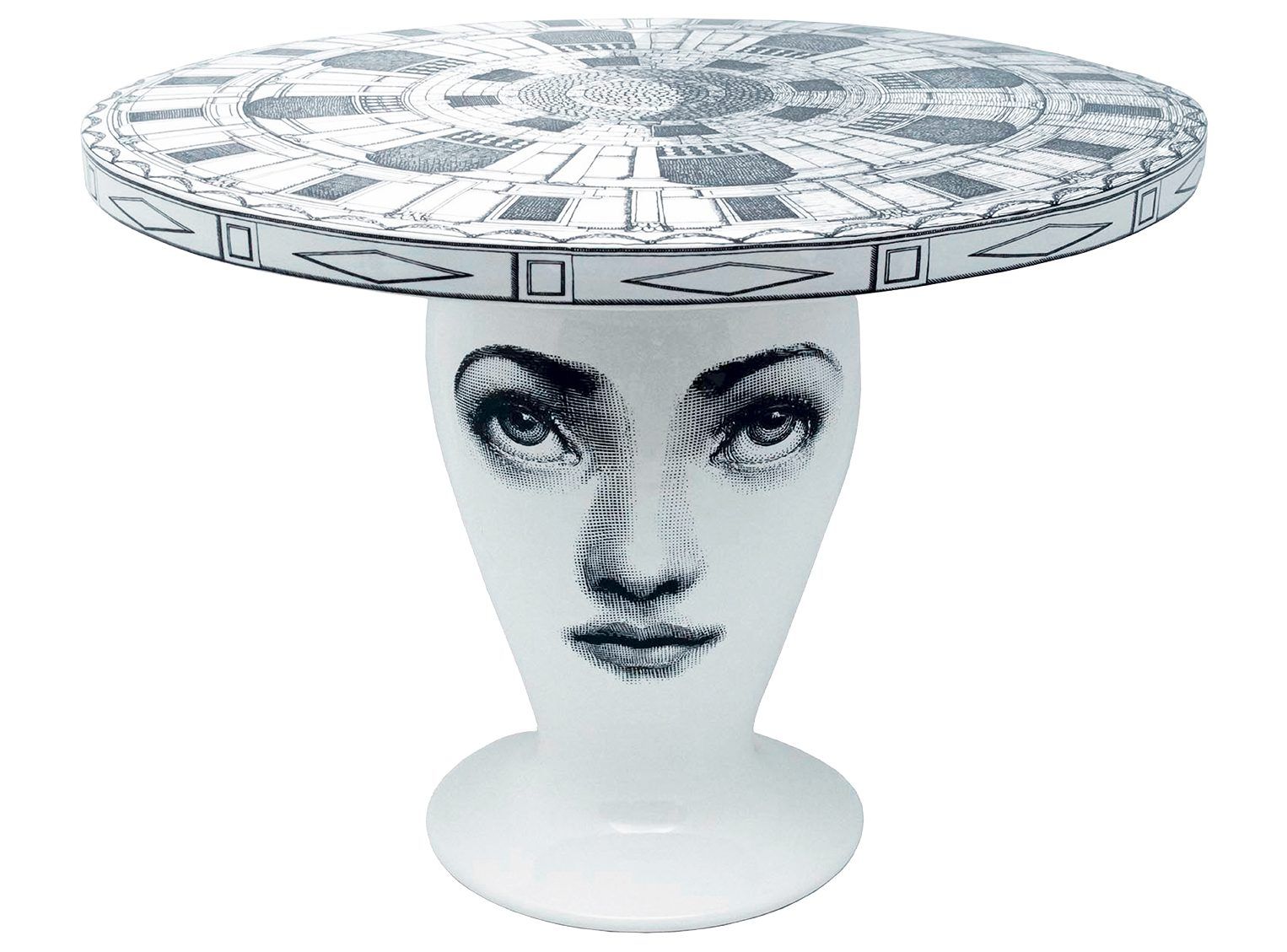
The most exciting interiors feel as if they’ve evolved naturally over time – a chic and comfortable space is how you pull it together, not how much you spend. I’m currently restoring two former Victorian stables into a design studio and our family home – here, flea-market finds will sit alongside witty Fornasetti pieces that I’ve spent years saving up for.

WHAT ABOUT PATTERN?
Guest bathrooms are perfect places for going a little bit out there with some bold wallpaper and a montage of framed pictures. I have a preference towards Hermès Jardin D’Osier wallpaper and Pierre Frey’s Mauritius linen. I also like a full-height pinboard wall, made from padded felt, where I can put up the kids’ drawings and funny postcards. It’s a constantly changing moodboard of our lives.
WHAT MAKES YOUR SPACES WORK SO WELL?
I’m a modern architect, so of course I obsess about detail, but contemporary isn’t about spaces looking uncomfortable and stark. It’s about design that feels light, effortless and deeply considered. To me, that’s what real style is all about. I want to leave behind a legacy of giving great pleasure to people and always exceeding their expectations.
For more info about Sally Mackereth, visit studiomackereth.com
Be The First To Know
The Livingetc newsletter is your shortcut to the now and the next in home design. Subscribe today to receive a stunning free 200-page book of the best homes from around the world.
The homes media brand for early adopters, Livingetc shines a spotlight on the now and the next in design, obsessively covering interior trends, color advice, stylish homeware and modern homes. Celebrating the intersection between fashion and interiors. it's the brand that makes and breaks trends and it draws on its network on leading international luminaries to bring you the very best insight and ideas.
-
 The 12 Best Table Lamps for Reading —I'm a Certified Bookworm (and Shopping Expert)
When it comes to table lamps for reading, I don't mess around. If you're the same, this edit is for YOU (and your books, or course — and good recommendations?)
By Brigid Kennedy Published
-
 "It's Scandi Meets Californian-Cool" — The New Anthro Collab With Katie Hodges Hits Just the Right Style Note
The LA-based interior designer merges coastal cool with Scandinavian simplicity for a delightfully lived-in collection of elevated home furnishings
By Julia Demer Published

