Designer Profile: Michaelis Boyd
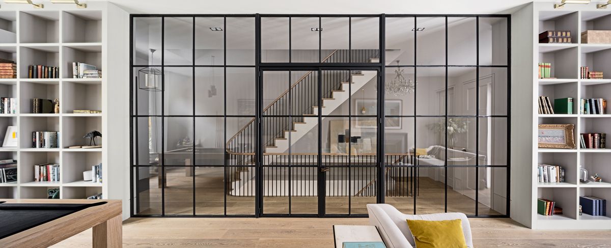
Architects Alex Michaelis and Tim Boyd joined forces in 1995, having freelanced side by side in Alex’s loft space post graduation. They had a vision to bring elegant simplicity and a sense of homely comfort to disparate spaces, from Byron burger joints, retreats such as Babington House and London member’s club Groucho, to homes around the UK including countryside pool houses and the Camerons’ London home (before they moved to Number 10). Alex tells us about his obsession with flow, light and space.
DID YOU ALWAYS WANT TO BE AN ARCHITECT?
Although my father was an architect, it wasn’t until I went to Florence at 18, wandering around and admiring all those beautiful buildings, that I thought there might be something to this building lark. After graduating in 1991, I went to work for Julyan Wickham, a completely mad but great fun architect until he basically ran out of work and it forced me to go solo. It was the best thing that could have happened.

HOW DID YOU TEAM UP WITH TIM?
We were both working on little mini jobs found through word of mouth recommendations; we realised it made much more sense to work together. The first big jobs we did included the bar at Soho House in Greek Street and the Moro restaurant in Exmouth Market.
YOU FORGED AN EARLY REPUTATION FOR CLEAN-LINED, MINIMALIST WHITE SPACES...
I think we used to be more modernist – all white and simple oak floors, very John Pawson-esque (one of my heroes, alongside Le Corbusier, Claudio Silvestrin and Swiss architect Peter Zumthor) – but now we’re more relaxed. Our main concern is to get as much light and flow into a space and to get the fixed concrete part of the building right, because then the client can do whatever they want.

WHAT'S YOUR SECRET TO ACHIEVING 'FLOW'?
Sticking to clean lines. We also play with the sensual, beautiful curves of a balustrade or a chair. We’re not frightened of good curves – it’s an architectural technique that slightly gets lost on a computer. I like to sketch out a space, especially in an existing house, to find the right flow from one room to another.
WHAT MAKES THE PERFECT SPACE?
It needs to have lots of light and room and to be calm – the world is getting madder and madder so home is more and more of a haven – and I like spaces that are very kid-friendly. Between my new partner and I, we have seven children. We’re currently building a new house on the site of an old garage in west London and there’s going to be a big den so they don’t take over the living room the whole time, a fireman’s pole and a netted trampoline (among real trees) on the flat roof.

HOW ABOUT OPEN-PLAN LIVING?
I love being able to cook, talk and eat in the same space because I want anyone to be able to come around anytime and sit down and have a glass of wine and talk. Lose the formal dining room – no one uses them – and put where you cook, eat, do homework and entertain in the one space that’s the best room in the house (basements are for children’s playrooms and utility rooms).
HOW DO YOU MAXIMISE THE SENSE OF LIGHT?
Skylights over staircases. Or if redoing a staircase, I’d opt for open tread, set away from the walls, so planes of light can just run down the house. High-level glazed panels allow light into any dark spaces where you also want privacy; doors should go all the way to the ceiling so light can run through from one room to the next when open; and curved walls help too – light disappears into boxy corners, whereas it follows a curve around and bounces off it.

IS TACTILITY IMPORTANT?
I like walking around barefoot and I love wooden floors with texture scraped out of them so you can feel the little ridges in the timber underneath your toes. An enveloping colour such as petrol blue work well against concrete and old metals. Anywhere I can surprise someone with leather on handrails is fantastic because it lends warmth and feels good to hold. There’s a myth that having something custom-made is expensive – but we work with lots of small suppliers with artisan skills that will disappear if we don’t support them and it always ends up cheaper because you get something beautifully made that fits the space properly.
BEST DECORATINH TECHNIQUE?
I love white plaster on walls – it’s beautiful, warm but cheap. It’s actually just a skim of whitened plaster that you simply leave and don’t seal or paint over. It immediately crosses out the £25K cost of decorating.

AND ANY DESIGN NO-NOS?
I don’t like things overdone, with too many materials thrown at it, or the way cheap hotels use so much plastic. Even as the world grows, we don’t need to resort to using cheap, nasty, tacky materials.
YOU'VE UPPED THE NOTCH ON GROUCHO CLUB TO RAVE REVIEWS...
Spatially, it was a mess. We’re moving the entrance and added a library and an outdoor terrace. The key was to rationalise how the space worked. There were lots of funny, blocked spaces nobody wanted to go, including a snooker room no one used. The key was to make it feel different without losing the spirit.

HOW DO YOU CREATE THE LIVED-IN FEEL?
I’ve always loved scouring vintage furniture markets in places such as Lille. Old pieces are a perfect way to soften a new space. We’re currently working on a hotel in Williamsburg, New York, where we’re leaving original finishes such as the seams of pipework rough so it doesn’t feel too polished. Leather, wood and bronze age so well the more you live with them.
Find out more at michaelisboyd.com
Be The First To Know
The Livingetc newsletter is your shortcut to the now and the next in home design. Subscribe today to receive a stunning free 200-page book of the best homes from around the world.
The homes media brand for early adopters, Livingetc shines a spotlight on the now and the next in design, obsessively covering interior trends, color advice, stylish homeware and modern homes. Celebrating the intersection between fashion and interiors. it's the brand that makes and breaks trends and it draws on its network on leading international luminaries to bring you the very best insight and ideas.
-
 How to Thaw a Frozen Pipe — Learn Everything You Need to Know in 5 Minutes With This Guide
Winter storm caught you off guard? We asked an expert — just how do you thaw a frozen pipe?
By Hugh Metcalf Published
-
 The 12 Very Best Silk Bedding Pieces — As Our Style Editor Says: 'It's What Dreams Are Made Of!'
Slumber in lustrous luxury with the very best silk bedding sheets, duvets, pillowcases, and more — your sleep score will thank us later
By Julia Demer Published

