Trending: Bold Colour
Get inspired by bold, colourful schemes...

CENTRE STAGE
Your quickest route to a cook space with style confidence? Start with complementary colour pairings. Let deVOL’s New York showroom be your design inspiration and mix glossy green metro tiles with flamingo-pink cabinetry for a look that dials up the domestic drama...

This red chair needs to take the lead, so paint the set white and surround it with strong supporting players each with a colour character of their own.

FAMILY DRAMA
Love all your pieces equally for their shapes as well as their shades. If the shapes work together – as they do here, with an assembly of low-slung pieces – the colours will fall into line.

BIT PART
Get closer to the action with a table of vibrant small pieces that provide a change of scale and focus. These rounded objects pick up on the curves behind, but avoid repetition by telling their own separate story in shapes and colours.

DUAL ROLES
Colours take sides here: in the blush corner, the pink-red of the pillar, chairs, stool and mirror. In the white corner, the kitchen, the walls, the table and rug. The accessories bring in new shades to heighten the tension.

CASTING CALL
With a bleached-out backdrop, you’re free to stage a new drama every night. The white in the patterned pieces creates a link with the surrounding space, or try strong shapes in solid matt colours that attract light and attention.

THE BIG REVEAL
Find a show-off piece – like this metal-lined bar – and use colour to take it centre stage. Here, the solid panel of fabric on the wall catches the eye and a glossy screen caresses the bar’s curves. The different shapes – flat and curved – work together to complement the bar.

LEARN YOUR LINES
Every piece here adds an experimental graphic element, giving the scheme a post-modern vibe. The rug’s blue and green hues echo around the room from the large blue sculptural pieces to the delicate frame of the chair.

BRAVO!
Why match everything when you can be bold and daring? Leaving space between patterns and colours avoids overloading the eye with too much detail, while the rich colours of the bed, table and artwork create focal points.

DOUBLE ACT
Two colour dynamics are at play here. Primary shades connect the table to the plinth in the foreground, while the soft-brown hue of the chair connects with the patterned pillar. Keep palettes distinct to avoid blurring boundaries.

Photography: Jake Curtis
Styling: Hannah Franklin
Be The First To Know
The Livingetc newsletter is your shortcut to the now and the next in home design. Subscribe today to receive a stunning free 200-page book of the best homes from around the world.
Lotte is the Digital Editor for Livingetc, and has been with the website since its launch. She has a background in online journalism and writing for SEO, with previous editor roles at Good Living, Good Housekeeping, Country & Townhouse, and BBC Good Food among others, as well as her own successful interiors blog. When she's not busy writing or tracking analytics, she's doing up houses, two of which have features in interior design magazines. She's just finished doing up her house in Wimbledon, and is eyeing up Bath for her next project.
-
 How to Thaw a Frozen Pipe — Learn Everything You Need to Know in 5 Minutes With This Guide
Winter storm caught you off guard? We asked an expert — just how do you thaw a frozen pipe?
By Hugh Metcalf Published
-
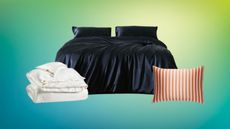
 The 12 Very Best Silk Bedding Pieces — As Our Style Editor Says: 'It's What Dreams Are Made Of!'
Slumber in lustrous luxury with the very best silk bedding sheets, duvets, pillowcases, and more — your sleep score will thank us later
By Julia Demer Published

