The world's best interior designers are all picking this exact shade as the smartest and newest trend for relaxing bedrooms
Three of the world's leading designers have separately identified this color as the one you should be using in your bedroom designs


It's not uncommon for the interior designers I interview to - coincidentally - agree with each other. Certain moods take hold, ideas take over, and in general the thinking about how to decorate usually reaches a consensus.
But it's unusual for designers to pick the same exact color, completely separately of each other, in separate interviews. And when those interior designers are Robert Stilin, Brigette Romanek and Tom Dixon, you sit up and take note.
The three icons of design have different aesthetics, but there is definitely a link between them. Based in Laurel Canyon, LA, Brigette is the height of relaxed, Californian glamor. She recently completed Gwyneth Paltrow's incredible home and it's not dissimilar to her own - organic shapes, indoor trees, rooms that inspire you to want to wear a cocktail gown but to very much go barefoot, too.
Robert, on the other hand, lives in New York, and his take on urban-apartment-meets-upstate-cabin often sees white walls, clever art placement, and lots of rich dark brown pieces of furniture.
And Tom, based in London, is perhaps most famous for his lighting and dramatically-shaped chairs, though his products and interiors are also fascinating for their mix of materials and innovative processes.
Where these three international designers overlap is in their perfect curation of things - of how the space between each item in the room is as important as the item itself. They are all hugely influential, their work seem in magazines and books all over the world, their own names now as big as their impressive roster of clients.
And guess what color they all picked as their top bedroom idea? Lavender. Yes, lavender.
Why lavender is the best color for the bedroom

Robert Stilin was the first designer to pick lavender as his favorite bedroom shade. I was asking him about how he manages to use predominantly white walls and make them feel warm, not stark.
'I've been doing this work for 30 years,' he told me, 'and color is the biggest challenge. I have the highest insecurity around color, and [I find it scary to be] making a choice to paint a room [something vivid like] orange or green. There are so many variables about the light in the room that you can't control, and you have to make a leap of faith to use a strong paint shade. So when I was younger, I would stick with white paint for interior walls and bring the color in elsewhere - the white became part of the architecture to build the decor on to. But recently I've found myself more relaxed with color and more confident, and a room that I might have automatically painted super white I might now drop a little lavender into.'
At this point, my jaw dropped slightly. Because Robert, you see, is someone I associate with being cool. Really cool. His rooms are so artful and contemporary and confident that I would never have associated him with lavender, a color that - to me at the time - felt pedestrian, the worst kind of pastel, a shade my grandmother would have had in her bathroom in 1982.
I pushed him on particular brands, and how to use lavender now. 'Benjamin Moore, Farrow and Ball, Fine Paints of Europe all do amazing paints,' he said, though couldn't remember the names of specific shades. In a separate interview with Livingetc a couple of months later, I asked the writer to ask him again.
'There’s a light lavender, WC-09 by Fine Paints of Europe, that is one of my very favorite colors,' Robert said. 'It’s subtle, but it still catches your eye, and it is unexpected and playful. Farrow and Ball's Calluna is a light grey-lavender that's cosy and bit moody - wonderful for a bedroom.' He also likes Decorator's White from Benjamin Moore, which sits at the greyer end of lavender.

Calluna estate emulsion paint on walls by Farrow and Ball
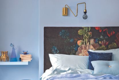
Judging from this image, using Farrow and Ball's Calluna, I can see what he means about the power of the paint's pigment. Even in this zesty kid's bedroom, the walls help to seem both cosy and moody - really what the perfect modern bedroom should be. A place to feel hunkered into, but also to feel smart in, to invite you to want to keep the bed made nicely and the art hung straight and to have a room you'd be proud to show off - if you were in a frame of mind of showing off the bedroom, that is.
The lavender tint in this wall is barely there - you could easily add this space to your grey bedroom ideas. A world away from my grandmother's home which - I'm being unkind - was sweet. In its own way.

WC-09 by Fine Paints of Europe, one of Robert Stilin's favorite shades.
I filed lavender away as a quirk of Robert's bedoom color ideas. Smart, clever, but a one off.
And then I was chatting to Brigette Romanek about her design sensibilities, and how her projects are always imbued with a sense of Californian light. And did she have any suggestions for how we could all try that ourselves, wherever we lived?
'I’m almost overwhelmed when it comes to colors right now!' Brigette said. 'I love yellows and rusts and pale greens with muted blues. I like to take a lavender and mix with a little grey - there’s a softness here that is so easy to live with, and wonderful in a bedroom.'
I asked her why, specifically, lavender. 'When we’re out in the world, we're busy, we're running around, we're doing our thing,' she said. 'When you come home, and particularly into the bedroom, you want to exhale. You want your space to let you just take it easy.'
And I can see why Lavender 2.0 does this. Warmer than grey, richer than white, it sits in the middle, comforting yet chic. Exactly where the dial is sitting for modern interior design right now.

As a rookie journalist, I was always taught it makes three to make a zeitgeist. So I still wasn't ready to file lavender into my folder of bedroom trends. Yet.
Then I was speaking to Tom Dixon. We were chatting about how he feels design has changed since the pandemic, and that he will be redesigning his iconic Wingback chair to show in Milan later this year, making it more cocooning, more wonderful as a place to sit and work, giving it chaise longue proportions. We got to discussing how the home could be a space to feel calm in, and I casually asked what colors he liked for soothing spaces.
'Well,' Tom said. 'The colors that make you feel calm are cyclical. But right now, it's sort of a....lavender, or lilac.'
'Tom, you're kidding!' I gasped. 'Would you...would you use it in a bedroom?'
'Yes, it would be great for a bedroom, very relaxing,' he said. 'But it's not lavender like the flowers,' he added, assuming my shock was because I'd not understood the exact hue he meant. 'It needs to be very matte, perhaps with a bit of pink, a bit of green. It could be a hard color to use, but layered up as textiles it would create a really soft environment to be in.'
How to use lavender in the bedroom

Paneling in Theatre Land No.282, wall in Pale Lilac No.246, both by Mylands
As with most of Robert Stilin's projects, the color comes from within the room, not on the walls. So he said he would paint the walls a subtle lavender shade, and then pair it with deeper hues. 'Like green and blue,' he said.
Tom Dixon had suggested using it for the linens, which is certainly easier than redecorating the entire room. That said, in the Mylands Colors of London paint collection there is a color called Pale Lilac, seen above, which fits this new direction perfectly.
'There are many tonal variations of lavender, but it is always a relaxing color, loved by designers for its versatility, warmth and freshness,' says Dominic Mylands, the paint brand's CEO. 'It works brilliantly as a sophisticated neutral, and can be particularly effective when paired with a darker color to bring it depth and intrigue. A deep red can complement it beautifully; if of a similar tone, the darker red will draw out the red pigments within the lavender to make it feel cohesive but original and striking, such as our Theatre Land No.282 (above, on the panelling) which works really well with Pale Lilac No.246 (above, on the wall).'
As a pale base to pair with bolder colors, lavender could be the ideal starting point if you're creating a boho bedroom, the contrast to all those more intense patterns and prints.
To drench in lavender, or not to drench?

Design by Holly Vaughan
Designer Holly Vaughan of Vaughan Design and Development completed this project in the UK recently, matching the lavender bedroom walls with the bespoke lavender cabinetry creating an overall effect of being in a super-calm space. She has elevated the shade by pairing it with modern decorative decor - the subtle pop of red on the stripes of the headboard don't overpower, but stop the room from feeling too pastel.
International interior designer Olga Ashby is the master of using neutrals - her projects are always really luxe and ultra glam but liveable and informal through clever use of texture and organic shapes. I asked her what she makes of lavender in the bedroom, a slightly warmer take on the white she tends to favor.
'I find this color very suitable for colder climates where the light is more on a cold spectrum,' Olga says. 'Colors like Farrow and Ball's Calluna 270 are looking sophisticated and elegant. Personally, if I were to use it in a bedroom I definitely would put it on a feature wall and ceiling to provide a cozy, wrap up effect. Paired with a rich dark berry color like Pelt 254 from Farrow and Ball and very textural 100% linen bedding similar in shade to Farrow and Ball's Skimming Stone it would look very complex but effortless at the same time.'
The trick, Olga thinks, is to stop lavender from seeming like the main color in the room, to use soft patterns to break it up as much as possible. 'I would also add blocks of light beige travertine instead of bedside tables to provide even more texture to the scheme,' she says, and it's easy to imagine the soft whorl of stone against the soft hue of lavender.
I'd use lavender to go up and over too. Paired with a mahogany bed to over a contrasting richness, a green quilt to bring out lavender's verdant tones, and gold bedside lamps, perhaps Lee Broom's Eclipse which shows that the design here is modern, a world away from Lavender Version 1.
So, lavender is the new color of the moment, picked independently by the people who set the trends and tone of design, guaranteed to filter out now into the wider world. And you heard it here first. Ideal for restful spaces and sophisticated places, the perfect neutral bedroom shade.
Here's where to shop for your lavender paint...


Be The First To Know
The Livingetc newsletter is your shortcut to the now and the next in home design. Subscribe today to receive a stunning free 200-page book of the best homes from around the world.

The editor of Livingetc, Pip Rich (formerly Pip McCormac) is a lifestyle journalist of almost 20 years experience working for some of the UK's biggest titles. As well as holding staff positions at Sunday Times Style, Red and Grazia he has written for the Guardian, The Telegraph, The Times and ES Magazine. The host of Livingetc's podcast Home Truths, Pip has also published three books - his most recent, A New Leaf, was released in December 2021 and is about the homes of architects who have filled their spaces with houseplants. He has recently moved out of London - and a home that ELLE Decoration called one of the ten best small spaces in the world - to start a new renovation project in Somerset.
-
 These 12 Best Table Lamps for Your Desk — Perfect Glows for a Creative Home Office
The best table lamps for your desk is have a soft, targeted glow. Elevate your WFH set-up with these stylish picks endorsed by Style Editor Brigid Kennedy
By Brigid Kennedy Published
-
 The Nespresso VertuoPlus is 30% Off for President's Day, and it's Kim Kardashian's Coffee Maker of Choice
This sleek and stylish coffee maker was spotted in Kim's home bar, and you can currently save $60 if you buy yours from Amazon
By Lilith Hudson Published
-
 Furniture 're-outfitting' is the designer trend for reimagining iconic pieces with bold new looks
Designers are ‘re-outfitting’ furniture to bring a fresh creative perspective to classic pieces. Just don't call it upcycling...
By Hugh Metcalf Published
-
 Top designers are all following this new trend that makes your home office a much more creative space
Hint: it's a piece of furniture you wouldn't have thought of but that changes everything about how your office feels
By Aditi Sharma Maheshwari Published
-
 Jonathan Adler's expert advice for creating the perfect living room scheme
Livingetc's guest editor Jonathan Adler knows just how to create the perfect living room, and his advice means you can, too
By Livingetc Published


