The biggest bathroom tile trends for 2022 that’ll make any powder room pop
These 11 top bathroom tile trends picked by interior designers aren’t holding back, from vivid colors to bold layouts

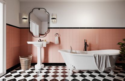
If bathroom tile trends are making one thing clear for 2022, it's that plain white subway blocks just aren't cutting it anymore (sorry). Having long been the default for modern renovations, this year interior designers are mixing it up, ditching the plain and ordinary for bathrooms tiles that burst with personality.
“When thinking about bathroom tile ideas, I’m noticing clients being bolder, thinking less about boring neutrals and ‘resale value,’ and more around what will truly make them smile at home,” says Portland-based designer Max Humphrey. Today’s bathroom trends aren’t just about making the most of your space—they’re about making it your space.
And that’s why bathroom tiles are in a unique position to give you an edge on your next renovation; more dynamic than a fresh coat of paint, tiles can change the very surface of a room, creating depth and transforming the way space feels. It’s why interior designers are now favoring tiles that break the rules, tiling more surface area than ever before with rich textures, vivid colors, out-of-the-box layouts, and a little bit more fun.
Bathroom tile trends
1. Triangular green tiles

Design by Ginny Macdonald Design
When it comes to bathroom wall tile ideas, picture a classic shape. Does the image take the form of a white rectangle or square? Think again. Designers are reinventing the modern default, breaking the mold with different shapes and palettes. One blockbuster interior design trend is the color green—currently popular in virtually every space of the home, including kitchens, living rooms, and bedrooms—and the bathroom is following suit. Don’t be surprised if more green bathrooms continue to pop up in powder rooms all across your feeds, especially those with playful shapes and patterns that aim to mix up the trend.
In the bathroom above by Los Angeles’ Ginny Macdonald Design, a soft green backsplash triangulates the wall with Heath Ceramics tiles (which can be ordered in a dual-glaze to double-down on green hues). “People are being more adventurous with their tiles in bathrooms now and want to break away from a subway tile,” says the designer Ginny Macdonald. “We chose the triangle tile for this bathroom to add a playfulness to the space and give it an almost mid-century modern look. To make it feel more adult we chose an earthy green which still adds a nice pop of colour but feels sophisticated.”
We also love the effect that comes with mixing gloss and matt tiles together in the same color.
2. Grid-like tiles with contrasting grout

Design by Emma Beryl Kemper
Of course, classic square tiles continue to make their rounds—albeit with a contemporary update. “Retro-inspired 4x4 tiles installed in a grid pattern are trending right now because they feel nostalgic and classic but not overly traditional,” says New York designer Emma Beryl Kemper. In the bathroom above, Beryl Kemper leaned into nostalgia with ceramic square tiles that are tightly gridlocked along the shower’s walls; it doesn’t break the rulebook for bathroom tiles, but she added a twist if you look between the lines.
“I like to accentuate them by using a high-contrast grout to really make the pattern stand out,” adds Beryl Kemper. Opting for a contrasting grout makes the square tiles pop, highlighting their graphic quality in a way that recalls graph paper—it’s a new school approach to an old-school aesthetic, which works particularly well when considering small bathroom tile ideas.
3. Architecturally textural tiles

Design by NAINOA
Classic tiles—flat, right-angled, and glossy—are popular for many reasons: they’re a straightforward install, they’re easy to clean, and they pair well with modern fixtures. But they can also feel sterile in a world increasingly drawn toward comfort. In line with the latest trend toward cocooning furniture, some designers reach for soothing textures and surfaces, favoring tiles that embrace a human touch—three-dimensional surfaces with gentle bumps and grooves that offer relief. It helps that textured tiles rise to the occasion. “Bathrooms often have directional lighting (ceiling fixtures, wall sconces, etc) so architectural materials that have a rich texture to them typically show very beautifully under those lighting conditions,” says designer Noa Santos, a noted fan of curves and texture. “The more textural the better.” A useful tip to remember when wondering how to tile a bathroom.
Santos looks for materials with a rich tactile quality—surfaces that make you want to lean in and get a closer look. In a recent bathroom design, pictured above, Santos incorporated a custom fluted travertine tile that surrounds the powder room’s sink. The neutral yet warm stone offers a natural brightness while the fluted surface begs to be strum like a guitar. You’ll find comparable textures with Eso Surfaces’ 3D Triangle Cement Sticks, or Ann Sacks’ Terrazzo Renata Fluted Squares.
4. Patterned tiles with patterned wallpaper

Design by Home Studios
Classic bathrooms were noted for their restraint, with black-and-white, hyper-clean tiles designed for cleanliness and peace of mind. But new applications embrace the movement of maximalism in interior design with bold bathrooms that have a mind of their own. Bathroom tiles are objects that fetishize order, something this trend swiftly ignores—expect raucous combinations of patterned tiles, punchy wallpapers, mixed materials, and playful textiles.
“We love a maximalist room, and this bathroom is one of the most maximalist we’ve seen, a layered celebration of material and motif,” says Sarah Lonsdale, the senior creative director of Clé Tiles of the bathroom pictured above. “Powder rooms were made for this type of exuberant play.” The bathroom’s interior designer, Brooklyn’s Home Studios, applied black-and-white cement tiles (part of Clé Tiles’ Slant line) in seemingly random order as part of an explosive palette that also features a Picasso-esque mural by artist Kimmy Quillin. Home Studios could have stopped there, but added to their modern bathroom ideas by separating these two surfaces—like a layer of ash in double Dutch cheese— with a thin ledge made of Giallo Siena stone.
5. Intense single-color tiles

Designed by Life/Style
Drenched in color, designers aren’t afraid to go all-in with monochrome palettes, often picking vivid tiles that cover bathrooms from corner to corner - why should bathroom floor tile ideas stop at just the floor? “It’s so wonderful to see this kind of boldness after years of white tile leading the way in bathroom design,” says Sarah Lonsdale of Clé Tiles.
In the above bathroom, designed by West Hollywood’s Studio Life/Style, a glossy Palace Red Zellige Tile brings wall-to-floor drama paired with a red-painted ceiling. “Beyond the color, additional visual interest comes from the natural variation in color inherent in handcrafted tile,” says Lonsdale. “There’s also the texture and dimension courtesy of the chiseled edges of the tile and the natural pits that come with the wood firing.” The result is not a flat color, but a constellation of squares that catch light in different ways—it’s a color story in motion.
6. Matching bathroom tiles with grout

Design by A1000xBetter
Grout lines tend to be the least exciting piece of the puzzle, but interior designers are increasingly playing with the formula. While picking a consciously selected high-contrast grout (read: above) can make tiles pop in pleasant ways, it can also be distracting, especially when you’re working with deep monochrome palettes. The solution? Match the grout to your tile, a look that works particularly well in grey bathroom ideas where the pale grouting stands out less.
In order to maintain the dark and moody aesthetic in the bathroom pictured above—a mood set by a wall of matte, hand-glazed black tile—designer Kirsten Blazek, the founder of Los Angeles’ A1000xBetter, leaned into the vibe. “One way we enhanced that was by doing a grout in the same color as the tile which is something I am seeing more and more in tiling for bathrooms and kitchens,” adds Blazek. “I prefer the less busy look of a matching grout versus a contrasting one.”
7. Primary color blocked tiles

Design by Quiet Town in collaboration with Block Renovation
If you can’t commit to one bold color, take a turn at the color wheel and try two. “Color-blocking is a simple way to be bold,” says Lisa Fine, co-founder of the textile company Quiet Town, who recently launched a color-blocked bathroom design with Brooklyn’s Block Renovation (a studio that offers ready-to-go renovation packages). It’s a brilliant use of bathroom color ideas, and the same concept as adding an accent rug to bring a controlled splash of complementary color, except this design element brings permanence.
In Quiet Town’s design, pictured above, an eye-popping combination of sunflower yellow and sunshine orange, the shower niche is the sweet spot for high-contrast. “The pop of color in the niche can be sophisticated and calm or loud and energetic,” says Fine of the easily customizable accent.
8. Intentionally uneven grout widths

Not all grout lines are equal—nor should they be. Long seen as the gritty, grimy part of any tile installation, grout has the potential to be a show-stopping situation. “Playing with grout joints can create an interesting and dynamic pattern without having to use patterned or busy tiles that can become quickly dated,” says New York designer Robert McKinley. “Essentially, you can use classic styles and timeless colors and still have a dynamic graphic pattern by being creative with grout.”
You’ll see this trend in the bathroom pictured above, where McKinley created a unique, grouted pattern that reads like a textile as part of his walk-in shower ideas. “To achieve this, we placed the tiles vertically (when traditionally they are used horizontally) and we used a wider grout line on every other horizontal datum line to create a stripe,” explains McKinley. “The Meadow Green 2x4 Health Tiles have a beautiful depth to them and we were able to highlight their beauty by adding the larger grout line and giving a visual break to what would have been an all-green shower.”
9. Stacked tile placement

Design by Max Humphrey with architecture by Beebe Skidmore
“I’m seeing less subway tile or running bond tile and more stacked tile that’s either installed vertically or horizontally,” says designer Max Humphrey. He’s referring to one of the most traditional layout patterns—also called offset, or staggered—where rectangular tiles are arranged horizontally in a brick-like pattern. Instead of this approach, designers are increasingly stacking their rectangular tiles in a grid to create depth and visual interest, often using unexpected shades (Humphrey has been drawn to earthy colors himself, from olive greens to natural blues and pinks).
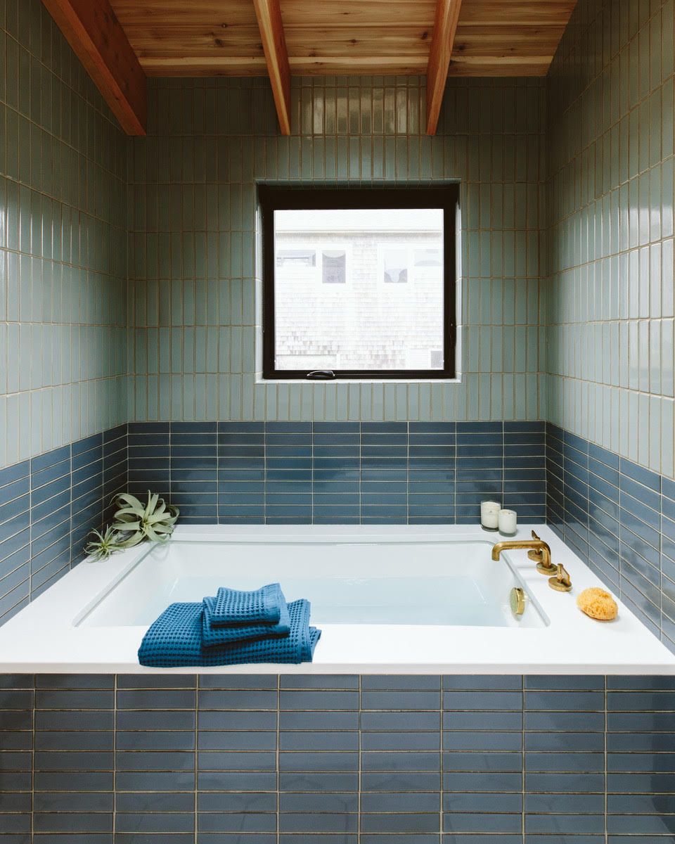
“To me, it’s a modern install method that can be applied to even more traditional materials,” adds Humphrey. Add it to your list of things to think about when next considering how to remodel a bathroom. In designing the bathroom pictured above, Humphrey used tiles from Ann Sacks’ Made collection, but any rectangular tile will do. From wall to wall, an earthy blue tile is stacked horizontally until about hip height, where Humphrey switched directions—creating what looks like a horizon—opting for a sky blue tile applied vertically all the way to the ceiling (these vertical lines double as a classic trick for making any space feel taller).
10. Multiple tile configurations

Like building blocks, the right tile can give even a classic bathroom a contemporary twist, and vice versa. “Even the most contemporary home can take a page from the past to customize a design style,” said California’s Fireclay Tile in its 2022 trend forecast. “Minimalist, modern, farmhouse and transitional designs are all setting trends by incorporating elements of the past into iterations of the future.”
For Fireclay Tiles, one example results from a recent collaboration with Block Shop, a textiles brand based in Los Angeles that created a line of hand-painted patterned tiles with geometric motifs—these tiles can be easily placed in any configuration to create your own patchwork and pattern. In the bathroom design above, a classic tile layout across the wall is paired with floors tiled in Block Shop’s charcoal Squiggle tile; the tile’s split pattern, complete with a squiggly edge, adds a playful touch to black and white bathroom ideas when configured as a traditional checkerboard floor—it’s classic with a little squiggle room.
You’ll find similar twists at NYC’s The Greenwich Hotel, where its Moore Penthouse bathroom floor embraces the traditional basket weave layout but punches it up with cobalt blue tiles, as well as playful possibilities with Popham Design’s Arch tile, which can be reconfigured to create customizable patterns worth repeating.
11. Tiled sinks and baths

Design by Home Studios
If you’ve been keeping a close eye on your feed, you may have noticed that tiled objects—tables, cubes, and more—are having a moment thanks to brands like Maza, which recently launched a line of pink-tiled furniture. It’s a look that dates back to the 60s (you can thank Italy’s Superstudio for introducing the tiled table) and 70s, and it’s cropping up on furniture all over again. Proving that tiles aren’t just for your walls, floors, or countertops, designers are also covering tubs, sinks, and seating.
In the bathroom above, designed by Brooklyn’s Home Studios, white square tiles flow from the floor all the way up, over, and into the sink and tub. Curved tiles take it over the top, giving the fixtures a pleasantly smooth and chunky look. Here to update your bathroom sink ideas, a recently launched line by Mutina, DIN, offers tiles with similar curved edges, an easy way to give basic shapes with rigid lines—like a square basin—a curvy aesthetic.
Are subway tiles in style for bathrooms in 2022?
Subway tiles, placed in the traditional way, are out of style for 2022. Designers are now more drawn to square tiles, slim finger-width tiles, or turning subway tiles on their sides so they run vertically instead. On the whole, designers and homeowners are being a little braver with color, meaning that the classic white subway tile is no longer a key bathroom trend.
Be The First To Know
The Livingetc newsletter is your shortcut to the now and the next in home design. Subscribe today to receive a stunning free 200-page book of the best homes from around the world.
Keith Flanagan is a New York based journalist specialising in design, food and travel. He has been an editor at Time Out New York, and has written for such publications as Architectural Digest, Conde Nast Traveller, Food 52 and USA Today. He regularly contributes to Livingetc, reporting on design trends and offering insight from the biggest names in the US. His intelligent approach to interiors also sees him as an expert in explaining the different disciplines in design.
-
 These 12 Best Table Lamps for Your Desk — Perfect Glows for a Creative Home Office
The best table lamps for your desk is have a soft, targeted glow. Elevate your WFH set-up with these stylish picks endorsed by Style Editor Brigid Kennedy
By Brigid Kennedy Published
-
 The Nespresso VertuoPlus is 30% Off for President's Day, and it's Kim Kardashian's Coffee Maker of Choice
This sleek and stylish coffee maker was spotted in Kim's home bar, and you can currently save $60 if you buy yours from Amazon
By Lilith Hudson Published

