5 style lessons from Sucre – the new Argentinian hangout in London
Sucre brings the vibrancy of Buenos Aires to Soho – and it’s influencing our decor ideas in the process


New London restaurant Sucre is serving seriously glam style alongside its Latin American food. Founder Greg Godik explains its secrets – so you can recreate its style throughout your modern decorating ideas.
1. Channel an Art Nouveau aesthetic with mosaic tiles

We worked with a Spanish quarrier to create the custom-made marble mosaics. They’re two types of marble; the cream is a Crema Marfil, and the dark one is an Emperador. Buenos Aires is defined by its Art Nouveau architecture. Mosaics are a large part of that style.
On our mood board, we had an image of the Teatro Colón opera house, which has a beautiful mosaic floor similar to the one we designed. We recreated this traditional look in a modern way; using a strong geometric pattern which ramps up onto the bar front and onto the wall opposite.
2. Warm a room with mirrored panelling

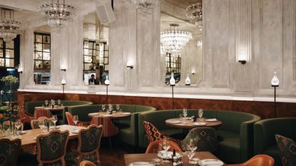
To create the mirrored panel, we worked with the original mouldings to inset an antique mirror into the rectangular shapes. The mirrors are symmetrical on both sides of the room, so you get an ‘infinity reflection’ effect when you look down to see the mirror on the other wall.
This adds light and warmth to a room that might otherwise feel quite plain. The original walls are a decaying white colour, so we wanted to make it feel more ambient by creating loads of amazing reflections. The mirrors are slightly yellow, so it feels warm – almost like you are in a glass of champagne.
3. Turn decanters into an unconventional light fitting

The decanter lights were bespoke-made for the restaurant, but we used off-the-shelf decanters that you can probably find online for an affordable price. The building is over 300 years old, so we wanted to reintroduce chandeliers into the space. However, we wanted to take the original shape and do something different.
Wine is a huge part of what we do, so it felt right. There are over 1000 decanters – and they all reflect light beautifully. While you can’t buy the fixtures, you can recreate their effect by shining light indirectly through a bottle display.
4. Curate a fluid gallery wall

The staircase leads to our underground bar. It is more industrial and is inspired by Buenos Aires in the 1980s. The images are inspired by fly posters from this era. They replace signage and signify that there is something different downstairs without being too obvious. These posters are dynamic and ever-changing, but we keep an archive of old displays in the bar. They have a handmade feel – so the closest thing to them would be finding vintage photographs or magazines.
It’s important to make any images your own. We do a lot of overprinting and graffitiing to present something historical in a new way.
5. Make a statement with Latin-inspired fabrics

We used several Latin-inspired fabrics across the furniture – including on our Aztec patterned chairs. Sucre is not a themed restaurant, but we wanted to pay homage to the history of the brand, and we decided to go bolder in the main dining room. The Aztec chairs were made for us, so they’re not available to buy. However, this was a Covid project, so things that would have come from other countries did come from the UK, including the Latin American-style textiles. So, you can buy similar fabric and upholster your furniture to recreate this look.
You can find Sucre Restaurant at 47B Great Marlborough St, London W1F 7JP. Or, discover more on their website. And, in the meantime, you can recreate their ornate interior design ideas across your dining room.
Let's begin.
Be The First To Know
The Livingetc newsletter is your shortcut to the now and the next in home design. Subscribe today to receive a stunning free 200-page book of the best homes from around the world.
Megan is the News and Trends Editor at Homes & Gardens. She first joined Future Plc as a News Writer across their interiors titles, including Livingetc and Real Homes. As the News Editor, she often focuses on emerging microtrends, well-being stories, and celebrity-focused pieces.
Before joining Future, Megan worked as a News Explainer at The Telegraph, following her MA in International Journalism at the University of Leeds. During her BA in English Literature and Creative Writing, she gained writing experience in the US whilst studying in New York. Megan also focused on travel writing during her time living in Paris, where she produced content for a French travel site.
-
 The 12 Best Table Lamps for Reading —I'm a Certified Bookworm (and Shopping Expert)
When it comes to table lamps for reading, I don't mess around. If you're the same, this edit is for YOU (and your books, or course — and good recommendations?)
By Brigid Kennedy Published
-
 "It's Scandi Meets Californian-Cool" — The New Anthro Collab With Katie Hodges Hits Just the Right Style Note
The LA-based interior designer merges coastal cool with Scandinavian simplicity for a delightfully lived-in collection of elevated home furnishings
By Julia Demer Published

