This 'outdated' trend for walls we once considered past-it is having a renaissance – and it's so much better this time around
Designers are starting to use this joyful decorating trend again and it might divide opinions

What goes around comes around in the world of trends and recently we’ve noticed the resurfacing of one very joyful technique. When it comes to interiors it’s without doubt that the right choice of colors can make or break a scheme. It might be one of the reasons why so many of us have gravitated towards decorating with neutrals - for their calming, serene, properties and clean look of course, but perhaps it’s also safer. There’s definitely a bigger fear of getting it wrong when it comes to mixing bolder colors.
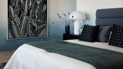
Initially very popular between 2018 and 2020 ombre is back in the spotlight. Maybe it’s because we’re ready to express ourselves more through our interiors that designers are picking this up again. The interior design trend is the process of blending one color hue to another, moving gradually from light to dark shades. It can be used as a paint technique on walls, textiles, or accessories.
We spoke to interior designers who are bringing this trend back to find out why now, and how we can use it in our home in a subtle yet effective way.
Why is ombre having a comeback now?
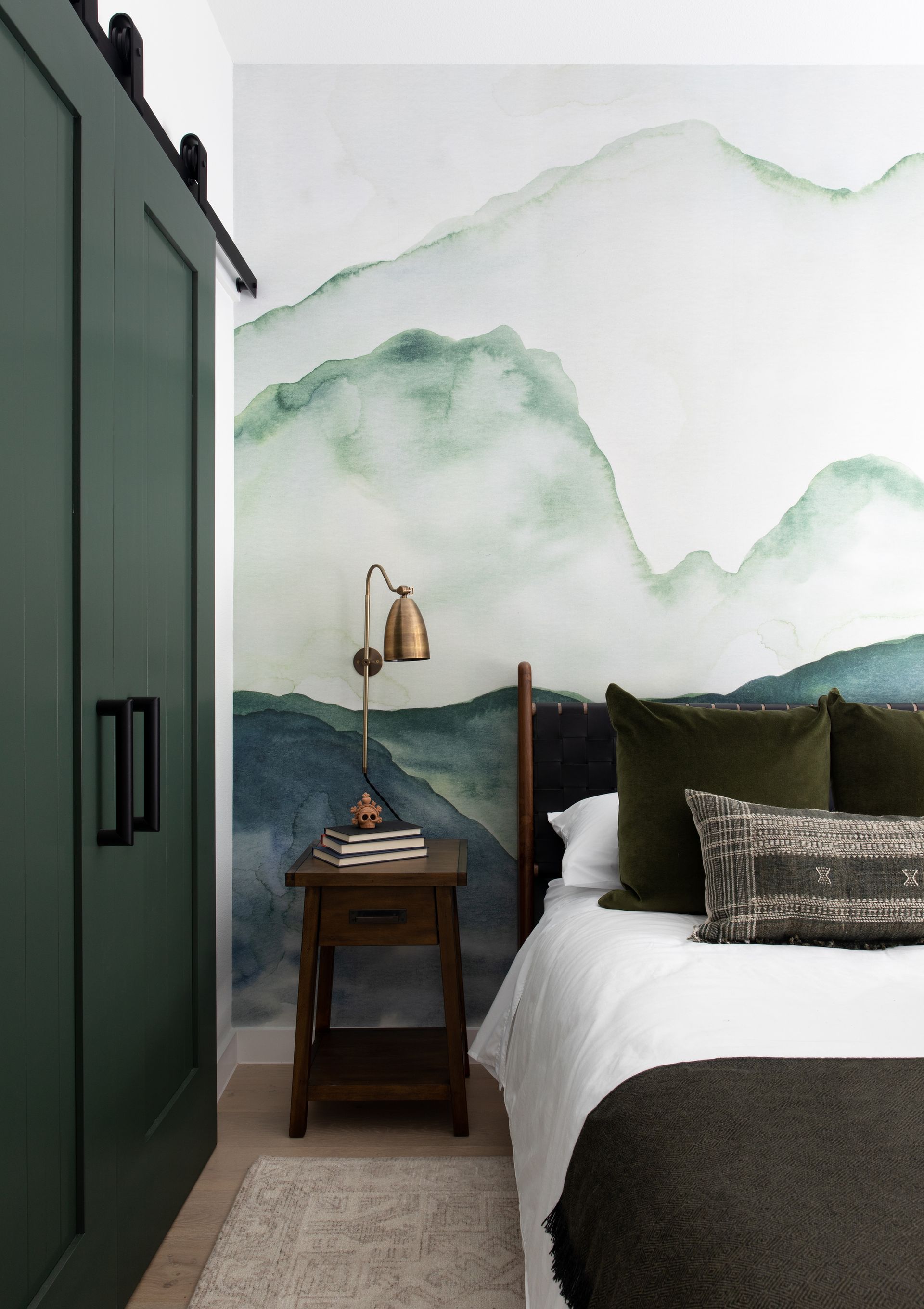
It’s definitely subtle now, but we have a strong feeling you’ll be seeing more and more of it. Sara Malek Barney, Founder and Principal Designer at BANDD/DESIGN, thinks it’s very possible that ombre is having a real comeback. ‘People are loving fluid, organic movement, and ombre naturally lends itself to that,’ she tells us. ‘It ties in so nicely to the massive organic modern layered look everyone is loving,’ adds Sara.
In her latest condo design, Sara strived to have the personality of the homeowner read through. Here is where unique details such as the watercolor wallpaper idea with an ombre effect really come into play and make a difference. ‘I wanted something that was interesting, but soft and not overwhelming. The room is quite small, and I wanted this mural to almost feel like a whisper,’ she explains.
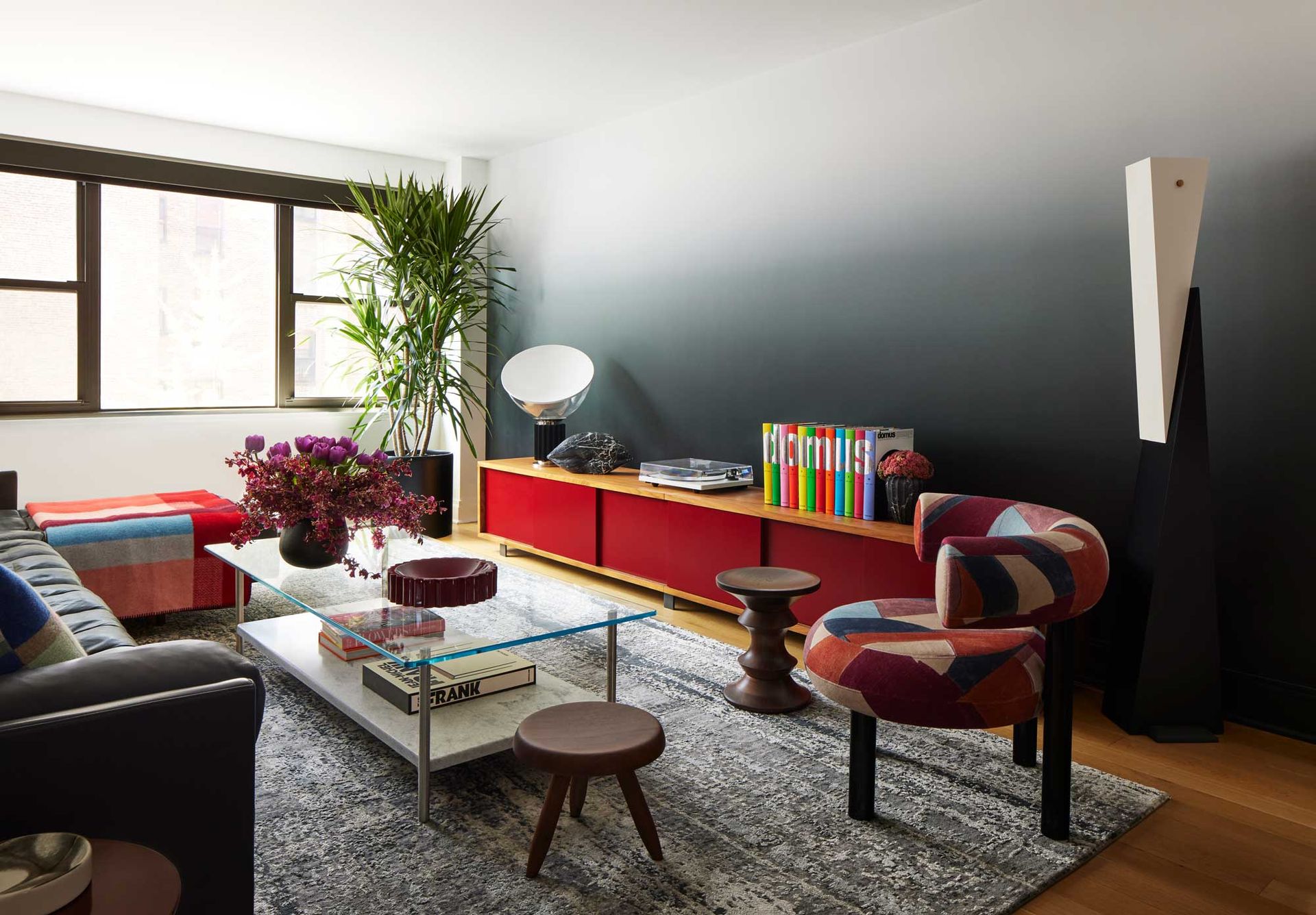
Interior designer Justin Charette used the ombre effect in the living room of his New York apartment. It’s subtle, yet impactful, and it was used to balance out the elements in the room. ‘The wall across from the ombre wall already had a large piece of art. I didn’t want another artwork to compete with this, and I thought mirrors would reflect too much light from the nearby windows,’ the designer tells us.

Price: $7.50 per foot
Material: textured mural
How to use ombre in design
As lovely as the ombre look is, you don’t want to overdo it. It’s best used in small doses, as an accent, so it doesn’t lose its impact. Used wisely, ‘it adds natural motion and transition without feeling forced,’ tells us Sara.
While it is mostly used for aesthetic reasons in the design of a room, it can also create a visual effect of making a room appear taller, if the hues go from darker at the bottom to lighter towards the ceiling. In his Gramercy Park apartment, the designer Justin Charette used this trick to create a sense of height in a relatively short space. While a wallpaper would have created a harsh line from paper to paint, he says the black-to-white ombre blends in beautifully with the white ceiling. The transition is subtle, adding a softness to contrast the apartment's more graphic qualities.

Sara Malek tells us her favorite way to incorporate ombre is subtly, through drapery and paint. ‘It can be done so quietly, and not at all kitschy.’ While we’re yet to see how far designers will take this trend, we can’t help but be tempted by the fresh, joyful feel of the ombre effect. Start slow, with accessories and soft furnishings, then decide how far you want to go experimenting paint ideas and wallpaper.

Price: $749.95
Material: Coconut sticks
Be The First To Know
The Livingetc newsletter is your shortcut to the now and the next in home design. Subscribe today to receive a stunning free 200-page book of the best homes from around the world.

Raluca is Digital News Writer for Livingetc.com and passionate about all things interior and living beautifully. Coming from a background writing and styling shoots for fashion magazines such as Marie Claire Raluca’s love for design started at a very young age when her family’s favourite weekend activity was moving the furniture around the house ‘for fun’. Always happiest in creative environments in her spare time she loves designing mindful spaces and doing colour consultations. She finds the best inspiration in art, nature, and the way we live, and thinks that a home should serve our mental and emotional wellbeing as well as our lifestyle.
-
 The 12 Best Table Lamps for Reading —I'm a Certified Bookworm (and Shopping Expert)
When it comes to table lamps for reading, I don't mess around. If you're the same, this edit is for YOU (and your books, or course — and good recommendations?)
By Brigid Kennedy Published
-
 "It's Scandi Meets Californian-Cool" — The New Anthro Collab With Katie Hodges Hits Just the Right Style Note
The LA-based interior designer merges coastal cool with Scandinavian simplicity for a delightfully lived-in collection of elevated home furnishings
By Julia Demer Published
