Kit Kemp’s New York cafe offers a lesson in bold patterns and embroidered details
The textile guru is teaching us all a lesson in color via the Palette cafe in Manhattan’s Bergdorf Goodman


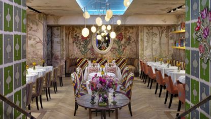
Kit Kemp is a master of indulgent color and layered textiles, so it is unsurprising that her latest project combines both so effortlessly. Introducing Palette cafe, the newly renovated restaurant in New York’s Bergdorf Goodman.
Kit, who is the Founder and Creative Director of Firmdale Hotels, redesigned Palette into a whimsical hangout that offers a colorful escape from Manhattan’s hustle. And we’re taking design notes on everything we observe. Here, the designer from the eponymously-named studio shares five ways to recreate its modern decorating ideas in your home.
1. Scale boldly-hued patterns

I used Live it Up one of my weaves for Christopher Farr on the Banquette seating. It is a stripe that goes with so many colors. It has a high martingale, so it will last and be low maintenance. On my Handle Chairs, I used two Moon fabrics in a wool weave. We cut out a motif of a Palette on the back of the chairs to echo the name of the restaurant for a quirky but sophisticated feel.
I then used Harlequin and Brokenwood for the other chairs. I only use one large-scale fabric in a room and then add a smaller geometric and fine stripe to go alongside. It is about balance and scale. I like a bold interior, not a frantic one.
2. Be playful with an atmospheric mural

It is important to bring individuality to a room, and something custom-made will capture the imagination. We decided on our mural called Tall Trees that would not only climb the walls but go over the ceiling to meet the coffer that runs down the center of the space. This surrounds you and creates an immersive atmosphere. I wanted to create a feeling of elegance and playfulness – maybe a little intrigue and color.
A mural is a wonderful hallway idea as it immediately creates an atmosphere. It envelopes you and is rather comforting.
3. Handcraft embroidered details

Adding embellishments adds craft to a room, which is so important. In Palette, the embroidered vines and flowers are something handmade, handcrafted, and kind of psychedelic. They have a subtle 3D effect and add another layer to the design. At home, I would put a similar embroidered piece into a large Perspex box framed artwork to stand exclusively on a wall.
The embroideries are enclosed by a banquette below, and a recessed space around that acts as a frame in itself. I love how these handmade pieces hold their own in the room and are unusually strong.
4. Curate a gallery wall – on a shelf

The shelves are in a contrasting yellow to stand out and not look like an accident. I like to have different shaped picture frames sitting on a long shelf in a room. They can be changed around at random. They look neater because they are all on the same level, even if they are different sizes.
It is often difficult to hang pictures, so a long shelf or two can solve a hanging problem. Often a design thread of similar articles saying something interesting or seasonal can be fun.
5. Wallpaper your ceiling

This is a magical space, so the blue night sky and stars are perfect for the inside of the coffered ceiling. I hung our Rockin Robin-designed light hanging mobiles from our collection with Porta Romana from the ceiling. I love a colored ceiling. If I have the height, I will add color on ceilings going up staircases and sometimes on beautifully figured ceilings and moldings.
Paint is easier to start with to give an all-around shoebox effect. I like taking wallpaper all over the ceiling in upstairs spaces where the walls are lower or angled.
We’re changing our dining room ideas to incorporate Palette asap. And, if you find yourself in NYC in the meantime, you can find the cafe at 754 5th Avenue, New York, NY 10019.
Be The First To Know
The Livingetc newsletter is your shortcut to the now and the next in home design. Subscribe today to receive a stunning free 200-page book of the best homes from around the world.
Megan is the News and Trends Editor at Homes & Gardens. She first joined Future Plc as a News Writer across their interiors titles, including Livingetc and Real Homes. As the News Editor, she often focuses on emerging microtrends, well-being stories, and celebrity-focused pieces.
Before joining Future, Megan worked as a News Explainer at The Telegraph, following her MA in International Journalism at the University of Leeds. During her BA in English Literature and Creative Writing, she gained writing experience in the US whilst studying in New York. Megan also focused on travel writing during her time living in Paris, where she produced content for a French travel site.
-
 The 12 Best Table Lamps for Reading —I'm a Certified Bookworm (and Shopping Expert)
When it comes to table lamps for reading, I don't mess around. If you're the same, this edit is for YOU (and your books, or course — and good recommendations?)
By Brigid Kennedy Published
-
 "It's Scandi Meets Californian-Cool" — The New Anthro Collab With Katie Hodges Hits Just the Right Style Note
The LA-based interior designer merges coastal cool with Scandinavian simplicity for a delightfully lived-in collection of elevated home furnishings
By Julia Demer Published

