Five ways to style the IKEA KALLAX – get creative with the flatpack minimalist icon
From a boutique home bar to a bespoke statement piece, nothing showcases stylish versatility quite like KALLAX
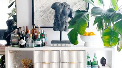

With its simple yet ever-so-chic aesthetic, it is unsurprising that the legendary KALLAX holds a place amongst the list of the most beloved IKEA staples.
This Scandi-cool shelving system is an enduring feature in the most stylish of interiors – whether it is accessorized with plants (Jared Leto, we're looking at you) or used as a blank canvas for an IKEA HACK.
The wonderful KALLAX is durable, ever-changing, and always stylish – but it can still be hard to know where to begin when armed with a fresh flatpack. Or, at least it was hard, until now. Here are our five favorite ways to style the KALLAX.
1. KALLAX as a stylish cellar

Yes, this storage staple just made the cellar chic. If you're missing a built-in cellar, follow Liesa Maier's lead and fit a KALLAX underneath your stairs to create a stand-in cellar space. 'We don't have a cellar, and we need storage space. The KALLAX shelf is just the thing for that,' Liesa says.
Liesa chose a white KALLAX to maintain the neutral tones of her broader scheme and chose softly-hued storage baskets and minimalist accessories to complete the Nordic aesthetic.
2. KALLAX as a home bar
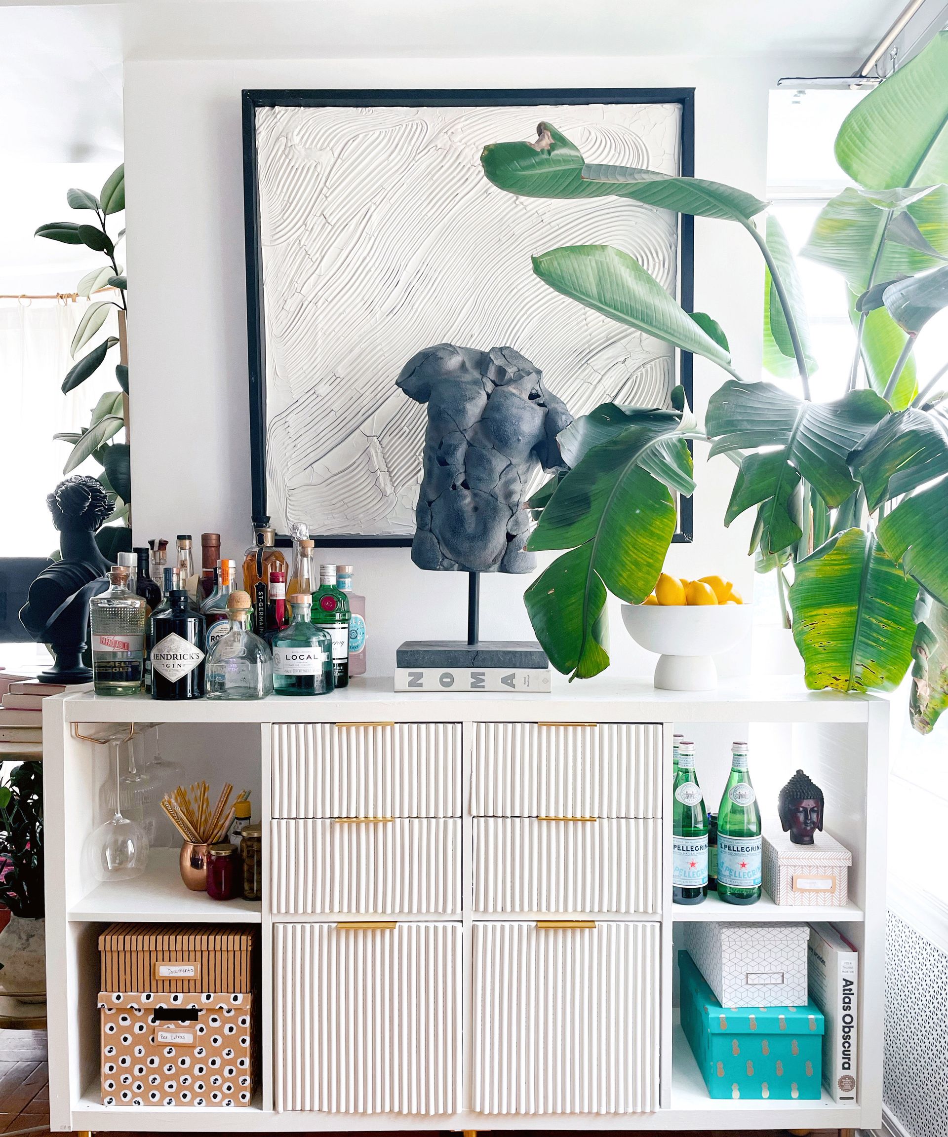
Who knew the twenty-first-century speakeasy could come from a flatpack? Jennifer Osias certainly did. Jennifer accentuated her storage system to create a sophisticated drinks display – complete with a statement sculpture and curated collection of art books.
'I like the functionality of the Kallax but wanted to give it a more elevated and modern look. I've always wanted to try a fluted look and was inspired by a media console from West Elm,' Jennifer begins, whilst sharing her modern home decor ideas.
'I added a stem hanger to hold my glasses. I created the large textured art piece to mimic the fluted detail on the Kallax and paired it with a black torso sculpture to help anchor the entire area. I used my plant and the bowl of fruit to add a pop of color to the otherwise neutral look.'
Jennifer then added the statuette as a talking point amongst guests when she entertains guests. If Jay Gatsby had a KALLAX, we're fairly sure it would look like this.
3. KALLAX for your WFH backdrop

The last year has seen an unsurprising emphasis on home office design, as video call backdrops remain at the forefront of our minds. Though, associates of Daniella Keating will already know that a dull or disorganized setting is the least of her worries – thanks to her KALLAX.
'I absolutely love KALLAX units and knew I had to have one for our office,' Daniella shares. 'I went for black and used some of the rattan effect boxes for storage. I've styled it up with my favorite accessories and, of course, all of the plants. It's so handy for storing away crafting bits and bobs and office supplies.'
4. KALLAX in a subtly chic nursery

Perhaps one of the most beautiful ways to style your KALLAX is by taking inspiration from Anna Blomqvist, who renovated her unit to give it a fairytale aura in her daughter's bedroom.
Though, in all its beauty, this unit is no less practical, as Anna explains: 'I have styled it with legs from New Swedish Design, so it is easier to clean the floor under the shelf – plus I like how the design changed with them.'
'The baskets are for my daughter's toys, and behind the doors, there are books – perfect storage for the kid's room,' she adds.
5. KALLAX as a statement piece
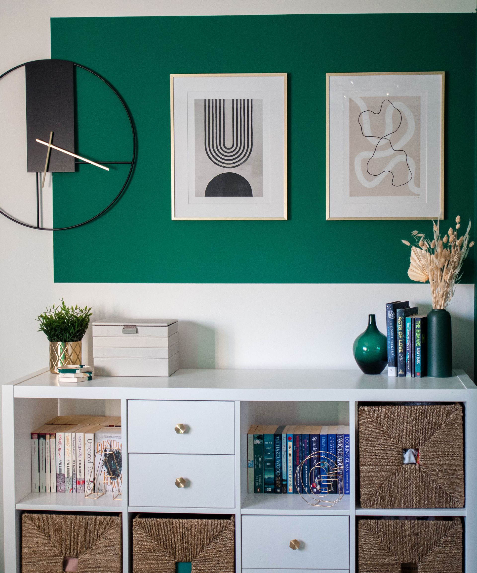
The most bespoke furnishings are those that are exclusively your own. To create a focal point with your KALLAX, follow Gemma Cronnie's design and style your unit with gold features to create a luxe piece that would not look displaced in a boutique hotel.
'I styled my KALLAX with drawer knobs and legs in gold to add a sense of luxe,' Gemma shares. 'Plus, the legs elevate it from the floor, creating a sense of more space in the room.'
These are the interior design ideas this timeless icon deserves.
If you need us, we'll be at IKEA.
Be The First To Know
The Livingetc newsletter is your shortcut to the now and the next in home design. Subscribe today to receive a stunning free 200-page book of the best homes from around the world.
Megan is the News and Trends Editor at Homes & Gardens. She first joined Future Plc as a News Writer across their interiors titles, including Livingetc and Real Homes. As the News Editor, she often focuses on emerging microtrends, well-being stories, and celebrity-focused pieces.
Before joining Future, Megan worked as a News Explainer at The Telegraph, following her MA in International Journalism at the University of Leeds. During her BA in English Literature and Creative Writing, she gained writing experience in the US whilst studying in New York. Megan also focused on travel writing during her time living in Paris, where she produced content for a French travel site.
-
 How Can I Hide the Lights Under My Kitchen Cabinets? 4 Effective Ways to Conceal Wires
While undercabinet lights are super practical, they have a small downside — their visible network of wires can spoil the look of the room. Experts tell us how to hide this eyesore
By Aditi Sharma Maheshwari Published
-
 5 Things People With Flattering Bathrooms Never Have — (And You Shouldn't Either!)
Designers say you should avoid these five things if you want a bathroom that flatters your reflection and therefore uplifts your mood
By Oonagh Turner Published
