Designers love this beautiful new tile trend for mixing gloss and matte together – here's how to get it right
The latest tile trend is all about mixing gloss and matte tiles together for a dynamic, textured look. These experts explain how it's done
Is there anything more striking than a beautifully tiled kitchen or bathroom floor tile? We don't think so. The sheer amount of options in the market – from different styles and patterns to various tile types – allows us to express ourselves in a fun, quirky, and colorful way. In recent years, geometric designs have been all the rage, but have you ever considered mixing gloss and matte tiles in your home?
Well, the latest tile trend encourages us to do just that, and for all the right reasons. This simple yet intriguing idea mixes the two contrasting tile finishes to produce astonishing results. Typically, when mixing and matching tiles in a space our instinct is to choose the same style, just in differing shades, shapes, or a smattering of patterned options, but the visual impact of juxtaposed matte and gloss tiles can create a dynamic, contemporary look that cleverly plays with lighting in your space.
'In 2023, the combination of matte and gloss tiles of the same color is sure to be trending,' says Diane Hyde, marketing manager and tile expert at Craven Dunnill. 'This creates a unique design with an understated patterned effect where the gloss finish catches the light, creating a sense of space and contrasting the neighboring matte tiles.'
The experimental look was a standout feature at the Cersaie tile exhibition in Bologna last month, and we're pretty sure we'll see plenty of designers embrace the look in the year ahead.
Here, we've asked some for their tips on how to replicate the look so you can experiment with the style, too.

Lilith is an expert at following news and trends across the world of interior design. She's committed to sharing articles that help readers embrace emerging trends and keep up-to-date with changing styles, including the latest tile trends. For this piece, she spoke with leading designers and tile manufacturers to learn how to execute the mix-and-match gloss and matte tile look in your home.
What are the aesthetic benefits of mixed gloss and matte tiles?
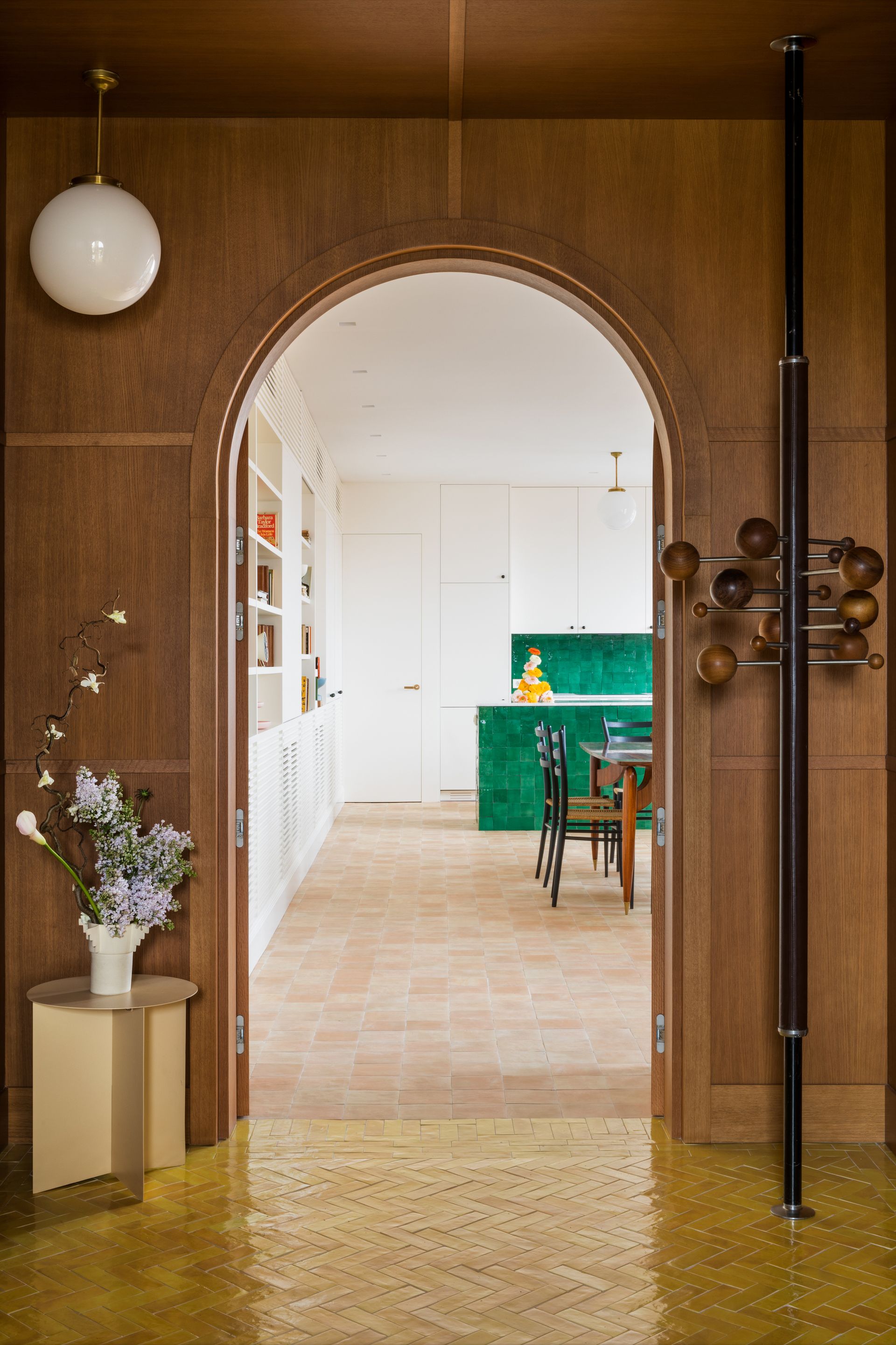
Before we delve into the details on how to get the look, let's first consider the aesthetic benefits of mixing gloss and matte tiles. Classically elegant uniform tiles are always a safe choice, so you might be nervous to commit to such a bold kitchen or bathroom floor tile idea. Why mix two finishes and risk clashing them when you could just opt for a simple yet nonetheless effective design instead?
According to Lesley Taylor, interior designer and founder of The Baked Tile Company, several ways embracing this new tile trend could benefit your space. 'The aesthetic benefits that come from mixing gloss and matte tiles boils down to the wonderful contrast between the two,' she says. 'This adds a really interesting dimension that brings detail to space without having to rely on a pattern.'
Due to the contrasting appearance of gloss and matte tiles, pairing them can accentuate their individual qualities. Next to a gloss tile, a matte one looks richer and even more textured. Conversely, a matte finish makes the gloss look even glossier. 'What you're doing is heightening the aesthetic quality of each one of them by putting them together,' says Lesley.
As she also notes, gloss and matte tiles used alongside one another in a space can add depth and dimension. This is thanks to the changes in light perception. Light will bounce off reflective gloss tiles to give a glowing effect while matte tiles absorb it, resulting in a soft, duller appearance. When used next to each other – especially with abstract, geometric-shaped shaped tiles – the tiles introduce dimension to your wall or floor that will look as though it ebbs and flows.
What should the ratio of gloss and matte tiles be?

If you're sold on the idea of gloss and matte tiles together, whether, for floor tiles, bathroom wall tile, or a kitchen backsplash, there are a few things you ought to consider before applying them in your own home. Firstly, there's the question of ratio. Should you have an equal number of each or an imbalance?
As Lesley explains, this very much depends on the look you're trying to create. 'Gloss and matte look equally as good with a 50/50 split in a fairly repetitive, ordered layout as they do as a random spattering of one finish amongst its dominant rival.' The bottom line is ratio comes down to personal preference.
There's also the question of whether you want a more contemporary or traditional look. 'Glossy tiles add elegance and sophistication to a design, perfect for drawing focus, whilst matte tiles’ lack of sheen creates a modern, industrial feel,' adds Diane of Craven Dunnill. 'The balance depends on which aesthetic you prefer and want to shine most within your design.'
A uniform arrangement of rectangular gloss and matte tiles in a running brick formation will produce a more traditional feel. Randomly interspersed matte tiles on the other hand will result in a more abstract and thus modern look.
'If you want a look that’s not quite so formulated, I’d suggest a spattering of either gloss or matte kitchen or bathroom tiles,' says Lesley. 'That way, the fact that you've got less of the gloss or less of the matte makes it more powerful because your eyes become accustomed to something when it repeats regularly across your floors or walls. But when you've just got one or two, they can have more power.
Should you arrange them in a pattern or randomly?
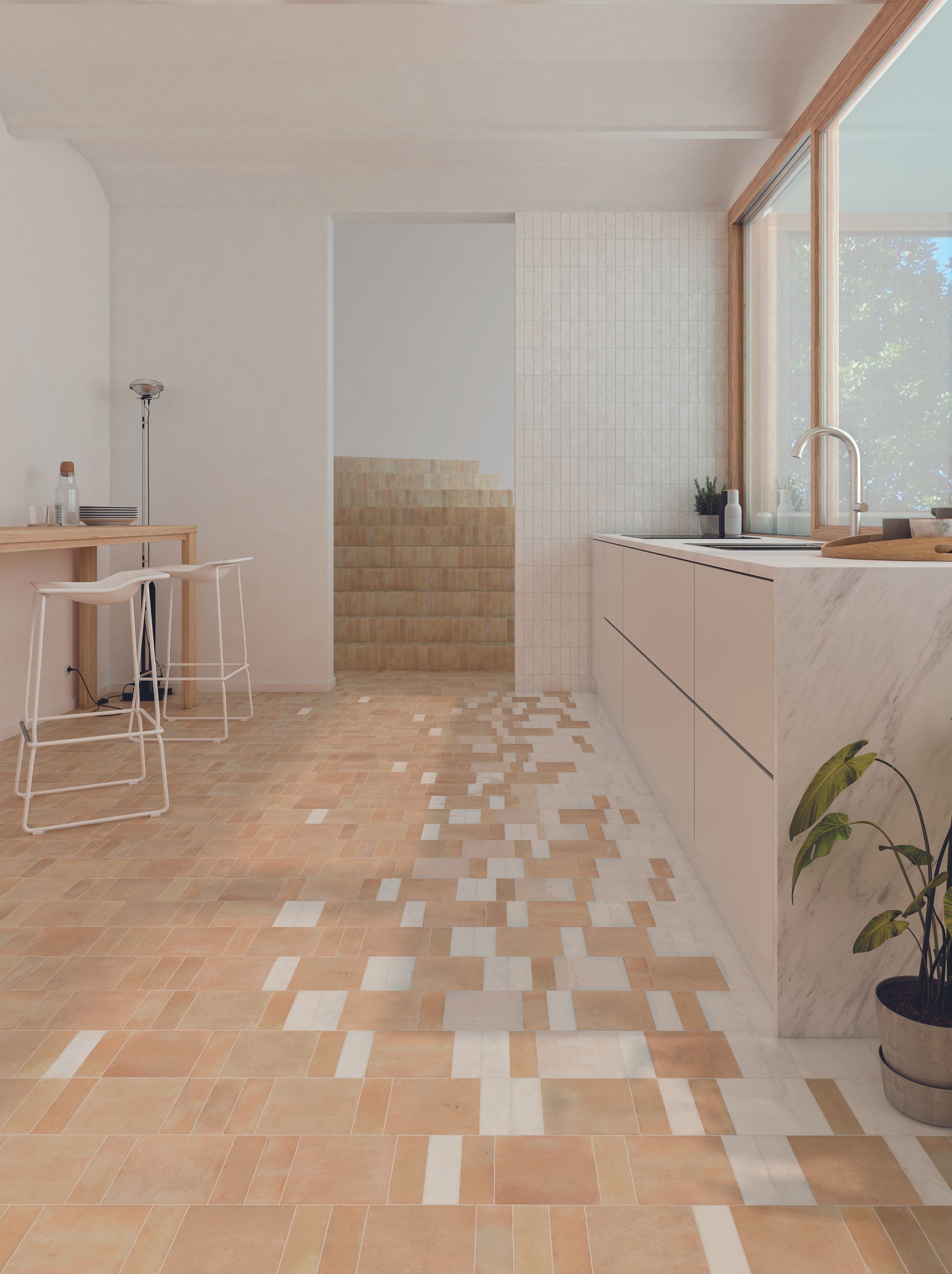
The answer to this question will likely inform the ratio of your tiles (or vice versa), but knowing whether to opt for a pattern or a more abstract idea can be tricky. What do you picture as the notion of gloss and matte? Is it a formulaic pattern of gloss tiles like a diagonal stripe, or is it a smattering of colored random matte tiles in a sea of white gloss squares?
The truth is, any arrangement has its unique qualities, however, certain designs lend themselves better to different styles. Lesley suggests using a smattering of random tiles for a more rustic look, 'whereas, in an older property where you want to achieve a more traditional look, putting together a checkerboard effect of gloss and matte tiles would look amazing.'
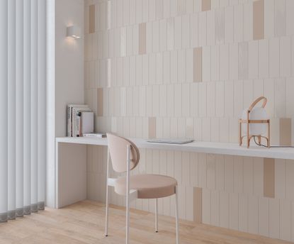
In general, uniform patterns will look more traditional while experimental arrangements will create a more contemporary feel. Think about it – a perimeter line of glossy subway shower tiles amongst an otherwise matte wall has a sophisticated, classic look about it, while a mix of gloss into matte (as shown above) is quirkier. (This example by the Baked Tile Company reminds us of computer pixels!)
'You can mix matte and gloss in a randomised pattern to subtly enliven classic subway tiles,' suggest Diane. 'If you prefer more consistency, create a pattern, alternating finishes in stripes or checks, or use gloss tiles as a border. For a mural effect, consider a gradient feature wall, creating a soft ombre by starting with glossy tiles at the bottom, gradually working upwards into matte. The options are endless.'
Lesley's advice? If you're creating something with a more contemporary twist, go for something less ordered and regular. 'An offset design is almost always going to have a more contemporary feel,' she says.
Should you keep the colors the same?
In short, whether or not you keep the colors of your glass and matte tiles the same is completely up to you, but a monochromatic look can be effortlessly impactful in its simplicity.
'Combining matte and gloss tiles is a beautiful, restrained way to add texture and variety whilst keeping with a sleek monochromatic color scheme,' says Diane. 'This is perfect for a kitchen backsplash, or a fireplace surround as the softness of matte tiles adds contrast, allowing the glossy tiles to shine without overpowering the space.'
The main takeaway from us is to stick with a monochromatic scheme if you want to maintain an element of cohesion, but don't be afraid to experiment! Whichever ratio or pattern you decide to arrange your matt and gloss tiles, it's sure to produce beautiful results.
Be The First To Know
The Livingetc newsletter is your shortcut to the now and the next in home design. Subscribe today to receive a stunning free 200-page book of the best homes from around the world.

Lilith Hudson is the News Editor at Livingetc, and an expert at decoding trends and reporting on them as they happen. Writing news, features, and explainers for our digital platform, she's the go-to person for all the latest micro-trends, interior hacks, and color inspiration you need in your home. Lilith discovered a love for lifestyle journalism during her BA in English and Philosophy at the University of Nottingham where she spent more time writing for her student magazine than she did studying. After graduating, she decided to take things a step further and now holds an MA in Magazine Journalism from City, University of London, with previous experience at the Saturday Times Magazine, Evening Standard, DJ Mag, and The Simple Things Magazine. At weekends you'll find her renovating a tiny one-up, one-down annex next to her Dad's holiday cottage in the Derbyshire dales where she applies all the latest design ideas she's picked up through the week.
-
 The 12 Best Table Lamps for Reading —I'm a Certified Bookworm (and Shopping Expert)
When it comes to table lamps for reading, I don't mess around. If you're the same, this edit is for YOU (and your books, or course — and good recommendations?)
By Brigid Kennedy Published
-
 "It's Scandi Meets Californian-Cool" — The New Anthro Collab With Katie Hodges Hits Just the Right Style Note
The LA-based interior designer merges coastal cool with Scandinavian simplicity for a delightfully lived-in collection of elevated home furnishings
By Julia Demer Published
