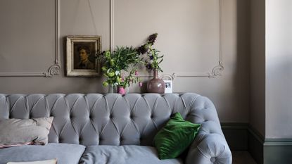
Farrow & Ball's Joa Studholme reveals the new neutral shade that will set the tone for 2021
The color curator urges us to look beyond beloved gray tones and embrace a stylish & subtle new hue


Nobody knows color quite like the undisputed queen of paint, Joa Studholme. As Farrow & Ball's top color curator Joa not only observes trends but creates them. So, when she sat down with Livingetc, we were naturally keen to discuss the future of the most aesthetic palette of them all – and discover the new neutral.
Yes, while nobody knows color like Joa, nothing says chic like a stylish neutral hue that balances our schemes and forms our painted wall ideas. The shade in question was (at least until now) gray – whose subtle tones have blessed the trendiest of interiors – but the day of gray's reign may be numbered.
Here, Joa reveals the color we need to keep at the forefront of our radar for the rest of 2021, and beyond.

'When it comes to new neutrals, I think that we will be looking at softer tones than the ubiquitous gray so popular over the last decade,' Joa declares. Instead, she suggests we look to a warmer, almost brown tone, such as Farrow & Ball's Jitney, to bless our walls for the rest of the season.
'Jitney with its warm (but slightly gray!) base was created specifically to herald the renaissance of earthier tones in the home, and the rise in popularity of the stony tones of Shadow White shows that we want both softer woodwork and warmer walls,' she adds.

In discussing neutral tones, Joa also discussed the organic palette surrounding Farrow & Ball's factory amid the rugged Dorset landscape. Secrets behind this beautiful headquarters will air across the UK tonight, July 8th, in Farrow and Ball: Inside the Posh Paint Factory. We already know we'll taking notes for our future modern living room ideas throughout.
'Colours have been inspired by many places, including beautiful India and mysterious Morocco, but we always hold a great affection for the wonderful countryside surrounding our base in Dorset,' Joa says, before noting more neutral shades to remember.

'Purbeck Stone was inspired by the wonderful Jurassic coast, as was Ammonite, while Wevet and Dimpse are both West Country dialects – the former for a spider's web and the latter for a twilight sky – both of which conjure up the colors perfectly,' she adds.
Are these shades the future for our modern homes? If Joa says so, we simply have to agree. More about Farrow and Ball: Inside the Posh Paint Factory is available to watch here.
Be The First To Know
The Livingetc newsletter is your shortcut to the now and the next in home design. Subscribe today to receive a stunning free 200-page book of the best homes from around the world.
Megan is the News and Trends Editor at Homes & Gardens. She first joined Future Plc as a News Writer across their interiors titles, including Livingetc and Real Homes. As the News Editor, she often focuses on emerging microtrends, well-being stories, and celebrity-focused pieces.
Before joining Future, Megan worked as a News Explainer at The Telegraph, following her MA in International Journalism at the University of Leeds. During her BA in English Literature and Creative Writing, she gained writing experience in the US whilst studying in New York. Megan also focused on travel writing during her time living in Paris, where she produced content for a French travel site.
-
 The 12 Best Table Lamps for Reading —I'm a Certified Bookworm (and Shopping Expert)
When it comes to table lamps for reading, I don't mess around. If you're the same, this edit is for YOU (and your books, or course — and good recommendations?)
By Brigid Kennedy Published
-
 "It's Scandi Meets Californian-Cool" — The New Anthro Collab With Katie Hodges Hits Just the Right Style Note
The LA-based interior designer merges coastal cool with Scandinavian simplicity for a delightfully lived-in collection of elevated home furnishings
By Julia Demer Published

