How Emily Henderson used a clever layout to squeeze three kids into this small attic bedroom
New skylights, colorful wallpaper and creative storage ideas have helped to brighten up this kids' room
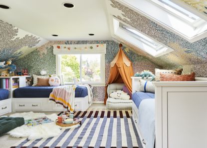

Trying to find space for one more? When you've got kids, it's easy to outgrow your home without realizing, but with the right design, you can make a kids' room the perfect sharing space without compromising on comfort.
This was the aim of stylist and designer Emily Henderson, who has given this attic kids' room a bright and bold makeover thanks to the help of new colorful patterned wallpaper and some skylights. The homeowners wanted to pair fun and functionality in their kids' room and, luckily, Emily was on hand to deliver.
The Seattle family were winners of Emily's 'Brighten Up Any Room' makeover contest, so they received a colorful, natural light-filled update to the shared kids' room for free. The bedroom has since been transformed into the perfect place to play and rest. Clever storage idea and fun designs make it an ideal space for the three kids to share without feeling overcrowded or compromising on preference.
If you're looking to renovate your child's bedroom and need a little inspiration, then look no further. We caught up with Emily to find out how she created such a beautiful room fit for three young children and gathered her best tips on bringing bold color to a room.

Emily Henderson is a stylist, author and TV personality, renowned for her cozy, approachable interior style. Her website, Style by Emily Henderson, is packed with inspiring ideas and Emily and her team's best advice.
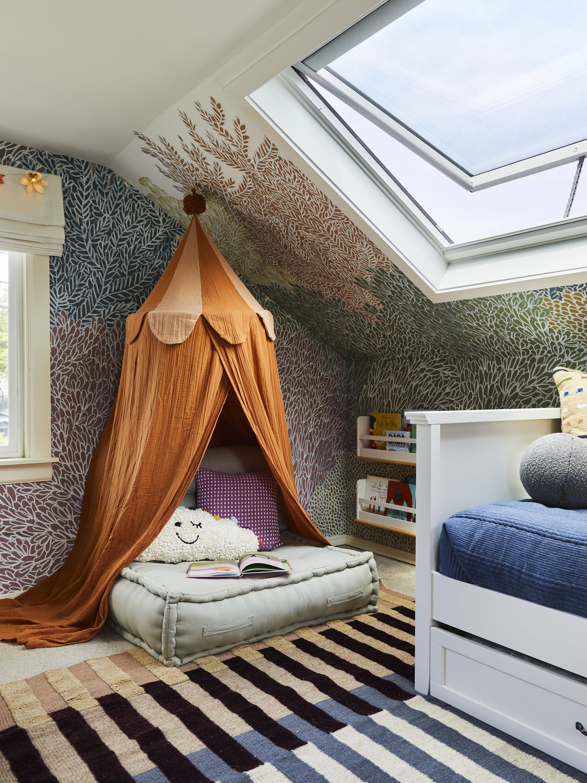
It's clear that Emily Henderson knows a thing of two about how to design a kids' room. One of the stand out features of her design is the colorful, illustrated-effect wallpaper which creeps up onto the ceiling with a tree-like effect.
'We had several moodboards built out, and this wallpaper kept calling my name to match the new light-filled feel of the space,' she explains. 'It's called "Hideaway, Gentle" from Rebel Walls and it looks really organic but also has an eye-catching color palette that doesn’t have a lot of contrast.'
The fun wallpaper makes the perfect addition to a kids' room due to the range of colors that are bound to suit young, developing tastes. It ties in with the eclectic color palette that's also found in the rugs and other decor. As Emily explains: 'It felt magical for these kids and brought the room to life.'
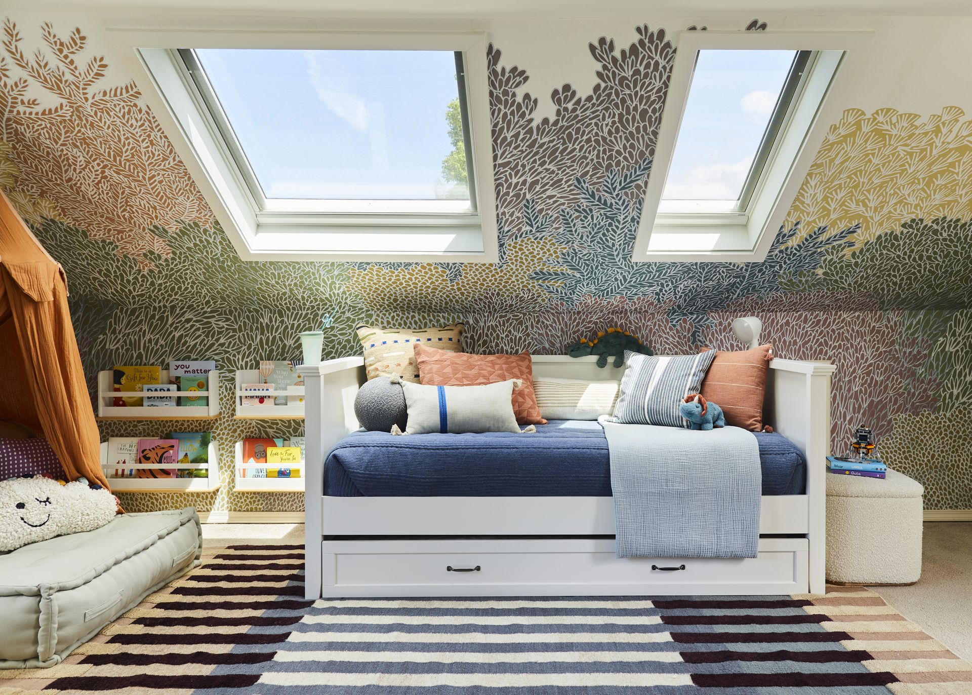
Skylights from VELUX invite plenty of natural lighting into this attic room, making it a bright and cheerful sharing bedroom for the kids to play.
'Before I started the project, the room just had just a few fairly small vertical windows,' Emily explains. 'While bringing in some light, they didn’t make the attic bedroom feel much larger.'
It was Emily who suggested adding skylights to help lift the space. 'I’m a massive believer in how much natural light can improve a room – and the more the better in the Pacific Northwest,' she says. 'The angled ceilings were perfect for two new skylights, and VELUX skylights are game changers.'
The skylights Emily and her team installed are solar-powered and they can open and close via a remote or app. This means mum and dad can alter the settings easily from their phones helping improve airflow in the second-floor bedroom.
Blackout blinds were also an essential part of the design to ensure a good night's rest for all the youngsters. 'We selected room-darkening shades that block 99% of the sunlight, which I knew was key for newborn naps,' says Emily.
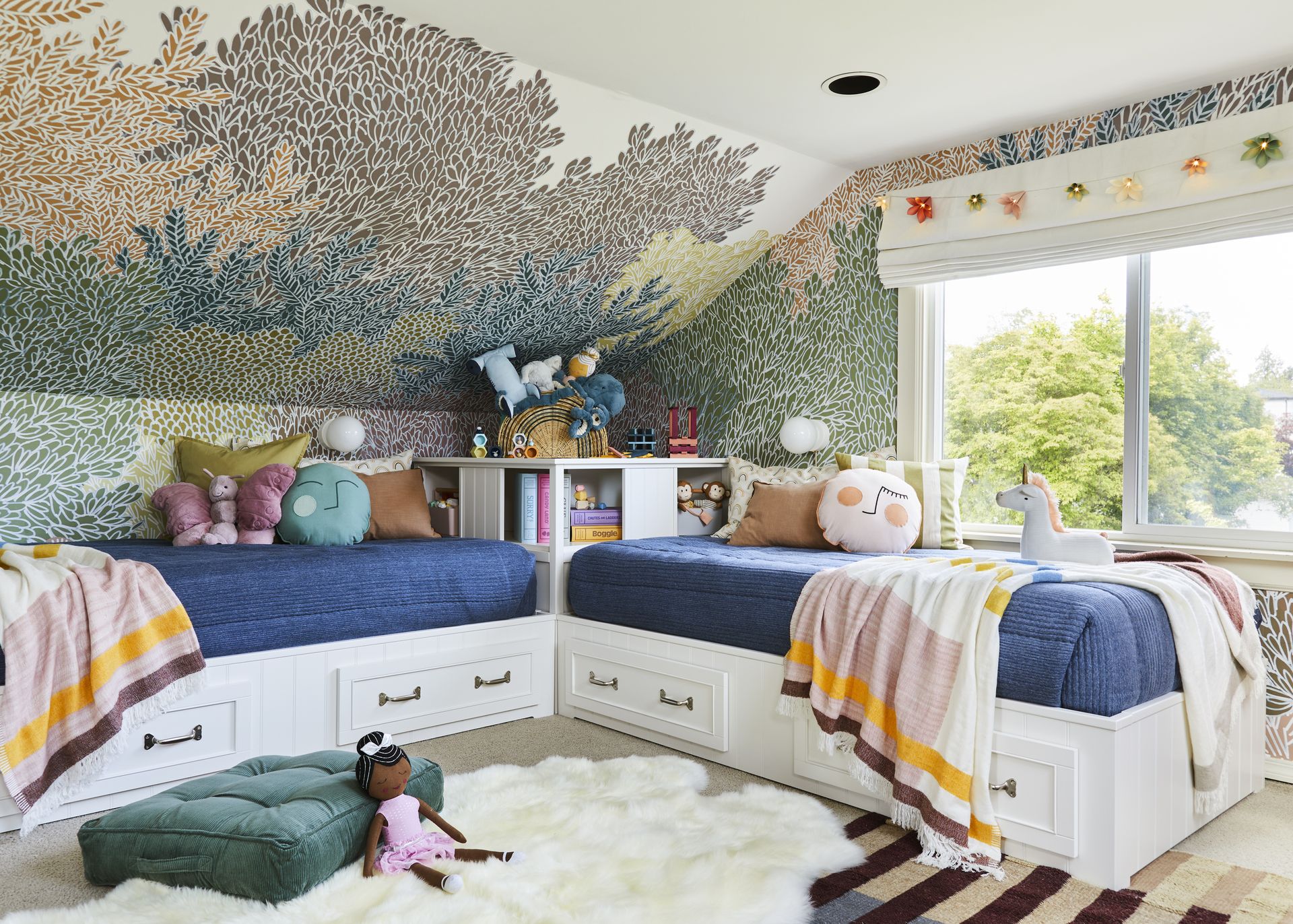
Soft textures were introduced through layering rugs which helps to create a warm and cozy atmosphere. A soft sheepskin rug under next to the two older children's beds is like stepping on a fluffy cloud as you wake up.
'The Lulu and Georgia linear-patterned rug we selected is so lush,' Emily says. 'Layering in the sheepskin element was the perfect touch to make it nice and cozy for reading or playtime.'
In terms of meeting the needs of three different children, Emily says there wasn't a need for many compromises. 'The colors and patterns in this room are all very neutral but still bright, which is great with a son and two daughters,' she explains.
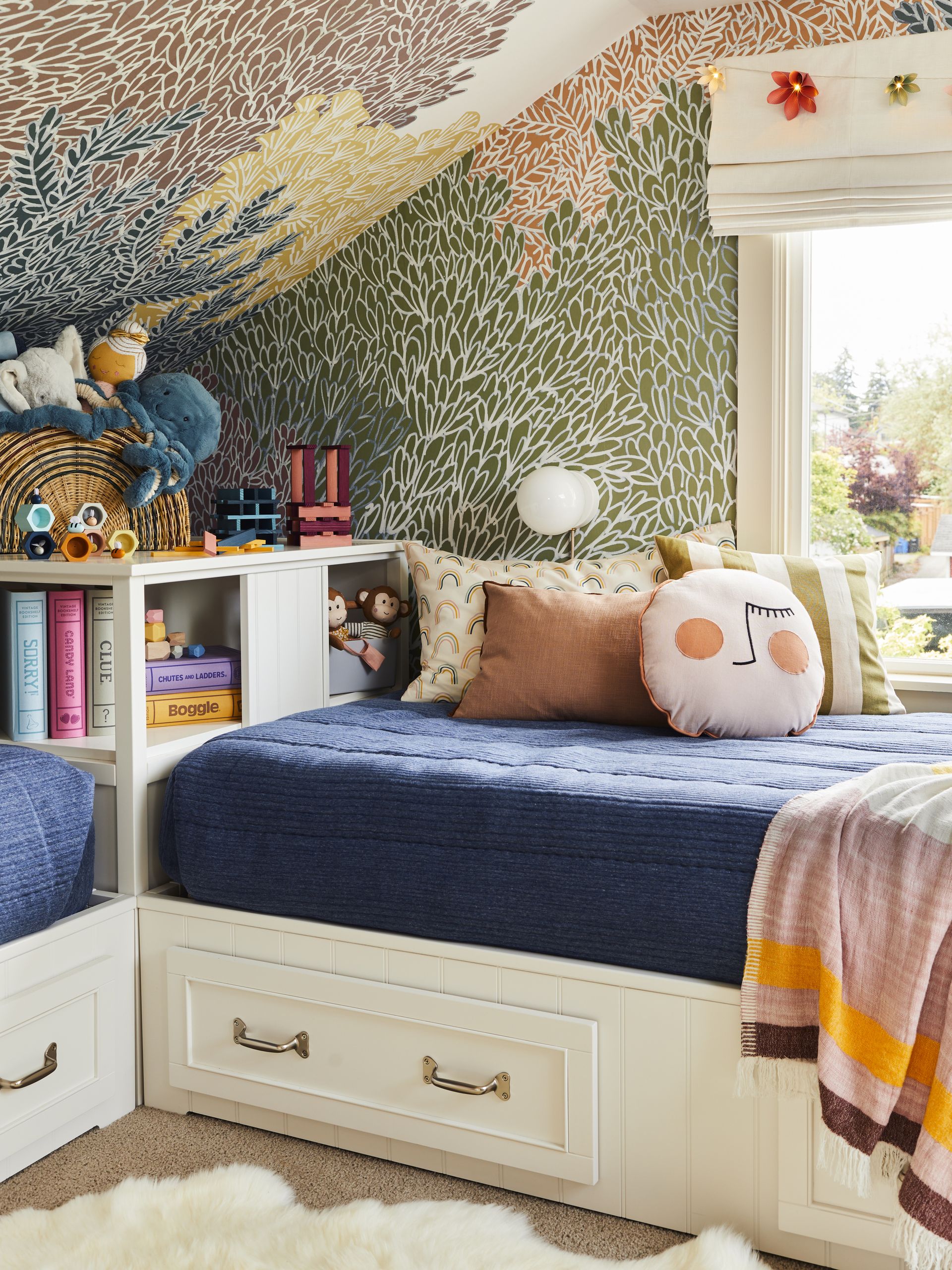
As a relatively small attic room with slanted ceilings, design choices were made with clever storage ideas in mind to maximize space.
'First off, the skylights immediately made the room feel so much more spacious, which gave us more flexibility on furniture placement underneath them,' Emily explains. 'To give the children a place to play on the floor, we used every bit of wall space for the beds, while the wallpaper also draws the eye toward the ceiling.'
They also gave consideration to the bed sizes and their height. It can be difficult to know how to organize a kids room, but some clever storage solutions helped this family keep a tidy space. 'Knowing that the ceilings did not allow for bunk beds, under bed storage became our best friend and solidified a really clean look.'
Two twin beds up make an L-shape in one corner with a shared bookcase-turned-nightstand to ensure every inch of space is used to its potential. There was no need to sacrifice fun in favor of functionality either. 'Styling-wise, we maintained our aim of creating moments throughout the room,' Emily says.
She adds: 'The canopy adds to the whimsical nature of the space, while also providing a secluded space to read while the art station makes good use of an oddly shaped corner and gives the children a chance for focused creativity.'
Be The First To Know
The Livingetc newsletter is your shortcut to the now and the next in home design. Subscribe today to receive a stunning free 200-page book of the best homes from around the world.

Lilith Hudson is the News Editor at Livingetc, and an expert at decoding trends and reporting on them as they happen. Writing news, features, and explainers for our digital platform, she's the go-to person for all the latest micro-trends, interior hacks, and color inspiration you need in your home. Lilith discovered a love for lifestyle journalism during her BA in English and Philosophy at the University of Nottingham where she spent more time writing for her student magazine than she did studying. After graduating, she decided to take things a step further and now holds an MA in Magazine Journalism from City, University of London, with previous experience at the Saturday Times Magazine, Evening Standard, DJ Mag, and The Simple Things Magazine. At weekends you'll find her renovating a tiny one-up, one-down annex next to her Dad's holiday cottage in the Derbyshire dales where she applies all the latest design ideas she's picked up through the week.
-
 The 12 Best Table Lamps for Reading —I'm a Certified Bookworm (and Shopping Expert)
When it comes to table lamps for reading, I don't mess around. If you're the same, this edit is for YOU (and your books, or course — and good recommendations?)
By Brigid Kennedy Published
-
 "It's Scandi Meets Californian-Cool" — The New Anthro Collab With Katie Hodges Hits Just the Right Style Note
The LA-based interior designer merges coastal cool with Scandinavian simplicity for a delightfully lived-in collection of elevated home furnishings
By Julia Demer Published
