Designers have created a bathroom trend that makes the shower the star - these 6 show you how it's done
The statement shower trend infuses bathrooms with drama and excitement, and these six show how to get the look
There’s no denying that freestanding tubs have a knack for stealing the spotlight in modern bathroom design. But as homeowners continue to seek a daily spa-like experience at home, the shower is coming out from behind the curtain – often bolder and bigger than ever before.
‘Most of our clients shower much more frequently than they take a tub bath, so it feels only natural that we design a shower that can accomplish the experience that was previously the responsibility of the tub: being a true experience for the user, imparting a feeling of zen, and being a real design moment within the larger bathroom,’ says Susannah Holmberg, an interior designer based in Salt Lake City, Utah.
We’re seeing showers now as bespoke environments within a modern bathroom, with dramatic features that make walk-ins a stand out feature worthy of any hotel suite. Anything from double doors and epic layouts to sculptural enclosures and eye-catching materials give tubs a run for their money – the point is to create a daily escape with every excuse to rinse, linger, and repeat.
And on the luxury end, over-the-top designs command more floor space, creating open atmospheres (some more akin to wetrooms) with no signs of the cramped, concealed cubicles typical of smaller footprints.
‘Owners request and respond to large and luxe bathrooms,’ says interior designer Jamie Drake, co-founder of NYC’s Drake/Anderson. ‘The size of showers is especially on their radar, the bigger the better – room to stretch and wash away the stresses and tensions of daily life.’
Well beyond rainfall shower heads and fancy soaps, this worthy architectural interior design trend can transform your shower into a daily wellness retreat within your home – here’s a few upgrades guaranteed to make a splash.
6 incredible statement showers
1. Choose large-format materials
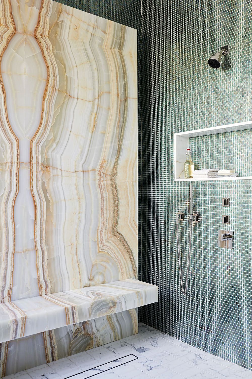
For an outstanding finish worthy of any spa bathroom oasis, large format materials will make a bold statement. They offer a canvas for splashy materials while also covering more vertical surface area with less grout lines than tile. ‘Walls of easy to clean slabs of marble, onyx, glass and quartz are easy to clean as well as deliciously monumental,’ notes interior designer Jamie Drake, co-founder of NYC’s Drake/Anderson. In this mixed material shower, an oversized Honey Onyx slab creates maximal impact alongside a wall of glass mosaic tiles.
But the decisions go beyond looks and squeaky clean surfaces. ‘To create a shower that one wants to linger in we select materials with both visual interest and practicality,’ adds Drake of the interior above, one of the projects featured in his firm’s book, BOLD: The Interiors of Drake/Anderson, available from Amazon. Slip-resistant materials, like honed stone or small mosaics, can look just as sensational as they are safe – the tiled statuary marble floors give the overall design a solid base.
2. Double the doors
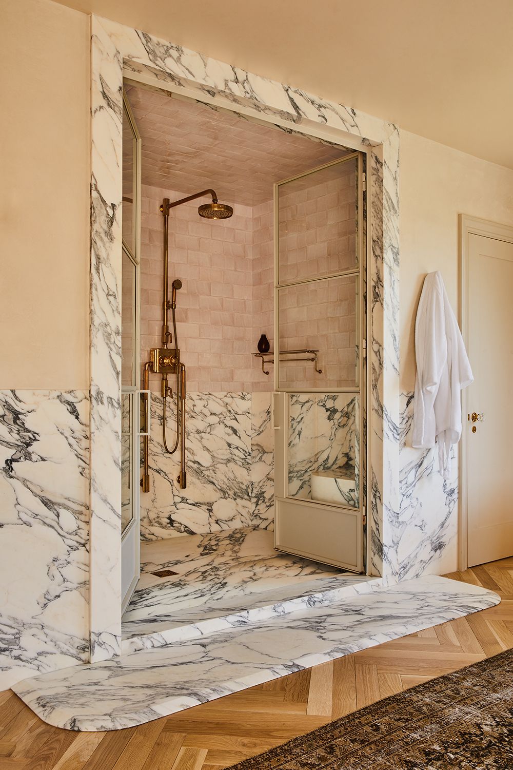
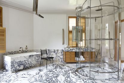
As if the Arabescato marble wasn’t loud enough for this bathroom trend, this spacious shower speaks volumes with double doors, an extra dose of drama for a space that usually gets a simple curtain. And when it comes to selecting your shower doors, it’s all about the details. ‘Perhaps it is the color of the door – in this case it was powder coated a soft white – or perhaps it is the shower door handle,’ says David John Dick, a cofounder of LA’s DISC Interiors. ‘Both are opportunities to bring a subtle moment of visual surprise to one’s space, and to break the mold.’
And why are those tiny details especially important in the shower? ‘The shower is a place where one interacts with the hardware, the stone and tile, and clients will come in direct contact with the materials,’ adds Dick, noting how these small choices add to ambience, bringing a certain je ne sais quoi. ‘DISC Interiors is always seeking to design showers that feel calm, classic, and luxurious, with an element of surprise.’
3. Take the shower screen full-height
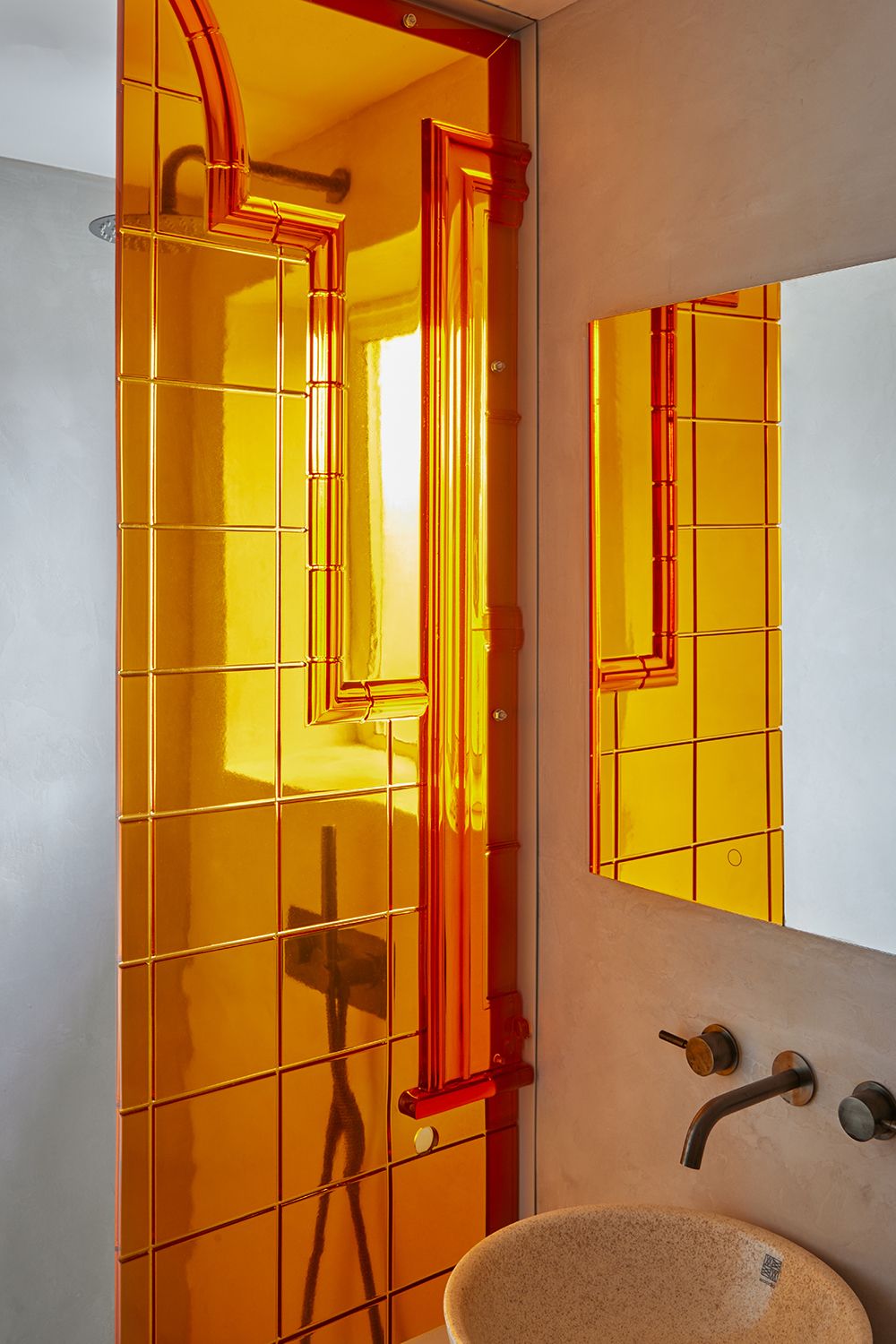
Especially if you avoid the plain, frameless panes typical of modern walk-ins, a custom shower screen can inject visual interest without changing the standard layout. Here, an amber resin panel inspired by Victorian architecture drenches the bathroom in a tangerine glow - another example of the orange bathroom trend. ‘The most important thing for a custom shower screen is that you get to decide the size to fit the space, so I would always make it go full-height of the room so you don't have to have any additional horizontal supports or armatures that can ruin the look,’ says Alex Holloway, creative director at London’s Holloway Li.
And even if bespoke resin panels aren’t exactly within reach, you can still make a statement by choosing traditional materials that still draw the eye, all while remaining entirely practical. ‘Frosted, clear, or textured transparent materials are great because they are more forgiving than plain glass from a maintenance point of view,’ adds Holloway.
4. Add curves
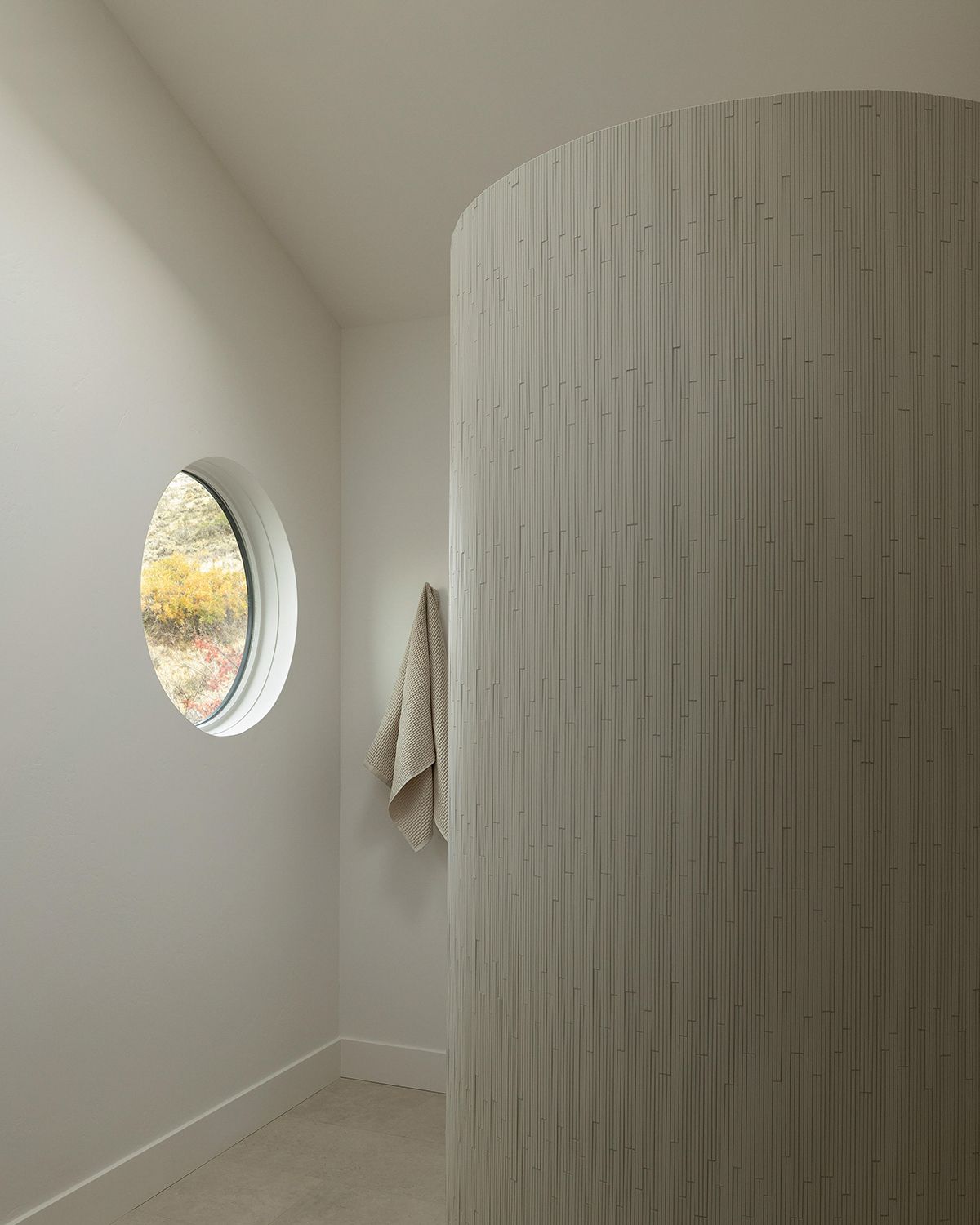
While standard walk-in showers are often rectangular or stuck in a cubicle, custom designs think outside the box, like this sculptural stall with curved walls. ‘Absolutely pay attention to wall height when designing a shower like this – the wall needs to be tall enough to accommodate the height needed for a shower head,’ says Susannah Holmberg, who intentionally left space between the wall and ceiling to create an elegant yet organic form. ‘Additionally, this aesthetic would be less successful with a curb – it really needs to be a clean transition at the shower entrance.’
To round out the look in this cream-colored minimalist bathroom, Holmberg leaned into the natural shape of the circular shower. “We chose a small format tile that intentionally lays out with some variation, so it has the most lovely, matte, artisanal finish,’ adds Holberg. ‘It reminds me of a sea shell after being smoothed and rounded by the waves.”
5. Tile a shed structure
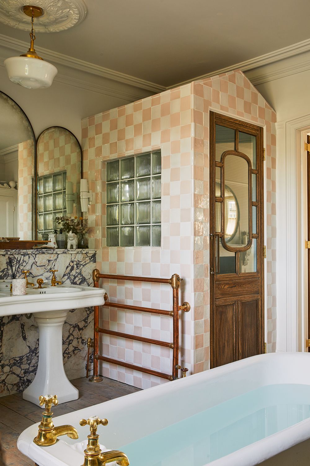
A riff on the standard shape of corner showers, this charming ‘shower shed’ (which mirrors another shed for the toilet) ticks all the boxes with pink-and-white checkered walls and a glass block window. ‘Often showers are simply glass cubicles but we felt for the design of this bathroom, it would be interesting to use the showers “walls” as a very decorative feature on the outside,’ says Angus Buchanan, Creative Director and Co-Founder of London’s Buchanan Studio. ‘We were able to create the symmetry with the WC shed and bring some colour and pattern into the bathroom.’
As a result, the opportunity for bringing in visual interest is flipped inside out; while shower wall ideas are often reserved for inside the cubicle, giving the shower its own structure creates a new way to incorporate shapes, textures, and materials – here, beauty is on the outside.
6. Place the shower in the center

If space is no concern, create a new focal point by pulling your shower out of the corner or away from the wall. ‘This shower is in the middle of the room which makes it unique – it’s a glass form with metal structure and the marble surround gives it height and an artistic, almost sculptural frame,’ says NYC-based interior designer Sara Story, who embraced the central placement with a showstopping base. ‘I used a very lively pattern of stone in the design – given the size of the space it could handle it!’
And when your shower is the focal point, your materials and finishes work overtime in the spotlight. “The plumbing is exposed here which gives it a chic and edgy vibe,” says Story. “I love seeing the mechanics and the metal frame — all tailored and finished in a sophisticated way while still being exposed. Due to its size a bathroom shower is an excellent space to use interesting materials, textures, and forms to be a cool focal point while still being functional.”
Be The First To Know
The Livingetc newsletter is your shortcut to the now and the next in home design. Subscribe today to receive a stunning free 200-page book of the best homes from around the world.
Keith Flanagan is a New York based journalist specialising in design, food and travel. He has been an editor at Time Out New York, and has written for such publications as Architectural Digest, Conde Nast Traveller, Food 52 and USA Today. He regularly contributes to Livingetc, reporting on design trends and offering insight from the biggest names in the US. His intelligent approach to interiors also sees him as an expert in explaining the different disciplines in design.
-
 What are the Most Comfortable Pillowcases? From Temperature Regulating to the Best for Your Skin
When you're looking for comfort in your pillowcases, material matters. These are the best you can buy
By Faaizah Shah Published
-
 5 Simple, but Genius Bathroom Layout Tricks That Will Make Your Space Work so Much Harder
Small switches to how you lay out your bathroom that help make the most of a small space
By Luke Arthur Wells Published
