Before & After: a tired home in LA becomes an uplifting and restful open plan haven
An entirely new floor has been added to this home resulting in a beautifully modern transformation


Thanks to the work of Californian design and architecture studio Arterberry Cooke, this dated bungalow in the San Gabriel foothills of Los Angeles has been transformed into two-storey modern home perfect for family life.
Prompted by some substandard work by a previous owner that needed reconstructing, the gut renovation project involved the addition of a new facade, a second floor, and opening the floor plan.
Previously, the two-bedroom, one-bathroom lackluster property was filled with dark, closed rooms that lacked any real character but the designers have beautifully transformed the interior into a bright, contemporary home that now encompasses five bedrooms and three bathrooms.
Functional yet stylish, there is ample space for the homeowners and their two children to enjoy time together as well as individually. 'The clients wanted to be able to stay on the lovely foothill property where they could raise their family, and we investigated multiple ways to achieve this,' says designer Barrett Cooke.
'In the end we settled on a full second floor addition with space for three bedrooms so the family could all be on one floor,' she adds. 'This allowed for one bedroom on the first floor to be used as an office and the second bedroom to be used a guest room.'
The result is a modern family home that flows seamlessly from room to room, equipped with all the necessary facilities for family life.
BEFORE THE RENOVATION

Before designers Alice and Barrett from Arterberry Cooke worked their magic on the home, the property was an unremarkable stucco box bungalow that would easily go unnoticed by passers by. Shaded by trees, the raised front yard lacked visual appeal with its sparse lawn and weathered stone wall.
The home itself was overshadowed by the foliage which, combined with the small windows, minimised the natural light indoors. The property was easily overlooked and in desperate need of a uplift.

Within the home, 80s-style cabinetry, countertops, and tiles dominated the kitchen. Despite more modern upgrades such as the spotlighting, the home seemed dark and enclosed. As Barrett explains: 'The old cherry cabinets really added to the darkening effect on the space.'
Dated tiles on the floor and walls made the space feel mismatched and the entire room lacked any cohesion through a color scheme or notable style.

Despite being a spacious bungalow, the arrangement of the furniture wasn't used to its advantage. Beautiful antique items (such as the cabinet in the living area) were poorly placed, meaning they failed to stand out and faded into the background.
Other architectural elements, such as the arched doorway, were also not used to their advantage. The open doorways offer a glimpse into the kitchen from the living area but because the rooms lack any cohesion, the interior looks ill-matched.

Prior to the renovation, the backyard was overgrown and in need of some TLC. The pool area looked unkept thanks to the overhanging foliage and there were few intentional spaces for flowers or grass to flourish.
After the renovation

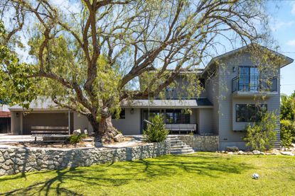
Once Alice and Barrett put their skills to the test, the home exterior is completely unrecognisable. 'We ended up gutting the main space and completely opening it up, enlarging the windows and adding skylights to bring in as much natural light as possible,' explains Barrett. 'We removed all the stucco and installed new cement board siding.'
A second floor helps to rise the previously shallow property, making it look more well-balanced in the raised front yard. Meanwhile, the grey-beige of the cement board siding compliments the natural stone wall, which has been restored to its former glory.
'This home had a logical space to add the second floor,' says Barrett. 'Adding back siding helped bring the home from a drab stucco box to something with more character and charm. '

The kitchen is now a convivial and social space, perfect for hosting guests while also being the perfect family gathering spot. 'We wanted to keep the main interior space as bright as possible since the clients host many gatherings with family and friends,' explains Barrett.
'These clients have a real "open door policy" so the kids come home with friends after school and do homework on the island,' she adds.
A calming neutral color scheme with splashes of green makes for a sophisticated yet fun space while the home’s new open floor plan is airy and bright, allowing for a functional sense of flow.
'We discovered this green by Benjamin Moore called Dakota Shadow and fell in love,' Barrett says. 'I love how rich it feels and pairs wonderfully with whites, blues, and greys.'

The open plan kitchen-dining area helps with the continuation of the color scheme which is tied together with the natural light wood panelled flooring. As Barrett explains: 'We wanted to keep the lighter wood flooring throughout as we were opening the kitchen to the main space so as to make the rooms feel more connected.'
A collection of antiques had been in the homeowners' family for generations so they wanted to ensure the new design would allow for the pieces to be rehomed. With statement furnishings like the dining table, Alice and Barrett made them the focal point of the space, unlike their out of place appearance before.
'The antique items have been in her family for many generations and we knew when we started the project that they were going to remain in the home,' Barrett says. 'We love the juxtaposition of these timeless antiques with the modern-leaning house.'

In the living area, the natural fiber rug and soft wooden finishes combined with the grey toned furniture hint towards a coastal grandmother feel. The neutral color scheme adds a coziness that the home previously lacked while the clean lines throughout give the space a modern edge.

Throughout the home, the bathrooms have been given a modern makeover. A white marble vanity creates the clean and fresh feel that we all search for in our bathrooms. Elsewhere, the softer and more traditional wooden cabinetry contrasts beautifully with the black brassware finishes on the mirror, lighting and taps. As Barrett explains: 'Black is so universal it's hard to go wrong.'

Upstairs, the designers have used the clients existing furnishings to be slightly more playful. The rug paired with the footstool creates a boho bedroom vibe complemented by the vaulted ceiling. According to Barrett, many of the rugs throughout the home are family heirlooms, and so it was vital they were incorporated into the design.

'The yard and pool areas were re-landscaped by Sarah Peterson of LandSpaces,' says Barrett. Thanks to her work, a luscious green lawn is far more inviting that the previous drab poolside and the misshaped paving stones are a fun yet functional addition. The stone border for the shrubs marries perfectly with the stone wall in the front yard and the neutral color scheme throughout the home, introducing the cohesive element that this L.A. home once desperately lacked.
Be The First To Know
The Livingetc newsletter is your shortcut to the now and the next in home design. Subscribe today to receive a stunning free 200-page book of the best homes from around the world.

Lilith Hudson is the News Editor at Livingetc, and an expert at decoding trends and reporting on them as they happen. Writing news, features, and explainers for our digital platform, she's the go-to person for all the latest micro-trends, interior hacks, and color inspiration you need in your home. Lilith discovered a love for lifestyle journalism during her BA in English and Philosophy at the University of Nottingham where she spent more time writing for her student magazine than she did studying. After graduating, she decided to take things a step further and now holds an MA in Magazine Journalism from City, University of London, with previous experience at the Saturday Times Magazine, Evening Standard, DJ Mag, and The Simple Things Magazine. At weekends you'll find her renovating a tiny one-up, one-down annex next to her Dad's holiday cottage in the Derbyshire dales where she applies all the latest design ideas she's picked up through the week.
-
 The 12 Best Table Lamps for Reading —I'm a Certified Bookworm (and Shopping Expert)
When it comes to table lamps for reading, I don't mess around. If you're the same, this edit is for YOU (and your books, or course — and good recommendations?)
By Brigid Kennedy Published
-
 "It's Scandi Meets Californian-Cool" — The New Anthro Collab With Katie Hodges Hits Just the Right Style Note
The LA-based interior designer merges coastal cool with Scandinavian simplicity for a delightfully lived-in collection of elevated home furnishings
By Julia Demer Published

