Before and after: a downtown Toronto kitchen gets a sleek contemporary makeover
See how this downtown Toronto kitchen is transformed from dark and dingy to chic and colorful


This downtown Toronto kitchen makeover is a master class in modern kitchen ideas used to breathe life and style into a tired and dark space. The kitchen is easily the most functional room in the home – but its functionality needn't sacrifice style or attention to detail, as this stunning transformation proves. Above all, it showcases the importance of choosing the right materials and color scheme for creating a high-end kitchen design.
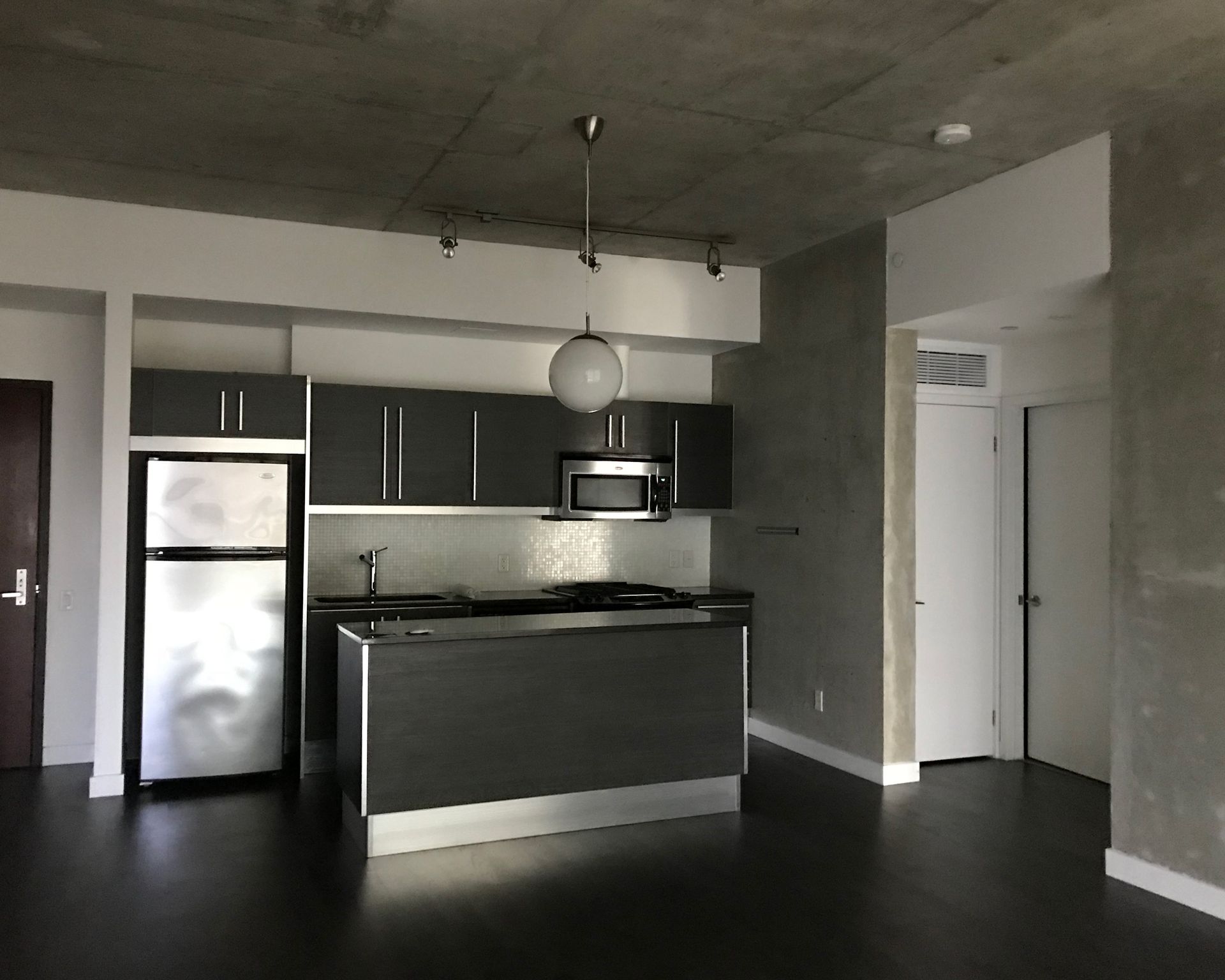
Before

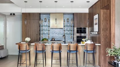
After

When a couple decided to leave Bermuda after 30 years and move to Toronto, they purchased a 10-year-old downtown condo that did not reflect their sense of design or their lifestyle. The original design is heavy on functional, monochrome finishes that lack personality.
The couple love to cook and entertain, so they tasked Svetlana Tryaskina of Toronto-based Estee Design with creating a functional kitchen outfitted with high-end appliances, seating for six to eight people, upscale finishes, better lighting, and more privacy for the unit. The resulting project is an imaginative transformation that injects warmth and contemporary edge into the space.
Before

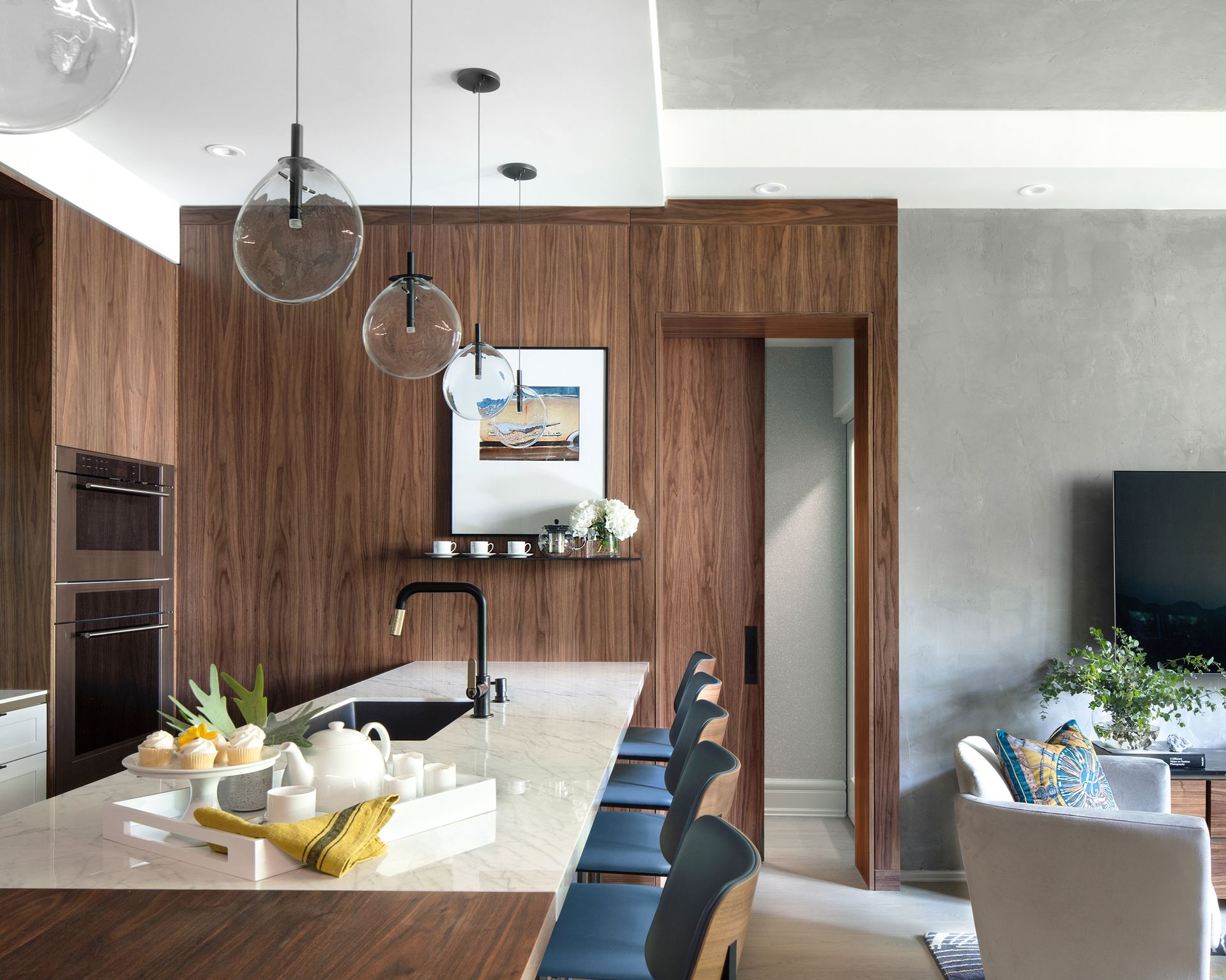
After

Svetlana started by rearranging the layout of the open concept living room and kitchen. Top-of-the-line, built-in appliances allowed her to design seamless millwork panels without sacrificing storage and performance.
The design embraces the warmth of wood, creating a seamless link with the open plan living space.

As the centerpiece of the design, she selected five eye-catching Cantina pendants from SONNEMAN–A Way of Light featuring flask-like, flat oval glass profiles suspended from slender cables. These pendants almost look like art objects and give the kitchen a rarified, modern look. Delicate and airy, they would work equally as living room lighting ideas.

A single point source of LED illumination within the void of the larger clear glass volume creates a special aesthetic tension of scales. As objects of kinetic art, the pendants complement the two-tone kitchen and create the illusion of a larger space.
Exclusive handmade wallpaper with shimmering texture adds a sense of spaciousness and luxury. Beautiful hand-selected walnut millwork veneer brings warmth and elegance and brass fixtures exude opulence and exclusivity. A blue hand-glazed tile backsplash pays homage to Bermuda’s blue waters.
We can't get enough of this exquisite interplay of colors and finishes – a chic, modern kitchen that reflects its owners passions.
Be The First To Know
The Livingetc newsletter is your shortcut to the now and the next in home design. Subscribe today to receive a stunning free 200-page book of the best homes from around the world.

Anna is a professional writer with many years' experience. She has special interests in architecture, photography, and high-end interior design. Her work has appeared in Homes & Gardens, Gardeningetc, and many other publications.
-
 These 12 Best Table Lamps for Your Desk — Perfect Glows for a Creative Home Office
The best table lamps for your desk is have a soft, targeted glow. Elevate your WFH set-up with these stylish picks endorsed by Style Editor Brigid Kennedy
By Brigid Kennedy Published
-
 The Nespresso VertuoPlus is 30% Off for President's Day, and it's Kim Kardashian's Coffee Maker of Choice
This sleek and stylish coffee maker was spotted in Kim's home bar, and you can currently save $60 if you buy yours from Amazon
By Lilith Hudson Published

