Allison Holker has embraced this controversial bookshelf trend in her home - and it's an idea that splits designers
There are multiple ways to decorate bookshelves, but Allison's idea has designers torn
When it comes to decorating bookshelves there are numerous tips and tricks on how to style them to achieve a beautifully curated look. There is a trend in particular, however, that's proven especially popular in recent years, but also particularly divisive. The more minimalist among us definitely seem to prefer it, while fans of more traditional designs watch on in horror. Love it or not, celebs are bringing this bookshelf-styling look into their homes, and they're not afraid to show it off.
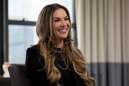
I’m talking about turning books backward so you don’t see the spine. Dancer and actress Allison Holker recently gave us a glimpse of her beautifully styled shelves and her preference for hiding the spines for a muted, monochromatic look. Here, we take a closer look at this popular way of decorating bookshelves and let you decide if you'll go for it too.
The backward book display trend

This trend is all about displaying your books the wrong way around by effectively turning your books backward to hide the spine. This avoids all the different colors distracting the eye, and instead just shows the light color of the pages, for a more minimalist effect. Some of us are all for it but booklovers find it impractical as it makes it almost impossible to find any title you’d be looking for. It really boils down to a matter of style vs functionality.
For some, the pared-back style of backward books might complement the rest of their space. Allison Holker's home has very neutral colors and crisp lines, and the neutral look works great on her media wall. The pages in their light colors are an extra texture added to a minimalist scheme that makes it more interesting.
Home renovator and stylist, Nicola Skidmore, styles her books the same way for similar reasons. ‘One reason I opted for backward books was the aesthetic they create and visual interest they add to the room, as well as being a neutral color palette that compliments any space,' she says. 'It also makes choosing a book more interesting as you are more likely to pick something that you might not ordinarily jump to!'
A post shared by Allison Holker (@allisonholker)
A photo posted by on
What are the drawbacks of backwards books?

Blogger Laureen Clauson, however, flags the obvious barrier when styling your books backward. 'As far as practicality, there is none,' she says. 'I knew when I designed this space that these wouldn't be books I'd be searching for to read. It's purely aesthetic.' For book lovers, these are prized possessions that are worthy of display. In recent years, more and more beautiful limited-edition books have been released by artists and designers, and many would argue that they're there to be seen in all their glory.
That's the view held by Emma Bestley of Move Over Magnolia studio and the co-founder and creative director of YesColours. 'Books have become more than just something to read, they’re a home accessory that helps make an interior scheme pop,' she explains. 'Not only this but often the books we choose to have on display have meaning, so why opt to hide them?'
Turning your books backward is a trend that works best for those more inclined toward minimalism. However, if you love your books and are keen to display them, don't shy away from embracing the colors and the personality they bring to a space. The decision is in your hands!
Style your bookshelves with these chic buys

Price: $105
If you're leaning more toward the colorful bookshelves, rather than turning books backward, this book is definitely worth displaying next to other orange-colored tomes.

Price: $20
Alison has beautifully styled shelves with a mix of books and decorative objects. Go for sculptural shapes in neutral colors, like this black vase.

Price: $99
If you want to go total minimalist style wrap your books in white paper, or do a cheat and buy a set online for a clean, chic shelves look.
Be The First To Know
The Livingetc newsletter is your shortcut to the now and the next in home design. Subscribe today to receive a stunning free 200-page book of the best homes from around the world.

Raluca is Digital News Writer for Livingetc.com and passionate about all things interior and living beautifully. Coming from a background writing and styling shoots for fashion magazines such as Marie Claire Raluca’s love for design started at a very young age when her family’s favourite weekend activity was moving the furniture around the house ‘for fun’. Always happiest in creative environments in her spare time she loves designing mindful spaces and doing colour consultations. She finds the best inspiration in art, nature, and the way we live, and thinks that a home should serve our mental and emotional wellbeing as well as our lifestyle.
-
 What are the Most Comfortable Pillowcases? From Temperature Regulating to the Best for Your Skin
When you're looking for comfort in your pillowcases, material matters. These are the best you can buy
By Faaizah Shah Published
-
 5 Simple, but Genius Bathroom Layout Tricks That Will Make Your Space Work so Much Harder
Small switches to how you lay out your bathroom that help make the most of a small space
By Luke Arthur Wells Published
