5 Ways to Enhance the "Dead Space" Above Kitchen Cabinets — "This Trick Can Add a Sense of Calm Luxury"
Leading designers explain how to transform this often awkward-feeling gap into a feature that feels intentional and calming

With most kitchen cabinets designed to reach part way up the wall, the question of what to do with the gap that remains can be a tough one.
Filling it with objects is impractical (you don’t want to have to keep a ladder to hand) and can easily look messy. But leaving the space totally bare can feel like a wasted opportunity to add some height and interest to a modern kitchen.
Depending on what you want to achieve, different strategies can add character, ambience or a sense of calm luxury to your kitchen. Keep reading to discover leading designers’ tried-and-tested ideas for what to do with the gap.
1. Create a soffit

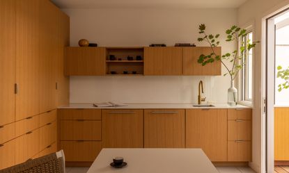
One of the most elegant solutions to making use of the space above kitchen cabinets is to build a soffit—a structure that extends down from the ceiling to cover the gap. Not only can these hide away unsightly wiring or pipes, but they’ll give your kitchen a more calming, streamlined look. In the design above by Feldman Architecture, Director of Interiors Lindsey Theobald wanted the cabinetry to feel 'clean and consistent' and for the room to have 'a sense of purpose and harmony'.
The issue with the space above kitchen cabinets is it can create 'dark voids', says Maura Abernethy, Founder and Principal of Studio VARA. 'It is fairly normal when using modular cabinets that they will not continue to the ceiling plane,' she says. 'For this, we recommend building a soffit out of MDF, not sheetrock, to make up the difference.'
After all, the space above kitchen cabinets is not always the most practical place to put things. 'As a general "rule", if there are times when there is space above kitchen cabinets, we try to create a soffit or bring the cabinets all the way to the ceiling as that space can get dusty and greasy from regular kitchen use,' says Alina Wolhardt, Founder and Principal of Wolf in Sheep Design.
2. Add to the ambience with decorative lighting

Another way to avoid those 'dark voids' is use the space for kitchen lighting. Try adding sconces that suit your scheme and the dimensions of the space available, like the lamps in the design above by Studio AM. As this kitchen shows, placing sconces above a window rather than the cabinets themselves will prevent things from feeling overcrowded. Alternatively, strip lighting can add a warming glow to a kitchen, and will work no matter how much space you have to play with above your cabinets.

Meanwhile, the kitchen above, also by Studio AM, illustrates how lighting can help break up the space above standing-height kitchen cabinets. 'Dressed up and highlighted with a series of vintage sconces, a continuous stone shelf avoids that challenge of just what to do for spaces above lower cabinets,' says Danielle Krieg, Director of Interior Design at the studio. 'This kitchen uses the island and lowers for the bulk of daily storage. A full height cabinet for the pantry and the area around the range keeps things out for display.'
3. Display a few carefully chosen objects

As this design by Wittman Estes demonstrates, you can decorate above kitchen cabinets without creating a cluttered look, as long as you can exercise restraint. The books and vase above the cabinets here add interest and feel like deliberate display objects, rather than clutter. You can achieve this look by being selective, and including plenty of negative space in your arrangement.

In the above kitchen, Wolf in Sheep Design filled the space above lower kitchen cabinets with decorative open shelving. 'You never want to over-crowd with decor here, and be mindful that these pieces could get warm if it's close to a stove or other appliances,' says Alina Wolhardt, who designed the kitchen. 'But in instances where we create shelving in the kitchen to create separation from a different room, or create open shelves above cabinets, we try to bring some intentional decorative pieces without over cluttering. Leaning artwork and even adding lighting such as small lamps can add to creating a more ambient mood in the kitchen.'
4. Use the space to let natural light in

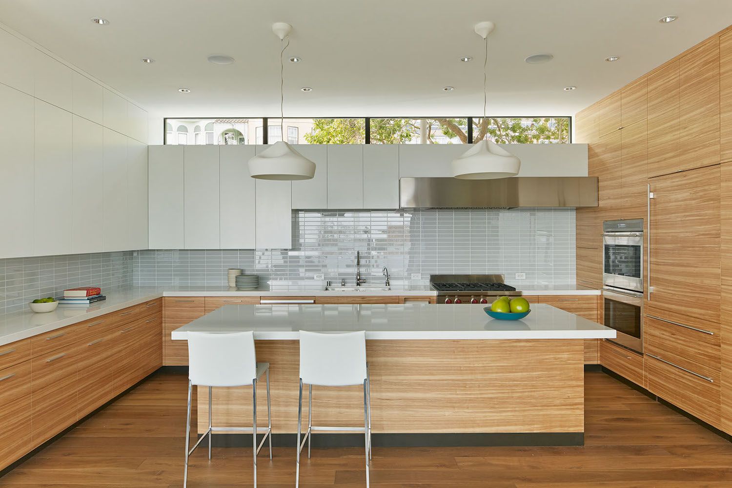
The space above kitchen cabinets can be a beautiful spot to frame a window, if the layout of your home allows for it. 'If there is a window above the upper cabinets or kitchen hood, let light bounce across the kitchen ceiling,' says Studio VARA’s Abernethy. 'Light in the afternoon from the west is particularly nice as a family transitions from afternoon activities (homework etc.) to making dinner.' So called 'clerestory' kitchen windows are an effective architectural strategy to help light reach further and deeper into your home.
Her advice, when it comes to thinking about the various heights in your kitchen, is to imagine it is like a sentence. 'All of the items that are tall, like a refrigerator, ovens, wine refrigerators, pantry cabinets, a broom closet, are either located at the beginning or end of the sentence (to the far left or far right of the elevation),' she says. 'We do this so that you can have an uninterrupted kitchen counter, with upper cabinets between the two tall masses. Then depending on how this lays out in your kitchen, we make the cooktop and hood the focal point of the kitchen.'
5. Build out your cabinets to the ceiling

If you’re able to extend your cabinets all the way to the ceiling, do—this will instantly make your kitchen look more luxurious. It will also draw the eye upwards and make the space overall feel bigger. The structure doesn’t need to house kitchen storage all the way to the top, in fact doing this isn’t always practical.
'Make sure space above kitchen cabinets is easily accessible and considered functionally as "useful storage",' says Matt Wittman, Principal Architect at Wittman Estes. 'Avoid ‘dead zones’ where cabinets are not easily reached, as these will become catch-alls for items rarely or never used.'
For higher-up cabinets, Wittman recommends lift-up hinges. 'These create a new zone of easily accessible shelving, doing double-duty and allowing both an open mode with full visibility to retrieve materials, and a closed mode for visual calm and simplicity.'
 Further reading
Price: $21.82
Designer - and Livingetc favorite - Amber Lewis knows the best use for all those tricky corners of your home. She has a knack for making spaces more liveable and easier to love, as seen to perfection in this beautiful book.
Be The First To Know
The Livingetc newsletter is your shortcut to the now and the next in home design. Subscribe today to receive a stunning free 200-page book of the best homes from around the world.
Kate Hollowood is a freelance journalist who writes about a range of topics for Marie Claire UK, from current affairs to features on health, careers and relationships. She is a regular contributor to Livingetc, specializing in reporting on American designers and global interiors trends. Based in London, Kate has also written for titles like the i paper, Refinery29, Cosmopolitan and It’s Nice That.
-
 These 12 Best Table Lamps for Your Desk — Perfect Glows for a Creative Home Office
The best table lamps for your desk is have a soft, targeted glow. Elevate your WFH set-up with these stylish picks endorsed by Style Editor Brigid Kennedy
By Brigid Kennedy Published
-
 The Nespresso VertuoPlus is 30% Off for President's Day, and it's Kim Kardashian's Coffee Maker of Choice
This sleek and stylish coffee maker was spotted in Kim's home bar, and you can currently save $60 if you buy yours from Amazon
By Lilith Hudson Published

