8 ways to style vintage prints in modern homes, easily elevating your transitional-style game
Vintage prints are an easy way to add charm to your modern space by following our expert tips

Bringing old and new together in transitional style homes is a huge trend for 2023. By combining the warmth and character of antiques with the elegance of modern design pieces, transitional-style design leads to spaces that are both sophisticated and highly personal.
But mixing old and new in a way that feels calm and cohesive can be tricky - transitional style isn't as simple as it looks. One of the easiest and arguably most joyful ways to achieve this look is to add vintage wall art to a modern interior. “Vintage prints in a modern interior add balance in a room,” says Kristen Rivoli of Kristen Rivoli Interior Design explains. “They ground the design so it doesn't skew too modern, which can sometimes feel cold.”
Shopping for vintage prints can be a lot of fun, but before you get started make sure you know what to look for. Keep reading to discover our expert advice on how to choose, frame and place the perfect vintage prints for your modern space.
How to use vintage prints in modern interiors
1. Create cohesion through color

Whenever you're working with contrast – which in this case is vintage and modern – the key is to find a cohesive element that brings the design of your room together. Color is one great way to create a dialogue between contrasting pieces, and a fallback trick of transitional style, so look for prints that pick out a key shade of your scheme.
“Everything needs to work in some way,” says Kristen Rivoli. “For example, we used blue fabrics for a transitional-style bedroom and were drawn to the blues in a vintage sailboat print to tie it all together [see the image above].”
By choosing colors that work, you can be more relaxed about things like the frames and positioning of your prints. “We love the ‘more is more’ maximalist approach of hanging lots of prints together and not worrying too much about whether the frames match or not. As long as we love everything there, and makes sure the colors work together,” say Harriet Williams and Sylwia Newman from design studio Projekt 26.
2. Let your favorite poster inspire your color scheme

If you’re starting out with a blank canvas, why not let a vintage print lead the way for your color scheme? This can result in a space that feels incredibly personal, and can be a great way to decide on a vision when you’re stuck. In this transitional-style dining room, the green of the print is picked up by the green of the chairs.
“We always say the best way to choose a vintage poster is to follow your heart," say Harriet Williams and Sylwia Newman from Projekt 26. "Vintage posters – especially those from the Polish School of Posters – were designed to speak directly to you and some really do! Having said that, we've had people come to us with lots of different reasons for choosing a print. Sometimes it might be a poster for a film or theater production which means something special to them. Sometimes it’s a favorite actor, or something designed in the year of their birth, or an artist they’ve fallen in love with.”
3. Choose matching frames

If you don’t want to be restricted by a certain color palette for your vintage prints, there are other methods to make them blend in seamlessly with your modern space.
“I love the idea of creating a gallery wall out of vintage prints,” says Kristen Rivoli. “To create a playful style while also creating cohesion between different vintage style prints, try taking the prints out of their original frames and choosing one single frame design.”
4. Group by subjects

Another option is to keep your vintage prints focused on a shared theme, such as the prints featuring old nautical paintings in Kristen Rivoli's designs.
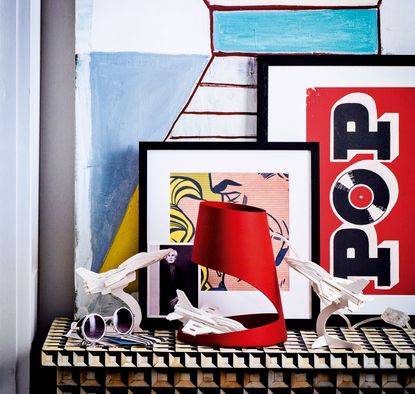
Other themes to try include pictures of flowers and plants, images of places and environments from a bygone era, pop art prints like in this image, above.
5. Look out for mid-century designs

It can be easier to blend mid-century vintage prints with modern furniture than older designs. Thankfully, there’s a lot to love about the print designs coming out of this period.
“Mid-century graphics come from a golden-era of design and are some of the finest ever created,” say Harriet Williams and Sylwia Newman. “They are bold and contemporary – especially when compared to older, more conservative vintage prints. But because they were designed in a pre-digital age they also have an imperfect charm which is impossible to replicate with a modern print. The overlapping inks from the process of litho printing, for example, and even the marks of time that can be found on original vintage pieces, add character to a space. They are able to connect us to the past, yet feel just as bold and contemporary as the day they were created.”
Among the Projekt 26 founders’ favorite mid-century artists are Polish designers Andrzej Krajewski [featured above] and Jan Mlodozeniec, or English artist Tom Eckersley. “There is also a naive style to many mid-century illustrative posters which we adore,” say Harriet Williams and Sylwia Newman. “These posters will instantly inject personality to a wall, and bring even the most sterile modern interior bursting into life.”
6. When in doubt, opt for a simple black frame

Vintage prints can look incredible in a variety of frame styles, from warm golden metals to wooden frames painted in bright, contemporary colors. But if you want to play it safe, a simple black frame will always help a vintage print blend in with a modern interior.
“Sylwia has a thoughtful approach and will frame single pieces she loves in a classic minimalist black frame on an off white mount,” say Harriet Williams and Sylwia Newman. “Hanging a pair or set of three mid-size posters together can also look lovely. We’d always recommend using UV glass to protect the colors from fading over time and avoid hanging the prints in direct sunlight.”

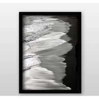
Single picture frame, Target
A simple, modern touch - this thin black frame truly helps to make vintage prints seem modern.
7. Use paper to plan your arrangement

Before you start drilling holes into your spotless transitional-style living room, use paper to experiment with the best position for your prints. This is especially important if you’re creating a gallery wall and have multiple dimensions to think about.
“Always consider the size and placing of the prints,” says Annica Wallin, Executive Creative Director at Desenio. “The best way to do this is to use plain paper in your chosen sizing and use blue tac to temporarily attach it to the wall. This gives you the opportunity to play around with the composition before making a more permanent decision. Start with the larger print as the focal point, and add the smaller prints around to create your preferred arrangement. It is recommended to space the prints 2–4 inches apart.”
8. Avoid holes entirely by propping up pictures

If you rent your home and aren’t allowed to hang artwork – or if you don’t have much wall space to play with – try popping prints up against your walls instead. This approach works particularly well for vintage prints as it has the air of a Parisian artist who lives in a bohemian way, elevating the print to look even better than it already does.
“Vintage prints look great leaning against the wall, whether that’s on the floor or on a sideboard, shelf or mantelpiece,” say Harriet Williams and Sylwia Newman. “Even if you do hang them, the great thing about prints is that you can move them around from room to room, and take them with you when you move,” say Harriet Williams and Sylwia Newman. “Don't overthink it. The most important thing is to get them up and start enjoying them!”
The best places to source vintage prints

Society 6
The home of quirky, fun and eclectic prints this is where you are bound to find something you like. There is simply so much to choose from. The pop art-style print section is the strongest, and it's all super affordable.
Browse Society 6 here
Projekt 26
Projekt 26 specialises in vintage posters and magazines that hail from the Polish School of Posters, an art movement that took place between the 1950s and 1980s. “For us, Communist era Polish posters are the most expressive, meaningful and original ever created; with a soulful beauty all of their own,” reads the website.
Browse Projekt 26 here
Desenio
The selection of prints available online at Desenio is designed to match Scandinavian and Nordic-style interiors, making it an ideal destination to find prints to suit a modern space.
“From prints capturing the roaring twenties through to the swinging sixties and beyond, Desenio’s wide collection of posters are the perfect addition to any home looking to introduce the vintage style,” says Annica Wallin, Executive Creative Director at Desenio.
Browse Desenio here
Be The First To Know
The Livingetc newsletter is your shortcut to the now and the next in home design. Subscribe today to receive a stunning free 200-page book of the best homes from around the world.
Kate Hollowood is a freelance journalist who writes about a range of topics for Marie Claire UK, from current affairs to features on health, careers and relationships. She is a regular contributor to Livingetc, specializing in reporting on American designers and global interiors trends. Based in London, Kate has also written for titles like the i paper, Refinery29, Cosmopolitan and It’s Nice That.
-
 The 12 Best Table Lamps for Reading —I'm a Certified Bookworm (and Shopping Expert)
When it comes to table lamps for reading, I don't mess around. If you're the same, this edit is for YOU (and your books, or course — and good recommendations?)
By Brigid Kennedy Published
-
 "It's Scandi Meets Californian-Cool" — The New Anthro Collab With Katie Hodges Hits Just the Right Style Note
The LA-based interior designer merges coastal cool with Scandinavian simplicity for a delightfully lived-in collection of elevated home furnishings
By Julia Demer Published

