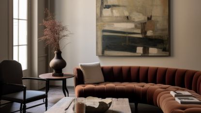
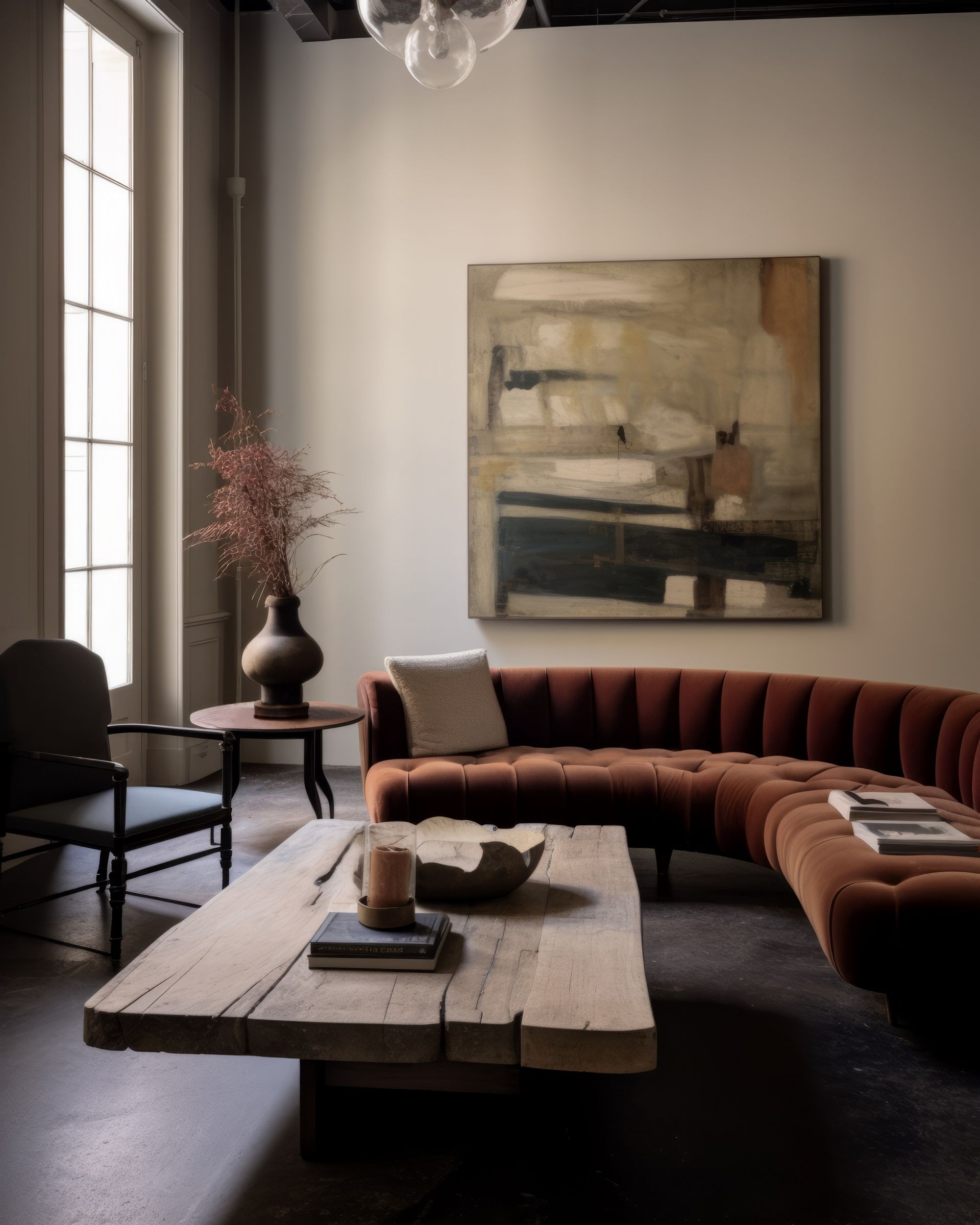
These are the top 5 neutral paints that designers come back to every time for works-with-everything decor
If you're looking for the perfect neutral paint, these are the five neutral paint colors designers swear by


When picking from a seemingly limitless world of neutral wall paints, it can feel a little overwhelming. There are so many options out there, and it's hard to know what your neutral will look like throughout the year as daylight changes over the course of the seasons, not to mention how light will reflect and bounce around the room with the color of furniture you might have in the space.
Instead of endless patch tests and swatch cards, we like to rely on the experts that know neutral paints best. Designers too have faced this question time and time again, so they know a thing or two about neutral paints and all have their favorite go-tos. To give you some inspiration at home, we've spoken to the designers to find out what the best neutral paints out there are.
1. Alabaster by Sherwin Williams

Another super subtle off-white that exudes coziness is Alabaster by Sherwin Williams. In bright light, it will shine brighter, but in the fall, when the nights begin to draw in earlier and earlier, it will feel warmer and more cocooning in a soft way, with a super subtle creamy undertone.
'This room is Sherwin Williams 7008 Alabaster,' explains Shannon Mann of Mann Designs Studios. 'We chose this white as it is crisp and warm at the same time in certain lights.
'It works perfectly with the light caramel tones in the French oak floors. This palette of indigo, caramel, cream, charcoal, stone is based on the homeowner's desire for a sophisticated neutral scheme that offers longevity and a great backdrop for living room wall art.'

Price: From $69.99 per gallon
2. Horizon by Benjamin Moore

If you're looking for a neutral with a fresh, cool undertone, Horizon for you. A neutral is characterized by a color without much saturation, and this subtle tinge of green is only evident in certain lights. It's barely noticeable, which is why it's a near-perfect neutral.
'We love using Benjamin Moore Horizon,' says Matthew Rauch of New York-based Rauch Architecture. 'It's a warm, milky blue-green grey.'
'It's perfect for living rooms because it is the perfect calm grey that reflects enough light to make a statement while not clashing with any other design decisions in the space.
'It changes throughout the day, allowing a golden glow in the mornings and a soft backdrop in the evenings - perfect for softening any room and making it feel more cozy.'
'Another trick that we have been using is to paint the ceiling the same color as the walls. The lack of contrast can create a more subtle, muted color scheme, and make the ceiling feel a bit lower and less intimidating.'

Price: From $59.99 per gallon
3. Shaded White by Farrow & Ball

For something a little warmer that works during the fall and winter, go for a sandy off-white that has a warming yellow undertone. 'The color used in this room is Farrow and Ball Shaded White,' says Christine Lemieux of Lemieux Et Cie who designed the above space.

Price: From $140 per gallon
4. Hog Bristle Quarter by Dulux

Neutral tones are light shades that bring guaranteed coziness through the subtle nuances of color. Instead of using a clean, bright white on your walls, those creamier tones with warmer undertones bring a cozy living room feel and come into their own come fall and winter.
This is because the lack of light in winter can make your room feel dull and gloomy, but neutrals are a range of tones that work against this feeling and instead embrace you like a big hug. 'I'm a big fan of warm neutral whites,' says Luke Carter, architect and director of interiors and architecture studio, Sandbox Studio.
'Hog Bristle Quarter by Dulux is one of my top picks for a living room, adding to the coziness because it's a warm shade, but also neutral enough that it can easily become a backdrop to more art and furniture. Timelessness is the aim and this shade achieves it.'

Price: From $49.90 per litre
5. Joanna by Little Greene

Finally, Joanna is a Little Greene shade that deserves a place on this list. It's more beige than off-white, but is warm and delicate and is a super pale taupe, as shown here by a white living room from New York and London-based designer, Sheena Murphy of Nune.
'One of the neutrals we see ourselves going back time and time again is Joanna by Little Greene,' says Margherita Thumiger of Studio 29 Architects
'We are doing more and more white sitting rooms recently and Joanna by Little Green is the color we swear by.
'It is the palest of taupe, with just enough body and warmth to make the space cosy and elegant at the same time. It goes well with any wood color, enhancing their texture and shade and it's a great background to both modern and traditional art.'

Price: From $125 per gallon
Be The First To Know
The Livingetc newsletter is your shortcut to the now and the next in home design. Subscribe today to receive a stunning free 200-page book of the best homes from around the world.

Oonagh is a content editor at Livingetc.com and an expert at spotting the interior trends that are making waves in the design world. Writing a mix of everything and everything from home tours to news, long-form features to design idea pieces on the website, as well as frequently featured in the monthly print magazine, she's the go-to for design advice in the home. Previously, she worked on a London property title, producing long-read interiors features, style pages and conducting interviews with a range of famous faces from the UK interiors scene, from Kit Kemp to Robert Kime. In doing so, she has developed a keen interest in London's historical architecture and the city's distinct tastemakers paving the way in the world of interiors.
-
 How to Thaw a Frozen Pipe — Learn Everything You Need to Know in 5 Minutes With This Guide
Winter storm caught you off guard? We asked an expert — just how do you thaw a frozen pipe?
By Hugh Metcalf Published
-
 The 12 Very Best Silk Bedding Pieces — As Our Style Editor Says: 'It's What Dreams Are Made Of!'
Slumber in lustrous luxury with the very best silk bedding sheets, duvets, pillowcases, and more — your sleep score will thank us later
By Julia Demer Published

