'It's a centuries-old movement!' This creative ceiling idea is trending as a way to elevate your room's 'fifth wall'
From antique copper tin to uber-cool subways designs, tiling a ceiling is the new way to make a statement in any room
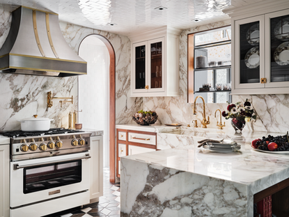

We can't really say that ceilings are an overlooked part of our homes anymore. With anything ceiling related, we would always start by mentioning the potential of the fifth wall, and how we are all missing out on an opportunity to add style and color to our rooms. But ceilings have really come into their own in the last few years, they are really prominent in interior design trends and it's no longer just the brave and bold among us who are paying ceilings some attention.
Paint was the first foray into ceiling decor, then there was wallpaper and now we are seeing an emerging trend for tiled ceilings. Now tiled ceilings, aren't exactly a new thing – tin tiles for example have donned the ceilings of Victorian-era New York homes for hundreds of years – but it seems like we are really starting to give this look credit where credit is due and there are loads of companies now offering replicas so you can recreate the look in any age or style of home.
And we have also been noticing ceramic tiles being used on ceilings too. Yep, just like you would find in bathroom, and it's such a cool look. So here we take a bit of a deep dive into this emerging interior design trend and find out from designers how the look can work and what options are out there.
1. First think of the practicalities
As all these spaces are about to prove, you can tile a ceiling, just as you would do a wall or floor. However, before you commit there are some practicalities to consider. Tile is heavy, ceilings are high, and therefore you always want to make sure you are picking the right tile, the right grout, and the right space before you get started. Seek advice from a professional when tiling a ceiling just so you can be sure it's safe and secure as well as looking fabulous.
'Tile adds so much to ANY space when the proper materiality is specified along with thoughtful attention to scale. Even though tiled ceilings are rising in popularity now, this is in fact a centuries-old movement. It is essentially maintenance-free and requires little cleaning to maintain integrity.' says Tanner Morgan, designer and principle of Morgan Madison Design, who have used tile on the ceilings in many of their projects.
'I would advise anyone thinking of tiling a ceiling to go for it! But always make sure you consult a trusted installation professional prior to ordering your tile as you want to have a conversation about the weight of what you are looking to attach to the ceiling. I would also say keep your grout joints as small as possible as it will enhance the overall look of the installation. While on the subject of grout, we always take the path of a tonal grout as it minimizes the appearance and scale of the grout joints themselves, thus celebrating the tile.'
2. Inject character with a tiled ceiling

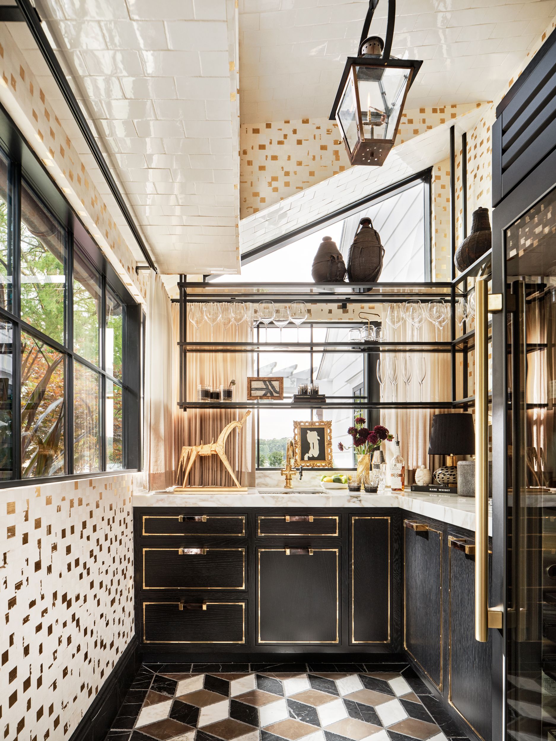
What draws us to tiled ceilings is they add so much depth to a room. Sure you can paint a ceiling, even go bolder with wallpaper, but only tile is going to give you that texture, the unexpected 3D effect, and the fabulous glossy finish. Tiles are perfect for injecting some extra character into a room – case in point this incredibly glamorous kitchen design by Morgan Madison Design.
'This space was designed to feel as if it had existed, as is, for many years – that it was original to the home. This residence was built in the 1930s, but lacked the finish quality and attention to detail one might associate with that era of building,' explains Tanner. 'It was very important to the client that the home not lose “character” in the renovation process, but I would argue that we replaced bad character with good, as we were very focused on details, finishes, and treatments such as the tile ceilings. This particular tile in the Kitchen is made by Waterworks and was custom-colored to the exact tone of the appliances and the cabinetry. The imperfect edges and glaze was chosen to reflect the same notion of age, history, and originality.'

Price: $104.32 per box
Material: Ceramic
3. Take a backsplash over the ceiling too

And you needn't take tile over the whole ceiling to get those room-enhancing effects. In this colorful kitchen, designed by Kingston Lafferty, the backsplash around the stove area is seamlessly taken up and over the ceiling, enclosing the workspace and turning this small part of the room into its own nook. You could create a similar effect by tiling an alcove or window seat.
'This kitchen’s original concept was that of a jewelry box,' explains the studio's founder Roisin Lafferty. 'The brass detailing around the kitchen is accentuated by the rich jewel tones of the Zellig tiles. The client loved entertaining and cooking and wanted an eye-catching kitchen that really stood out and caught your eye.'
'Tiles are traditionally used on floors or in areas like bathrooms and kitchens where there is water. But they are also a beautiful decorative feature that can be used anywhere in your home. We love to use tiles in different ways than what people expect, if you can have a beautiful tiled patterned wall in your bathroom then why not have one in your dining room or bedroom? This is the same with ceilings, tiles add a beautiful decorative element to the ceiling and also have a framing effect drawing your eye in this case to the kitchen.' she adds.
4. Replicate wallpaper with mosaic tiles

A tiled ceiling in a bathroom may not seem particularly groundbreaking. Off all the rooms in the home, it's the place it makes the most sense to cover every surface in water and steam proof materials. But take a closer look at this bathroom ceiling. It almost looks like bathroom wallpaper, however, it's actually an intricate pattern of mosaic tile.
'This bath came with its own set of peculiarities and obstacles. When I first walked the property, the principle bath was roughly 8 ft by 6ft and included a shower tub combo as well as the toilet and a very small vanity. Creatively, we decided to gain space for the bath by losing a rather large and dysfunctional linen closet (as we gained proper storage elsewhere). We also gained real estate by absorbing a water closet original to the home.' explains Tanner.
'Tiling the entire room became a natural choice both in terms of aesthetics and function. Using the same material in different scales and patterns created interest while also creating air and the illusion of a space far larger than it actually is. Due to the scale of the bathroom, and again for the sake of functionality, we choose to essentially treat the entire room as a “wet room” to avoid any issue with moisture that one might encounter with other possible surface materials and treatments.'
5. Balance warmth and glamor with a tin tile ceiling

Tin ceiling tiles have been around for hundreds of years, they originated in the 1800s as a more affordable alternative to plaster. You could still get that decorative finish, just at a cheaper price point. And they've had a huge resurgence in recent years, giving an old-timey, industrial feel to any room of any style. That resurgence has meant there are now plenty of manufacturers making new, still really affordable, sheets of tin tile that can be treated and painted. Or you can buy second-hand online if you are after the real thing.
This bedroom by New York designer Kati Curtis was blessed with the original tiles, which became the focus of the room's renovation. 'This space resides within a townhouse we renovated in the vibrant West Village neighborhood of Manhattan. The tin ceilings have been beautifully preserved from the original design,' explains Kati. 'Our clients, who possess a youthful and modern spirit, desired to maintain the home's original charm while infusing it with a playful touch. Thus, we remained faithful to the historic essence of the property while incorporating elements like vibrant wallpaper, a Moroccan wedding blanket, and contemporary sculptures, adding a delightful twist to the overall ambiance.'
'The ceiling, often overlooked as the "5th wall," presents a wonderful opportunity to infuse character and charm into your space. Opting for a tiled ceiling is an excellent choice in achieving this goal. Regardless of whether you reside in a historic residence such as this one or a modern apartment, selecting the right tile style can elevate the aesthetic of your home and provide it with a polished and refined ambiance. By considering the ceiling as an integral part of your design, you can enhance the overall look and create a sense of completeness within your living space.' adds Kati.

Price: From $15.34
Material: Styrene
6. Paint a tin tile ceiling for a modern twist

If metallics aren't your vibe, you can actually paint tin tiles or buy them pre-sprayed. It dials down the glamour and makes them better suited to a more modern rustic aesthetic as seen here in this nook designed by Bespoke Only.
The white tile lifts the deep blue-black of the walls, and while it's always up for debate whether or not you should paint a ceiling darker or lighter than the walls, in this case, we think lighter works. The texture and the sheen of the tile make a lighter ceiling look less flat and it dials down the contrast between the walls and the ceiling. In fact, check out how in this room all the surfaces are different textures – the stone flooring, the paneled wall, and the tiled ceiling – it gives this simple room a ton of depth and interest without having to crowd it with furniture or decor.
7. Zone an open plan space with ceiling tiles

Again, another example of how just tiling a section of the ceiling can have an impact. In open-plan living spaces, we always think it's a good idea to bring in design elements that really subtly zone the room. Tiling the diving line between a kitchen and a living room or dining space acts like a room divider, giving that definition, without intruding on the space.
'This kitchen was a family home combining the kitchen with a daily living and dining space for the young family to spend time together. The focus was on bringing the garden on and maximize on the stunning natural light that floods the space,' explains Roisin Lafferty. 'The patterned tiles in tonal greens from the garden accentuate the link from the living/dining space to the main kitchen space framing your view from both directions and zoning the functions of the different areas.'
'Creating a small area of a tiled ceiling in a portal, doorway, or framing a bulkhead around your kitchen is a great way to get started but don’t let that limit you. You can tile a larger area just make sure to get the correct substrate build-ups and adhesives from your contractor and manufacturers. Tiles, like stone, paint, and wallpaper don’t have to stop at floors and walls!'
8. Choose a classic subway design
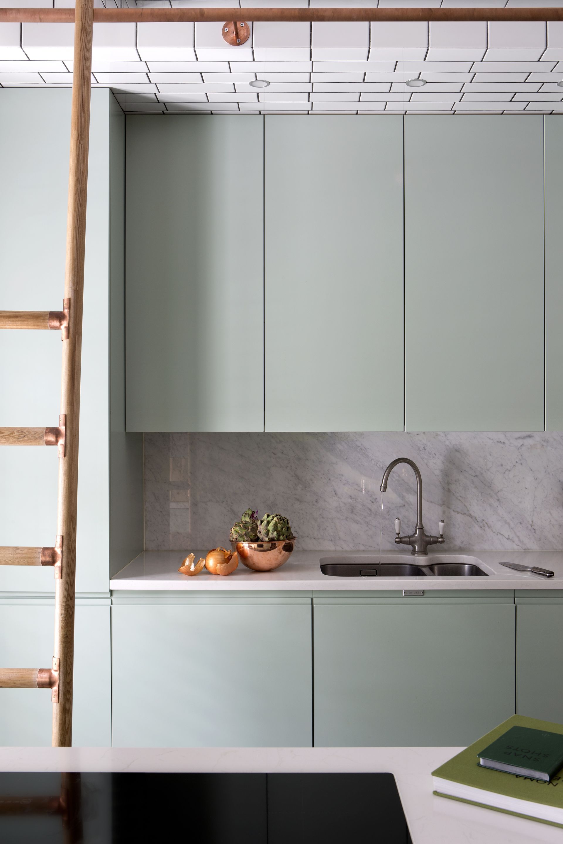
Subway tiles are a classic, adding a slightly retro industrial vibe that can work with any style. We see them all the time used for kitchen backsplashes and this Kingston Lafferty kitchen makes a real case for them being used on the ceiling too. The contrasting grout makes it more of a statement, almost like a graphic wallpaper would, but you also have the option of matching the grout to the tile color, less of a bold look but you still get the texture and shine.
In this kitchen, it's actually just the bulkhead that's tiled, so the space doesn't feel overwhelmed by grout lines and it makes the bulkhead blend more seamlessly into the kitchen and the same tile is also brought down the walls. 'This soft green kitchen is housed within a tiled bulkhead fully framing the kitchen. The kitchen is part of a family home in London with the curved subway tiles referencing the location of the project.' explains Roisin.
9. Make a statement with a bold tile

Even the most neutral of tiled ceilings makes a statement, but if you are only tiling a section or experimenting in a room that can handle it, like a cloakroom or a dressing room as seen here, go bold with your color or pattern, or layout.
'This tile is a showstopper for sure,' says Tanner. 'At first glance, it may appear to be a tiled ceiling, however, it’s far more impressive when you realize the ceiling is comprised of hand-stitched and padded leather tiles. The intention for this room was to create a luxurious space to dress – one that feels as if you are walking into a luxury goods dressing room. The ceiling/wet bar tile was the perfect fit. We also chose the striking saffron color to coordinate with other elements throughout the principle suite. The color was developed to match a Piere Frey silk velvet and the hides were all dyed at the same time for consistency.'
10. Expand a small space with all over tile
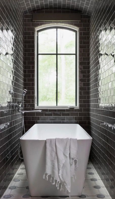
We've seen color drenching become the newest way to make a small room look bigger, but what about tile drenching? Could that be a thing? We think so. It's perfect for small bathrooms and cloakrooms as taking the same tile over the walls and ceiling blurs the dimension of the room, making the space feel larger and loftier.
'For this bathroom, we wanted to create a space that felt sophisticated, timeless, and functional,' explains designer Nina Magon. 'Choosing a color pallet that was neutral and dynamic, allowed the space to remain stylish. We emphasized a moody colored tile that we wrapped the space with that seamlessly ran from the walls to the ceiling to add a dramatic edge.'
'We chose to add evergrowing ceiling tiles to add interest and enhance the curves of the ceiling. The tiles catch light and add reflection to their moody color, which creates sleek but still timeless feel. This glossy tile also invites the eyes upward and emphasizes the tall ceilings. And of course, adding tiles to the bathroom ceiling can also help protect it from moisture and steam.'
Be The First To Know
The Livingetc newsletter is your shortcut to the now and the next in home design. Subscribe today to receive a stunning free 200-page book of the best homes from around the world.
Hebe is the Digital Editor of Livingetc; she has a background in lifestyle and interior journalism and a passion for renovating small spaces. You'll usually find her attempting DIY, whether it's spray painting her whole kitchen, don't try that at home, or ever changing the wallpaper in her hallway. Livingetc has been such a huge inspiration and has influenced Hebe's style since she moved into her first rental and finally had a small amount of control over the decor and now loves being able to help others make decisions when decorating their own homes. Last year she moved from renting to owning her first teeny tiny Edwardian flat in London with her whippet Willow (who yes she chose to match her interiors...) and is already on the lookout for her next project.
-
 The 12 Best Table Lamps for Reading —I'm a Certified Bookworm (and Shopping Expert)
When it comes to table lamps for reading, I don't mess around. If you're the same, this edit is for YOU (and your books, or course — and good recommendations?)
By Brigid Kennedy Published
-
 "It's Scandi Meets Californian-Cool" — The New Anthro Collab With Katie Hodges Hits Just the Right Style Note
The LA-based interior designer merges coastal cool with Scandinavian simplicity for a delightfully lived-in collection of elevated home furnishings
By Julia Demer Published
