This California Home's Minimalist Furniture is Pure Genius — 'They Make This Space Feel so Streamlined'
A neutral color scheme that nods to the surrounding landscape and seriously smart furniture is what sets this California home apart
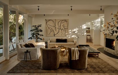

Space-saving isn't just about storage, it's about clever furniture and thinking outside the box, as is beautifully exemplified in this California home. The designers are Joelle Kutner and Jesse Rudolph – the creative masterminds behind Los Angeles-based design studio, Ome Dezin.
In this project in Brentwood, the design duo took an older home and gave it a modern makeover, with natural materials and a neutral color palette that breathes a fresh lease of life to the space, all the while honoring the architecutral bones of the building and its iconic heritage. Natural light floods every space and plays with the palette, but it's two furniture ideas that elevate this home from a beautiful space to pure genius. We speak to the designers of this modern home to find out the source of their inspiration.
The dining room

In this home designed by Ome Dezin and sold by O’Connor Estates, the dining table is the first elegant furniture idea that incorporates chairs with a custom-made, cherry wood table. When in use, the chairs neatly slide out and provide comfortable seating. When the chairs aren't in use, they slot neatly under the table with a sophisticated S-shape. The table comes together with the chairs as one sculptural piece.
The dining table is inspired by Donald Judd, whose furniture designs often featured clean lines, simple geometric shapes, and an emphasis on functionality.
'The idea is to seamlessly integrate with the space it inhabits,' says Joelle Kutner of Ome Dezin. 'Whether placed in a gallery setting or a home environment, pieces of furniture like this should be an integral part of the overall spatial experience. It’s also important to note the final design of the table was by Ben Willett, our friend and collaborator.'
For the duo, it's about embracing a minimalist ethos when it comes to furniture. 'The minimalism and lack of clutter allows the space to feel more sleek.'
The dining room is given an extra dose of character with a wall tapestry. This art piece is by Ohio-based visual artist, Tyler Macko, who draws inspiration from American histories of decorative art.
The vanity unit

This minimalist custom-made vanity is made of two key materials - a Cipollino marble primarily found in Greece. 'To us, it perfectly mimics the mountainside with its vibrant plant variations and colors,' says Joelle. The marble pairs with the light white oak wood for an elegant finish.
The unit showcases another clever form of space-saving, with a pull-out chair that allows you to take a seat at the vanity, almost as you would interact with a kitchen island. The seat pulls out, and when not in use, tucks snugly back in. The look is seamless, so there is no awkward and bulky chair in the bathroom creating an awkward flow of movement.
'If there is space we always look to add a chair or vanity area within a modern bathroom,' says Joelle. 'Due to the size and space of this bathroom, there wasn’t space to do it separately so we knew we had to fit it within the existing vanity, therefore having the chair within, usable but also able to be hidden when not used we thought this was the best idea.'
After a long day or early morning, I think everyone is looking for someone to sit briefly and do their morning or evening routines. There are times when maybe it’s not thought of due to spatial constraints and people don’t take the time to think of the livability of each space in accompaniment with design.'
Neutral color palette

To really enhance the airiness and space in the home, the designers embraced a neutral color palette made up mostly of wood and other materials. The wood is balanced by metallic details, used in hardware and lighting, as well as glass and marble.
Wood reflects the outside landscape, which is seen from every angle in the home. Natural light bounces off the wooden tones, and in this instance, dappled light radiates through the trees and onto the off-white wall for extra pattern and texture.
The open atrium

Space is also a factor in design. 'Originally built in the 1960’s by architect A Quincy Jones, an open connection between inside and out is a key theme of the home and the new works ensure this remains,' says Joelle.
Most A Quincy Jones homes incorporate a usable atrium, high ceilings and walls of glass, this one is no different. 'From each room you are, jaw to the floor, gazing at a gift. Each room faces a hillsides of plant life and a humble 25 ft waterfall,' says Joelle. 'We only hope our design uplifts this home, frames the nature well.'
'The integration of an atrium space brings both natural light into the center of the dwelling and highlights the 40 ft waterfall in the backyard.
'Amid a mostly neutral color scheme of finishes, wood plays heavily in warming and bringing texture inward, while natural stone elevates kitchens and bathrooms, creating a sense of longevity.'

This bedroom is one of the designers' favorites of all time. 'It feels so serene, especially with the balcony doors wide open to sit on your reading nook and listen to the waterfall,' says Joelle.
'We love the detail of these special ‘stone’ pillows from Katsu Stone. - 'They're very playful and whimsical.
Get the look with these minimalist buys

Material: Bamboo frame and paper
Price: $89

Price: $100

Price: $220
Be The First To Know
The Livingetc newsletter is your shortcut to the now and the next in home design. Subscribe today to receive a stunning free 200-page book of the best homes from around the world.

Oonagh is a content editor at Livingetc.com and an expert at spotting the interior trends that are making waves in the design world. Writing a mix of everything and everything from home tours to news, long-form features to design idea pieces on the website, as well as frequently featured in the monthly print magazine, she's the go-to for design advice in the home. Previously, she worked on a London property title, producing long-read interiors features, style pages and conducting interviews with a range of famous faces from the UK interiors scene, from Kit Kemp to Robert Kime. In doing so, she has developed a keen interest in London's historical architecture and the city's distinct tastemakers paving the way in the world of interiors.
-
 The 12 Best Table Lamps for Reading —I'm a Certified Bookworm (and Shopping Expert)
When it comes to table lamps for reading, I don't mess around. If you're the same, this edit is for YOU (and your books, or course — and good recommendations?)
By Brigid Kennedy Published
-
 "It's Scandi Meets Californian-Cool" — The New Anthro Collab With Katie Hodges Hits Just the Right Style Note
The LA-based interior designer merges coastal cool with Scandinavian simplicity for a delightfully lived-in collection of elevated home furnishings
By Julia Demer Published
