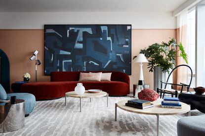
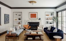
Side table decor ideas – styling tips from interior designers for decorating a well-placed end table
Looking for side table decor ideas to finish off your living room scheme? Try these simple tricks for designer-inspired space


You might not spend as much time thinking about side table decor ideas as you do hunting for the perfect side table, but when it comes to your living room, it’s the small finishing touches that really set the tone.
Side tables present a different challenge to some of your other living room furniture ideas. Where a coffee table has ample surface area for you to get creative with decor, side tables tend to be a bit more limited. A perfectly positioned side table is an essential part of your overall living room furnishings, but where it is might depend on the decor you place atop it. Sometimes, end tables need to be functional, giving you a space to place a glass or cup, or create space for a table lamp. Sometimes, your side table can be purely decorative, like a plinth to display your favorite design objet.
So, how do you style a side table? We’ve collected some inspiring spaces and expert tips to get it right.
Expert tips for side table decor ideas
First things first, in a modern interior design scheme, keep side table styling simple. An end table isn’t likely to be the focal point of your space, so don’t overdress, or overload, it with decor. End tables are a good example of allowing negative space to form part of the design - choosing one beautiful, sculptural object is preferable to a complicated tablescape, plus it leaves room for placing a coaster every now and again if it needs to pull double duty when you have guests around.
1. Have fun with bold, decorative objects

When a side table isn’t at risk of being knocked by elbows or rampaging kids, it can serve as a vessel for interesting decorative objects and art. ‘A grouping of objects and art are a chance to set the mood and a great way to illustrate the story of the homeowners,’ suggests interior designer Ghislaine Viñas. ‘Of course, a little cheekiness goes a long way in creating a unique and authentic vibe.’
In this living room, this generous side table perfectly illustrates how to use the rule of three to style a side table, with three design objects that vary in color, height, texture and shape. Plus, with a table lamp incorporated, it serves a practical purpose too in supplementing the living room lighting ideas.
2. Think about your side table as part of the bigger picture

Think about how your side table, and the decor on it, play across the larger vignette of your modern living room. ‘Our typical rule in a space when we have a singular chair or chaise which is a focal point in the room, we most always pair it with a floor lamp and a side table for a three-part composition,’ says interior designer Jamie Bush of Jamie Bush + Co. ‘The chair becomes a sculptural mass while the floor lamp demarcates the grouping with a vertical stake and the side table provides a smaller scale embellishment to complement or contrast the chair – whatever the intention is.’
In the design of this Manhattan apartment, this set-up is finished with a white oak side table. 'This threesome is made of luminous moss green mohair, with the polished brass to provide warmth and reflection as well as white oak to contrast the dark green a fresh natural warm tone which complements the brass,' Jamie says. 'It’s important that all three are considered as one complete idea.'
3. Bring in nature with a potted plant

The best houseplants are perennially popular home decor, so are of course an option for side tables. In a neutral scheme, a potted plant can bring in greenery for a little color and contrast to the space, but they could even be used to round out a scheme, embracing green as part of the overall palette.
In this open-plan living-dining room, the trailing plant plays a part in this tonal scheme. ‘The furniture and decor were selected all in the green and blue family to keep the room a mainly monochromatic color scheme and play off of the base of the Calico Wall covering in the adjacent dining area,’ explains interior design Melissa Anderson of OAD Interiors.
4. Or add a color pop with flowers

A side table can make the perfect platform for fresh flowers if you like to add a seasonal touch to your home. Vases with sculptural branches are a big interior design trend right now, but florals offer the chance to introduce color and interesting forms, whether to contrast or complement your existing color scheme.
If you’re looking for a low-maintenance option, consider dried grasses, or flowers with a longer shelf-life. In this space designed by Justin Charette, a few stems of orange anthurium add another dimension to this simple green and monochrome palette. And, while some flowers will last just a few days, anthurium’s waxy flowers can last up to three weeks if treated properly.
5. Create a casual home bar on an end table

While home bars may be a big trend, if you have a small living room, you might not have room for a built-in or cabinet to serve as the heart of your home entertaining. Why not, then, use stylish decanters to act as decor while also serving a practical purpose?
‘This living room was for a client who loves to entertain,’ explains Holly A Kopman, a San Francisco-based interior designer. ‘Displaying decorative decanters on side tables allows for guests to try different spirits as they move around the room. A glamorous decanter adds drama and can be conversation starters for guests as well.’
6. Consider lighting as part of the scheme

A side table is a good spot for a table lamp to round out your lighting scheme, but if you have a living room where your furniture isn’t pushed back against the walls, it can be difficult to include one here practically without wires trailing across your space, unless you have a wireless table lamp or floor-set sockets.
However, think about incorporating lighting around a side table instead. Combining a side table next to a floor lamp is a great idea, and can make for an impactful set-up if a table lamp isn’t an option. In this minimalist room, designer Jen Talbot has combined a small marble plinth with an oversized floor lamp, introducing effective levels into the scheme. Meanwhile, if your side table is up against a wall, a wall sconce is a great small living room lighting idea as it frees up surface space, while illuminating your room just where you want it.
7. Keep it simple with a stack of coasters

We’ve already covered that a good side table should be able to cope with the occasional coaster, but keeping coasters out on display isn’t the worst idea in the world, especially if they complement your interior scheme, as they keep surfaces clear, but not unstyled. Practically, they’ll be used more if you have them to hand, and they can be distributed around the room, too.
Plus, the right stack of coasters can actually give you a sculptural decor moment. Think about the materiality of your coasters, and choose a style that matches in with the rest of the decor, or that provides an interesting accent.
How do you style a side table?
Some side tables are small enough to work well with just one piece of decor, but others will have space to create more of a display. 'The perfect vignette with a side table I think plays with scale and composition,’ says Melissa Anderson, founder of OAD Interiors. Think about different sizes, while experimenting with shapes for a more interesting set-up. Use the rule of three to style a table with three decorative elements to create a balanced look.
Think about how your decor contrasts with the table, too. A sleek marble side table could be matched with a more rustic accessory for a modern, relaxed look, while pairing with a brass accessory may create a more luxe style.
Be The First To Know
The Livingetc newsletter is your shortcut to the now and the next in home design. Subscribe today to receive a stunning free 200-page book of the best homes from around the world.

Luke Arthur Wells is a freelance design writer, award-winning interiors blogger and stylist, known for neutral, textural spaces with a luxury twist. He's worked with some of the UK's top design brands, counting the likes of Tom Dixon Studio as regular collaborators and his work has been featured in print and online in publications ranging from Domino Magazine to The Sunday Times. He's a hands-on type of interiors expert too, contributing practical renovation advice and DIY tutorials to a number of magazines, as well as to his own readers and followers via his blog and social media. He might currently be renovating a small Victorian house in England, but he dreams of light, spacious, neutral homes on the West Coast.
-
 'Subtle Gray' Is The New Color Trend Designers Are Using to Replace White — It's So Much Warmer and More Luxe
It’s the new shade grabbing designers’ attention and you should know about it. But what is ‘subtle gray’, and how can you use it?
By Raluca Racasan Published
-
 Exactly When to Fertilize a Lawn After Winter — Experts Guarantee You a Beautiful Backyard All Year
if you know when to fertilize a lawn after winter then you can set yourself up for a well manicured and healthy backyard all year long
By Jacky Parker Published

