5 dark colors that are at risk of being "overdone" in our homes - designers are trying to stay away from these shades
These are the 5 dark colors designers say are just on the edge of being overdone
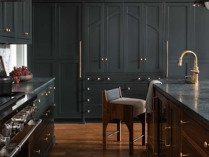

Dark colors have taken off in the home in recent years. Where designers might once have steered clear of dark shades for fear that they make a room look smaller, giving it a claustrophobic, oppressing feel, we've been seeing homeowners feeling brave with their choice of color.
Instead of fighting the small space and trying to make a room feel lighter and brighter, using dark colors on the walls is a way of embracing the space you have. When executed correctly, dark colors can make a room feel snug and cocooning. From dark greens to chocolate browns, designers have celebrated the dark side. But as with all trends, when something is repeated and repeated, there is a chance it ends up feeling a little predictable and boring. To find out more, we've spoken to the designers to find out the paint colors that are teetering on the edge of being 'overdone'.
1. Navy blue
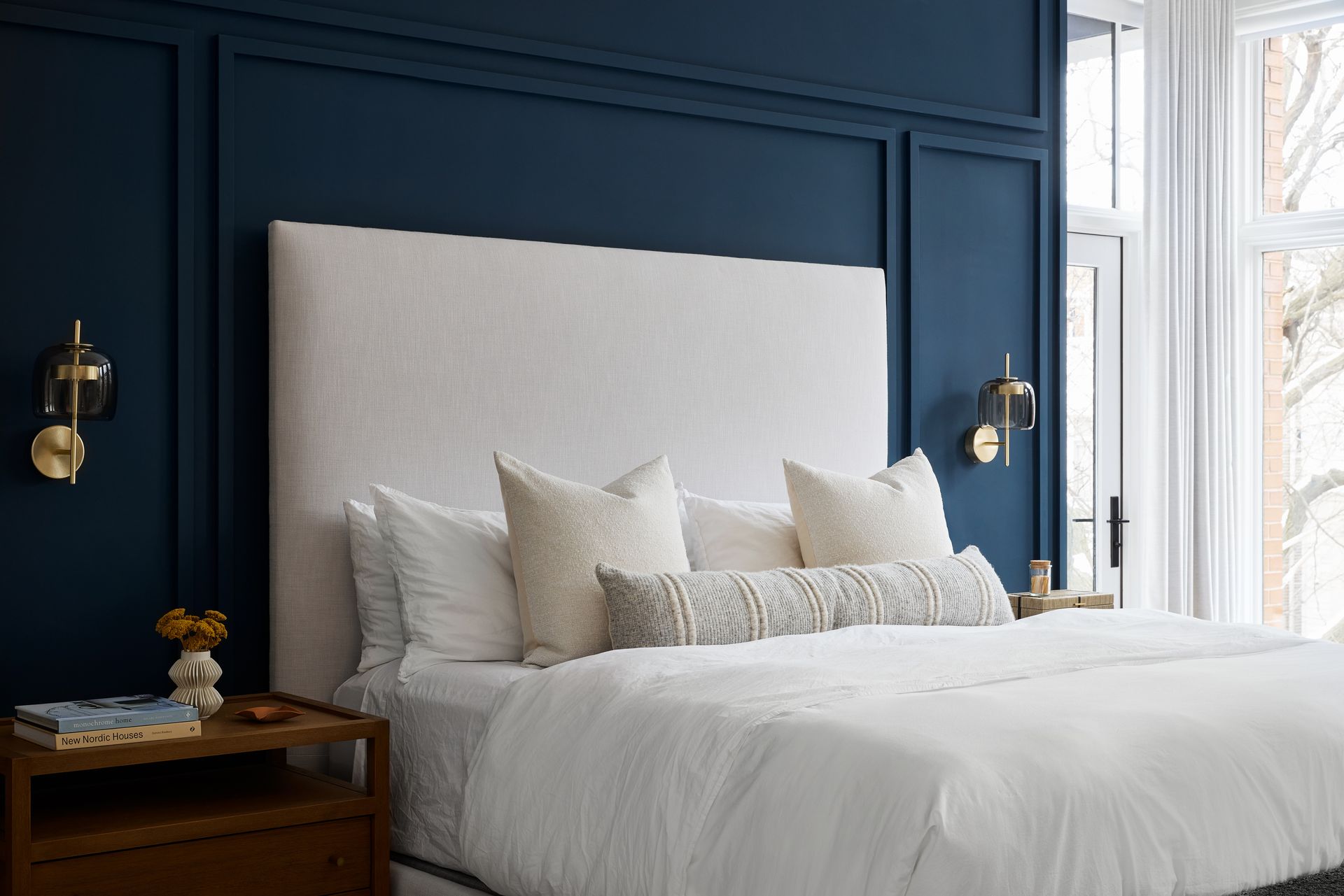
There was a time when you couldn't escape navy blue in the home. Used in bedrooms, bathrooms and even for living room accent walls, this shade was everywhere. But trends are always moving, and as soon as something becomes ubiquitous, it runs the risk of becoming overdone.
Navy blue is a prime example. 'I would say navy blue is a dark color we try to stay away from,' says Brittany Hakimfar, founder of the Philadelphia-based interior design studio, Far Studio. 'It feels too calculated and not saturated enough for the moods we want to create.'
If you want the intensity of a dark blue, go for something like Benjamin Moore's Color Of The Year for 2024 - a smoky, blue with just a hint of violet, Blue Nova. Sherwin-Williams, and Dunn-Edwards both also opted for a blue shade for their color choices for 2024, proof that blue is still trending - just make sure it's the right shade and not navy.
2. Dark grey

Dark grey has also had its moment in the spotlight. What was once seen as sleek and smart is now just a little boring and creates a sterile atmosphere.
‘In my opinion, dark grey paint is no longer trendy or desirable,’ says Kelly Cray, creative principal at U31. ‘We are currently seeing a return to warmer tones that have a connection to nature.' Think greys with brown undertones to bring warmth to this overwise dull and cold shade.
Bedrooms are one space in particular that saw a grey makeover. 'But these should be designed as places of refuge and retreat,' says Kelly. 'The transition from working in a stark white environment, like an office, to a tranquil bedroom featuring warm tones, like mushroom grey quickly melts away the stressors of the day and leads us toward rest and relaxation.' A dusky, dark green is also a good alternative to dark grey, bringing a bit more pigment while carrying the same moody atmosphere.
'Dark greys are beyond overdone,' agrees Juan Carretero of Capital C Interiors. 'Anything grey smells of the 2000s, avoid it like the plague!'
3. Black

Black has also been trending in the home, but because of its popularity, it is also at risk of being overused and feeling overdone. ‘The black kitchen has long been one of the most modern and classy decor trends,’ says Montreal-based designer, Sophie P-Lefebvre. ‘But for 2024, the interior decoration is intended to be softer. Black and dark shades in general have shown their limits because dark colors like black really shrink the space.'
'This does not mean, however, that you should completely forget about dark shades,' Sophie adds. 'They can bring depth and a particular dimension to the room.' Ideally, use the shade with caution and make sure there are metallic pops or warmer shades of wood to keep it fresh and innovative.
4. Dark purple

Purple is another color to be wary of. The right shade can feel sumptuous and enveloping. The wrong shade feels tawdry and garish. Purple in all its hues was a feature of design in the early 2000s, with purple living room designs and accent wall a common style, but it's fallen out of favor altogether.
'Choose something like a deep plum instead,' says Artem Kropovinsky of Arsight, an interior design studio based in New York. 'Especially if it is used with different materials and has an element of indulgence.'
5. Dark brown

Last on our list, while we've been enjoying a touch of 70s revival, there is a danger that dark, chocolate brown tips over into the overused category. It's a shade that can feel luxe and sophisticated for a brown living room, yet retro all at once, but just be careful when using it on your walls.
To make sure you don't overdo it, layer your browns in varying shades. Instead of painting a wall and creating a big monolithic block of dark brown, break it up with a variety of lighter shades from your furniture and texture.
Think fairer wood accents and complementary colors to make the scheme layered and luxurious. Pops of metallic brass or trending polished nickel are a great way to break up brown and make it feel elegant, refined, and contemporary.
Alternatively, go lighter with your brown shades, mixing it with grey to achieve a lighter greige shade that feels a little more subtle and modern.
3 on-trend dark paint colors

Price: From $59.99 per gallon

Price: From $59.98
Size: 1 gallon

Price: From $140 per gallon
Be The First To Know
The Livingetc newsletter is your shortcut to the now and the next in home design. Subscribe today to receive a stunning free 200-page book of the best homes from around the world.

Oonagh is a content editor at Livingetc.com and an expert at spotting the interior trends that are making waves in the design world. Writing a mix of everything and everything from home tours to news, long-form features to design idea pieces on the website, as well as frequently featured in the monthly print magazine, she's the go-to for design advice in the home. Previously, she worked on a London property title, producing long-read interiors features, style pages and conducting interviews with a range of famous faces from the UK interiors scene, from Kit Kemp to Robert Kime. In doing so, she has developed a keen interest in London's historical architecture and the city's distinct tastemakers paving the way in the world of interiors.
-
 The 12 Best Table Lamps for Reading —I'm a Certified Bookworm (and Shopping Expert)
When it comes to table lamps for reading, I don't mess around. If you're the same, this edit is for YOU (and your books, or course — and good recommendations?)
By Brigid Kennedy Published
-
 "It's Scandi Meets Californian-Cool" — The New Anthro Collab With Katie Hodges Hits Just the Right Style Note
The LA-based interior designer merges coastal cool with Scandinavian simplicity for a delightfully lived-in collection of elevated home furnishings
By Julia Demer Published
