5 outdated paint trends that interior designers are glad to see the back of – and what they're doing instead
Some tried and trusted paint ideas are falling out of favor with interior designers. This is how they won't be decorating spaces from here on out
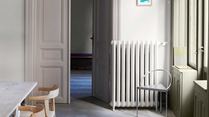
Can you really beat paint when it comes to transforming a room? It's something that you can be endlessly creative with when decorating (or not, depending on what you're looking to achieve), but the best thing about it is that it doesn't have to be permanent.
Whether it's a bold and impulsive choice of wall color, or a painted kitchen you love for now but might be bored of in a year or two, you can choose a paint safe in the knowledge that it's not going to be a huge problem to change it up when you've had enough of it.
Where people are braver with paint, you also find that trending paint ideas go in and out of fashion much faster than other "investment" trends for your home, meaning it's easy to get left behind. When it comes to creating a room that feels cool and contemporary, these are the paint trends it's best to leave behind.
1. White trim with colorful walls
The paint trends that will date your space most right now are actually some of the most classic, and that includes painting your trim white as a contrast to the wall color.
'White trim with colorful walls feels very outdated and hard on the eye,' says New York-based interior designer Justin Charette.
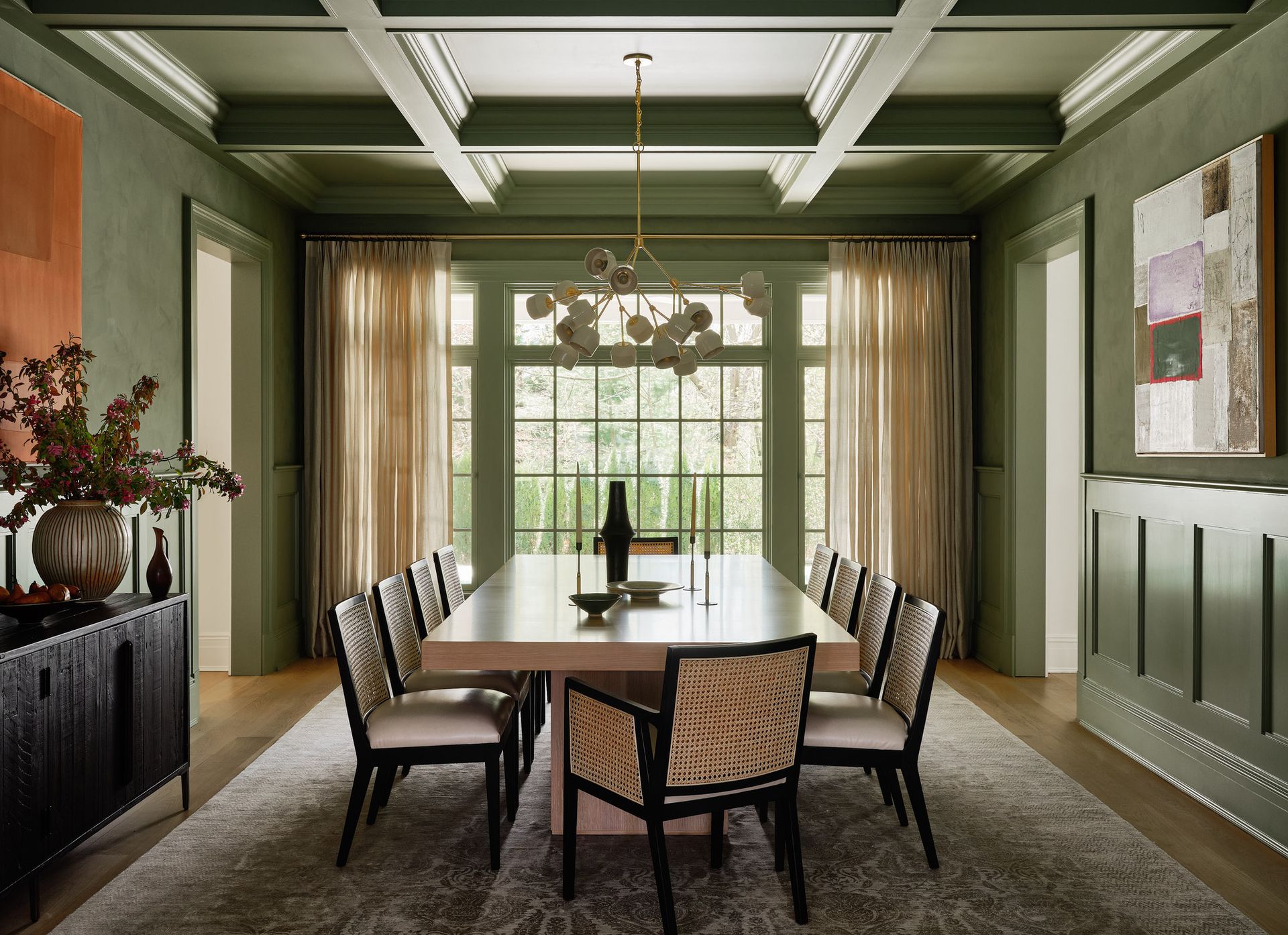
What to do instead: 'I would suggest painting your trim the same color as your walls. This makes your space appear larger, cohesive, and fresh,' Justin says. The idea of "color drenching" has become a huge trend in interiors, and you'll often see homes with matching walls and trims, quieting down the visual noise.
However, contrast trims aren't out of fashion altogether. If you have white walls, you could consider a baseboard and door trim painted in an interesting accent color, or if you have color on your walls, you could consider a tonal contrast to bring some definition to the space. It's just the colorful wall and white trim combo that's started to feel a little, for the lack of a better word, basic.
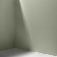
Saged, Backdrop
This muted sage green color would make for a beautiful, semi-neutral approach to color drenching a room.
2. Accent walls
The idea of the accent wall has been out of favor for a little while now, but it doesn't seem to be making a comeback with interior designers any time soon either. 'This trend is becoming less popular as people are moving towards more cohesive and balanced color schemes,' says interior designer Sara Malek Barney, founder of BANDD/DESIGN.

What to do instead: Accent walls did offer a way to bring color to a scheme where you might not want to commit to it across every wall. So how can you add interest in a similar way in a modern scheme? 'Instead of relying solely on accent walls, I recommend creating visual interest through other design elements like artwork, textured wallpapers, or architectural details,' says Sara.
Instead of an accent door, you could consider turning other architectural elements into features, whether that's doors, window reveals or even the ceiling works better as an accent surface in the modern home.

Brassica, Farrow & Ball
This dusky lilac is a modern way to use purple in the home, and could just make for a striking accent ceiling.
3. White ceilings with colorful walls
Much like trim, it's an outdated concept that you have to paint a ceiling white. 'It's really old-fashioned to pick things out in white,' says interior designer Kelly Hoppen, 'especially in small spaces.'
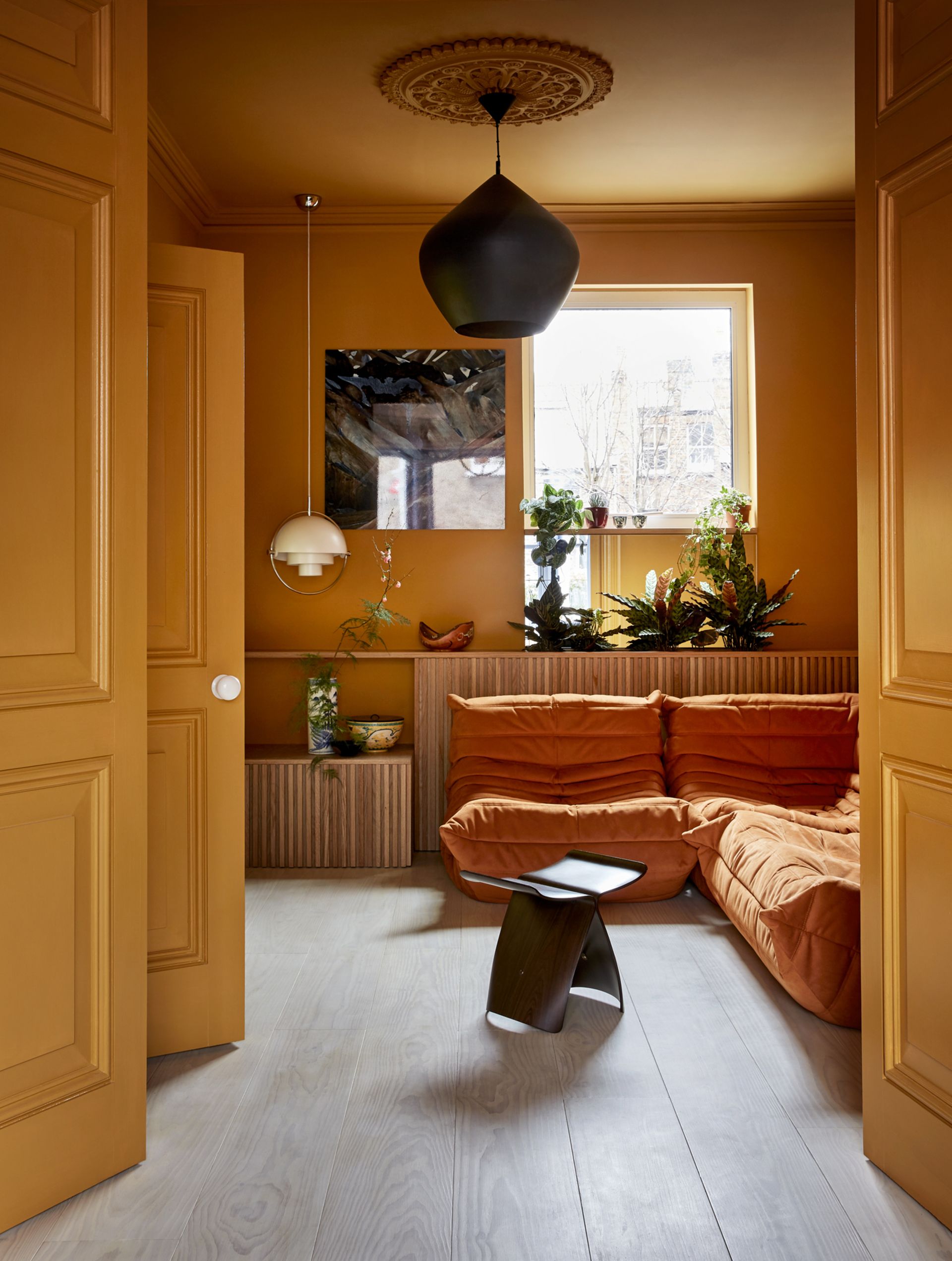
What to do instead: Should you paint the ceiling and walls the same color? Well, Kelly says yes. 'If you paint it all one color, it will give you the illusion of space, height and everything will flow. You want to walk in and everything feel seamless and that's why it should always be in the same color.' The only time you'll really want to paint a ceiling white in a modern scheme is when your walls are painted white too.
If you want to make more of an impact or feature of your ceiling, you could consider painting it in an accent color instead – just avoid white.
4. Faux paint effects
Textured paint finishes may have only just come back into fashion, but for some interior designers, they've peaked already. 'Faux finishes that imitated Tuscan plaster or distressed textures were popular, but have had their time, and these finishes can now appear dated,' says designer Sara Malek Barney.

What to do instead: You can't beat a timeless approach to paint, so Sara's best advice is to keep it simple. 'To achieve a more modern and sophisticated look, consider using smooth finishes with complementary color palettes,' Sara says.
If texture is what you're after for your walls, more classic design elements won't feel so dated so fast. 'Explore other texture options like grasscloth wallpaper or decorative wall panels,' Sara says.
5. Geometric murals
Decorative wall murals aren't everyone's cup of tea at the best of times, but those designs using strong, geometric forms that were once so popular have strongly fallen out of favor with designers in this decade.
It's a design that screams "DIY job" in the most unflattering of ways, and we've seen a big move away from sharp, angular motifs in recent years for softer design elements.
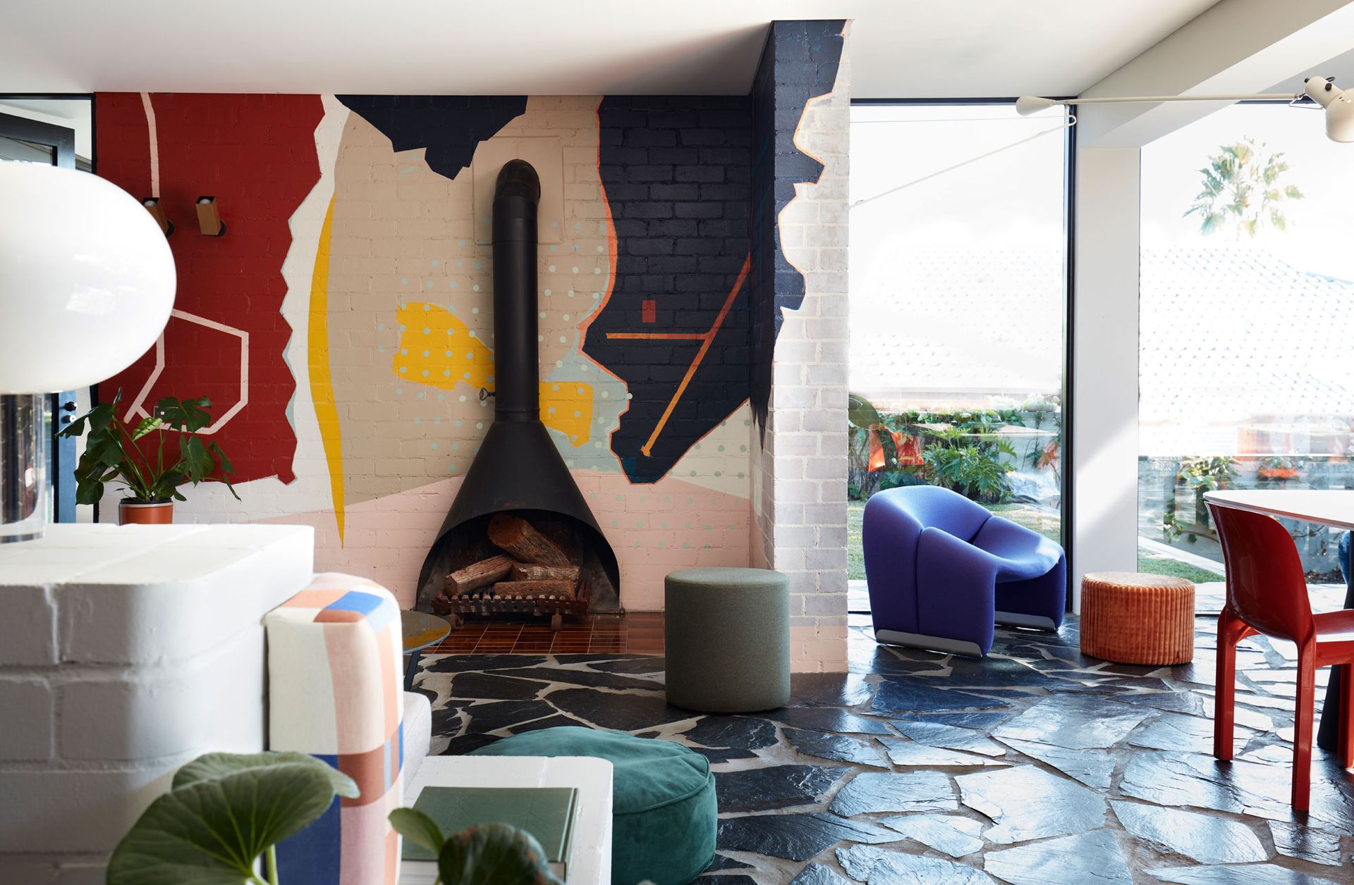
What to do instead: If murals are your thing, look towards designs that have more organic forms. Circles, arches and waves are your best bet for translating a graphic wall mural in a way that feels suitably modern.
Of course, these aren't quite so easy to DIY as using painters' tape to create a geometric mural, in which case, why not explore other avenues? 'Instead of relying solely on paint, consider incorporating wallpaper with interesting patterns or textures,' says Sara. 'Wallpaper can add depth, personality, and a unique touch to a space, allowing you to create a focal point or a cohesive design scheme.'
Be The First To Know
The Livingetc newsletter is your shortcut to the now and the next in home design. Subscribe today to receive a stunning free 200-page book of the best homes from around the world.

Luke Arthur Wells is a freelance design writer, award-winning interiors blogger and stylist, known for neutral, textural spaces with a luxury twist. He's worked with some of the UK's top design brands, counting the likes of Tom Dixon Studio as regular collaborators and his work has been featured in print and online in publications ranging from Domino Magazine to The Sunday Times. He's a hands-on type of interiors expert too, contributing practical renovation advice and DIY tutorials to a number of magazines, as well as to his own readers and followers via his blog and social media. He might currently be renovating a small Victorian house in England, but he dreams of light, spacious, neutral homes on the West Coast.
-
 The 12 Best Table Lamps for Reading —I'm a Certified Bookworm (and Shopping Expert)
When it comes to table lamps for reading, I don't mess around. If you're the same, this edit is for YOU (and your books, or course — and good recommendations?)
By Brigid Kennedy Published
-
 "It's Scandi Meets Californian-Cool" — The New Anthro Collab With Katie Hodges Hits Just the Right Style Note
The LA-based interior designer merges coastal cool with Scandinavian simplicity for a delightfully lived-in collection of elevated home furnishings
By Julia Demer Published
