5 outdated trends for entryways to avoid, and what to do instead for a welcoming entrance
It’s out with the old and in with the new when it comes to these designers' staple entryway trends
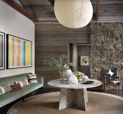
There is a lot riding on the entryway of your home. 'It’s the first thing people see when they come over so you want it to reflect the rest of the house and show off your sense of style,' Emma Kemper of Emma Beryl Interiors puts it.
With the rest of the house sitting on its shoulders, there is a lot of pressure to get it right. You might think you know what you need to do, but sticking to outdated trends is enough to cause well-intentioned entryway ideas to quickly fall apart, or at the very least, look tired and lacking in energy.
Here are the trends interior designers are happily waving goodbye to, and the alternative styles they welcome with open arms.
1. Too many trinkets
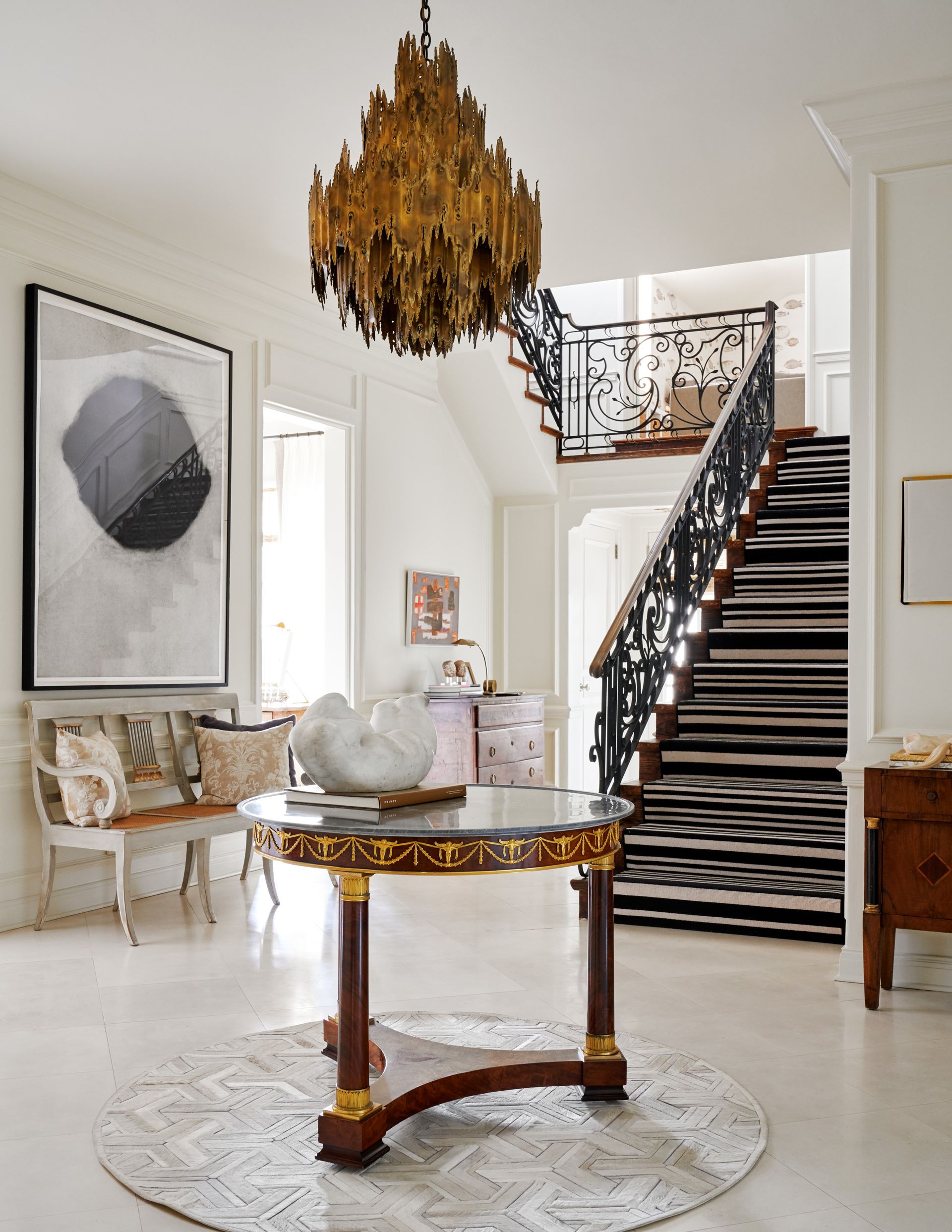
It’s official - your entryway has too much "stuff" in it. There's definitely a trend towards filling these spaces with decor to bring personality to your entrance, but this can often set the wrong tone for a home. This goes for photo frames all the way through to tiny trinkets. Lots of small pieces offer nowhere for your eye to rest making the entryway feel chaotic and untidy. This is especially true of a household already prone to using their entryway as a dumping ground.
If the pieces you are using as entryway console table decor are not adding any utility or a personal touch to the space, they have got to go. This is the standpoint taken by Dallas-based designer Jean Liu who tells us: 'We think the days of having a candle as part of the entryway design formula have come and gone.'
2. Gallery walls
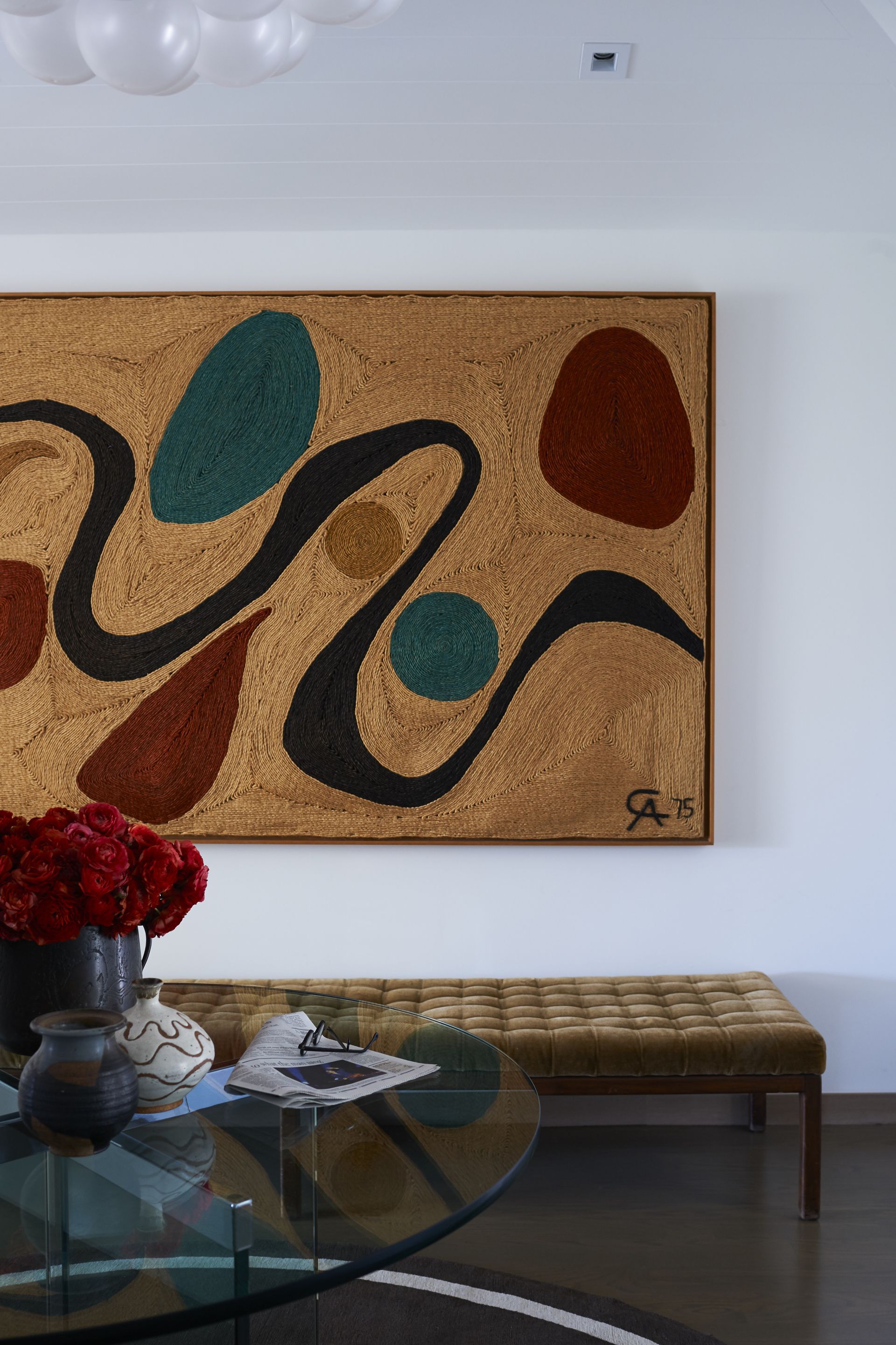
If you’re moving away from tiny accessories and have gone down the art route, there is an outdated trend to be wary of, too. A small entryway might seem like the perfect spot for a gallery wall that won't dominate the space, but designers actually suggest the opposite for making tiny spaces look bigger.
Though minimalism is in, it is best to opt for pieces which are minimal in tone or choosing just one large piece to fill the space as opposed to lots of little prints or paintings which get lost in the space and quickly make your walls look cluttered. When it comes to art, something statement is top of Los-Angeles-based designer Peter Dunham’s agenda when dressing an entryway.
He says he is sick of seeing, as he puts it, "dinky" anything: 'art, plants, whatever it may be. If you’re going to do it – go for it. A sad little tree or a too-small piece of art can hurt the look rather than help it. Get the big tree, hang the fabulous art.' This is a "go big or go home" occasion.
3. Cliched objects
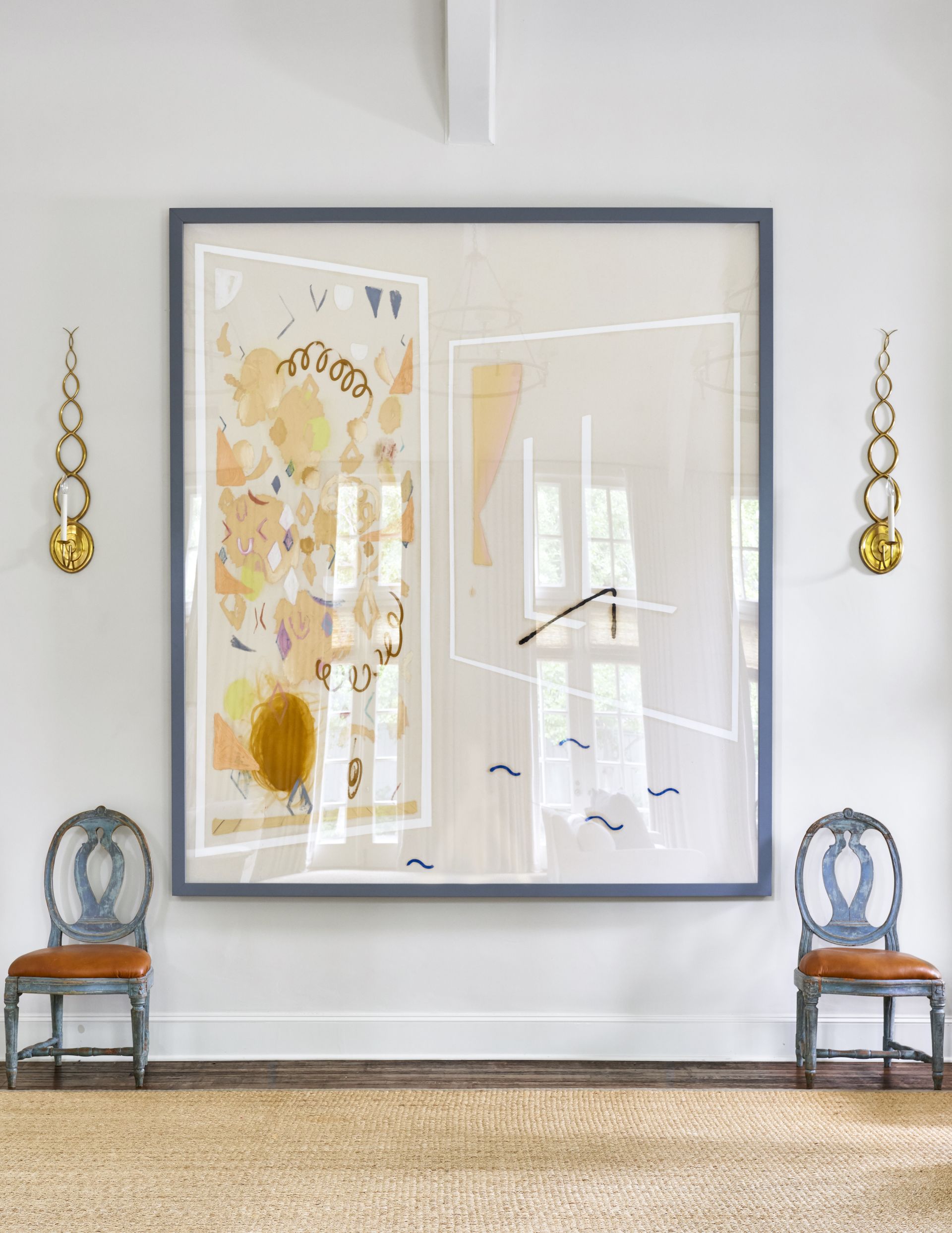
Although it can be tempting to use designs you see on Instagram as a template for your new entryway, designers are advising against decking out your entryway with generic pieces that can be picked up at any home decor store. It's important to remember that as the space which offers guests the first insight into your home, you want to make it feel like it tells the first chapter of your story.
When picking up accessories for your entryway, opt for one or two unusual or antique pieces of furniture which add your personality to the space over a trending piece you've seen in multiple homes. Founder and principal designer at New York-based brand Arsight Artem Kropovinsky is on the same page. He advises that you 'sidestep the allure of commonplace accessories' and instead says we must 'embrace elements that resonate with personal stories.'
4. All-white entryways
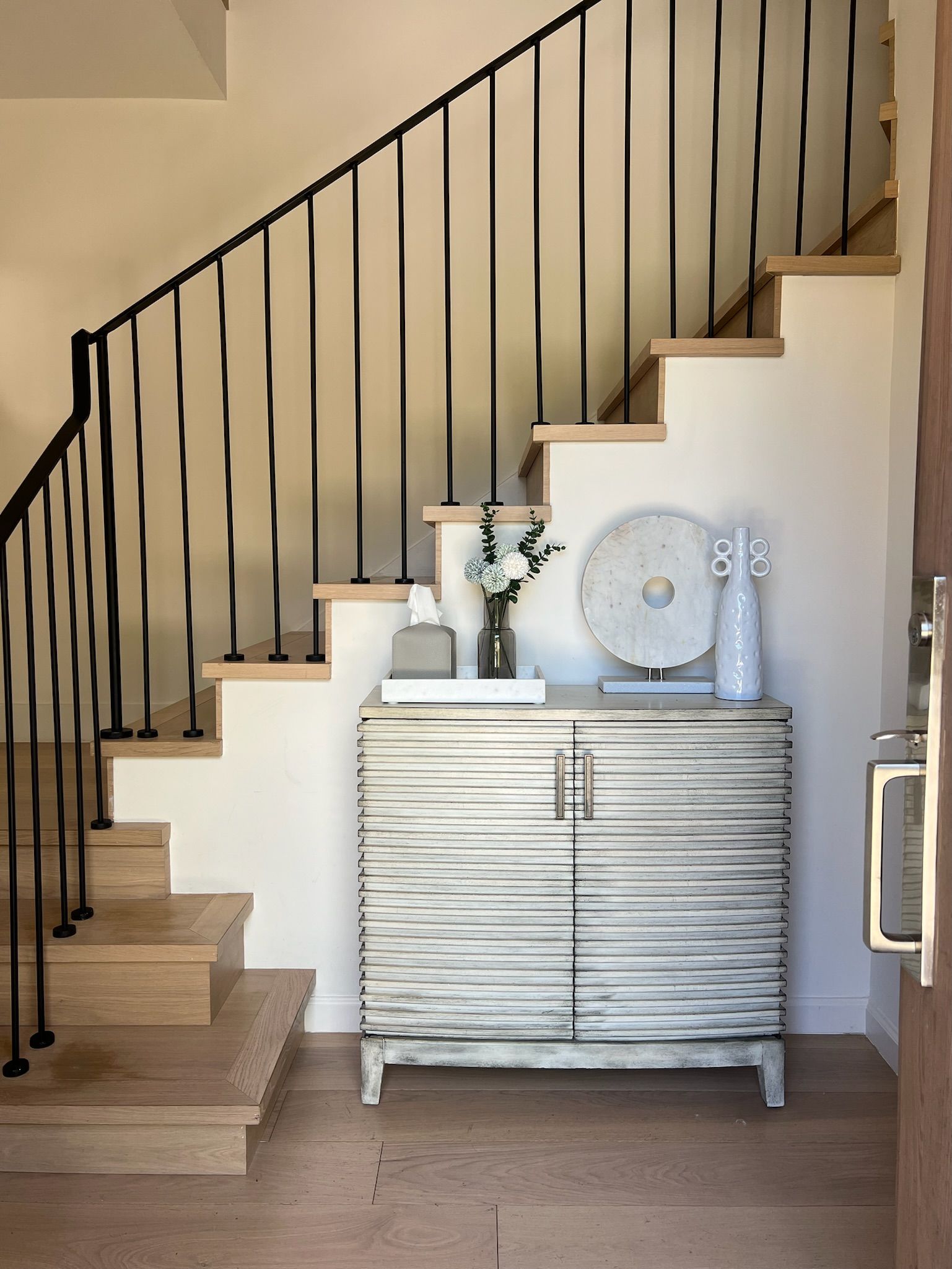
Entryways are just meant to be white, right? You'd be forgiven for thinking this with how much of a trend this color is for these spaces. Though many entryways are narrow and can be dark, going with pure white can be both impractical and cold. Even if you are trying to make a small entryway look brighter and larger, Miami-based interior designer and founder of Chill Casa, Madison Popper’s piece of advice is one to note: 'I think the biggest factor to consider is balance.'
'Although a classic, an entirely white foyer can seem cold,' agrees Artem from Arsight. 'Instead, experiment with shades that exude warmth and set a welcoming tone.'
This can be achieved by balancing white with warm wood floors or an oak console table to warm up the palette. Artem also says that adding greenery to a space which uses neutral tones can add life and dimension back into the space. 'Varying texture can also add dimension into a neutral space,' the designer adds, 'and I favor mixing wood, marble, and stone elements.'
5. Generic trends

Think of an entryway as the transitional space between your home and the outside world. Following basic interior design trends that could appear in any home across the world is a missed opportunity according to the designers we spoke to.
Instead, as Peter Dunham suggests, look to your surroundings for inspiration. 'I love to see a sense of place in the entry,' he says. 'Bringing an element of the location is essential to an authentic feeling entry. It could be sea glass at the beach or sexy mirror-clad walls in New York City.'
Once you have chosen a theme, stick to it and as designer Artem Kropovinsky recommends: 'Aim for a clean, unobstructed space.'
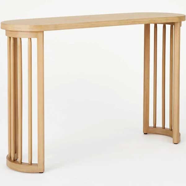
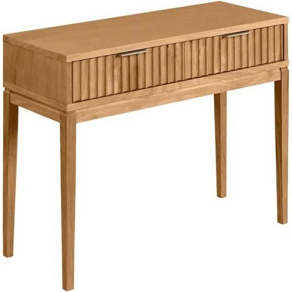
Price: $200
Material: Wood composite
Price: $219.99
Material: Wood
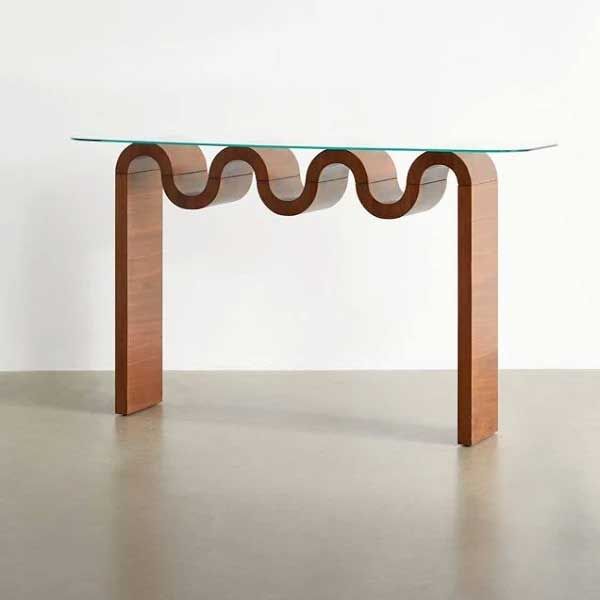
Price: $599
Material: Walnut veneer, glass
Though there are countless entryway trends which may catch your eye, nailing an esthetically pleasing entryway is easier than it seems. The key thread running through the advise of all of our experts is personality. When a space follows trends too rigidly, it can quickly look dated and impersonal. Using trends as inspiration never hurt anyone, but those added personal touches will make the space sparkle.
Be The First To Know
The Livingetc newsletter is your shortcut to the now and the next in home design. Subscribe today to receive a stunning free 200-page book of the best homes from around the world.
Katie is a freelance lifestyle writer who has recently finished an MA in Magazine Journalism at City, University of London. Before writing for Livingetc, Katie has gained bylines with The Caterer and The Telegraph and has interned at several lifestyle magazines including Grazia and Red. When not scrolling through Pinterest for interior design inspiration, Katie can be found writing about women's issues, trying out new beauty trends for her blog or seeing a West End show.
-
 What are the Most Comfortable Pillowcases? From Temperature Regulating to the Best for Your Skin
When you're looking for comfort in your pillowcases, material matters. These are the best you can buy
By Faaizah Shah Published
-
 5 Simple, but Genius Bathroom Layout Tricks That Will Make Your Space Work so Much Harder
Small switches to how you lay out your bathroom that help make the most of a small space
By Luke Arthur Wells Published
